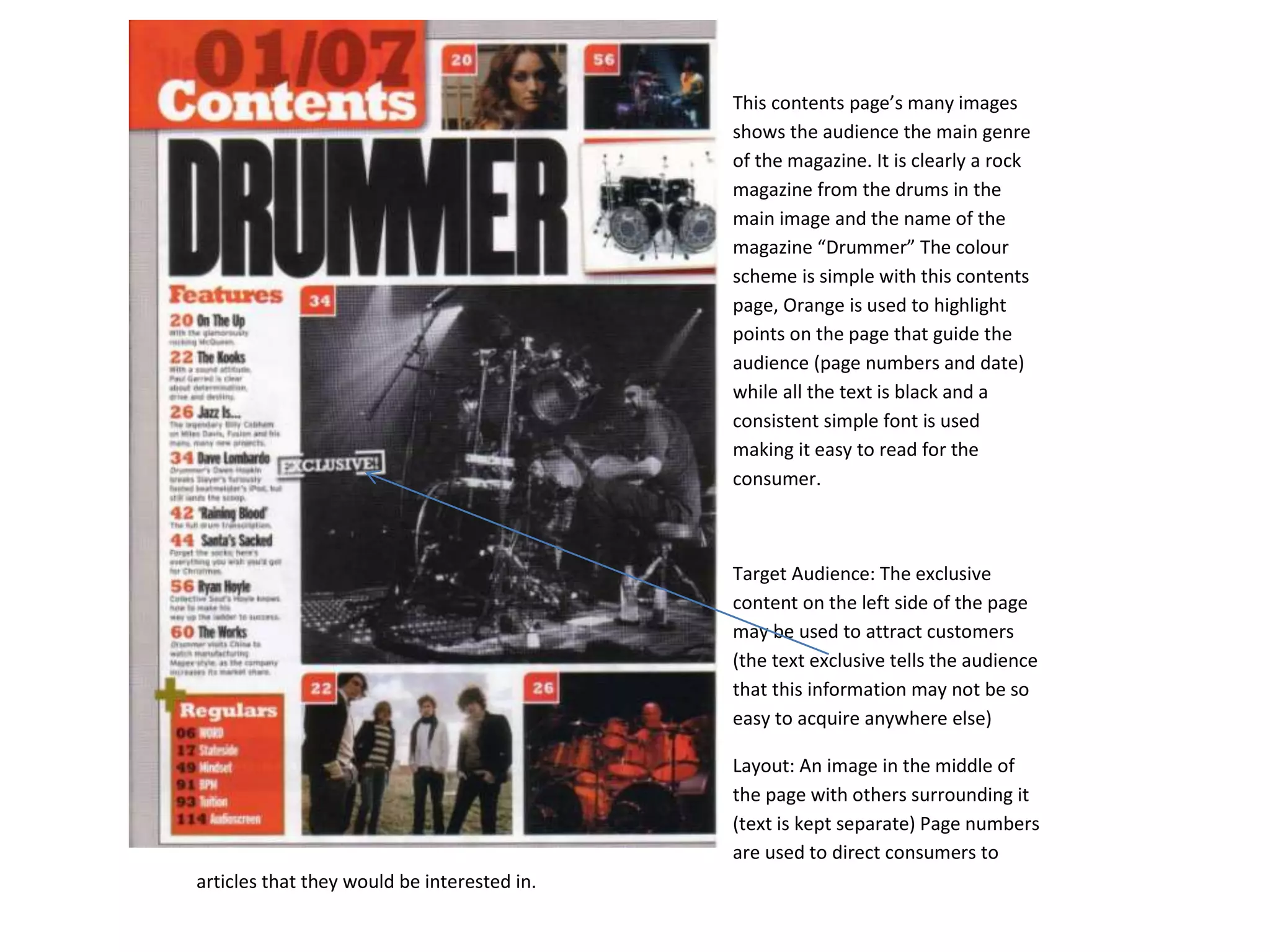
This contents page’s many images
                                             shows the audience the main genre
                                             of the magazine. It is clearly a rock
                                             magazine from the drums in the
                                             main image and the name of the
                                             magazine “Drummer” The colour
                                             scheme is simple with this contents
                                             page, Orange is used to highlight
                                             points on the page that guide the
                                             audience (page numbers and date)
                                             while all the text is black and a
                                             consistent simple font is used
                                             making it easy to read for the
                                             consumer.


                                             Target Audience: The exclusive
                                             content on the left side of the page
                                             may be used to attract customers
                                             (the text exclusive tells the audience
                                             that this information may not be so
                                             easy to acquire anywhere else)

                                             Layout: An image in the middle of
                                             the page with others surrounding it
                                             (text is kept separate) Page numbers
                                             are used to direct consumers to
articles that they would be interested in.
Uses many types of typography. The image
used in this contents page can be used to infer
what type of genre the magazine is about. This
is inferred from the guitar and hand piano that
the artists are using in the main image.

Target Audience: Easily grips its audience with
the band index. This will allow consumers to
find their favourite artists quickly (or influence
them to buy the magazine if they see an artist
they know) Also the promotional offer at the
bottom of the magazine is also used to attract
the audience. The offer may be seen as a “one
time only” type of offer, therefore forcing
them to buy it quickly.

Layout: Not a typical contents page. A lot of
text on both sides of the page and only one
main image. Also the paragraph is also
unusual for a contents page. However, the
colour is consistent with this and it is easy
enough to read.
The main image is colourless, with an
exception of the red heart on the artists
chest. This heart may give the impression
to the audience that “everyone loves
him” and may sway their own opinions
of him.The typography is simple and 3
fonts are used.

Target Audience: This magazine appeals
to two types of audiences. Music and
fashion. Using the main image as the
centrepiece for music and fashion,
consumers of music magazines may see
the fashion feature as an added bonus,
influencing them to buy.

Layout: Simple layout, main image on
one side of the page with most of the
text on the other. Easy to read contents
page with simple typography. The colour
is also minimal to perhaps emphasise the
simplicity of the magazine.

Contents page analysis power point

  • 1.
    This contents page’smany images shows the audience the main genre of the magazine. It is clearly a rock magazine from the drums in the main image and the name of the magazine “Drummer” The colour scheme is simple with this contents page, Orange is used to highlight points on the page that guide the audience (page numbers and date) while all the text is black and a consistent simple font is used making it easy to read for the consumer. Target Audience: The exclusive content on the left side of the page may be used to attract customers (the text exclusive tells the audience that this information may not be so easy to acquire anywhere else) Layout: An image in the middle of the page with others surrounding it (text is kept separate) Page numbers are used to direct consumers to articles that they would be interested in.
  • 2.
    Uses many typesof typography. The image used in this contents page can be used to infer what type of genre the magazine is about. This is inferred from the guitar and hand piano that the artists are using in the main image. Target Audience: Easily grips its audience with the band index. This will allow consumers to find their favourite artists quickly (or influence them to buy the magazine if they see an artist they know) Also the promotional offer at the bottom of the magazine is also used to attract the audience. The offer may be seen as a “one time only” type of offer, therefore forcing them to buy it quickly. Layout: Not a typical contents page. A lot of text on both sides of the page and only one main image. Also the paragraph is also unusual for a contents page. However, the colour is consistent with this and it is easy enough to read.
  • 3.
    The main imageis colourless, with an exception of the red heart on the artists chest. This heart may give the impression to the audience that “everyone loves him” and may sway their own opinions of him.The typography is simple and 3 fonts are used. Target Audience: This magazine appeals to two types of audiences. Music and fashion. Using the main image as the centrepiece for music and fashion, consumers of music magazines may see the fashion feature as an added bonus, influencing them to buy. Layout: Simple layout, main image on one side of the page with most of the text on the other. Easy to read contents page with simple typography. The colour is also minimal to perhaps emphasise the simplicity of the magazine.