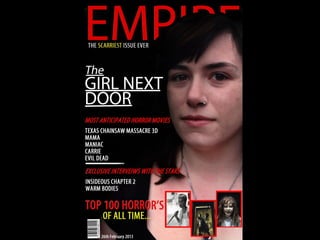
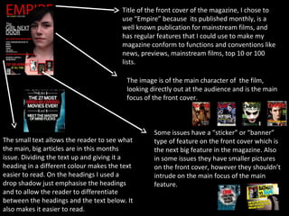
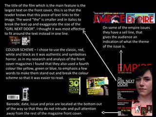
The document evaluates the front cover design of a magazine called "Empire". It discusses design elements like the main image focusing on the film's character, larger text identifying the main feature film, and additional details like release banners, smaller supporting images, and descriptive text in headings and sections. Color schemes with red, white, black, and an accent color are analyzed as classic designs that emphasize important words and make the cover easier to read.