
Recommended
More Related Content
What's hot
What's hot (19)
Similar to In what ways does your media product use, develop or challenge forms and conventions of real life music magazines?
Similar to In what ways does your media product use, develop or challenge forms and conventions of real life music magazines? (20)
Recently uploaded
Recently uploaded (20)
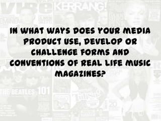
In what ways does your media product use, develop or challenge forms and conventions of real life music magazines?
- 1. In what ways does your media product use, develop or challenge forms and conventions of real life music magazines?
- 2. During the stages of researching i looked at professional and students magazines of the genre of rock. The magazines gave me a guide of what conventions I needed to include. The reason I looked at a variety of different rock music magazines is because they know exactly what their target audience want, thus making them buy their magazine Other conventions include the masthead which is usually located at the top of the page either in the left corner or centre. The fonts used are also very important because every music magazine genre has its own style of fonts. Also Rock magazines have their editors not on the contents page. The colours used for the magazine relies on the genre and audience. In this case the main colours used are white,yellow,black and red. When it came to making my music magazine, i took into account the conventions needed, simply because I know my target audience will buy it seeing as the conventions are appealed to them.
- 3. Masthead: >Kerrang its self is a sound a guitar makes stereotyping the type of genre the music magazine >The lines on the masthead act like strings of a guitar reinforcing the stereotype of a guitar being a rock icon The central image is of the lead singer of Paramore. We can tell that she’s the main focus of the issue of this magazine. The colours she’s using also reflects the house style of this magazine. Other bands in the magazine, this makes the audience want to buy it more as it has more about their favourite bands Barcode This suggests that the audience is willing to pay for the magazine. They seem to want to attract a female audience so they’ve added posters which include males The size of the text shows what’s important in this issue. In this case it’s the main headline. Kerrang make their text big so it can catch their target audience’s eyes Having “Your” highlighted makes the magazine more personal to the audience The house style presented in this magazine is consisted of the colours Black,White and Yellow Information Bar Has a competition which makes the audience more keen into buying it It also makes the target audience a more active audience than passive
- 4. Information bar Puff Primary headline Central image Masthead ISBN code Issue date Secondary Headlines My Magazine shares similar conventions as Kerrang! Magazine. The Masthead is the biggest text on the front cover, It’s also big and bold , This draws attention to the audience as it attracts their eyes. Those who are loyal readers will know the name of the magazine even though it’s overlapped by the central image. I think that the font I used for the Masthead matches the genre for my music magazine as I didn't use bubbly and happy fonts. Housetyle I used was the colours Black,White,Yellow and Red , Similar to the Kerrang magazine one . I also took into consideration that my main article had to be the biggest Font and I made it stand out so the Audience knows what the main story is. The secondary headlines are slightly smaller than the Main headline’s text.
- 5. Page Numbers Title of page Issue and cover date Picture of featured article Editors note My contents page has similar codes and conventions to a professional rock magazine cover . I used the colours red, black, yellow and white since they’re my colour scheme and also the colours that define the music of rock. I made sure I had all the correct conventions required for a rock magazine so I researched and found contents pages that I could easily recreate. I found out that most magazines have a double page contents pages. But I followed some of their style despite them being a double page contents page and mine being a single one
- 6. Pull Quote Columns Heading Relatable images My Double page spread shares the same convention as a professional rock magazine. I added a rip where it says “the untold story” I found that a ripped effect was very popular in a rock magazine so I thought I would try to add it to my magazine to give more layers of meaning to it . My Double page spread follows the same colour scheme as my front cover and Contents page as it’s the colours used in this genre of music magazine