
Recommended
More Related Content
What's hot
What's hot (20)
Viewers also liked
Viewers also liked (8)
Similar to evaluation question 5
Similar to evaluation question 5 (20)
Recently uploaded
Recently uploaded (20)
evaluation question 5
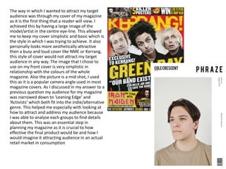
- 1. The way in which I wanted to attract my target audience was through my cover of my magazine as it is the first thing that a reader will view. I achieved this by having a large image of the model/artist in the centre eye-line. This allowed me to keep my cover simplistic and basic which is the style in which I was trying to achieve. It also personally looks more aesthetically attractive then a busy and loud cover like NME or Kerrang, this style of cover would not attract my target audience in any way. The image that I chose to use on my front cover is very simplistic in relationship with the colours of the whole magazine. Also the picture is a mid shot, I used this as it is a popular camera angle used in most magazine covers. As I discussed in my answer to a previous question my audience for my magazine was narrowed down to ‘Leaning Edge’ and ‘Activists’ which both fit into the indie/alternative genre. This helped me especially with looking at how to attract and address my audience because I was able to analyse each groups to find details about them. This was an essential step in planning my magazine as it is crucial to how effective the final product would be and how I would imagine it attracting audience in an actual retail market in consumption
- 2. I wanted to do some aspects of my magazine to be unconventional as this would interest my target audience and attract more target audience or even convert people to view my magazine. I built on the name to create something that lived up to the alternative name, I wanted something short snappy and straight to the point. This was an inspired idea from the cover of surface magazine which does a similar issue name of each of their magazine, it gives the magazine something different about each one as they are based on different aspects of music and artists. I think that including this allows my cover to remove itself from the mainstream audience and towards the niche/alternative audience which are my target audience.
- 3. I did not include any specific cover lines on the cover of my magazine because I wanted all focus to be on the image and the title which takes up a very large amount of the page. This was because these were the main components of the magazine which portrayed what the magazine was about and give the reader a deeper understanding. On my contents page and double page I have included informal language in my double page spread as this is what I found would attract my indie/alternative target audience better. I think it gives a more relaxed feel which works with the age range that was my target audience.