Downloaded 338 times
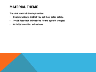
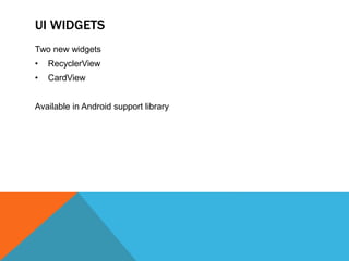
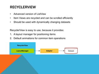
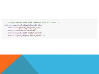
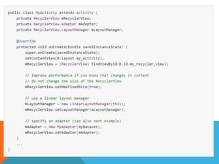
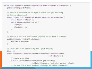
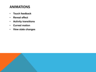
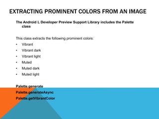

The document outlines the new Material Theme for Android, detailing its system widgets, layouts, elevations, and animations. It introduces key components such as RecyclerView and CardView, along with various animation techniques for touch feedback and activity transitions. Additionally, it discusses how to extract prominent colors from images using the Palette class and the implementation of UI styles and widgets that conform to Material Design guidelines.


