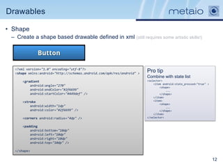
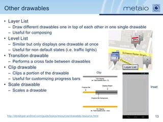
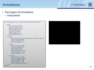
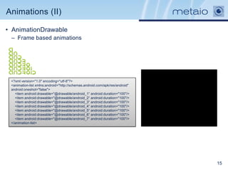
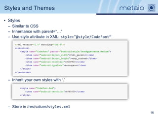
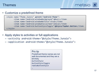
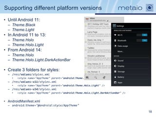
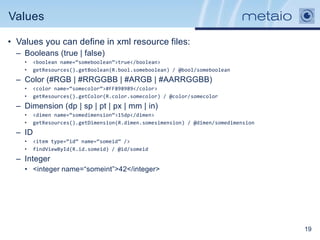
Efficient Android resources 101
Resource folders
•       Located under /res folder
•       Used to store
        images, layouts, values, internationalization, animation,
        menus, etc.
•       Provide different resource versions depending on
        qualifiers
•       Name the folders using the form:
    •     <folder_name>-<qualifier_config>
    •     Can add more than one but respecting an order

•       Samples
    •     drawable-hdpi: high density version (~240dpi)
    •     drawable-land-xhdpi: extra high density version for            Pro tip
          landscape mode (~320dpi)                                       Exclude resources
    •     values-es: Strings and values to use when the locale is “es”   that begin with _
          (Spanish)
    •     layout-large-land-car-night-finger-v11: guess it!              Tip
                                                                         Folders without
                                                                         qualifiers are the
•       More info:
                                                                         default values
        http://developer.android.com/guide/topics/resources/pro
        viding-resources.html                                                                 2
Automatic handling of resources

• Correct resource folder is chosen automatically.
  – Unless you override it
• Different versions of same resource must have the
  same file name.
• Same view in different layout versions must have the
  same id.
• If the resource does not match any qualifier, android
  tries to find the best match.
• Resources are accessed in two ways:
  – In code: R.string.app_name
  – In XML: @string/app_name


  Pro tip
  Access android core resources
  with android.R.anim.fade_in
  or @android:anim/fade_in

                                                          3
Supporting different screen densities

• Android density independent pixels (dp)
  – The density-independent pixel is equivalent to one physical pixel on a 160 dpi
    screen
  – px = dp * (dpi / 160). For example, on a 240 dpi screen, 1 dp equals 1.5
    physical pixels
  – Don‟t ever EVER use pixels, use dp instead (or sp for font sizes).


 Relative sizes for bitmap drawables that support each density

 http://developer.android.com/guide/practices/screens_support.html                   4
Supporting different screens

• Layout qualifiers can be used to provide different layouts for different
  devices and “avoid” fragmentation.


   • Screen madness:
      • Use smallestWidth qualifier: sw<N>dp (sw480dp, sw600dp)
      • Qualifiers from Android 3.2 to set different layouts
             •    320dp: a typical phone screen (240x320 ldpi, 320x480 mdpi, 480x800 hdpi, etc).
             •    480dp: a tweener tablet like the Streak (480x800 mdpi).
             •    600dp: a 7” tablet (600x1024 mdpi).
             •    720dp: a 10” tablet (720x1280 mdpi, 800x1280 mdpi, etc)

       res/layout/main_activity.xml # For handsets (smaller than 600dp available width)
       res/layout-sw600dp/main_activity.xml # For 7” tablets (600dp wide and bigger)
       res/layout-sw720dp/main_activity.xml # For 10” tablets (720dp wide and bigger)


                                                                                                   5
Efficient layouts

• Layouts are defined in XML files
  – Under /res/layout

• Types of containers
  – LinearLayout: Easiest to learn. Displays views
    either horizontally or vertically.
  – RelativeLayout: Positions views relative to other
    views. Good to create layouts that overlap with
    transparencies.
  – FrameLayout: Basic layout. Stack views one
    above the other. Not very useful
  – Also TableLayout and GridLayout

• Android drawing algorithm
  – onMeasure. How big does the views want to be.
  – onLayout. Drawing the views


                                                        6
Efficient layouts (II)

• Keeping the hierarchy flat speeds up
  drawing the UI
  •   (aka use RelativeLayout)

• Reuse layouts
  •   You can use <include/> to add other layout file
  •   <include android:id="@+id/cell1" layout="@layout/workspace_screen" />


• Avoid duplicating containers of same type
  •   Use <merge/>
  •   Attaches it‟s children to it‟s parent
  •   Great combo with <include/>


                                                                              7
Efficient layouts(III)

• Don‟t define views used rarely
  •   Use ViewStub to load views on demand

<ViewStub
    android:id="@+id/stub_import"
    android:layout="@layout/progress_overlay"
    android:layout_width="fill_parent"
    android:layout_height="wrap_content"
    android:layout_gravity="bottom" />

((ViewStub) findViewById(R.id.stub_import)).setVisibility(View.VISIBLE);
// or
View importPanel = ((ViewStub) findViewById(R.id.stub_import)).inflate();


                                                                            8
Efficient layouts (IV)

• Use as less views as possible and use compound drawables


   <LinearLayout                                                          <TextView
       android:layout_width="wrap_content"                                    android:layout_width="wrap_content"
       android:layout_height="wrap_content"                                   android:layout_height="wrap_content"
       android:layout_gravity="center_horizontal"                             android:layout_gravity="center_horizontal"
       android:orientation="horizontal" >                                     android:drawableLeft="@drawable/ic_launcher"
       <ImageView                                                             android:gravity="center"
           android:layout_width="wrap_content"                                android:text="@string/hello_world" />
           android:layout_height="wrap_content"
           android:src="@drawable/ic_launcher" />
       <TextView
           android:layout_width="match_parent"
           android:layout_height="match_parent"
           android:gravity="center"
           android:text="@string/hello_world"/>
   </LinearLayout>


   http://www.curious-creature.org/2009/03/16/android-layout-tricks-4-optimize-part-2/                                       9
Drawables

• Nine-Patch
 •   Stretchable image files
 •   Define areas to stretch and areas where content is
     placed
 •   Image expands to fit content preserving complex image
     shapes like corners or decorations


• Top and left
   • Define stretchable areas (no shrinkable!)

 • Bottom and right
    • Content area, the rest is padding

                                                             10
Drawables

• State list
  – It is used to provide different drawables or colors to different states of the view.
  – The order is important. First match.
  – Density independant. Store the file in /res/drawable/btn_nav_bg_selector.xml


             Disabled           Default           Pressed
   <?xml version="1.0" encoding="utf-8"?>
   <selector xmlns:android="http://schemas.android.com/apk/res/android">
       <item android:drawable="@drawable/btn_nav_forward_default" android:state_enabled="true"
               android:state_window_focused="false"/>
       <item android:drawable="@drawable/btn_nav_forward_disabled" android:state_enabled="false"
               android:state_window_focused="false"/>
       <item android:drawable="@drawable/btn_nav_forward_disabled" android:state_enabled="false"
               android:state_window_focused="true"/>
       <item android:drawable="@drawable/btn_nav_forward_pressed" android:state_pressed="true"/>
       <item android:drawable="@drawable/btn_nav_forward_pressed" android:state_enabled="true"
               android:state_focused="true"/>
       <item android:drawable="@drawable/btn_nav_forward_default" android:state_enabled="true"/>
       <item android:drawable="@drawable/btn_nav_forward_default" android:state_focused="true"/>
       <item android:drawable="@drawable/btn_nav_forward_default"/>
   </selector>


   android:background="@drawable/btn_nav_bg_selector"
                                                                                                   11
Drawables

• Shape
 – Create a shape based drawable defined in xml (still requires some artistic skills!)


  <?xml version="1.0" encoding="utf-8"?>
  <shape xmlns:android="http://schemas.android.com/apk/res/android" >
                                                                        Pro tip
                                                                        Combine with state list
      <gradient                                                         <selector>
                                                                            <item android:state_pressed="true" >
          android:angle="270"                                                   <shape>
          android:endColor="#2f6699"                                                ...
          android:startColor="#449def" />                                       </shape>
                                                                            </item>
      <stroke                                                               <item>
                                                                                <shape>
          android:width="1dp"                                                       ...
          android:color="#2f6699" />                                            </shape>
                                                                            </item>
      <corners android:radius="4dp" />                                  </selector>


      <padding
          android:bottom="10dp"
          android:left="10dp"
          android:right="10dp"
          android:top="10dp" />

  </shape>

                                                                                                                   12
Other drawables

• Layer List
  – Draw different drawables one in top of each other in one single drawable
  – Useful for composing
• Level List
  – Similar but only displays one drawable at once
  – Useful for non default states (i.e. traffic lights)
• Transition drawable
  – Performs a cross fade between drawables
• Clip drawable                                                                 Layer List

  – Clips a portion of the drawable                                      Clip

  – Useful for customizing progress bars
• Scale drawable                                                                             Inset
  – Scales a drawable


 http://developer.android.com/guide/topics/resources/drawable-resource.html                     13
Animations

• Two types of animations
 – Interpolated

 <set xmlns:android="http://schemas.android.com/apk/res/android" >

    <scale
        android:duration="5000"
        android:fillAfter="false"
        android:fromXScale="1.0"
        android:fromYScale="1.0"
        android:pivotX="50%"
        android:pivotY="50%"
        android:toXScale="3.0"
        android:toYScale="3.0" />
    <set>
        <alpha
            xmlns:android="http://schemas.android.com/apk/res/android"
            android:duration="3000"
            android:fromAlpha="0.2"
            android:toAlpha="1.0" />

        <rotate
            android:duration="4000"
            android:fromDegrees="0"
            android:pivotX="50%"
            android:pivotY="50%"
            android:startOffset="700"
            android:toDegrees="-360"
            android:toYScale="0.0" />

         <translate
             android:duration="3000"
             android:fromXDelta="100%"
             android:fromYDelta="60%"
             android:toXDelta="-20%"
             android:toYDelta="-30%"
             android:zAdjustment="bottom" />
     </set>
 </set>
                                                                         14
Animations (II)

• AnimationDrawable
 – Frame based animations


 <?xml version="1.0" encoding="utf-8"?>
 <animation-list xmlns:android="http://schemas.android.com/apk/res/android"
 android:oneshot="false">
   <item android:drawable="@drawable/android_1“ android:duration="100"/>
   <item android:drawable="@drawable/android_2“ android:duration="100"/>
   <item android:drawable="@drawable/android_3“ android:duration="100"/>
   <item android:drawable="@drawable/android_4“ android:duration="100"/>
   <item android:drawable="@drawable/android_5“ android:duration="100"/>
   <item android:drawable="@drawable/android_6“ android:duration="100"/>
   <item android:drawable="@drawable/android_7“ android:duration="100"/>
 </animation-list>


                                                                              15
Styles and Themes

• Styles
  – Similar to CSS
  – Inheritance with parent=“…”
  – Use style attribute in XML: style="@style/CodeFont“


  – Inherit your own styles with „.‟


  – Store in /res/values/styles.xml
                                                          16
Themes

• Customize a predefined theme
   <style name="Theme.Junaio" parent="android:Theme">
          <item name="android:windowBackground">@null</item>
          <item name="android:windowNoTitle">true</item>
          <item name="android:windowFullscreen">false</item>
          <item name="android:buttonStyleToggle">@style/Topbar.Button</item>
   </style>


• Apply styles to activities or full applications
  – <activity android:theme="@style/Theme.Junaio">
  – <application android:theme="@style/Theme.Junaio">


                          Pro tip
                          Predefined theme names are not
                          well documented and they are a
                          bit tricky
                          buttonStyle
                          buttonStyleToggle
                          radioButtonStyle
                          …
                                                                               17
Supporting different platform versions

• Until Android 11:
  – Theme.Black
  – Theme.Light
• In Android 11 to 13:
  – Theme.Holo
  – Theme.Holo.Light
• From Android 14:
  – Theme.Holo
  – Theme.Holo.Light.DarkActionBar

• Create 3 folders for styles:
  – /res/values/styles.xml
    •   <style name="AppTheme" parent="android:Theme.Light" />
  – /res/values-v11/styles.xml
    •   <style name="AppTheme" parent="android:Theme.Holo.Light" />
  – /res/values-v14/styles.xml
    •   <style name="AppTheme" parent="android:Theme.Holo.Light.DarkActionBar" />


• AndroidManifest.xml
  – android:theme="@android:style/AppTheme"

                                                                                    18
Values

• Values you can define in xml resource files:
  – Booleans (true | false)
    •    <boolean name=“someboolean”>true</boolean>
    •    getResources().getBoolean(R.bool.someboolean) / @bool/someboolean
  – Color (#RGB | #RRGGBB | #ARGB | #AARRGGBB)
    •    <color name=“somecolor”>#FF898989</color>
    •    getResources().getColor(R.color.somecolor) / @color/somecolor
  – Dimension (dp | sp | pt | px | mm | in)
    •    <dimen name=“somedimension”>15dp</dimen>
    •    getResources().getDimension(R.dimen.somesimension) / @dimen/somedimension
  – ID
    •    <item type=“id” name=“someid” />
    •    findViewById(R.id.someid) / @id/someid
  – Integer
    • <integer name=“someint”>42</integer>


                                                                                     19
Array values

 – Integer Array
   • getIntArray(R.array.someintarray)
 – Typed Array
   • Mixed types


                                         20
Questions?


      “Work it Harder
      Make it Better
      Do it Faster
      Make us Stronger”
                      -Daft Punk


                                   21

Fernando F. Gallego - Efficient Android Resources 101

  • 1.
  • 2.
    Resource folders • Located under /res folder • Used to store images, layouts, values, internationalization, animation, menus, etc. • Provide different resource versions depending on qualifiers • Name the folders using the form: • <folder_name>-<qualifier_config> • Can add more than one but respecting an order • Samples • drawable-hdpi: high density version (~240dpi) • drawable-land-xhdpi: extra high density version for Pro tip landscape mode (~320dpi) Exclude resources • values-es: Strings and values to use when the locale is “es” that begin with _ (Spanish) • layout-large-land-car-night-finger-v11: guess it! Tip Folders without qualifiers are the • More info: default values http://developer.android.com/guide/topics/resources/pro viding-resources.html 2
  • 3.
    Automatic handling ofresources • Correct resource folder is chosen automatically. – Unless you override it • Different versions of same resource must have the same file name. • Same view in different layout versions must have the same id. • If the resource does not match any qualifier, android tries to find the best match. • Resources are accessed in two ways: – In code: R.string.app_name – In XML: @string/app_name Pro tip Access android core resources with android.R.anim.fade_in or @android:anim/fade_in 3
  • 4.
    Supporting different screendensities • Android density independent pixels (dp) – The density-independent pixel is equivalent to one physical pixel on a 160 dpi screen – px = dp * (dpi / 160). For example, on a 240 dpi screen, 1 dp equals 1.5 physical pixels – Don‟t ever EVER use pixels, use dp instead (or sp for font sizes). Relative sizes for bitmap drawables that support each density http://developer.android.com/guide/practices/screens_support.html 4
  • 5.
    Supporting different screens •Layout qualifiers can be used to provide different layouts for different devices and “avoid” fragmentation. • Screen madness: • Use smallestWidth qualifier: sw<N>dp (sw480dp, sw600dp) • Qualifiers from Android 3.2 to set different layouts • 320dp: a typical phone screen (240x320 ldpi, 320x480 mdpi, 480x800 hdpi, etc). • 480dp: a tweener tablet like the Streak (480x800 mdpi). • 600dp: a 7” tablet (600x1024 mdpi). • 720dp: a 10” tablet (720x1280 mdpi, 800x1280 mdpi, etc) res/layout/main_activity.xml # For handsets (smaller than 600dp available width) res/layout-sw600dp/main_activity.xml # For 7” tablets (600dp wide and bigger) res/layout-sw720dp/main_activity.xml # For 10” tablets (720dp wide and bigger) 5
  • 6.
    Efficient layouts • Layoutsare defined in XML files – Under /res/layout • Types of containers – LinearLayout: Easiest to learn. Displays views either horizontally or vertically. – RelativeLayout: Positions views relative to other views. Good to create layouts that overlap with transparencies. – FrameLayout: Basic layout. Stack views one above the other. Not very useful – Also TableLayout and GridLayout • Android drawing algorithm – onMeasure. How big does the views want to be. – onLayout. Drawing the views 6
  • 7.
    Efficient layouts (II) •Keeping the hierarchy flat speeds up drawing the UI • (aka use RelativeLayout) • Reuse layouts • You can use <include/> to add other layout file • <include android:id="@+id/cell1" layout="@layout/workspace_screen" /> • Avoid duplicating containers of same type • Use <merge/> • Attaches it‟s children to it‟s parent • Great combo with <include/> 7
  • 8.
    Efficient layouts(III) • Don‟tdefine views used rarely • Use ViewStub to load views on demand <ViewStub android:id="@+id/stub_import" android:layout="@layout/progress_overlay" android:layout_width="fill_parent" android:layout_height="wrap_content" android:layout_gravity="bottom" /> ((ViewStub) findViewById(R.id.stub_import)).setVisibility(View.VISIBLE); // or View importPanel = ((ViewStub) findViewById(R.id.stub_import)).inflate(); 8
  • 9.
    Efficient layouts (IV) •Use as less views as possible and use compound drawables <LinearLayout <TextView android:layout_width="wrap_content" android:layout_width="wrap_content" android:layout_height="wrap_content" android:layout_height="wrap_content" android:layout_gravity="center_horizontal" android:layout_gravity="center_horizontal" android:orientation="horizontal" > android:drawableLeft="@drawable/ic_launcher" <ImageView android:gravity="center" android:layout_width="wrap_content" android:text="@string/hello_world" /> android:layout_height="wrap_content" android:src="@drawable/ic_launcher" /> <TextView android:layout_width="match_parent" android:layout_height="match_parent" android:gravity="center" android:text="@string/hello_world"/> </LinearLayout> http://www.curious-creature.org/2009/03/16/android-layout-tricks-4-optimize-part-2/ 9
  • 10.
    Drawables • Nine-Patch • Stretchable image files • Define areas to stretch and areas where content is placed • Image expands to fit content preserving complex image shapes like corners or decorations • Top and left • Define stretchable areas (no shrinkable!) • Bottom and right • Content area, the rest is padding 10
  • 11.
    Drawables • State list – It is used to provide different drawables or colors to different states of the view. – The order is important. First match. – Density independant. Store the file in /res/drawable/btn_nav_bg_selector.xml Disabled Default Pressed <?xml version="1.0" encoding="utf-8"?> <selector xmlns:android="http://schemas.android.com/apk/res/android"> <item android:drawable="@drawable/btn_nav_forward_default" android:state_enabled="true" android:state_window_focused="false"/> <item android:drawable="@drawable/btn_nav_forward_disabled" android:state_enabled="false" android:state_window_focused="false"/> <item android:drawable="@drawable/btn_nav_forward_disabled" android:state_enabled="false" android:state_window_focused="true"/> <item android:drawable="@drawable/btn_nav_forward_pressed" android:state_pressed="true"/> <item android:drawable="@drawable/btn_nav_forward_pressed" android:state_enabled="true" android:state_focused="true"/> <item android:drawable="@drawable/btn_nav_forward_default" android:state_enabled="true"/> <item android:drawable="@drawable/btn_nav_forward_default" android:state_focused="true"/> <item android:drawable="@drawable/btn_nav_forward_default"/> </selector> android:background="@drawable/btn_nav_bg_selector" 11
  • 12.
    Drawables • Shape –Create a shape based drawable defined in xml (still requires some artistic skills!) <?xml version="1.0" encoding="utf-8"?> <shape xmlns:android="http://schemas.android.com/apk/res/android" > Pro tip Combine with state list <gradient <selector> <item android:state_pressed="true" > android:angle="270" <shape> android:endColor="#2f6699" ... android:startColor="#449def" /> </shape> </item> <stroke <item> <shape> android:width="1dp" ... android:color="#2f6699" /> </shape> </item> <corners android:radius="4dp" /> </selector> <padding android:bottom="10dp" android:left="10dp" android:right="10dp" android:top="10dp" /> </shape> 12
  • 13.
    Other drawables • LayerList – Draw different drawables one in top of each other in one single drawable – Useful for composing • Level List – Similar but only displays one drawable at once – Useful for non default states (i.e. traffic lights) • Transition drawable – Performs a cross fade between drawables • Clip drawable Layer List – Clips a portion of the drawable Clip – Useful for customizing progress bars • Scale drawable Inset – Scales a drawable http://developer.android.com/guide/topics/resources/drawable-resource.html 13
  • 14.
    Animations • Two typesof animations – Interpolated <set xmlns:android="http://schemas.android.com/apk/res/android" > <scale android:duration="5000" android:fillAfter="false" android:fromXScale="1.0" android:fromYScale="1.0" android:pivotX="50%" android:pivotY="50%" android:toXScale="3.0" android:toYScale="3.0" /> <set> <alpha xmlns:android="http://schemas.android.com/apk/res/android" android:duration="3000" android:fromAlpha="0.2" android:toAlpha="1.0" /> <rotate android:duration="4000" android:fromDegrees="0" android:pivotX="50%" android:pivotY="50%" android:startOffset="700" android:toDegrees="-360" android:toYScale="0.0" /> <translate android:duration="3000" android:fromXDelta="100%" android:fromYDelta="60%" android:toXDelta="-20%" android:toYDelta="-30%" android:zAdjustment="bottom" /> </set> </set> 14
  • 15.
    Animations (II) • AnimationDrawable – Frame based animations <?xml version="1.0" encoding="utf-8"?> <animation-list xmlns:android="http://schemas.android.com/apk/res/android" android:oneshot="false"> <item android:drawable="@drawable/android_1“ android:duration="100"/> <item android:drawable="@drawable/android_2“ android:duration="100"/> <item android:drawable="@drawable/android_3“ android:duration="100"/> <item android:drawable="@drawable/android_4“ android:duration="100"/> <item android:drawable="@drawable/android_5“ android:duration="100"/> <item android:drawable="@drawable/android_6“ android:duration="100"/> <item android:drawable="@drawable/android_7“ android:duration="100"/> </animation-list> 15
  • 16.
    Styles and Themes •Styles – Similar to CSS – Inheritance with parent=“…” – Use style attribute in XML: style="@style/CodeFont“ – Inherit your own styles with „.‟ – Store in /res/values/styles.xml 16
  • 17.
    Themes • Customize apredefined theme <style name="Theme.Junaio" parent="android:Theme"> <item name="android:windowBackground">@null</item> <item name="android:windowNoTitle">true</item> <item name="android:windowFullscreen">false</item> <item name="android:buttonStyleToggle">@style/Topbar.Button</item> </style> • Apply styles to activities or full applications – <activity android:theme="@style/Theme.Junaio"> – <application android:theme="@style/Theme.Junaio"> Pro tip Predefined theme names are not well documented and they are a bit tricky buttonStyle buttonStyleToggle radioButtonStyle … 17
  • 18.
    Supporting different platformversions • Until Android 11: – Theme.Black – Theme.Light • In Android 11 to 13: – Theme.Holo – Theme.Holo.Light • From Android 14: – Theme.Holo – Theme.Holo.Light.DarkActionBar • Create 3 folders for styles: – /res/values/styles.xml • <style name="AppTheme" parent="android:Theme.Light" /> – /res/values-v11/styles.xml • <style name="AppTheme" parent="android:Theme.Holo.Light" /> – /res/values-v14/styles.xml • <style name="AppTheme" parent="android:Theme.Holo.Light.DarkActionBar" /> • AndroidManifest.xml – android:theme="@android:style/AppTheme" 18
  • 19.
    Values • Values youcan define in xml resource files: – Booleans (true | false) • <boolean name=“someboolean”>true</boolean> • getResources().getBoolean(R.bool.someboolean) / @bool/someboolean – Color (#RGB | #RRGGBB | #ARGB | #AARRGGBB) • <color name=“somecolor”>#FF898989</color> • getResources().getColor(R.color.somecolor) / @color/somecolor – Dimension (dp | sp | pt | px | mm | in) • <dimen name=“somedimension”>15dp</dimen> • getResources().getDimension(R.dimen.somesimension) / @dimen/somedimension – ID • <item type=“id” name=“someid” /> • findViewById(R.id.someid) / @id/someid – Integer • <integer name=“someint”>42</integer> 19
  • 20.
    Array values –Integer Array • getIntArray(R.array.someintarray) – Typed Array • Mixed types 20
  • 21.
    Questions? “Work it Harder Make it Better Do it Faster Make us Stronger” -Daft Punk 21