Material Design
Ankit Shandilya
Dec 29th, 2015
Agenda
1
What, Why & How.
2
Principals.
3
APIs.
1
What, Why & How.
2
Principals.
3
APIs.
Your Company Slogan Here and some Business Information E-Mail: me@materialdesigntemplate l Phone: +49 89 1726182
3
What, why & How
Situation
1. Device Variety
2. Branding
3. Usability
4. Development & Design effort
Variety
Branding & Usability
Development effort
Enter.. Material Design
Principal
Material is the metaphor
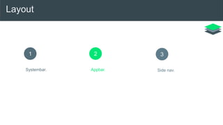
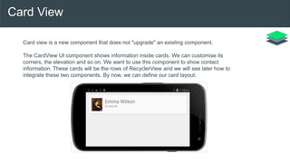
Material Design is a design language developed by Google. Expanding upon the "card" motifs that debuted in
Google Now, Material Design makes more liberal use of grid based layouts, responsive animations and
transitions, padding, and depth effects such as lighting and shadows. Designer Matías Duarte explained that,
"unlike real paper, our digital material can expand and reform intelligently. Material has physical surfaces and
edges. Seams and shadows provide meaning about what you can touch." Google states that their new
design language is based on paper and ink.
Material Design can be used in Android version 2.1 and up via the v7 appcompat library, which is used on
virtually all Android devices that were made after 2009.
Surfaces & Shadows
Element of design
Graphic Intentional
1. Color
2. Typography
3. Imagery
4. Layout
Color
Typography
Imagery
Bold
Geomteric
Symmetrical
Layout
1
Systembar.
2
Appbar.
3
Side nav.
Systembar
Status bar contains notification
icons and system icons. On
Chrome, the top bar contains the
window controls: minimize, full
screen, and close. In a Chrome app,
the top bar can disappear, and the
window controls are then brought
into the app b
Metrics:
Status bar height: 24dp
Chrome barheight: 32dpar
Appbar
App bar, formerly known as the
action bar in Android, is a special
kind of toolbar that’s used for
branding, navigation, search, and
actions.
Metrics:
Mobile Landscape: 48dp
Mobile Portrait: 56dp
Tablet/Desktop: 64dp
Side nav
Side nav bars can be pinned for
permanent display or float
temporarily as overlays. Side navs
can be positioned on the left or
right side of the screen.
Metrics:
Width = Screen width − 56 dp
Maximum width: 320dp
APIs
Api : material theme
<!-- res/values/styles.xml -->
<resources>
<!-- your app's theme inherits from the Material theme -->
<style name="AppTheme" parent="android:Theme.Material">
<!-- theme customizations -->
</style>
</resources>
Defining additional styles to theme
Baseline grids
Keylines
Spacing
Touch target size
Layout structure
Api : UI widgets
1. Recycler View
2. Card View
3. Floating action button
4. Coordinator Layout
Recycler View
RecyclerView is more advanced and flexible and efficient version of ListView. RecyclerView
ViewGroup is an container for larger data set of views that can be recycled and scrolled very
efficiently. RecyclerView can be used for larger datasets to be rendered on the UI like a list.
RecyclerView provides maximum flexibility to design different kind of views
Android RecyclerView falls under the material design of android. Android RecyclerView short
and simple as it consists a huge number of classes and each one of them is designed to be
customized.
Card View
Card view is a new component that does not "upgrade" an existing component.
The CardView UI component shows information inside cards. We can customise its
corners, the elevation and so on. We want to use this component to show contact
information. These cards will be the rows of RecyclerView and we will see later how to
integrate these two components. By now, we can define our card layout:
Floating action button
Floating action buttons are used for a special type of promoted
action. They are distinguished by a circled icon floating above the
UI and have special motion behaviors related to morphing,
launching, and the transferring anchor point.
Floating action buttons come in two sizes: the default and the mini.
The size can be controlled with the fabSize attribute.
Coordinator Layout
The Coordinator Layout is one of the new powerful layouts
introduced in the material design support library. We already talked
about the Navigation View and the Floating Action Button, but now
it´s time to put everything to work together and coordinate their
animations.
That´s what this new layout is all about: based on a set of rules
defined in Behaviors, we can define how views inside the
Coordinator Layout relate each other and what can be expected
when one of them changes. I´ll talk about behaviours in a future
post, but they identify which views another view depend on, and
how they behave when any of these views changes.
Thank you

Android Material Design

  • 1.
  • 2.
    Agenda 1 What, Why &How. 2 Principals. 3 APIs. 1 What, Why & How. 2 Principals. 3 APIs.
  • 3.
    Your Company SloganHere and some Business Information E-Mail: me@materialdesigntemplate l Phone: +49 89 1726182 3 What, why & How
  • 4.
    Situation 1. Device Variety 2.Branding 3. Usability 4. Development & Design effort
  • 5.
  • 6.
  • 7.
  • 8.
  • 9.
  • 10.
  • 11.
    Material Design isa design language developed by Google. Expanding upon the "card" motifs that debuted in Google Now, Material Design makes more liberal use of grid based layouts, responsive animations and transitions, padding, and depth effects such as lighting and shadows. Designer Matías Duarte explained that, "unlike real paper, our digital material can expand and reform intelligently. Material has physical surfaces and edges. Seams and shadows provide meaning about what you can touch." Google states that their new design language is based on paper and ink. Material Design can be used in Android version 2.1 and up via the v7 appcompat library, which is used on virtually all Android devices that were made after 2009.
  • 12.
  • 13.
  • 14.
    Graphic Intentional 1. Color 2.Typography 3. Imagery 4. Layout
  • 15.
  • 16.
  • 17.
  • 18.
  • 19.
    Systembar Status bar containsnotification icons and system icons. On Chrome, the top bar contains the window controls: minimize, full screen, and close. In a Chrome app, the top bar can disappear, and the window controls are then brought into the app b Metrics: Status bar height: 24dp Chrome barheight: 32dpar
  • 20.
    Appbar App bar, formerlyknown as the action bar in Android, is a special kind of toolbar that’s used for branding, navigation, search, and actions. Metrics: Mobile Landscape: 48dp Mobile Portrait: 56dp Tablet/Desktop: 64dp
  • 21.
    Side nav Side navbars can be pinned for permanent display or float temporarily as overlays. Side navs can be positioned on the left or right side of the screen. Metrics: Width = Screen width − 56 dp Maximum width: 320dp
  • 22.
  • 23.
    Api : materialtheme <!-- res/values/styles.xml --> <resources> <!-- your app's theme inherits from the Material theme --> <style name="AppTheme" parent="android:Theme.Material"> <!-- theme customizations --> </style> </resources>
  • 24.
    Defining additional stylesto theme Baseline grids Keylines Spacing Touch target size Layout structure
  • 25.
    Api : UIwidgets 1. Recycler View 2. Card View 3. Floating action button 4. Coordinator Layout
  • 26.
    Recycler View RecyclerView ismore advanced and flexible and efficient version of ListView. RecyclerView ViewGroup is an container for larger data set of views that can be recycled and scrolled very efficiently. RecyclerView can be used for larger datasets to be rendered on the UI like a list. RecyclerView provides maximum flexibility to design different kind of views Android RecyclerView falls under the material design of android. Android RecyclerView short and simple as it consists a huge number of classes and each one of them is designed to be customized.
  • 27.
    Card View Card viewis a new component that does not "upgrade" an existing component. The CardView UI component shows information inside cards. We can customise its corners, the elevation and so on. We want to use this component to show contact information. These cards will be the rows of RecyclerView and we will see later how to integrate these two components. By now, we can define our card layout:
  • 28.
    Floating action button Floatingaction buttons are used for a special type of promoted action. They are distinguished by a circled icon floating above the UI and have special motion behaviors related to morphing, launching, and the transferring anchor point. Floating action buttons come in two sizes: the default and the mini. The size can be controlled with the fabSize attribute.
  • 29.
    Coordinator Layout The CoordinatorLayout is one of the new powerful layouts introduced in the material design support library. We already talked about the Navigation View and the Floating Action Button, but now it´s time to put everything to work together and coordinate their animations. That´s what this new layout is all about: based on a set of rules defined in Behaviors, we can define how views inside the Coordinator Layout relate each other and what can be expected when one of them changes. I´ll talk about behaviours in a future post, but they identify which views another view depend on, and how they behave when any of these views changes.
  • 30.