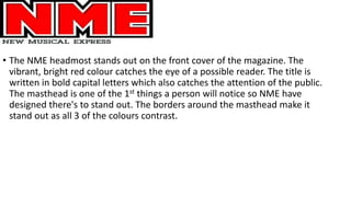
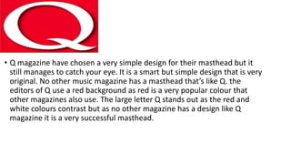
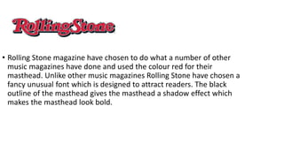
The document analyzes the mastheads of three music magazines: NME, Q Magazine, and Rolling Stone. For NME, the bright red color and bold capital letters of its masthead catch readers' attention. Q Magazine uses a simple yet original design with a large red letter Q that stands out against the white background. Rolling Stone also uses red but distinguishes itself with a fancy, unusual font for its masthead that appears bold with a black outline creating a shadow effect.