Existing
Mastheads
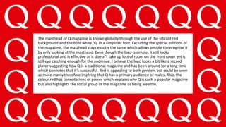
The masthead of Q magazine is known globally through the use of the vibrant red
background and the bold white ‘Q’ in a simplistic font. Excluding the special editions of
the magazine, the masthead stays exactly the same which allows people to recognise it
by only looking at the masthead. Even though the logo is simple, it still looks
professional and is effective as it doesn’t take up lots of room on the front cover yet is
still eye catching enough for the audience. I believe the logo looks a bit like a record
player suggesting how Q is a traditional magazine and has been around for a long time
which connotes that it’s successful. Red is appealing to both genders but could be seen
as more manly therefore implying that Q has a primary audience of males. Also, the
colour red has connotations of power which explains why Q is such a popular magazine
but also highlights the social group of the magazine as being wealthy.
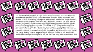
The masthead of ‘We <3 Pop’ changes colour depending on the issue but the house
style of the magazine stays the same. The speech bubble is always outlined in black
which is a colour that usually has negative connotations however, on this occasion it’s
used effectively to make the masthead ‘pop’. Moreover, the use of the heart gives a
childish connotation highlighting the target audience of this magazine is the younger
generation. People tend to remember ‘We <3 Pop’ for it’s childish yet entertaining
features along with it being a high success for a magazine aimed at young children.
The mast head uses the colour pink is predominately aimed at a female audience and
connotes calmness, love and creativity with a slight hint of purple which shows wealth
and luxury showing that the magazine would appeal to children of the middle class
from the ABC1 category so they could buy the magazine using their disposable income.
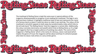
The masthead of Rolling Stone is kept the same even in special editions of the
magazine allowing people to recognise it just reading the masthead. The logo is very
bold and basic however it highlights traditional style of text and represents the name
of a famous band so doesn’t need lots done to make it eye catching. The colour of the
masthead is red which appeals to both sexes but predominately males which links to
the all male band ‘The Rolling Stones’ that the magazine is named after. Additionally,
the colour connotes dominance and wealth which links to Rolling Stone as it’s a high
end magazine that has a target audience of working class adults. The name of the
magazine is ‘Rolling Stone’ which is the name of a famous, classic rock band which
implies the genre of music the magazine will be about and how it’s aimed at people
who listen to classic rock artists or a very similar genre.
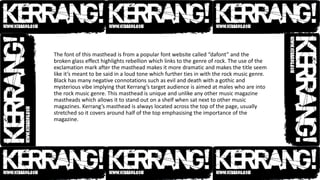
The font of this masthead is from a popular font website called “dafont” and the
broken glass effect highlights rebellion which links to the genre of rock. The use of the
exclamation mark after the masthead makes it more dramatic and makes the title seem
like it’s meant to be said in a loud tone which further ties in with the rock music genre.
Black has many negative connotations such as evil and death with a gothic and
mysterious vibe implying that Kerrang’s target audience is aimed at males who are into
the rock music genre. This masthead is unique and unlike any other music magazine
mastheads which allows it to stand out on a shelf when sat next to other music
magazines. Kerrang’s masthead is always located across the top of the page, usually
stretched so it covers around half of the top emphasising the importance of the
magazine.
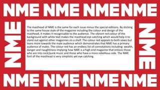
The masthead of NME is the same for each issue minus the special editions. By sticking
to the same house style of the magazine including the colour and design of the
masthead, it makes it recognisable to the audience. The vibrant red colour of the
background with white text makes the masthead eye catching which would help it to
stand out against other magazines on a shelf. The colour red appeals to both sexes but
leans more towards the male audience which demonstrates that NME has a primary
audience of males. The colour red has an endless list of connotations including: wealth,
danger and naughtiness implying how NME is a high end magazine that entices those
who are into rock/punk music and those who have a more rebellious side. The NME
font of the masthead is very simplistic yet eye catching.

Existing mastheads

  • 1.
  • 2.
    The masthead ofQ magazine is known globally through the use of the vibrant red background and the bold white ‘Q’ in a simplistic font. Excluding the special editions of the magazine, the masthead stays exactly the same which allows people to recognise it by only looking at the masthead. Even though the logo is simple, it still looks professional and is effective as it doesn’t take up lots of room on the front cover yet is still eye catching enough for the audience. I believe the logo looks a bit like a record player suggesting how Q is a traditional magazine and has been around for a long time which connotes that it’s successful. Red is appealing to both genders but could be seen as more manly therefore implying that Q has a primary audience of males. Also, the colour red has connotations of power which explains why Q is such a popular magazine but also highlights the social group of the magazine as being wealthy.
  • 3.
    The masthead of‘We <3 Pop’ changes colour depending on the issue but the house style of the magazine stays the same. The speech bubble is always outlined in black which is a colour that usually has negative connotations however, on this occasion it’s used effectively to make the masthead ‘pop’. Moreover, the use of the heart gives a childish connotation highlighting the target audience of this magazine is the younger generation. People tend to remember ‘We <3 Pop’ for it’s childish yet entertaining features along with it being a high success for a magazine aimed at young children. The mast head uses the colour pink is predominately aimed at a female audience and connotes calmness, love and creativity with a slight hint of purple which shows wealth and luxury showing that the magazine would appeal to children of the middle class from the ABC1 category so they could buy the magazine using their disposable income.
  • 4.
    The masthead ofRolling Stone is kept the same even in special editions of the magazine allowing people to recognise it just reading the masthead. The logo is very bold and basic however it highlights traditional style of text and represents the name of a famous band so doesn’t need lots done to make it eye catching. The colour of the masthead is red which appeals to both sexes but predominately males which links to the all male band ‘The Rolling Stones’ that the magazine is named after. Additionally, the colour connotes dominance and wealth which links to Rolling Stone as it’s a high end magazine that has a target audience of working class adults. The name of the magazine is ‘Rolling Stone’ which is the name of a famous, classic rock band which implies the genre of music the magazine will be about and how it’s aimed at people who listen to classic rock artists or a very similar genre.
  • 5.
    The font ofthis masthead is from a popular font website called “dafont” and the broken glass effect highlights rebellion which links to the genre of rock. The use of the exclamation mark after the masthead makes it more dramatic and makes the title seem like it’s meant to be said in a loud tone which further ties in with the rock music genre. Black has many negative connotations such as evil and death with a gothic and mysterious vibe implying that Kerrang’s target audience is aimed at males who are into the rock music genre. This masthead is unique and unlike any other music magazine mastheads which allows it to stand out on a shelf when sat next to other music magazines. Kerrang’s masthead is always located across the top of the page, usually stretched so it covers around half of the top emphasising the importance of the magazine.
  • 6.
    The masthead ofNME is the same for each issue minus the special editions. By sticking to the same house style of the magazine including the colour and design of the masthead, it makes it recognisable to the audience. The vibrant red colour of the background with white text makes the masthead eye catching which would help it to stand out against other magazines on a shelf. The colour red appeals to both sexes but leans more towards the male audience which demonstrates that NME has a primary audience of males. The colour red has an endless list of connotations including: wealth, danger and naughtiness implying how NME is a high end magazine that entices those who are into rock/punk music and those who have a more rebellious side. The NME font of the masthead is very simplistic yet eye catching.