1) The document discusses the design choices for magazine mastheads and logos for several music magazines.
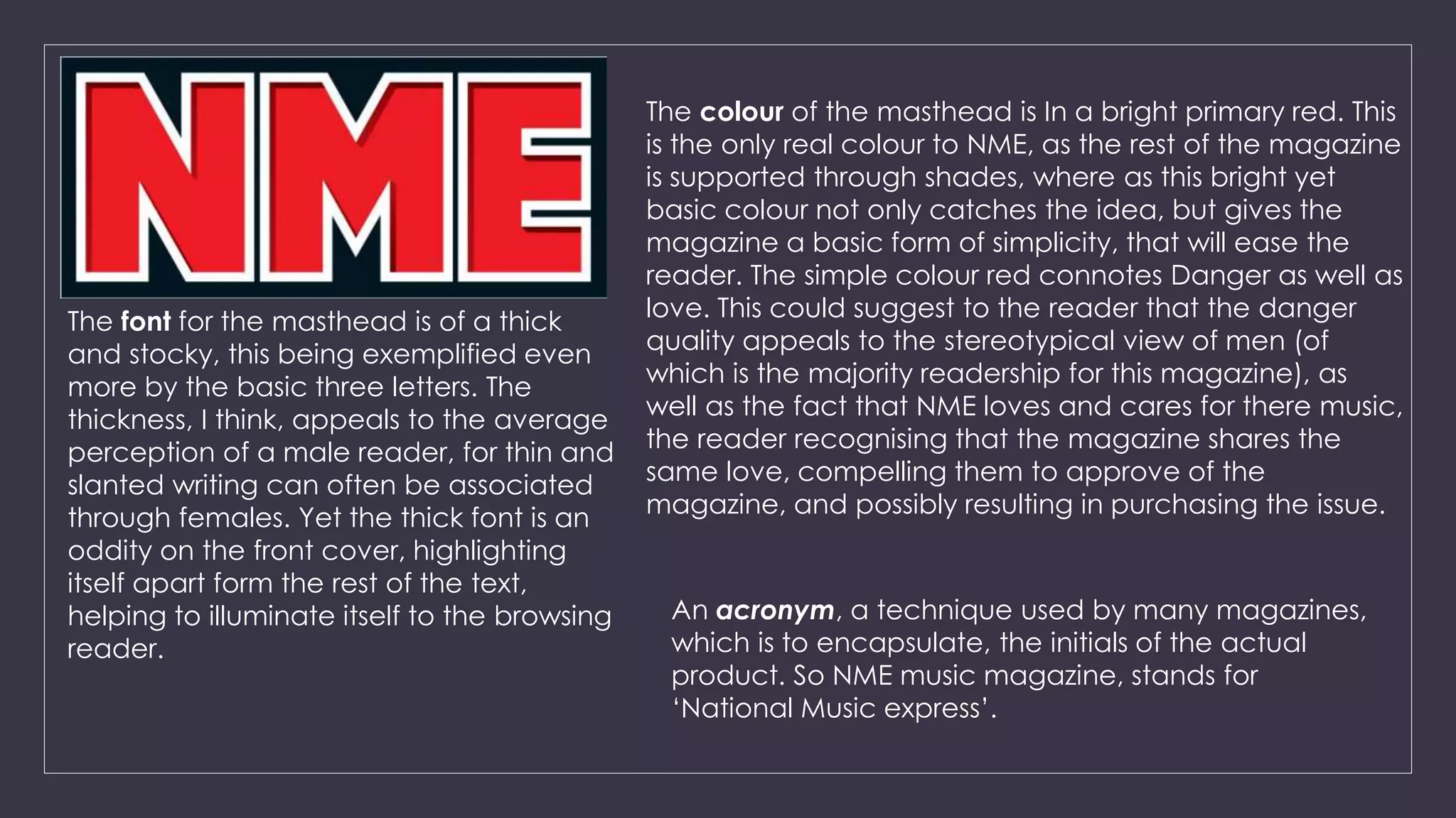
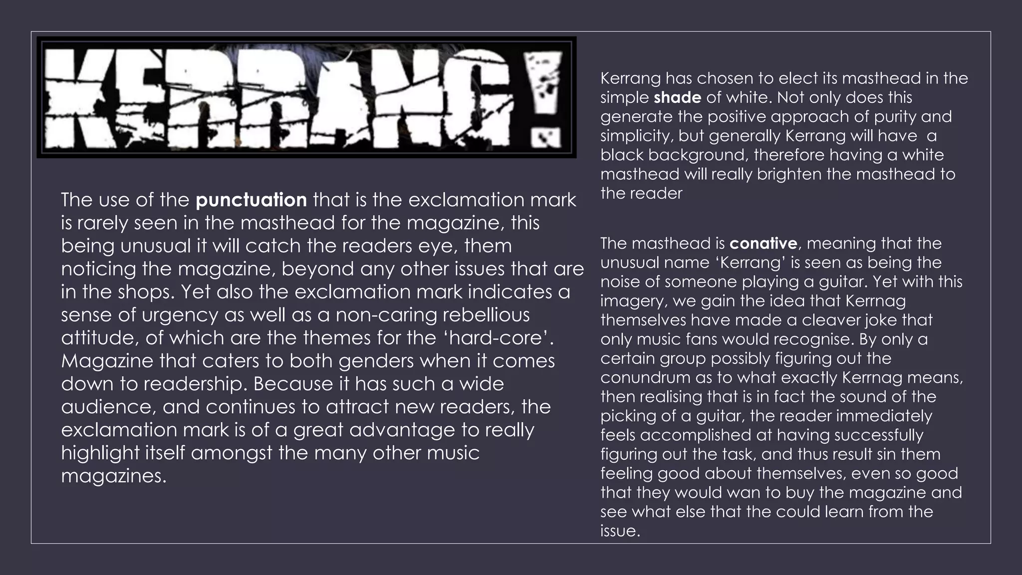
2) It analyzes why the magazines chose bright red for NME, plain white for Kerrang, and an exclamation point for Kerrang, noting how these design elements appeal to readers and catch their attention.
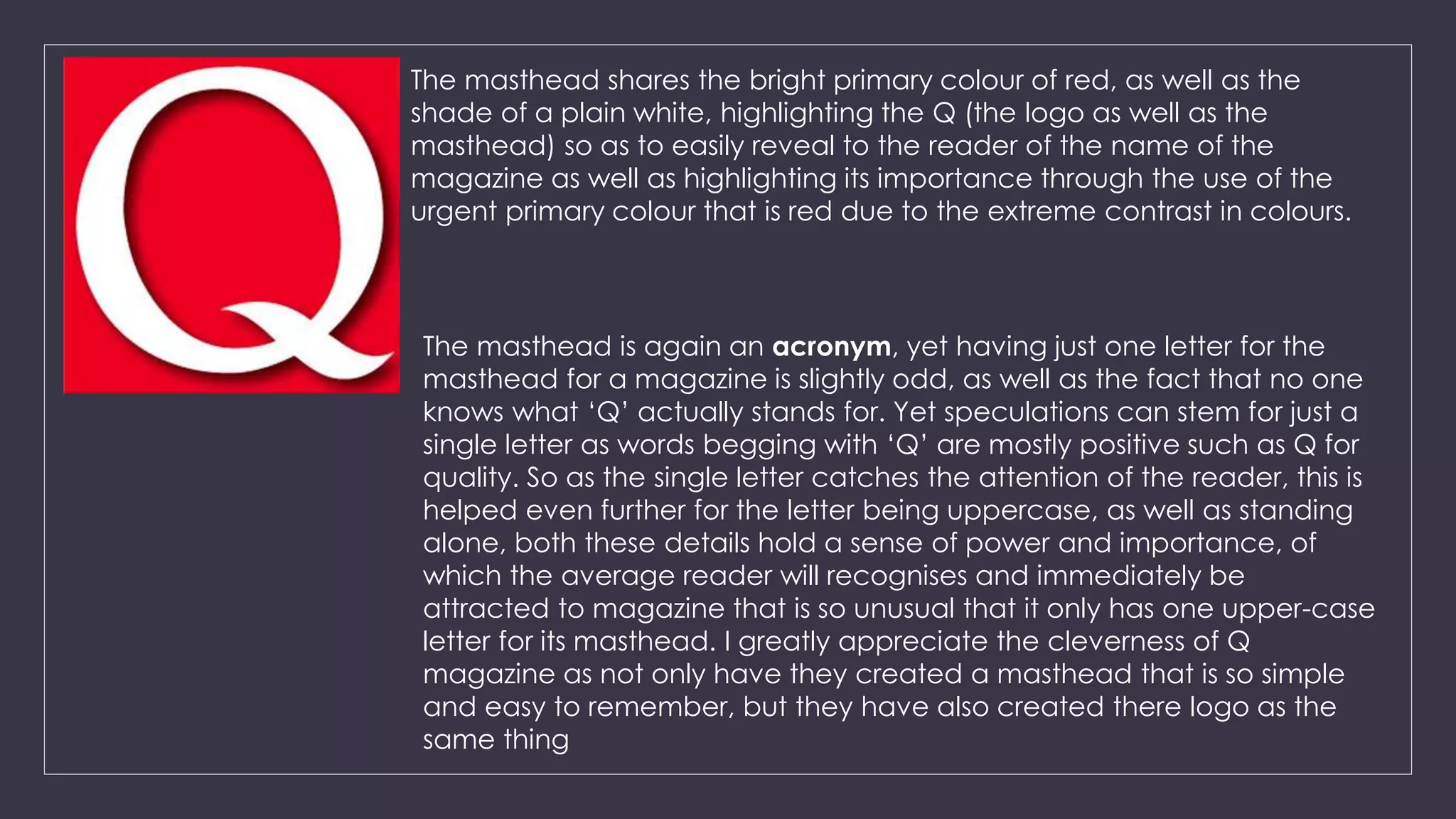
3) The analysis also discusses how Q magazine uses just a single uppercase letter for its unusual yet memorable masthead, and how the name "Kerrang" represents the sound of a guitar being played as a clever joke for music fans.