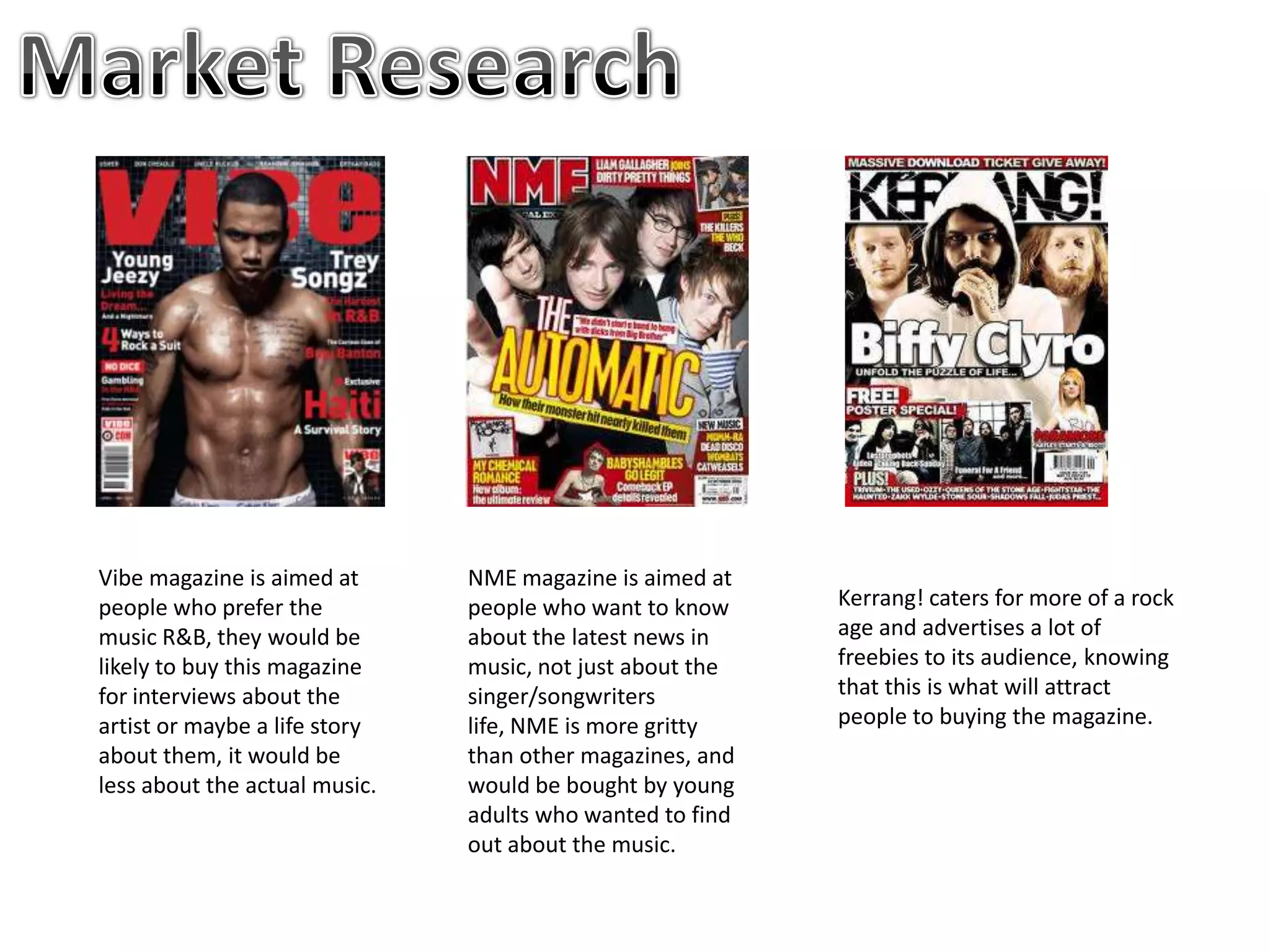
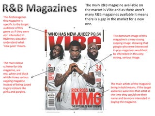
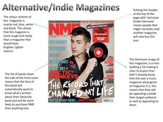
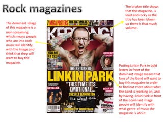
- The document discusses several music magazines aimed at different audiences, including Vibe (R&B), NME (music news), and Kerrang! (rock).
- It notes the color schemes, images, and features used on the covers of these magazines to appeal to their target audiences.
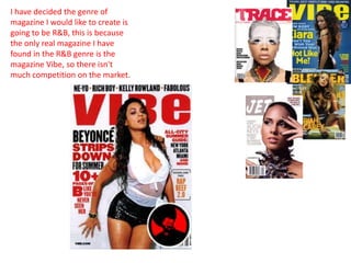
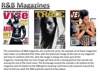
- The author decides to create a new R&B magazine, as there is currently little competition, and discusses conforming to conventions of the genre like coordinating colors and using a strong central image.
SMC Capitals Equity head Jagannadham Thuguntla said: "The market is showing signs of fatigue because of valuation concerns; besides, there is a apprehension that the budget may not have that many sweeteners." Market sentiment also was adversely affected by sustained pullout by foreign institutional investors, which were believed to be aggressive sellers during the day.
1. Vibe magazine is aimed at NME magazine is aimed at
people who prefer the people who want to know Kerrang! caters for more of a rock
music R&B, they would be about the latest news in age and advertises a lot of
likely to buy this magazine music, not just about the freebies to its audience, knowing
for interviews about the singer/songwriters that this is what will attract
artist or maybe a life story life, NME is more gritty people to buying the magazine.
about them, it would be than other magazines, and
less about the actual music. would be bought by young
adults who wanted to find
out about the music.
2. The main R&B magazine available on
the market is Vibe and as there aren't
many R&B magazines available it means
The Anchorage for
this magazine is there is a gap in the market for a new
specific to the target one.
audience of this
genre as if they were
not interested in The dominant image of this
R&B they wouldn’t magazine is a very strong
understand what rapping image, showing that
‘new juice’ means. people who were interested
in pop magazines would not
be interested in this very
strong, serious image.
The main colour
scheme for this
magazine, are
red, white and black
which shows serious
rapping magazine
instead of being based The main artists of the magazine
in girly colours like being in bold means, if the target
pinks and purples. audience were into that artist at
the time they would see their
name and be more interested in
buying the magazine.
3. Putting this header
at the top of the
The colour scheme of page with ‘exclusive
this magazine is Drake interview’
mainly red, blue, white means people that
and black. This shows might normally read
that the magazine is another magazine,
more rough and ready will now buy this
than a magazine that one.
would have
brighter, lighter
colours.
The dominant image of
this magazine, is a man
holding a CD making it
clear to buyers that
The list of bands down didn’t already know
the side of the front cover that this was a music
means that the fans of magazine what genre
this band will of magazine it is, this
automatically want to means that they will
know what's written be appealing outside
about their favourite their target audience
band and will be more as well as appealing to
likely to purchase NME them.
than anything else.
4. The broken title shows
that the magazine, is
loud and rocky as the
title has been blown
The dominant image up there is that much
of this magazine is a volume.
man screaming
which means people
who are into rock
music will identify
with the image and
think that they will
want to buy the
magazine.
Putting Linkin Park in bold
letters in front of the
dominant image means that
fans of the band will want to
buy this magazine in order
to find out more about what
the band is working on, and
by having Linkin Park in front
of the dominant image
people will identify with
what genre of music the
magazine is about.
5. I have decided the genre of
magazine I would like to create is
going to be R&B, this is because
the only real magazine I have
found in the R&B genre is the
magazine Vibe, so there isn't
much competition on the market.
6. The conventions of R&B magazines are mostly the same, for example all of these magazines
have colour co-ordinated their titles with the dominant image of the text so my magazine
will have to conform with this. Also the image is always the main part of the
magazine, meaning that my main image will have to be a strong picture that sounds out
among the rest of the front cover. The Anchorage around the outside is all relative to the
magazine and all relative to the R&B genre meaning I will have to do research around the
time to find out what the R&B audience want to know about.