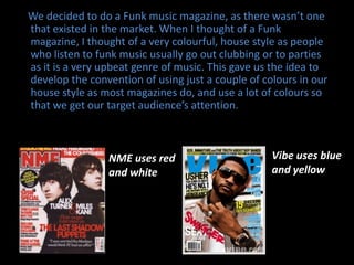
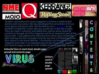
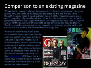
This document summarizes how the student's media product challenges conventions of real music magazines. It uses a colorful neon font and four colors throughout the magazine as its brand identity, rather than the typical single color. It also incorporates those colors into the masthead, double page spreads, and contents page in colorful lines. Feedback was positive on the uniqueness of this approach compared to magazines like Vibe and NME that use only a couple colors. The student aimed to make the magazine stand out from typical magazines like Q that only use a few colors on the front page with more text than photos.