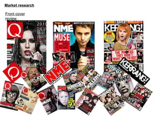
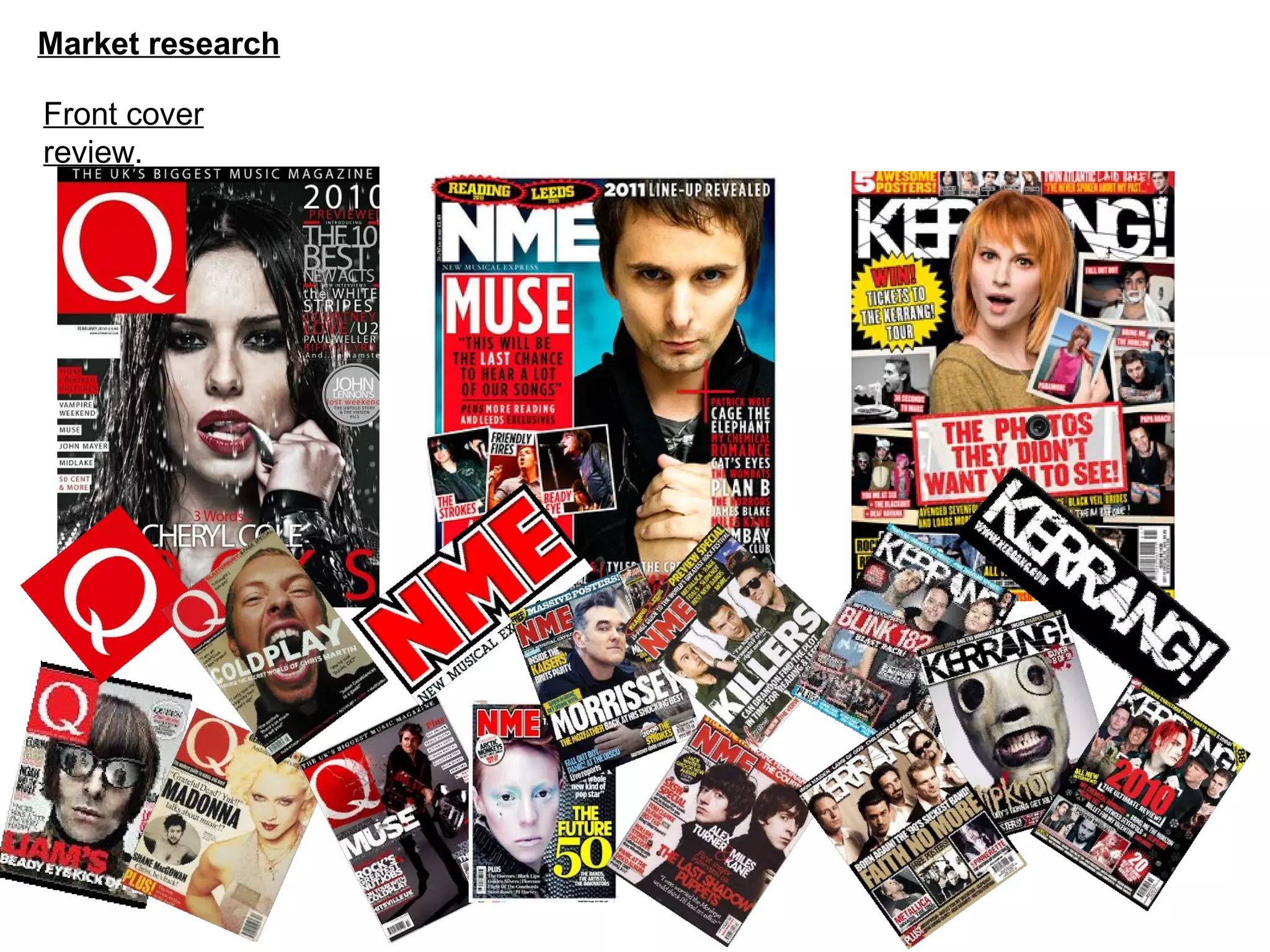
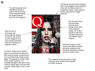
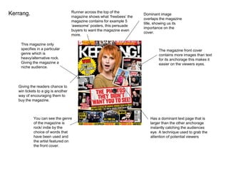
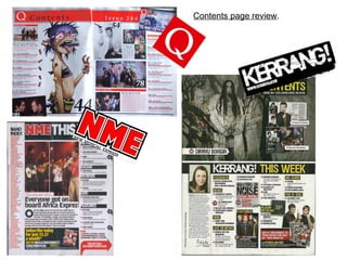
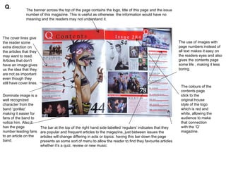
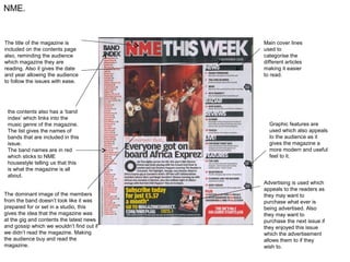
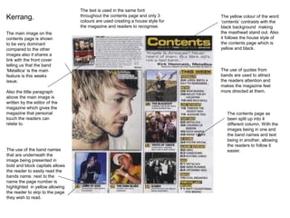
Market research

Front cover
review.
Q.
                                                             The banner across the top indicates
                                                             that it is the biggest music magazine
            The well recognised and                          in the UK, this tells us that the
            established Q logo is                            magazi9ne covers a wide range of
            used on the front cover                          genres appealing to a bigger
            of the magazine letting                          audience.
            the target audience
            know it’s a Q magazine.

                                                                        We can see this by
                                                                        the anchorage
                                                                        because even
                                                                        though Cheryl Cole
                                                                        is the dominant
      Also the use of                                                   image, ‘U2’ is also
      anchorage will                                                    include on the front
      encourage the readers                                             and both artist cover
      to read on and want to                                             two different types
      buy the magazine as it                                            of genre.
      may include something
      they find interesting or
      appeals to them.                                          Dominant image of a well
                                                                known artist attracts viewers
                                                                and other audiences that
                                                                would be interested in reading
     Q doesn’t really have a specific
                                                                about the chosen artist.
     genre it just includes the big artist
     who have the power to stay around
     such as Cherly Cole, Adele or lady
     gaga. This appeals to a wide range      The magazine as whole covers a range
     of the market audience, For             of genres which means that it appeals
     example teenagers who listen to the     to a wider audience.
     charts or adults aged 18-25 who like
     a pacific modern day or even a retro
     artist.
NME.
                            The name of the magazine is
                            bold and stands out allowing
                            fans/followers to know that it is
                            their magazine.


NME sticks to a specific genre                                                                The magazine like all other
and only appeals to a niche                                                                   magazines have a dominant
audience which is                                                                             image of a featured artist,
alternative/indie, we can see this                                                            which is the lead singer from
by the artist included on the front                                                           the band ‘Muse’ which is an
cover.                                                                                        alternative styled band.


The word ‘last’ is highlighted
in a different colour
compared which instantly
draws to the readers to it,
overall making them want to                                                                The magazine also stick the a
read on and buy the                                                                        certain house style of 2 main
magazine.                                                                                  colours, white and red but also
                                                                                           contains some text in black,
                                                                                           this catches the eyes of
                                                                                           potential readers because it is
  The magazine front cover                                                                 easy to read and established
  doesn’t contain any current and                                                          between two colours.
                                                      Barcode is in the right bottom
  now artist like lady gaga etc,
                                                      hand corner, typical of a magazine
  telling us that it doesn’t expect
                                                      front cover as we read top left to
  to appeal to that audience and
                                                      bottom right.
  only appeals to their niche
  audience.
Runner across the top of the
Kerrang.                             magazine shows what ‘freebees’ the
                                                                          Dominant image
                                                                          overlaps the magazine
                                     magazine contains for example 5
                                                                          title, showing us its
                                     ‘awesome’ posters, this persuade
                                                                          importance on the
                                     buyers to want the magazine even
                                                                          cover.
                                     more.

    This magazine only
    specifies in a particular                                                     The magazine front cover
    genre which is                                                                contains more images than text
    heavy/alternative rock.                                                       for its anchorage this makes it
    Giving the magazine a                                                         easier on the viewers eyes.
    niche audience.


   Giving the readers chance to
   win tickets to a gig is another
   way of encouraging them to
   buy the magazine.


            You can see the genre                                            Has a dominant text page that is
            of the magazine is                                               larger than the other anchorage
            rock/ indie by the                                               instantly catching the audiences
            choice of words that                                             eye. A technique used to grab the
            have been used and                                               attention of potential viewers
            the artist featured on
            the front cover.
Conclusion.
In conclusion you can see that all 3 magazine front covers are different but all use typical
conventions to establish their genre for example ‘Q’
magazine doesn’t have a specific genre but uses well known artists and the named
artists to grab their audiences attention.
This is totally different to say ‘Kerrang’ which does in fact have a specific genre. The
genre of the magazine ‘Kerrang’ is rock/indie the magazine uses the colours black, white
and yellow for its house style this is because black and white are colours we link with the
rock and indie genre allowing the audience to instantly get an idea of the genre it
specialises in.
‘NME’ specialises in the alternative genre and uses a number of conventions to put this
across for example having the main or dominant image has someone who is an
alternative artist also the dress sense of the artist allows us to see they are an indie artists
by including this within their main image ‘NME’ make it easier for potential readers to see
that it is an alternative genre style magazine.
Contents page review.
Q.            The banner across the top of the page contains the logo, title of this page and the issue
               number of this magazine. This is useful as otherwise the information would have no
               meaning and the readers may not understand it.


The cover lines give
the reader some                                                                                               The use of images with
extra direction on                                                                                            page numbers instead of
the articles that they                                                                                        all text makes it easy on
may want to read.                                                                                             the readers eyes and also
Articles that don’t                                                                                           gives the contents page
have an image gives                                                                                           some life , making it less
us the idea that they                                                                                         boring.
are not as important
even though they
still have cover lines.
                                                                                                               The colours of the
                                                                                                               contents page
Dominate image is a                                                                                            stick to the
well recognized                                                                                                original house
character from the                                                                                             style of the logo
band ‘gorillaz’                                                                                                which is red and
making it easier for                                                                                           white, allowing the
fans of the band to                                                                                            audience to make
notice him. Also it                                                                                            that connection
has the page              The bar at the top of the right hand side labelled ‘regulars’ indicates that they    with the ‘Q’
number leading fans       are popular and frequent articles to the magazine, just between issues the           magazine.
to an article on the      articles will change differing in acts or topics. having this bar down the page
band.                     presents as some sort of menu to allow the reader to find they favourite articles
                          whether it’s a quiz, review or new music.
NME.


The title of the magazine is               Main cover lines
included on the contents page              used to
also, reminding the audience               categorise the
which magazine they are                    different articles
reading. Also it gives the date            making it easier
and year allowing the audience             to read.
to follow the issues with ease.


 the contents also has a ‘band
 index’ which links into the
 music genre of the magazine.                Graphic features are
 The list gives the names of                 used which also appeals
 bands that are included in this             to the audience as it
 issue.                                      gives the magazine a
 The band names are in red                   more modern and useful
 which sticks to NME                         feel to it.
 housestyle telling us that this
 is what the magazine is all
 about.
                                           Advertising is used which
                                           appeals to the readers as
The dominant image of the members          they may want to
from the band doesn’t look like it was     purchase what ever is
prepared for or set in a studio, this      being advertised. Also
gives the idea that the magazine was       they may want to
at the gig and contents the latest news    purchase the next issue if
and gossip which we wouldn’t find out if   they enjoyed this issue
we didn’t read the magazine. Making        which the advertisement
the audience buy and read the              allows them to if they
magazine.                                  wish to.
The text is used in the same font
Kerrang.                         throughout the contents page and only 3
                                 colours are used creating a house style for
                                                                               The yellow colour of the word
                                                                               ‘contents’ contrasts with the
                                 the magazine and readers to recognise.        black background making
The main image on the                                                          the masthead stand out. Also
contents page is shown                                                         it follows the house style of
to be very dominant                                                            the contents page which is
compared to the other                                                          yellow and black.
images also it shares a
link with the front cover
telling us that the band
‘Metallica’ is the main                                                        The use of quotes from
feature is this weeks                                                          bands are used to attract
issue.                                                                         the readers attention and
                                                                               makes the magazine feel
Also the little paragraph                                                      more directed at them.
above the main image is
written by the editor of the
magazine which gives the
magazine that personal                                                            The contents page as
touch the readers can                                                             been split up into 4
relate to.                                                                        different column. With the
                                                                                  images being in one and
                                                                                  the band names and text
                                                                                  being in another, allowing
                                                                                  the readers to follow it
The use of the band names                                                         easier.
that are underneath the
image being presented in
bold and block capitals allows
the reader to easily read the
bands name. next to the
name the page number is
highlighted in yellow allowing
the reader to skip to the page
they wish to read.

Market research

  • 1.
  • 2.
    Q. The banner across the top indicates that it is the biggest music magazine The well recognised and in the UK, this tells us that the established Q logo is magazi9ne covers a wide range of used on the front cover genres appealing to a bigger of the magazine letting audience. the target audience know it’s a Q magazine. We can see this by the anchorage because even though Cheryl Cole is the dominant Also the use of image, ‘U2’ is also anchorage will include on the front encourage the readers and both artist cover to read on and want to two different types buy the magazine as it of genre. may include something they find interesting or appeals to them. Dominant image of a well known artist attracts viewers and other audiences that would be interested in reading Q doesn’t really have a specific about the chosen artist. genre it just includes the big artist who have the power to stay around such as Cherly Cole, Adele or lady gaga. This appeals to a wide range The magazine as whole covers a range of the market audience, For of genres which means that it appeals example teenagers who listen to the to a wider audience. charts or adults aged 18-25 who like a pacific modern day or even a retro artist.
  • 3.
    NME. The name of the magazine is bold and stands out allowing fans/followers to know that it is their magazine. NME sticks to a specific genre The magazine like all other and only appeals to a niche magazines have a dominant audience which is image of a featured artist, alternative/indie, we can see this which is the lead singer from by the artist included on the front the band ‘Muse’ which is an cover. alternative styled band. The word ‘last’ is highlighted in a different colour compared which instantly draws to the readers to it, overall making them want to The magazine also stick the a read on and buy the certain house style of 2 main magazine. colours, white and red but also contains some text in black, this catches the eyes of potential readers because it is The magazine front cover easy to read and established doesn’t contain any current and between two colours. Barcode is in the right bottom now artist like lady gaga etc, hand corner, typical of a magazine telling us that it doesn’t expect front cover as we read top left to to appeal to that audience and bottom right. only appeals to their niche audience.
  • 4.
    Runner across thetop of the Kerrang. magazine shows what ‘freebees’ the Dominant image overlaps the magazine magazine contains for example 5 title, showing us its ‘awesome’ posters, this persuade importance on the buyers to want the magazine even cover. more. This magazine only specifies in a particular The magazine front cover genre which is contains more images than text heavy/alternative rock. for its anchorage this makes it Giving the magazine a easier on the viewers eyes. niche audience. Giving the readers chance to win tickets to a gig is another way of encouraging them to buy the magazine. You can see the genre Has a dominant text page that is of the magazine is larger than the other anchorage rock/ indie by the instantly catching the audiences choice of words that eye. A technique used to grab the have been used and attention of potential viewers the artist featured on the front cover.
  • 5.
    Conclusion. In conclusion youcan see that all 3 magazine front covers are different but all use typical conventions to establish their genre for example ‘Q’ magazine doesn’t have a specific genre but uses well known artists and the named artists to grab their audiences attention. This is totally different to say ‘Kerrang’ which does in fact have a specific genre. The genre of the magazine ‘Kerrang’ is rock/indie the magazine uses the colours black, white and yellow for its house style this is because black and white are colours we link with the rock and indie genre allowing the audience to instantly get an idea of the genre it specialises in. ‘NME’ specialises in the alternative genre and uses a number of conventions to put this across for example having the main or dominant image has someone who is an alternative artist also the dress sense of the artist allows us to see they are an indie artists by including this within their main image ‘NME’ make it easier for potential readers to see that it is an alternative genre style magazine.
  • 6.
  • 7.
    Q. The banner across the top of the page contains the logo, title of this page and the issue number of this magazine. This is useful as otherwise the information would have no meaning and the readers may not understand it. The cover lines give the reader some The use of images with extra direction on page numbers instead of the articles that they all text makes it easy on may want to read. the readers eyes and also Articles that don’t gives the contents page have an image gives some life , making it less us the idea that they boring. are not as important even though they still have cover lines. The colours of the contents page Dominate image is a stick to the well recognized original house character from the style of the logo band ‘gorillaz’ which is red and making it easier for white, allowing the fans of the band to audience to make notice him. Also it that connection has the page The bar at the top of the right hand side labelled ‘regulars’ indicates that they with the ‘Q’ number leading fans are popular and frequent articles to the magazine, just between issues the magazine. to an article on the articles will change differing in acts or topics. having this bar down the page band. presents as some sort of menu to allow the reader to find they favourite articles whether it’s a quiz, review or new music.
  • 8.
    NME. The title ofthe magazine is Main cover lines included on the contents page used to also, reminding the audience categorise the which magazine they are different articles reading. Also it gives the date making it easier and year allowing the audience to read. to follow the issues with ease. the contents also has a ‘band index’ which links into the music genre of the magazine. Graphic features are The list gives the names of used which also appeals bands that are included in this to the audience as it issue. gives the magazine a The band names are in red more modern and useful which sticks to NME feel to it. housestyle telling us that this is what the magazine is all about. Advertising is used which appeals to the readers as The dominant image of the members they may want to from the band doesn’t look like it was purchase what ever is prepared for or set in a studio, this being advertised. Also gives the idea that the magazine was they may want to at the gig and contents the latest news purchase the next issue if and gossip which we wouldn’t find out if they enjoyed this issue we didn’t read the magazine. Making which the advertisement the audience buy and read the allows them to if they magazine. wish to.
  • 9.
    The text isused in the same font Kerrang. throughout the contents page and only 3 colours are used creating a house style for The yellow colour of the word ‘contents’ contrasts with the the magazine and readers to recognise. black background making The main image on the the masthead stand out. Also contents page is shown it follows the house style of to be very dominant the contents page which is compared to the other yellow and black. images also it shares a link with the front cover telling us that the band ‘Metallica’ is the main The use of quotes from feature is this weeks bands are used to attract issue. the readers attention and makes the magazine feel Also the little paragraph more directed at them. above the main image is written by the editor of the magazine which gives the magazine that personal The contents page as touch the readers can been split up into 4 relate to. different column. With the images being in one and the band names and text being in another, allowing the readers to follow it The use of the band names easier. that are underneath the image being presented in bold and block capitals allows the reader to easily read the bands name. next to the name the page number is highlighted in yellow allowing the reader to skip to the page they wish to read.