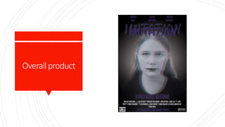
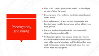
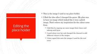
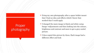
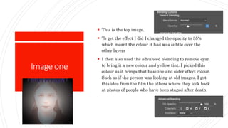
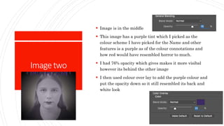
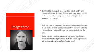
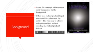
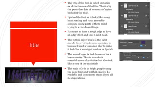
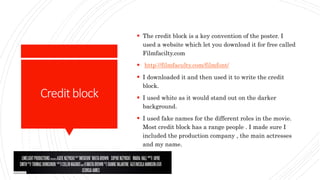
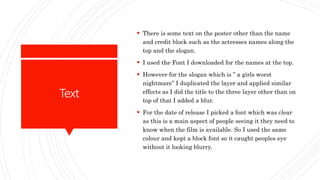
Poster production
Overallproduct
Photography
andimage
 First of all I used a place holder model , so I could get
an idea of what I wanted
 I used a photo of my sister as she is the main character
in the movie
 I did a photoshoot , it was nothing to advanced, the
location was a corridor in my home with a white/cream
back ground.
 It was a medium long shot of the character which
showed her face and shoulders
 Costume and props, was an easy choice. One reason
was because before hand when using my place holder I
used a black and white photo and liked the effect using
dark clothing and a light background made it so that
would work with my photo
Editingthe
placeholder
 This is the image I used as my place holder.
 I Had the idea after I changed the genre. My plan was
to have an image which looked like it was a glitch
image. That’s where my inspiration for the colour came
from.
 I did this by copying my main image three times and
editing each layer
 I used colour over lay and changed the channel to add
different colours to the images.
 I then copied this onto the images I used for the real
cover
Proper
photography
 Using my own photography after a space holder meant
that I had an idea and effects which I knew that
worked that I could apply
 I changed the main image to black and white using
Image >adjustments and then looking into the colours ,
brightness and contrast and more to get a grey scaled
picture.
 I then copied this picture by three, Each image had a
different effect and look
Imageone
 This is the top image.
 To get the effect I did I changed the opacity to 35%
which meant the colour it had was subtle over the
other layers
 I then also used the advanced blending to remove cyan
to bring it a new colour and yellow tint. I picked this
colour as it brings that baseline and older effect colour.
Such as if the person was looking at old images. I got
this idea from the film the others where they look back
at photos of people who have been staged after death
Imagetwo
 Image is in the middle
 This image has a purple tint which I picked as the
colour scheme I have picked for the Name and other
features is a purple as of the colour connotations and
how red would have resembled horror to much.
 I had 76% opacity which gives makes it more visibal
however its behind the other image
 I then used colour over lay to add the purple colour and
put the opacity down so it still resembled its back and
white look
Imagethree
 For the third image I used the first black and white
image I changed. I didn’t change anything about it and
just put the other images over the top to give the
shaking , 3D effect.
 I picked this as its called imitation and they are images
of the same person however copies but changed like the
coloured and changed layers are trying to imitate the
first
 I also used a gradient tool over the image to blend it
more into the background so that the black top worked
with the darker edges of the background
Background
 I used the rectangle tool to make a
solid black colour for the
background
 I then used radical gradient to get
the white light effect from the
center . This was easy to achieve
using the gradient tool and
selecting the radical gradient
feature
Title
 The title of the film is called imitation
as of the themes of the film. That’s why
the poster has lots of elements of copies
including the title.
 I picked the font as it looks like messy
hand writing and could resemble
someone losing parts of there mind
trying to write down things.
 Its meant to have a rough edge to have
an edgy effect and that it isn't neat.
 The bottom layer which is the light
purple however looks more smudged is
because I used a Gaussian blur to make
it look like a smudged marker or lipstick
 The second layer is back however has a
lower opacity. This is to make it
resemble more of a shadow but also look
like a copy of the main title
 The main title is in bright purple using
the same font and will full opacity. Its
readable and is meant to stand above all
its duplications.
Creditblock
 The credit block is a key convention of the poster. I
used a website which let you download it for free called
Filmfacilty.com
 http://filmfaculty.com/filmfont/
 I downloaded it and then used it to write the credit
block.
 I used white as it would stand out on the darker
background.
 I used fake names for the different roles in the movie.
Most credit block has a range people . I made sure I
included the production company , the main actresses
and my name.
Text
 There is some text on the poster other than the name
and credit block such as the actresses names along the
top and the slogan.
 I used the Font I downloaded for the names at the top.
 However for the slogan which is ” a girls worst
nightmare” I duplicated the layer and applied similar
effects as I did the title to the three layer other than on
top of that I added a blur.
 For the date of release I picked a font which was clear
as this is a main aspect of people seeing it they need to
know when the film is available. So I used the same
colour and kept a block font so it caught peoples eye
without it looking blurry.
effect
 Obviously all editing choices where made to have an
effect on the audience and to draw in the niche
audience.
 I used the editing to as such play slight mind games on
the viewers the mix of colours and triple image was
meant to make people they may be seeing things
confuse them and even make there eyes struggle to
register the image
 This is because the film is like a pyscological thriller
and its meant to represent the mental state of the
actress on the poster. She is one of the main
characters.
 As such the effect I created is meant to represent her
state of mind.
End
 Currently I have my end product however I am going
to show it to a focus group to get some feed back.
 Hopefully this I can make small changes to improve it
however wont have to change something drastically.

Production poster

  • 1.
  • 2.
  • 3.
    Photography andimage  First ofall I used a place holder model , so I could get an idea of what I wanted  I used a photo of my sister as she is the main character in the movie  I did a photoshoot , it was nothing to advanced, the location was a corridor in my home with a white/cream back ground.  It was a medium long shot of the character which showed her face and shoulders  Costume and props, was an easy choice. One reason was because before hand when using my place holder I used a black and white photo and liked the effect using dark clothing and a light background made it so that would work with my photo
  • 4.
    Editingthe placeholder  This isthe image I used as my place holder.  I Had the idea after I changed the genre. My plan was to have an image which looked like it was a glitch image. That’s where my inspiration for the colour came from.  I did this by copying my main image three times and editing each layer  I used colour over lay and changed the channel to add different colours to the images.  I then copied this onto the images I used for the real cover
  • 5.
    Proper photography  Using myown photography after a space holder meant that I had an idea and effects which I knew that worked that I could apply  I changed the main image to black and white using Image >adjustments and then looking into the colours , brightness and contrast and more to get a grey scaled picture.  I then copied this picture by three, Each image had a different effect and look
  • 6.
    Imageone  This isthe top image.  To get the effect I did I changed the opacity to 35% which meant the colour it had was subtle over the other layers  I then also used the advanced blending to remove cyan to bring it a new colour and yellow tint. I picked this colour as it brings that baseline and older effect colour. Such as if the person was looking at old images. I got this idea from the film the others where they look back at photos of people who have been staged after death
  • 7.
    Imagetwo  Image isin the middle  This image has a purple tint which I picked as the colour scheme I have picked for the Name and other features is a purple as of the colour connotations and how red would have resembled horror to much.  I had 76% opacity which gives makes it more visibal however its behind the other image  I then used colour over lay to add the purple colour and put the opacity down so it still resembled its back and white look
  • 8.
    Imagethree  For thethird image I used the first black and white image I changed. I didn’t change anything about it and just put the other images over the top to give the shaking , 3D effect.  I picked this as its called imitation and they are images of the same person however copies but changed like the coloured and changed layers are trying to imitate the first  I also used a gradient tool over the image to blend it more into the background so that the black top worked with the darker edges of the background
  • 9.
    Background  I usedthe rectangle tool to make a solid black colour for the background  I then used radical gradient to get the white light effect from the center . This was easy to achieve using the gradient tool and selecting the radical gradient feature
  • 10.
    Title  The titleof the film is called imitation as of the themes of the film. That’s why the poster has lots of elements of copies including the title.  I picked the font as it looks like messy hand writing and could resemble someone losing parts of there mind trying to write down things.  Its meant to have a rough edge to have an edgy effect and that it isn't neat.  The bottom layer which is the light purple however looks more smudged is because I used a Gaussian blur to make it look like a smudged marker or lipstick  The second layer is back however has a lower opacity. This is to make it resemble more of a shadow but also look like a copy of the main title  The main title is in bright purple using the same font and will full opacity. Its readable and is meant to stand above all its duplications.
  • 11.
    Creditblock  The creditblock is a key convention of the poster. I used a website which let you download it for free called Filmfacilty.com  http://filmfaculty.com/filmfont/  I downloaded it and then used it to write the credit block.  I used white as it would stand out on the darker background.  I used fake names for the different roles in the movie. Most credit block has a range people . I made sure I included the production company , the main actresses and my name.
  • 12.
    Text  There issome text on the poster other than the name and credit block such as the actresses names along the top and the slogan.  I used the Font I downloaded for the names at the top.  However for the slogan which is ” a girls worst nightmare” I duplicated the layer and applied similar effects as I did the title to the three layer other than on top of that I added a blur.  For the date of release I picked a font which was clear as this is a main aspect of people seeing it they need to know when the film is available. So I used the same colour and kept a block font so it caught peoples eye without it looking blurry.
  • 13.
    effect  Obviously allediting choices where made to have an effect on the audience and to draw in the niche audience.  I used the editing to as such play slight mind games on the viewers the mix of colours and triple image was meant to make people they may be seeing things confuse them and even make there eyes struggle to register the image  This is because the film is like a pyscological thriller and its meant to represent the mental state of the actress on the poster. She is one of the main characters.  As such the effect I created is meant to represent her state of mind.
  • 14.
    End  Currently Ihave my end product however I am going to show it to a focus group to get some feed back.  Hopefully this I can make small changes to improve it however wont have to change something drastically.