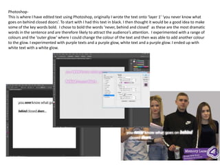
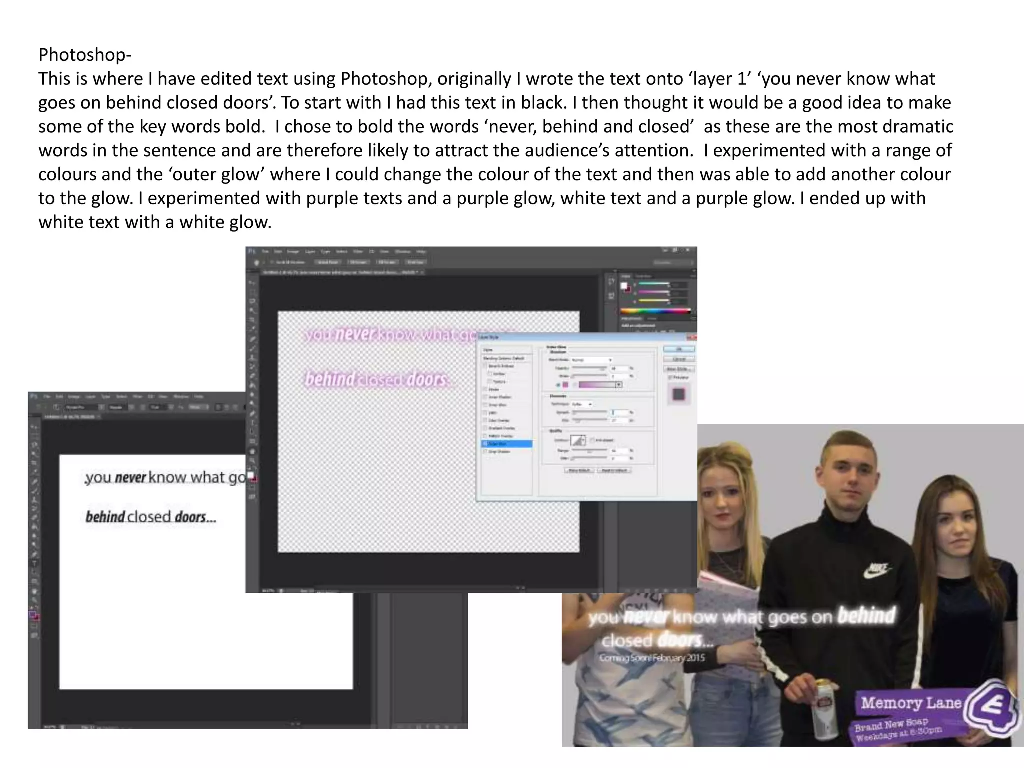
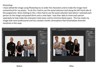
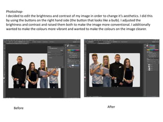
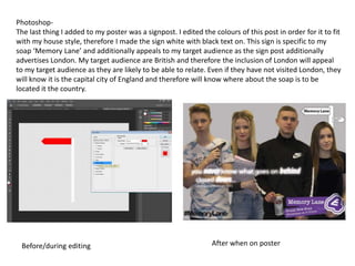
Photoshop-
This is where I have edited text using Photoshop, originally I wrote the text onto ‘layer 1’ ‘you never know what
goes on behind closed doors’. To start with I had this text in black. I then thought it would be a good idea to make
some of the key words bold. I chose to bold the words ‘never, behind and closed’ as these are the most dramatic
words in the sentence and are therefore likely to attract the audience’s attention. I experimented with a range of
colours and the ‘outer glow’ where I could change the colour of the text and then was able to add another colour
to the glow. I experimented with purple texts and a purple glow, white text and a purple glow. I ended up with
white text with a white glow.
Photoshop-
I have edited the image using Photoshop to re-order the characters and to make the image more
conventional for my poster. To do this I had to use the wand selection tool along the left hand side of
the programme. Once clicking on this, I then had to use the quick selection tool where I selected each
person on the image and pasted them onto a new layer. I was then able to move each person
separately to help make the characters look closer and to minimise blank space. This has made my
image look more professional and has created a darker atmosphere that foreshadows dramatic
storylines in the soap.
Before After
Photoshop-
I decided to edit the brightness and contrast of my image in order to change it’s aesthetics. I did this
by using the buttons on the right hand side (the button that looks like a bulb). I adjusted the
brightness and contrast and raised them both to make the image more conventional. I additionally
wanted to make the colours more vibrant and wanted to make the colours on the image clearer.
Before After
Photoshop-
The last thing I added to my poster was a signpost. I edited the colours of this post in order for it to fit
with my house style, therefore I made the sign white with black text on. This sign is specific to my
soap ‘Memory Lane’ and additionally appeals to my target audience as the sign post additionally
advertises London. My target audience are British and therefore the inclusion of London will appeal
to my target audience as they are likely to be able to relate. Even if they have not visited London, they
will know it is the capital city of England and therefore will know where about the soap is to be
located it the country.
Before/during editing After when on poster

Editing- photoshop

  • 1.
    Photoshop- This is whereI have edited text using Photoshop, originally I wrote the text onto ‘layer 1’ ‘you never know what goes on behind closed doors’. To start with I had this text in black. I then thought it would be a good idea to make some of the key words bold. I chose to bold the words ‘never, behind and closed’ as these are the most dramatic words in the sentence and are therefore likely to attract the audience’s attention. I experimented with a range of colours and the ‘outer glow’ where I could change the colour of the text and then was able to add another colour to the glow. I experimented with purple texts and a purple glow, white text and a purple glow. I ended up with white text with a white glow.
  • 2.
    Photoshop- I have editedthe image using Photoshop to re-order the characters and to make the image more conventional for my poster. To do this I had to use the wand selection tool along the left hand side of the programme. Once clicking on this, I then had to use the quick selection tool where I selected each person on the image and pasted them onto a new layer. I was then able to move each person separately to help make the characters look closer and to minimise blank space. This has made my image look more professional and has created a darker atmosphere that foreshadows dramatic storylines in the soap. Before After
  • 3.
    Photoshop- I decided toedit the brightness and contrast of my image in order to change it’s aesthetics. I did this by using the buttons on the right hand side (the button that looks like a bulb). I adjusted the brightness and contrast and raised them both to make the image more conventional. I additionally wanted to make the colours more vibrant and wanted to make the colours on the image clearer. Before After
  • 4.
    Photoshop- The last thingI added to my poster was a signpost. I edited the colours of this post in order for it to fit with my house style, therefore I made the sign white with black text on. This sign is specific to my soap ‘Memory Lane’ and additionally appeals to my target audience as the sign post additionally advertises London. My target audience are British and therefore the inclusion of London will appeal to my target audience as they are likely to be able to relate. Even if they have not visited London, they will know it is the capital city of England and therefore will know where about the soap is to be located it the country. Before/during editing After when on poster