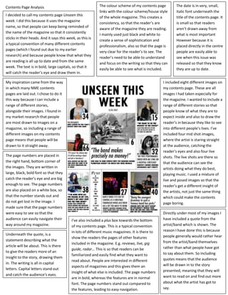
Contents Page Analysis                                      The colour scheme of my contents page         The date is in very, small,
                                                            links with the colour scheme/house style      italic font underneath the
I decided to call my contents page Unseen this
                                                            of the whole magazine. This creates a         title of the contents page. It
week. I did this because it uses the magazine
                                                            consistency, so that the reader’s are         is small so that readers
name, so that people can keep being reminded of
                                                            aware of the magazine they are reading.       aren’t drawn away from
the name of the magazine so that it consistently
                                                            I mainly used just black and white to         what is most important
sticks in their heads. And it says this week, as this is
                                                            create a sense of sophistication and          However because it is
a typical convention of many different contents
                                                            professionalism, also so that the page is     placed directly in the centre
pages (which I found out due to my earlier
                                                            very clear for the reader’s to see. The       people are easily able to
research) and because people know that what they
                                                            reader’s need to be able to understand        see when this issue was
are reading is all up to date and from the same
                                                            and focus on the writing so that they can     released so that they know
week. The text is in bold, large capitals, so that it
                                                            easily be able to see what is included.       they are up to date.
will catch the reader’s eye and draw them in.

My inspiration came from the way                                                                  I included eight different images on
in which many NME contents                                                                        my contents page. These are all
pages are laid out. I chose to do it                                                              images I had taken especially for
this way because I can include a                                                                  the magazine. I wanted to include a
range of different stories,                                                                       range of different stories so that
alongside their images. I found in                                                                people know of what they are to
my market research that people                                                                    expect inside and also to draw the
are most drawn to images on a                                                                     reader’s in because they like to see
magazine, so including a range of                                                                 into different people’s lives. I’ve
different images on my contents                                                                   included four mid shot images,
page means that people will be                                                                    where the artist is staring straight
drawn to it straight away.                                                                        at the audience, catching the
                                                                                                  reader’s eyes and also four live
The page numbers are placed in                                                                    shots. The live shots are there so
the right hand, bottom corner of                                                                  that the audience can see the
the images. They are written in                                                                   artists doing what they do best,
large, black, bold font so that they                                                              playing music. I used a mixture of
catch the reader’s eye and are big                                                                live and posed images so that the
enough to see. The page numbers                                                                   reader’s get a different insight of
are also placed on a white box, so                                                                the artists, not just the same thing
that the number stands out and                                                                    which could make the contents
do not get lost in the image. I                                                                   page boring.
made sure that the page numbers
were easy to see so that the                                                                      Directly under most of my images I
audience can easily navigate their         I’ve also included a plus box towards the bottom       have included a quote from the
way around my magazine.                    of my contents page. This is a typical convention      artist/band which is shown. The
                                           in lots of different music magazines. It is there to   reason I have done this is because
Underneath the quote, is a                                                                        people generally would rather hear
                                           show the readers the pages of other features
statement describing what the                                                                     from the artist/band themselves
                                           included in the magazine. E.g. reviews, live, gig
article will be about. This is there                                                              rather than what people have got
                                           guide, radar… This is so that readers can be
to give the readers more of an                                                                    to say about them. So including
                                           familiarized and easily find what they want to
insight to the story, drawing them                                                                quotes means that the audience
                                           read about. People are interested in different
in. The writing is all in capital                                                                 will be drawn in to the story
                                           aspects of magazines and this gives them an
letters. Capital letters stand out                                                                presented, meaning that they will
                                           insight of what else is included. The page numbers
and catch the audience’s eyes.                                                                    want to read on and find out more
                                           are in bold, whereas the features are in normal
                                           font. The page numbers stand out compared to           about what the artist has got to
                                           the features, leading to easy navigation.              say.

Contents Page Analysis

  • 1.
    Contents Page Analysis The colour scheme of my contents page The date is in very, small, links with the colour scheme/house style italic font underneath the I decided to call my contents page Unseen this of the whole magazine. This creates a title of the contents page. It week. I did this because it uses the magazine consistency, so that the reader’s are is small so that readers name, so that people can keep being reminded of aware of the magazine they are reading. aren’t drawn away from the name of the magazine so that it consistently I mainly used just black and white to what is most important sticks in their heads. And it says this week, as this is create a sense of sophistication and However because it is a typical convention of many different contents professionalism, also so that the page is placed directly in the centre pages (which I found out due to my earlier very clear for the reader’s to see. The people are easily able to research) and because people know that what they reader’s need to be able to understand see when this issue was are reading is all up to date and from the same and focus on the writing so that they can released so that they know week. The text is in bold, large capitals, so that it easily be able to see what is included. they are up to date. will catch the reader’s eye and draw them in. My inspiration came from the way I included eight different images on in which many NME contents my contents page. These are all pages are laid out. I chose to do it images I had taken especially for this way because I can include a the magazine. I wanted to include a range of different stories, range of different stories so that alongside their images. I found in people know of what they are to my market research that people expect inside and also to draw the are most drawn to images on a reader’s in because they like to see magazine, so including a range of into different people’s lives. I’ve different images on my contents included four mid shot images, page means that people will be where the artist is staring straight drawn to it straight away. at the audience, catching the reader’s eyes and also four live The page numbers are placed in shots. The live shots are there so the right hand, bottom corner of that the audience can see the the images. They are written in artists doing what they do best, large, black, bold font so that they playing music. I used a mixture of catch the reader’s eye and are big live and posed images so that the enough to see. The page numbers reader’s get a different insight of are also placed on a white box, so the artists, not just the same thing that the number stands out and which could make the contents do not get lost in the image. I page boring. made sure that the page numbers were easy to see so that the Directly under most of my images I audience can easily navigate their I’ve also included a plus box towards the bottom have included a quote from the way around my magazine. of my contents page. This is a typical convention artist/band which is shown. The in lots of different music magazines. It is there to reason I have done this is because Underneath the quote, is a people generally would rather hear show the readers the pages of other features statement describing what the from the artist/band themselves included in the magazine. E.g. reviews, live, gig article will be about. This is there rather than what people have got guide, radar… This is so that readers can be to give the readers more of an to say about them. So including familiarized and easily find what they want to insight to the story, drawing them quotes means that the audience read about. People are interested in different in. The writing is all in capital will be drawn in to the story aspects of magazines and this gives them an letters. Capital letters stand out presented, meaning that they will insight of what else is included. The page numbers and catch the audience’s eyes. want to read on and find out more are in bold, whereas the features are in normal font. The page numbers stand out compared to about what the artist has got to the features, leading to easy navigation. say.