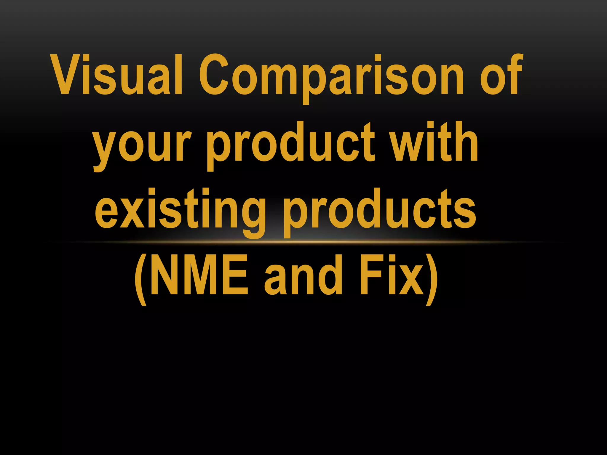
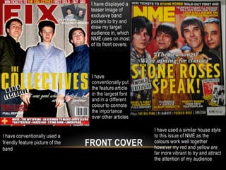
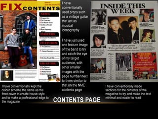
Visual Comparison of
  your product with
  existing products
    (NME and Fix)
I have displayed a
                                   teaser image of
                                   exclusive band
                                   posters to try and
                                   draw my target
                                   audience in, which
                                   NME uses on most
                                   of its front covers.


                                   I have
                                   conventionally put
                                   the feature article
                                   in the largest font
                                   and in a different
                                   colour to connote
                                   the importance
                                   over other articles

                                                          I have used a similar house style
I have conventionally used a                              to this issue of NME as the
friendly feature picture of the   FRONT COVER             colours work well together
                                                          however my red and yellow are
band
                                                          far more vibrant to try and attract
                                                          the attention of my audience
I have
                                       conventionally
                                       used props such
                                       as a vintage guitar
                                       that act as
                                       musical
                                       iconography

                                       I have just used
                                       one feature image
                                       of the band to try
                                       and catch the eye
                                       of my target
                                       audience, with
                                       other smaller
                                       images with the
                                       page number next
                                       to them similar to
I have conventionally kept the         that on the NME       I have conventionally made
colour scheme the same as the          contents page         sections for the contents of the
front cover to create house style                            magazine to try and make the text
and to make a professional edge to                           minimal and easier to read
the magazine                         CONTENTS PAGE
I have gone against conventions by                I have conventionally included an action shot of the band
placing a quote from the band across              performing at one of their gigs this also relates to the article as it
                                                  is about them being on tour.
the feature image, to try and draw the
reader into reading the article, it acts
as a teaser                              I have included a picture of the bands latest art work for their new
                                         album to once again tease the reader to read the article, I have also
                                         kept the colours and fonts the same as the front cover and contents
                                         page to create house style and keeping the magazine professional

I have conventionally
put the main image of
                                   DOUBLE PAGE SPREAD
the band on the left
hand side with the
article to the right.

Visual Comparison

  • 1.
    Visual Comparison of your product with existing products (NME and Fix)
  • 2.
    I have displayeda teaser image of exclusive band posters to try and draw my target audience in, which NME uses on most of its front covers. I have conventionally put the feature article in the largest font and in a different colour to connote the importance over other articles I have used a similar house style I have conventionally used a to this issue of NME as the friendly feature picture of the FRONT COVER colours work well together however my red and yellow are band far more vibrant to try and attract the attention of my audience
  • 3.
    I have conventionally used props such as a vintage guitar that act as musical iconography I have just used one feature image of the band to try and catch the eye of my target audience, with other smaller images with the page number next to them similar to I have conventionally kept the that on the NME I have conventionally made colour scheme the same as the contents page sections for the contents of the front cover to create house style magazine to try and make the text and to make a professional edge to minimal and easier to read the magazine CONTENTS PAGE
  • 4.
    I have goneagainst conventions by I have conventionally included an action shot of the band placing a quote from the band across performing at one of their gigs this also relates to the article as it is about them being on tour. the feature image, to try and draw the reader into reading the article, it acts as a teaser I have included a picture of the bands latest art work for their new album to once again tease the reader to read the article, I have also kept the colours and fonts the same as the front cover and contents page to create house style and keeping the magazine professional I have conventionally put the main image of DOUBLE PAGE SPREAD the band on the left hand side with the article to the right.