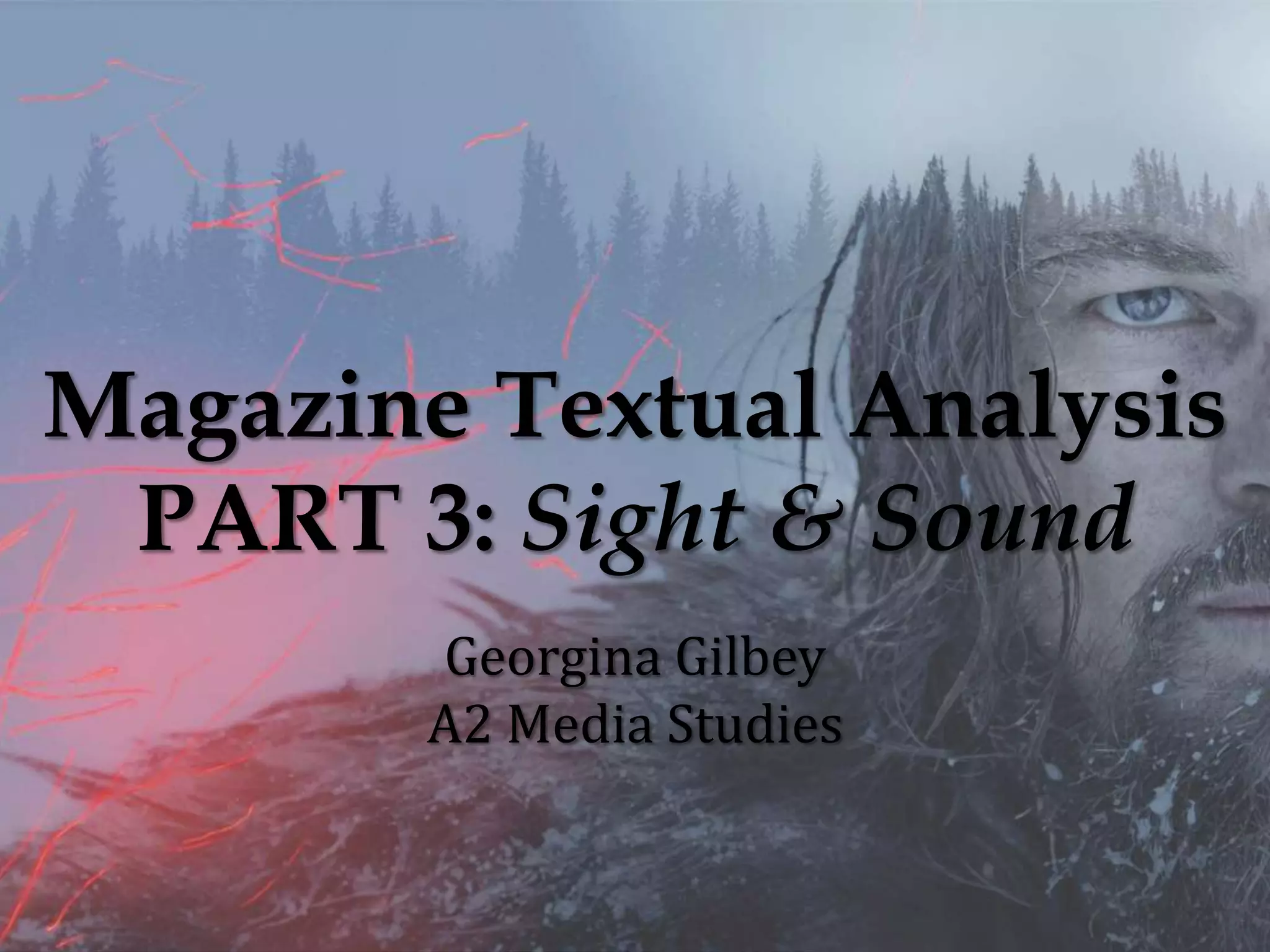
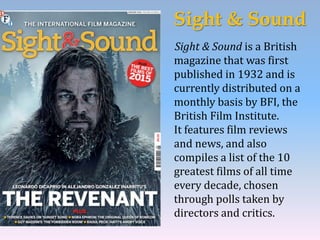
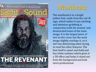
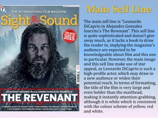
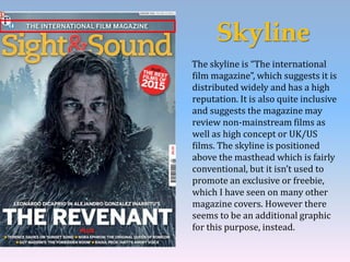
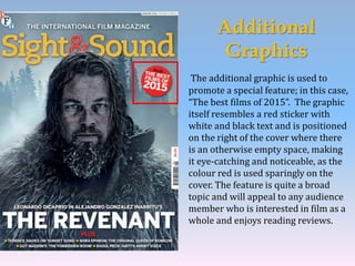
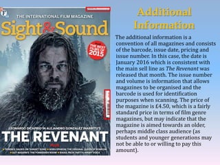
Magazine Textual Analysis
PART 3: Sight & Sound
Georgina Gilbey
A2 Media Studies
Sight & Sound
Sight & Sound is a British
magazine that was first
published in 1932 and is
currently distributed on a
monthly basis by BFI, the
British Film Institute.
It features film reviews
and news, and also
compiles a list of the 10
greatest films of all time
every decade, chosen
through polls taken by
directors and critics.
Masthead
The masthead is in a bright
yellow font, aside from the red ‘&’
sign, which makes it eye-catching
and attention-grabbing in
conjunction with the neutral and
desaturated tones of the main
image. It is the largest piece of
text on the cover, but the main
image slightly overlaps it, so it
isn’t too distracting when trying
to read the other features. The
font itself is smart and bold and
has white outlines which gives it
a 3D effect and helps it stand out
from the background and look
more professional.
Main Image
The main image features the main
protagonist of the 2015 film The
Revenant, Hugh Glass. He is covered in
frost, suggesting harsh, icy conditions
and there are cuts and bruises on his
face, a sign of conflict and struggle. The
background shows tall, ever green trees
enveloped in mist, while Glass stares
forward with a determined expression,
which may raise questions in the
audience’s mind because it is quite
enigmatic; we can see there is a conflict
but the lack of other characters (such as
in Empire magazine’s main image where
there was a hint at a character who
disrupts the narrative) means we don’t
have much context. The colour scheme of
the main image is fairly neutral with
tones of white, blue and black, and it
appears quite desaturated which makes
it seem more intense.
Main Sell Line
The main sell line is “Leonardo
DiCaprio in Alejandro Gonzalez
Inarritu’s The Revenant”. This sell line
is quite sophisticated and doesn’t give
away much, as it lacks a hook to draw
the reader in, implying the magazine’s
audience are expected to be
knowledgeable about film and this one
in particular. However, the main image
and this sell line make use of star
appeal, as Leonardo DiCaprio is such a
high-profile actor, which may draw in
a new audience or widen their
potential reach. In terms of formatting,
the title of the film is very large and
even bolder than the masthead,
making it instantly attention-grabbing,
although it is white which is consistent
with the colour scheme of yellow, red
and white.
Skyline
The skyline is “The international
film magazine”, which suggests it is
distributed widely and has a high
reputation. It is also quite inclusive
and suggests the magazine may
review non-mainstream films as
well as high concept or UK/US
films. The skyline is positioned
above the masthead which is fairly
conventional, but it isn’t used to
promote an exclusive or freebie,
which I have seen on many other
magazine covers. However there
seems to be an additional graphic
for this purpose, instead.
Additional
Graphics
The additional graphic is used to
promote a special feature; in this case,
“The best films of 2015”. The graphic
itself resembles a red sticker with
white and black text and is positioned
on the right of the cover where there
is an otherwise empty space, making
it eye-catching and noticeable, as the
colour red is used sparingly on the
cover. The feature is quite a broad
topic and will appeal to any audience
member who is interested in film as a
whole and enjoys reading reviews.
Additional
Sell Lines
The additional sell lines are positioned at the
bottom of the page and follow a format of either
‘Name: Title’ or ‘Name: Tagline’ , which makes it
easy for readers to decide if they are interested
at a glance, and are separated by small yellow
circles that act as bullet-points. The taglines and
titles are short and catchy to pull the reader in
whilst making the nature of the article clear. For
instance, “Nora Ephron: The original queen of
romcom”. The readership for Sight & Sound are
likely to be knowledgeable in terms of film
directors and stars and so would recognise the
connection between her and romcoms, (she has
been nominated for multiple Academy Awards,
such as Best Writing for When Harry Met Sally),
and may be interested in an article purely about
her work. The sell lines have a header of ‘PLUS’
in red, which is consistent with both the colour
scheme and the header used for the additional
graphic.
Additional
Information
The additional information is a
convention of all magazines and consists
of the barcode, issue date, pricing and
issue number. In this case, the date is
January 2016 which is consistent with
the main sell line as The Revenant was
released that month. The issue number
and volume is information that allows
magazines to be organised and the
barcode is used for identification
purposes when scanning. The price of
the magazine is £4.50, which is a fairly
standard price in terms of film genre
magazines, but may indicate that the
magazine is aimed towards an older,
perhaps middle class audience (as
students and younger generations may
not be able to or willing to pay this
amount).
How might Sight & Sound influence my
own work?
Sight & Sound magazine may influence my own work in terms of the
additional information such as pricing; the magazine costs £4.50, which
as aforementioned seems to be a standard price for film magazines, but I
think that because my target audience for my film is likely to be young
adults and upwards, I should price it at slightly lower to make it more
affordable. I may also take inspiration from the additional sell lines and
graphics of the magazine, as the additional graphic promoting ‘the best
films of 2015’ is such a broad topic that it will attract a large audience
and help to maximise the potential reach. As with Total Film and Empire,
I like the design techniques Sight & Sound employs, as there seems to be
a running theme of matching the colour scheme to the main image.
Additionally, I like that Sight & Sound uses its brightest colours sparingly
to attract the reader’s attention to specific features on the cover. Overall,
I think this magazine will be a source of inspiration for me when I create
my own cover to promote my film.

Magazine Textual Analysis Part 3

  • 1.
    Magazine Textual Analysis PART3: Sight & Sound Georgina Gilbey A2 Media Studies
  • 2.
    Sight & Sound Sight& Sound is a British magazine that was first published in 1932 and is currently distributed on a monthly basis by BFI, the British Film Institute. It features film reviews and news, and also compiles a list of the 10 greatest films of all time every decade, chosen through polls taken by directors and critics.
  • 3.
    Masthead The masthead isin a bright yellow font, aside from the red ‘&’ sign, which makes it eye-catching and attention-grabbing in conjunction with the neutral and desaturated tones of the main image. It is the largest piece of text on the cover, but the main image slightly overlaps it, so it isn’t too distracting when trying to read the other features. The font itself is smart and bold and has white outlines which gives it a 3D effect and helps it stand out from the background and look more professional.
  • 4.
    Main Image The mainimage features the main protagonist of the 2015 film The Revenant, Hugh Glass. He is covered in frost, suggesting harsh, icy conditions and there are cuts and bruises on his face, a sign of conflict and struggle. The background shows tall, ever green trees enveloped in mist, while Glass stares forward with a determined expression, which may raise questions in the audience’s mind because it is quite enigmatic; we can see there is a conflict but the lack of other characters (such as in Empire magazine’s main image where there was a hint at a character who disrupts the narrative) means we don’t have much context. The colour scheme of the main image is fairly neutral with tones of white, blue and black, and it appears quite desaturated which makes it seem more intense.
  • 5.
    Main Sell Line Themain sell line is “Leonardo DiCaprio in Alejandro Gonzalez Inarritu’s The Revenant”. This sell line is quite sophisticated and doesn’t give away much, as it lacks a hook to draw the reader in, implying the magazine’s audience are expected to be knowledgeable about film and this one in particular. However, the main image and this sell line make use of star appeal, as Leonardo DiCaprio is such a high-profile actor, which may draw in a new audience or widen their potential reach. In terms of formatting, the title of the film is very large and even bolder than the masthead, making it instantly attention-grabbing, although it is white which is consistent with the colour scheme of yellow, red and white.
  • 6.
    Skyline The skyline is“The international film magazine”, which suggests it is distributed widely and has a high reputation. It is also quite inclusive and suggests the magazine may review non-mainstream films as well as high concept or UK/US films. The skyline is positioned above the masthead which is fairly conventional, but it isn’t used to promote an exclusive or freebie, which I have seen on many other magazine covers. However there seems to be an additional graphic for this purpose, instead.
  • 7.
    Additional Graphics The additional graphicis used to promote a special feature; in this case, “The best films of 2015”. The graphic itself resembles a red sticker with white and black text and is positioned on the right of the cover where there is an otherwise empty space, making it eye-catching and noticeable, as the colour red is used sparingly on the cover. The feature is quite a broad topic and will appeal to any audience member who is interested in film as a whole and enjoys reading reviews.
  • 8.
    Additional Sell Lines The additionalsell lines are positioned at the bottom of the page and follow a format of either ‘Name: Title’ or ‘Name: Tagline’ , which makes it easy for readers to decide if they are interested at a glance, and are separated by small yellow circles that act as bullet-points. The taglines and titles are short and catchy to pull the reader in whilst making the nature of the article clear. For instance, “Nora Ephron: The original queen of romcom”. The readership for Sight & Sound are likely to be knowledgeable in terms of film directors and stars and so would recognise the connection between her and romcoms, (she has been nominated for multiple Academy Awards, such as Best Writing for When Harry Met Sally), and may be interested in an article purely about her work. The sell lines have a header of ‘PLUS’ in red, which is consistent with both the colour scheme and the header used for the additional graphic.
  • 9.
    Additional Information The additional informationis a convention of all magazines and consists of the barcode, issue date, pricing and issue number. In this case, the date is January 2016 which is consistent with the main sell line as The Revenant was released that month. The issue number and volume is information that allows magazines to be organised and the barcode is used for identification purposes when scanning. The price of the magazine is £4.50, which is a fairly standard price in terms of film genre magazines, but may indicate that the magazine is aimed towards an older, perhaps middle class audience (as students and younger generations may not be able to or willing to pay this amount).
  • 10.
    How might Sight& Sound influence my own work? Sight & Sound magazine may influence my own work in terms of the additional information such as pricing; the magazine costs £4.50, which as aforementioned seems to be a standard price for film magazines, but I think that because my target audience for my film is likely to be young adults and upwards, I should price it at slightly lower to make it more affordable. I may also take inspiration from the additional sell lines and graphics of the magazine, as the additional graphic promoting ‘the best films of 2015’ is such a broad topic that it will attract a large audience and help to maximise the potential reach. As with Total Film and Empire, I like the design techniques Sight & Sound employs, as there seems to be a running theme of matching the colour scheme to the main image. Additionally, I like that Sight & Sound uses its brightest colours sparingly to attract the reader’s attention to specific features on the cover. Overall, I think this magazine will be a source of inspiration for me when I create my own cover to promote my film.