
Recommended
More Related Content
What's hot
What's hot (17)
Similar to Film magazine front cover analysis
Similar to Film magazine front cover analysis (20)
Recently uploaded
Recently uploaded (20)
Film magazine front cover analysis
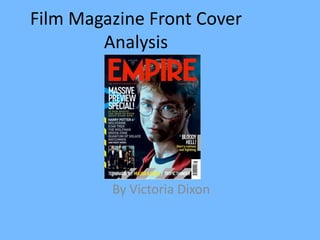
- 1. Film Magazine Front Cover Analysis By Victoria Dixon
- 2. Here are the 2 film magazine covers I am going to analyse. I will comment on the images, text to image ratio, layout design and spacing, mast head, sell lines, graphics, colour and representation.
- 4. Image • The image is just right of being central on the cover and is quite a unusual image because it is of 2 characters and the male is embracing the female to show he is protective of her, both of their faces look serious and quite sullen. It is almost a full length shot, and only takes up about 1/3 of the cover. It is covering a bit of the magazine title to show it is almost domineering the magazine.
- 5. Text to Image Ratio • The text to image ratio on this magazine cover is very dominated by the text. The title ‘Total Film’ is about ¼ of the cover and the main sell line is also very big. The text overall would take up about 2/3rds or more of the cover and there is only one image which takes up about 1/3 of the cover. • This is quite unusual to other film magazine covers because the image is usually dominating over the text.
- 6. Layout/Design and Spacing • The layout of the film magazine cover is quite similar to most magazines. The image is almost central and the sell lines are around the image. There is a main sell line that is bigger than the rest of the sell lines. It also includes a bar code and the price. • The spacing of the cover seems slightly overcrowded with the big mast head and sell lines and it seems as if theyve almost had to scale the image down to fit it onto the cover. This is different to the usual codes and conventions of film magazine covers where the image is usually the focus point and everything else fits around it.
- 7. Mast Head • The mast head is about ¼th of the cover and is in quite a blocky font to make it stand out. ‘Total’ is small inside the F of film but it shows that that isn’t as important as the film bit but it is part of the title. It is in a white colour to make it stand out but it isn’t too in your face. The ‘Total’ is in red so even though its small it stands out in that way. Also the image is covering part of the title to show that it is more significant and to show most people already know the name of the magazine so if a bit of it is covered it doesn’t matter.
- 8. Sell Lines • The sell lines are witty and also straight to the point and very informative and make the audience want to read more like all magazine covers try to achieve. ‘King Kong’ and the ‘ultimate winter preview’ is the main sell line and is bigger and bolder than the rest of the sell lines and it goes together with the main image. The sky line just has 1 word summing up will be in the magazine.
- 9. Colour • The colour of the magazine is quite simple with a grey background and white and yellow words. The background is incorporated with the film being advertised and the yellow makes the cover look more energetic and exciting. The ‘total’ is red to show that its not just a film magazine it is Total Film making it sound a lot more full up. The colour appeals to the audience because it is not too striking but it is bold and unique.
- 10. Representation • The magazine is trying to represent a strong man who is powerful and wants to protect a woman. It represents the sort of movie it is, which seems like an action love story.
- 12. Image • The image is central on the front cover and and is a very enticing and intriguing. The facial expression is a very grimacing smile and the actor is still in character and it is a full shot of the actor which is quite unusual for a front cover. The image takes up most of the cover and on this cover it looks as if the sell lines have been made to fit around the image. There is a background to the image but it is hard to see and isn't very important.
- 13. Text to Image Ratio • The text to image ratio is quite usual of most magazine covers, it is quite equal, but the image is central and is much more important to the cover. And also covers the title.
- 14. Layout/Design and Spacing • The cover is quite like that of other film magazines, the image is central on the cover and the sell lines are around and covering bits of the image, and it covers a bit of the title. There is a main sell line that is bigger than the rest of the sell lines. Which corresponds to the image, It also includes a bar code near the bottom without importance. • The spacing of the cover seems slightly overcrowded towards the top with the big mast head and the title, skyline and some of the image all near together. This is different to the usual codes and conventions of film magazine covers as there is a lot of different covers and there is quite a lot of space in the bottom left hand corner.
- 15. Mast Head • The mast head is about ¼th of the cover and is in quite a blocky font. It is in a red font to make it stand out, but compared to the bright green main sell line it doesn't stand out so much. Also the title is covered by the image, this is to emphasise the image and movie and also to show that Empire magazine is well known and doesn't need to stand out as much as, say, a new magazine does. It has already made its name as a good film magazine.
- 16. Sell Lines • The sell lines on the magazine all seem to follow the same green colour scheme. The sky line includes the words ‘World Exclusive’ which shows that you cant get this content anywhere else. Also the ‘joker’ and ‘batman’ are both in there original fonts from the film which isnt following the magazine theme it is following the film theme. It also has a circle with extra content in it which is important but different to the film being advertised.
- 17. Colour • The colour of the magazine doesn't really follow one theme. It has the red colour of the mast head but the colour of the sell lines follow a different pink green and white theme. The colour of the image has a dark background but the clothes of the cover star are quite colourful despite it being a dull image to symbolise he is a ‘joker’.
- 18. Representation • The cover represents a dark film with some dark humour as the character is the joker. • It will appeal to most film fanatics but also people into action and maybe psychological movies .