FULL ENJOY - 9953040155 Call Girls in Sangam Vihar | Delhi
Magazines
1. Sight And Sound
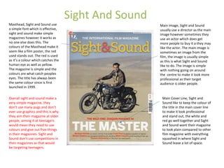
Masthead, Sight and Sound use
a simple font which is effective,
sight and sound make simple
magazines however it works as
no one else does this. The
colours of the Masthead make it
seem like a film poster, the red
used stands out. The red is used
as it’s a colour which catches the
human eye as well as yellow.
The magazine is simple and the
colours are what catch peoples
eyes. The title has always been
the same colour since is first
launched in 1999.
Main Image, Sight and Sound
usually use a director as the main
image however sometimes they
use an actor which does get
more people to buy it a they may
like the actor. The main image is
sometimes an image from the
film, the image is usually simple
as this is what Sight and Sound
like to do. The image is simple
with nothing going on around
the centre to make it look more
professional as their target
audience is older people.
Main Cover Line, Sight and
Sound like to keep the colour of
the title in the main cover line
to make it look professional
and stand out, the white and
red go well together and Sight
and Sound want their magazine
to look plain compared to other
film magazine with everything
squashed in where Sight and
Sound leave a lot of space.
Overall sight and sound make a
very simple magazine, they
don’t use many pugs and don’t
ever use graphics and this is why
they aim their magazine at older
people, aiming it at teenagers
would mean they need to use
colours and give out free things
in their magazines. Sight and
Sound don’t use competitions in
their magazines as that would
be targeting teenagers.
2. Empire
The Masthead is a basic font as it makes the
magazine look professional. However this
magazine is targeted at teenagers so doesn’t
need to look professional.
Empire always have a plus to make it
seem like there is a lot of things in
the magazine and this is an approach
by empire to sell its magazine. They
always have a specific colour palette
which is yellow and white, these
colours go well together which
catchers people eyes as well as the
Sight and Sound magazine. The main
image used by Empire will always go
over the Masthead to make it stand
out, they will always use an actor
from a film coming out as it gets
people excited. The magazine clearly
targets a young audience as the
colours are strong and stand out,
they also use pictures from films
which are coming out and it will be
the main actor from the film.
Empire always leave space above the
masthead which makes the
magazine look less professional.
The Main Image is the most
powerful part of Empire
magazine as it makes the
magazine a film magazine, the
image will always be a film star
from an up and coming movie.
This helps sell the magazine as
well as promote the film. The
main image blocks out some of
the title to give it more if an
effect. Empire magazine will
always have a main image from
a mainstream movie which has
major hype and expectation.
The main image usually makes
eye contact with the person
looking at the magazine.
The Main cover line is always
white and basic as Empire don’t
want people to look at the main
cover line, they would rather
you look at the side where they
tell you what's in the magazine
and they highlight free things
inside the magazine. The is clear
through the use od colour,
yellow catches the attention of
someone looking at the
magazine whereas white
doesn’t, the white also makes
the magazine look more
professional.
Pugs are always used by Empire to
catch the eye of people and make
it seem as if there is extra things
inside which interest their target
audience.
3. Total Film
The Masthead on 2 out of the 3
films is white which gives it the
professional look however Total
Film lose this but having ‘total’ in
the ‘f’. The font is basic however it
isn't as effective as the other
magazines as the main image and
the graphics are covering up most
of it.
The Main Cover Line isn't
positioned in the middle and is in a
fancy font which also makes the
magazine lose its professional
look. The other two magazines
have the main cover line white and
in a basic font.
The Banners used are red which is
a powerful colour but the red is
over used on this magazine. Total
Film always use red and white
which go together well but again
isn't effective.
Graphics are used on Total Film as
this is what teenagers are into,
teenagers love films with CGI
which is clear through the fan base
on superhero movies.
Cover Lines are over used by Total
Film to let people know what is
inside the magazine , this is
because it helps sell the magazine
however it also makes the
magazine look bad compared to
the others which have a more
professional look.
The Main Image on Total film isn't
as effective as it could be but this
is what Total Film do to take
peoples attention to the things
being promoted inside the
magazine. To make the main image
effective they would need to make
the font basic like the other two
magazine and create space on the
cover.
Total film put there Website on
there magazine to advertise more
things, this also gets people on the
website where they promote
subscriptions. The website is
always above the ‘M’ which is
similar to Empire who do the same
thing.
Total Film looks unprofessional as everything is
crammed in together and doesn’t look good. Total
Film will always have their website and the date of
the magazine above the ‘M’. Total Film always use a
fancy font to make the magazine appeal to their
target audience which is teenagers.