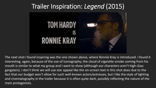
Ideas Update
&
Inspirations
Georgina Gilbey
A2 Media Studies
Trailer Inspiration: Legend (2015)
The first trailer I looked at for inspirational purposes was Legend’s. It is a crime film about the
famous British gangsters, the Kray brothers. In this shot I found a use of iconography: namely,
the gun that Ron Kray is placing on the table as a threat to others. Guns are part of crime
genre iconography because they clearly communicate a theme of violence and in this case
emphasizes Kray’s ability to intimidate and hold power over others (although Reggie is
extending his arm to stop Ron from escalating the situation. I think that familiar iconography
such as props like these is something my group and I should definitely use in our own trailer.
Trailer Inspiration: Legend (2015)
The next shot I found inspiring was the one shown above, where Ronnie Kray is introduced. I found it
interesting, again, because of the use of iconography; the cloud of cigarette smoke coming from his
mouth is similar to what my group and I want to show (although our characters aren’t high class
gangsters). I don’t think we will use star appeal like the on-screen text in this shot does due to the
fact that our budget won’t allow for such well-known actors/actresses, but I like the style of lighting
and cinematography in the trailer because it is often quite dark, possibly reflecting the nature of the
main protagonists.
Trailer Inspiration: Kill Your Darlings (2013)
The trailer for Kill Your Darlings employs quite a specific style of cinematography through its lighting
and camera work. In the shot above the lighting is soft and white, with the shallow focusing giving it
a hazy, dreamy look. This is obviously a different mood to what I would like in my own trailer, but I
think the shallow depth of field can be used to isolate a character from the background and give the
image a ‘3D effect’. I also think it would make my group’s trailer appear more professional and
sophisticated, and my audience would appreciate a defined cinematic style as they named this as
being an appealing feature in my primary research survey.
Trailer Inspiration: Kill Your Darlings (2013)
In this shot it is clear that the film uses colour grading to convey different moods, with this one having a slightly sepia but
bleak tone. Like the previous shot, it uses shallow focusing to make the characters stand out from the background. This is
something I would like to use in my trailer because I think colour grading makes a film appear more professional; in some
amateur films, colour grading is absent and so the film is seen as having little production value because the colour looks
unrealistic, over or under-exposed or washed-out (the time of day you shoot exterior scenes can also affect this – harsh
light such as in the middle of the day can produce this result). I want to prevent this by using sophisticated cinematography
such as shallow focusing (where appropriate and used sparingly, lest it become unimpressive) and colour grading, whether
it be a blue tone to convey hopelessness or a tone similar to Kill Your Darlings.
Other Inspiration: Requiem For a Dream (2000)
The film Requiem For a Dream is about addiction in
many forms, but primarily drugs, and their effects
on people. Above is a shot from the film where
some characters are about to take (presumably)
cocaine. The shot is taken from above which allows
us to see everything on the table. I find this to be a
source of inspiration because it appears to be a
typical mise-en-scene arrangement of props to
show drug use – the characters are using cards to
arrange the powder and rolling up notes to snort it
with, while the cards themselves suggest gambling.
There also seems to be a ‘bong’ in the top left
corner and a variety of packets in the bottom right.
I think that for the scenes in my trailer where there
are druggies, we should use mise-en-scene
elements such as these in order to adhere to the
conventions and familiar iconography of the crime
genre.
Other Inspiration: Requiem For a Dream (2000)
This is a shot of the character Marion. I find her inspirational because of her costume and make-up,
as she engages in substance abuse. My previous thoughts of a typical drug user’s costume were
along the lines of a ‘chav’ individual who wears hoodies and tracksuits etc, such as those represented
in shows like Breaking Bad, but Marion seems to be presented as a more modern view of drug
abusers in that she retains some of her individuality and doesn’t become a stereotype in terms of
her appearance. Her style is quite gothic as she wears moderately heavy eyeliner, lipstick, has black
hair, wears all-black clothes and even paints her nails black.
Other Inspiration: Breaking Bad (TV: 2008 – 2013)
Breaking Bad inspires me because it uses
various techniques to make its shots as visually
interesting as possible, which can be seen in
the collage on the right that features the main
protagonist (and druggie) of the series, Jesse
Pinkman. The show seems to like to experiment
with different types of lighting, from soft yellow
(bottom right) to harsh white (top left) and
contrasting tones, along with their being known
for using costume to connote emotions of the
character.
Additionally, the show uses many props that
would be appropriate for our trailer as we have
a similar theme, such as guns, bongs,
cigarettes, etc.
Poster Inspiration: Black Swan
(2011)
This is a poster for the psychological thriller Black Swan, in which a
young ballet dancer wins the lead role in Swan Lake. However, she
finds herself fighting to keep her sanity as she has delusions about
becoming the black swan. The cracks in her face on the poster
illustrate this, acting as symbolism for the cracks in her sanity. It is
quite a small but striking feature and makes the poster quite
enigmatic as it seems to lack a tagline that gives any clues on the
plot.
This inspires me because it is similar to how I would like to use
symbolic features to connote the theme of my own film. As our
main character is a member of Anonymous, I would like to feature
the mask in a close up and possibly have streaks of blood on it,
which will connote the violent theme of murder in our film and act
as an enigma for the audience to solve, as Black Swan’s poster
does.
Magazine Cover Inspiration:
Total Film
This magazine cover for Total Film inspires me because of its main
image and overall design; I like that it uses a close up of Star Trek’s
(its main feature) main protagonist and that he is staring directly
forwards, as it acts as a term of direct address and encourages the
audience to engage with the magazine. His facial expression also
suggests to the audience the theme of the film; he appears quite
determined and has one eyebrow slightly raised, almost
challengingly.
I would like to use this technique for my own magazine cover,
possibly by having the actor who plays my main character slightly
lifting up their bloodstained Anonymous mask to reveal some
smirking lips.
Additionally, I like the simplistic colour scheme of white, black and
red as it matches the black and white main image and is eye-
catching. I think a similar colour scheme involving red or crimson
would be appropriate for my own cover if I have a bloodstained
mask as the main image.

Ideas Update & Inspirations P1

  • 1.
  • 2.
    Trailer Inspiration: Legend(2015) The first trailer I looked at for inspirational purposes was Legend’s. It is a crime film about the famous British gangsters, the Kray brothers. In this shot I found a use of iconography: namely, the gun that Ron Kray is placing on the table as a threat to others. Guns are part of crime genre iconography because they clearly communicate a theme of violence and in this case emphasizes Kray’s ability to intimidate and hold power over others (although Reggie is extending his arm to stop Ron from escalating the situation. I think that familiar iconography such as props like these is something my group and I should definitely use in our own trailer.
  • 3.
    Trailer Inspiration: Legend(2015) The next shot I found inspiring was the one shown above, where Ronnie Kray is introduced. I found it interesting, again, because of the use of iconography; the cloud of cigarette smoke coming from his mouth is similar to what my group and I want to show (although our characters aren’t high class gangsters). I don’t think we will use star appeal like the on-screen text in this shot does due to the fact that our budget won’t allow for such well-known actors/actresses, but I like the style of lighting and cinematography in the trailer because it is often quite dark, possibly reflecting the nature of the main protagonists.
  • 4.
    Trailer Inspiration: KillYour Darlings (2013) The trailer for Kill Your Darlings employs quite a specific style of cinematography through its lighting and camera work. In the shot above the lighting is soft and white, with the shallow focusing giving it a hazy, dreamy look. This is obviously a different mood to what I would like in my own trailer, but I think the shallow depth of field can be used to isolate a character from the background and give the image a ‘3D effect’. I also think it would make my group’s trailer appear more professional and sophisticated, and my audience would appreciate a defined cinematic style as they named this as being an appealing feature in my primary research survey.
  • 5.
    Trailer Inspiration: KillYour Darlings (2013) In this shot it is clear that the film uses colour grading to convey different moods, with this one having a slightly sepia but bleak tone. Like the previous shot, it uses shallow focusing to make the characters stand out from the background. This is something I would like to use in my trailer because I think colour grading makes a film appear more professional; in some amateur films, colour grading is absent and so the film is seen as having little production value because the colour looks unrealistic, over or under-exposed or washed-out (the time of day you shoot exterior scenes can also affect this – harsh light such as in the middle of the day can produce this result). I want to prevent this by using sophisticated cinematography such as shallow focusing (where appropriate and used sparingly, lest it become unimpressive) and colour grading, whether it be a blue tone to convey hopelessness or a tone similar to Kill Your Darlings.
  • 6.
    Other Inspiration: RequiemFor a Dream (2000) The film Requiem For a Dream is about addiction in many forms, but primarily drugs, and their effects on people. Above is a shot from the film where some characters are about to take (presumably) cocaine. The shot is taken from above which allows us to see everything on the table. I find this to be a source of inspiration because it appears to be a typical mise-en-scene arrangement of props to show drug use – the characters are using cards to arrange the powder and rolling up notes to snort it with, while the cards themselves suggest gambling. There also seems to be a ‘bong’ in the top left corner and a variety of packets in the bottom right. I think that for the scenes in my trailer where there are druggies, we should use mise-en-scene elements such as these in order to adhere to the conventions and familiar iconography of the crime genre.
  • 7.
    Other Inspiration: RequiemFor a Dream (2000) This is a shot of the character Marion. I find her inspirational because of her costume and make-up, as she engages in substance abuse. My previous thoughts of a typical drug user’s costume were along the lines of a ‘chav’ individual who wears hoodies and tracksuits etc, such as those represented in shows like Breaking Bad, but Marion seems to be presented as a more modern view of drug abusers in that she retains some of her individuality and doesn’t become a stereotype in terms of her appearance. Her style is quite gothic as she wears moderately heavy eyeliner, lipstick, has black hair, wears all-black clothes and even paints her nails black.
  • 8.
    Other Inspiration: BreakingBad (TV: 2008 – 2013) Breaking Bad inspires me because it uses various techniques to make its shots as visually interesting as possible, which can be seen in the collage on the right that features the main protagonist (and druggie) of the series, Jesse Pinkman. The show seems to like to experiment with different types of lighting, from soft yellow (bottom right) to harsh white (top left) and contrasting tones, along with their being known for using costume to connote emotions of the character. Additionally, the show uses many props that would be appropriate for our trailer as we have a similar theme, such as guns, bongs, cigarettes, etc.
  • 9.
    Poster Inspiration: BlackSwan (2011) This is a poster for the psychological thriller Black Swan, in which a young ballet dancer wins the lead role in Swan Lake. However, she finds herself fighting to keep her sanity as she has delusions about becoming the black swan. The cracks in her face on the poster illustrate this, acting as symbolism for the cracks in her sanity. It is quite a small but striking feature and makes the poster quite enigmatic as it seems to lack a tagline that gives any clues on the plot. This inspires me because it is similar to how I would like to use symbolic features to connote the theme of my own film. As our main character is a member of Anonymous, I would like to feature the mask in a close up and possibly have streaks of blood on it, which will connote the violent theme of murder in our film and act as an enigma for the audience to solve, as Black Swan’s poster does.
  • 10.
    Magazine Cover Inspiration: TotalFilm This magazine cover for Total Film inspires me because of its main image and overall design; I like that it uses a close up of Star Trek’s (its main feature) main protagonist and that he is staring directly forwards, as it acts as a term of direct address and encourages the audience to engage with the magazine. His facial expression also suggests to the audience the theme of the film; he appears quite determined and has one eyebrow slightly raised, almost challengingly. I would like to use this technique for my own magazine cover, possibly by having the actor who plays my main character slightly lifting up their bloodstained Anonymous mask to reveal some smirking lips. Additionally, I like the simplistic colour scheme of white, black and red as it matches the black and white main image and is eye- catching. I think a similar colour scheme involving red or crimson would be appropriate for my own cover if I have a bloodstained mask as the main image.