Initial Ideas
E M I L Y G A U N T
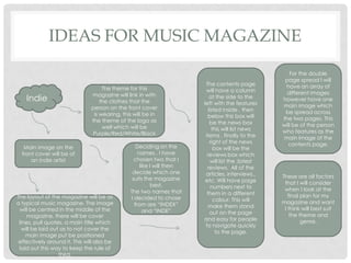
IDEAS FOR MUSIC MAGAZINE
Indie
Main image on the
front cover will be of
an indie artist
The theme for this
magazine will link in with
the clothes that the
person on the front cover
is wearing, this will be in
the theme of the logo as
well which will be
Purple/Red/White/Black
Deciding on the
names , I have
chosen two that I
like I will then
decide which one
suits the magazine
best.
The two names that
I decided to chose
from are “INDEX”
and “INDE”
The layout of the magazine will be as
a typical music magazine. The image
will be centred in the middle of the
magazine, there will be cover
lines, pull quotes, a main title which
will be laid out as to not cover the
main image put be positioned
effectively around it. This will also be
laid out this way to keep the rule of
third.
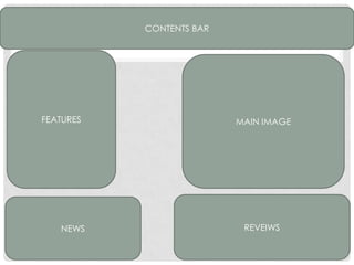
The contents page
will have a column
at the side to the
left with the features
listed inside , then
below this box will
be the news box
this will list news
items , finally to the
right of the news
box will be the
reviews box which
will list the ;latest
reviews. All of the
articles, interviews..
etc. Will have page
numbers next to
them in a different
colour. This will
make them stand
out on the page
and easy for people
to navigate quickly
to the page.
For the double
page spread I will
have an array of
different images
however have one
main image which
be spread across
the two pages. This
will be of the person
who features as the
main image of the
contents page.
These are all factors
that I will consider
when I look at the
final plan for my
magazine and want
I think will best suit
the theme and
genre.
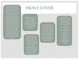
FRONT COVER
Cover Lines;
• The year of music
• This week! Hottest
new talent
• 50 faces of indie
• Win VIP tickets to
v-fest
• Exclusive Hayley
woods
• Indie festival line
ups
• Is Aires out for
good
• Stones new
album out
• 2014 preview
• New interview
exclusively to
index
Image of Hayley Sunter
acting as the artist
Hayley Woods, wearing
a tartan dress red
lipstick, eye liner, a nose
ring and has dark hair
which is down and
slightly curly, her hair is
pushed up by her right
hand and she is looking
down away from the
camera. She will be the
main image one the
front cover. There will
also be counter image
of Sophie Purchon she
will be on a smaller
scale in between the
cover lines, she is
wearing a patterned
shirt, blue jeans and is
pointing towards the
camera.
The cover lines are
positioned down
the side of the
image and above
and below. They will
be of different size
fonts wont cover
the image.
The title will be
index and this will
be across the top of
the image. This will
be in a font which is
of a similar colour to
the rest of the fonts
however the X and
the end will
become a different
font as to make the
title stand out.
All of the images
which feature on
the front cover will
be original apart
from one which will
be the ticket at the
bottom of the
page, this is
because there were
no 2014/2013 tickets
which I could get
hold of in time to
photograph one.
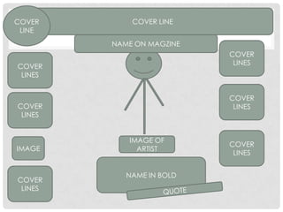
NAME IN BOLD
COVER LINECOVER
LINE
COVER
LINES
COVER
LINES
COVER
LINES
COVER
LINES
COVER
LINES
COVER
LINES
IMAGE
IMAGE OF
ARTIST
NAME ON MAGZINE
CONTENTS PAGE
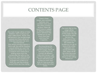
The main title for the
page will be
situated at the top
of the page, this will
also feature within
the box the
date, issue of the
magazine and the
link where the
audience can go to
look at the online
magazine and
social networking
sites. These will all
be white because
the box behind is
black so the writing
stands out.
There is three
boxes, one contains
features, one
contains news and
the other contains
reviews. These will
each have a variety
of different snippets
which will inform the
reader but no too
much that they
wont buy the
magazine.
The main image will be of Holly
Sheldon, she is acting as an
artist called Aimie Stones. She
will feature in the double page
spread and there will be an
interview between her and
the interviewer.
She will be standing against a
brick wall. She will be wearing
casual clothes as I want the
audience to relate to her, it’s
a medium shot where she is
looking away from the
camera like the artist on the
front cover. They will both look
away from the camera so it
engages the audience to
think why are they looking
away? What are they hiding
Running along the
bottom third of the
content page, there will
be a box which will
contain all different
indie artist names. I will
put this in because I feel
that it will attract the
audience when they
look at it because they
will recognise the other
artists.
CONTENTS BAR
FEATURES
NEWS REVEIWS
MAIN IMAGE
DOUBLE PAGE
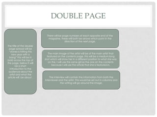
The title of the double
page spread will be
“stones is hitting this
new year with a
bang” this will be in
bold across the top of
the page, below it will
be a short
introduction to the
audience about the
artist and what the
article will be about .
There will be page numbers at each opposite end of the
magazine, these will both be arrows which point in the
direction of the next page.
The main image of the artist will be of the main artist that
featured on the contents page, this will be a medium long
shot which will show her in a different position to what she was
on the, I will use the same girl as the one on the contents
because I will use the article that she is featured in.
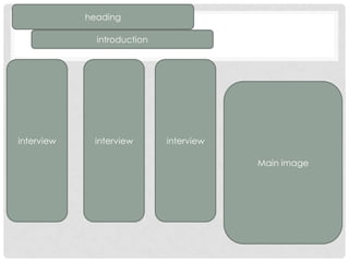
The interview will contain the information from both the
interviewer and the artist. This would be set out in columns and
the writing will go around the image.
heading
introduction
interview interview interview
Main image

Inital ideas

  • 1.
    Initial Ideas E MI L Y G A U N T
  • 2.
    IDEAS FOR MUSICMAGAZINE Indie Main image on the front cover will be of an indie artist The theme for this magazine will link in with the clothes that the person on the front cover is wearing, this will be in the theme of the logo as well which will be Purple/Red/White/Black Deciding on the names , I have chosen two that I like I will then decide which one suits the magazine best. The two names that I decided to chose from are “INDEX” and “INDE” The layout of the magazine will be as a typical music magazine. The image will be centred in the middle of the magazine, there will be cover lines, pull quotes, a main title which will be laid out as to not cover the main image put be positioned effectively around it. This will also be laid out this way to keep the rule of third. The contents page will have a column at the side to the left with the features listed inside , then below this box will be the news box this will list news items , finally to the right of the news box will be the reviews box which will list the ;latest reviews. All of the articles, interviews.. etc. Will have page numbers next to them in a different colour. This will make them stand out on the page and easy for people to navigate quickly to the page. For the double page spread I will have an array of different images however have one main image which be spread across the two pages. This will be of the person who features as the main image of the contents page. These are all factors that I will consider when I look at the final plan for my magazine and want I think will best suit the theme and genre.
  • 3.
    FRONT COVER Cover Lines; •The year of music • This week! Hottest new talent • 50 faces of indie • Win VIP tickets to v-fest • Exclusive Hayley woods • Indie festival line ups • Is Aires out for good • Stones new album out • 2014 preview • New interview exclusively to index Image of Hayley Sunter acting as the artist Hayley Woods, wearing a tartan dress red lipstick, eye liner, a nose ring and has dark hair which is down and slightly curly, her hair is pushed up by her right hand and she is looking down away from the camera. She will be the main image one the front cover. There will also be counter image of Sophie Purchon she will be on a smaller scale in between the cover lines, she is wearing a patterned shirt, blue jeans and is pointing towards the camera. The cover lines are positioned down the side of the image and above and below. They will be of different size fonts wont cover the image. The title will be index and this will be across the top of the image. This will be in a font which is of a similar colour to the rest of the fonts however the X and the end will become a different font as to make the title stand out. All of the images which feature on the front cover will be original apart from one which will be the ticket at the bottom of the page, this is because there were no 2014/2013 tickets which I could get hold of in time to photograph one.
  • 4.
    NAME IN BOLD COVERLINECOVER LINE COVER LINES COVER LINES COVER LINES COVER LINES COVER LINES COVER LINES IMAGE IMAGE OF ARTIST NAME ON MAGZINE
  • 5.
    CONTENTS PAGE The maintitle for the page will be situated at the top of the page, this will also feature within the box the date, issue of the magazine and the link where the audience can go to look at the online magazine and social networking sites. These will all be white because the box behind is black so the writing stands out. There is three boxes, one contains features, one contains news and the other contains reviews. These will each have a variety of different snippets which will inform the reader but no too much that they wont buy the magazine. The main image will be of Holly Sheldon, she is acting as an artist called Aimie Stones. She will feature in the double page spread and there will be an interview between her and the interviewer. She will be standing against a brick wall. She will be wearing casual clothes as I want the audience to relate to her, it’s a medium shot where she is looking away from the camera like the artist on the front cover. They will both look away from the camera so it engages the audience to think why are they looking away? What are they hiding Running along the bottom third of the content page, there will be a box which will contain all different indie artist names. I will put this in because I feel that it will attract the audience when they look at it because they will recognise the other artists.
  • 6.
  • 7.
    DOUBLE PAGE The titleof the double page spread will be “stones is hitting this new year with a bang” this will be in bold across the top of the page, below it will be a short introduction to the audience about the artist and what the article will be about . There will be page numbers at each opposite end of the magazine, these will both be arrows which point in the direction of the next page. The main image of the artist will be of the main artist that featured on the contents page, this will be a medium long shot which will show her in a different position to what she was on the, I will use the same girl as the one on the contents because I will use the article that she is featured in. The interview will contain the information from both the interviewer and the artist. This would be set out in columns and the writing will go around the image.
  • 8.