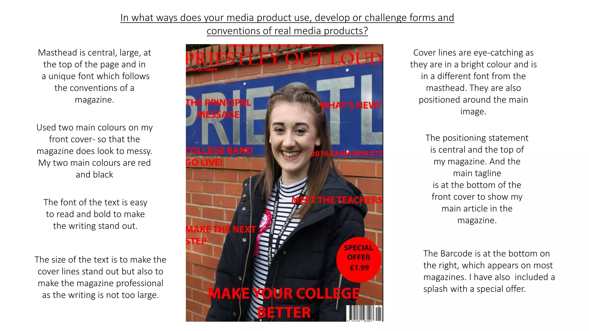
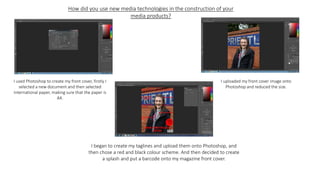
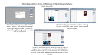
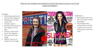
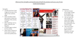
In what ways does your media product use, develop or challenge forms and
conventions of real media products?
Masthead is central, large, at
the top of the page and in
a unique font which follows
the conventions of a
magazine.
Cover lines are eye-catching as
they are in a bright colour and is
in a different font from the
masthead. They are also
positioned around the main
image.
Used two main colours on my
front cover- so that the
magazine does look to messy.
My two main colours are red
and black
The positioning statement
is central and the top of
my magazine. And the
main tagline
is at the bottom of the
front cover to show my
main article in the
magazine.
The font of the text is easy
to read and bold to make
the writing stand out.
The size of the text is to make the
cover lines stand out but also to
make the magazine professional
as the writing is not too large.
The Barcode is at the bottom on
the right, which appears on most
magazines. I have also included a
splash with a special offer.
I have included the front cover
of my magazine as an imaged
and included this in my
contents page.
I have come up with three main
headings on my contents page
which are News, Features and
Regulars. This is conventional as
most magazine include main
headings.
I have chosen to only include three
images excluding the front cover
image, this is because I did not want
my contents page to look to
crowded or messy.
I have included 9 main articles to
feature in my contents page.
Along with the main articles I
have given a brief summary
of what the article contains.
I have chose also to follow the
same colour scheme as the
front cover this is to make my
magazine look professional.
How did you use new media technologies in the construction of your
media products?
I used Photoshop to create my front cover, firstly I
selected a new document and then selected
international paper, making sure that the paper is
A4.
I uploaded my front cover image onto
Photoshop and reduced the size.
I began to create my taglines and upload them onto Photoshop, and
then chose a red and black colour scheme. And then decided to create
a splash and put a barcode onto my magazine front cover.
To create my contents page I used QuarkXPress.
Firstly I selected a new project and creating 3
columns for my contents page. I chose to do 3
columns for my 3 headings which were News,
Features and Regulars.
I then inserted my pictures onto QuarkXPress including
my front cover images as well as some more photos for
my contents page.
I chose the same colour scheme as my front cover to make my
magazine look more professional. As well as uploading photos
onto my contents page I also created headings and article names.
With the article names I gave a brief summary of what the article
included.
What are the strengths and weaknesses of both the product and your use of new
media technologies?
Strengths-
• Positioning statement at
the top of the magazine.
• Masthead has its now
unique font.
• Includes a splash
• Barcode at the bottom of
the magazine on the
right.
• Contains a date at the
top on the magazine.
• One main front cover
image
• Medium close up of
subject as main image
Weaknesses-
• Not enough cover lines
• Too much space around
the subject.
• Not enough colour,
could portray as boring.
• Subject has too much
head space on the front
cover.
Strengths-
• Includes the front cover
image at the top on the
right of the contents
page.
• Have included a brief
description of what the
headings of the articles
include.
• Main headings such as
News, Features and
Regulars.
• Included page numbers
for the articles
• Same colour scheme as
front cover to make it
look more professional.
Weaknesses-
• I did not include
actual page number
at the bottom on
my contents page
• I do not have one
main image and
other little images,
which goes against
the conventions of a
contents page.
• Not much colour
on my contents
page could be
classed as not eye-
catching enough.

Evaluaton

  • 1.
    In what waysdoes your media product use, develop or challenge forms and conventions of real media products? Masthead is central, large, at the top of the page and in a unique font which follows the conventions of a magazine. Cover lines are eye-catching as they are in a bright colour and is in a different font from the masthead. They are also positioned around the main image. Used two main colours on my front cover- so that the magazine does look to messy. My two main colours are red and black The positioning statement is central and the top of my magazine. And the main tagline is at the bottom of the front cover to show my main article in the magazine. The font of the text is easy to read and bold to make the writing stand out. The size of the text is to make the cover lines stand out but also to make the magazine professional as the writing is not too large. The Barcode is at the bottom on the right, which appears on most magazines. I have also included a splash with a special offer.
  • 2.
    I have includedthe front cover of my magazine as an imaged and included this in my contents page. I have come up with three main headings on my contents page which are News, Features and Regulars. This is conventional as most magazine include main headings. I have chosen to only include three images excluding the front cover image, this is because I did not want my contents page to look to crowded or messy. I have included 9 main articles to feature in my contents page. Along with the main articles I have given a brief summary of what the article contains. I have chose also to follow the same colour scheme as the front cover this is to make my magazine look professional.
  • 3.
    How did youuse new media technologies in the construction of your media products? I used Photoshop to create my front cover, firstly I selected a new document and then selected international paper, making sure that the paper is A4. I uploaded my front cover image onto Photoshop and reduced the size. I began to create my taglines and upload them onto Photoshop, and then chose a red and black colour scheme. And then decided to create a splash and put a barcode onto my magazine front cover.
  • 4.
    To create mycontents page I used QuarkXPress. Firstly I selected a new project and creating 3 columns for my contents page. I chose to do 3 columns for my 3 headings which were News, Features and Regulars. I then inserted my pictures onto QuarkXPress including my front cover images as well as some more photos for my contents page. I chose the same colour scheme as my front cover to make my magazine look more professional. As well as uploading photos onto my contents page I also created headings and article names. With the article names I gave a brief summary of what the article included.
  • 5.
    What are thestrengths and weaknesses of both the product and your use of new media technologies? Strengths- • Positioning statement at the top of the magazine. • Masthead has its now unique font. • Includes a splash • Barcode at the bottom of the magazine on the right. • Contains a date at the top on the magazine. • One main front cover image • Medium close up of subject as main image Weaknesses- • Not enough cover lines • Too much space around the subject. • Not enough colour, could portray as boring. • Subject has too much head space on the front cover.
  • 6.
    Strengths- • Includes thefront cover image at the top on the right of the contents page. • Have included a brief description of what the headings of the articles include. • Main headings such as News, Features and Regulars. • Included page numbers for the articles • Same colour scheme as front cover to make it look more professional. Weaknesses- • I did not include actual page number at the bottom on my contents page • I do not have one main image and other little images, which goes against the conventions of a contents page. • Not much colour on my contents page could be classed as not eye- catching enough.