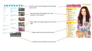
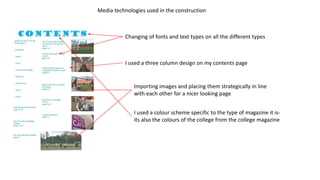
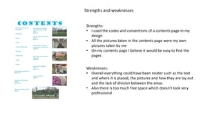
Evaluation of
my front cover
Codes and conventions
• My magazine follows codes and conventions because it
has a masthead.
• It’s similar to this billboard issue because it is located at
the top of the cover and is the biggest piece of writing
on the page.
• However mine is a more of a serif edge to the words
and is two words.
• My magazine follows codes and conventions because it has
cover lines
• Similarities between mine and ‘Billboard’ is they are both by
the side of the main image and are both about articles in the
magazine
• However they’re different because mine don’t have a title on
them and don’t go over the main image at all.
• My magazine follows codes and conventions because it has a main
image on the cover
• It is similar to the ‘Billboards’ issue because the images are both in
the middle and are the biggest thing on the cover, also both people
have direct address to the reader
• However it is different because mine is a medium close up and theirs
is a close up, also theirs is black and white whilst mine is colourful.
Media technologies in construction
When creating my cover I had to crop down my image so
it was a medium close up and I did this using Photoshop
Also in Photoshop I added writing on to my cover, however
the masthead has to be its own font so I have used a wide
range of text types
On my cover I added a splash which is there to stand out and I did
this on Photoshop as well
I added a barcode which used resizing and placement of images and
things on my cover
Strengths and weaknesses
Strengths of product:
• The price and barcode show the realness of the product because it shows that its being
sold
• The issue number is a good way to show the legitimacy of the product because it is
regularly brought out
• The cover lines are placed in the space around the main image which is a good use of the
spare space
Weaknesses of product:
• The mise-en-scene could be improved because the background blends in to his top and isn’t
very creative
• The cover lines could have stood out more by using a bolder font and making them larger
than they are
• There's still too much free space
Strengths of media technologies:
• The placement of the masthead, using Photoshop looks like a real magazine because if not all
magazines have the masthead at the top of the cover
• The main image has been cropped down to a medium close up so it doesn’t take up too much
of the cover
Weaknesses of media technologies:
• The splash needs to look more natural on the cover- it looks out of place
• All the features are small, they could be a slight bit bigger and it would still fit thr codes and
conventions (barcode, splash, coverlines, masthead and the issue number. Not the main image,
however)
Evaluation of my contents page
Content- at the top of the page and is the largest
piece of text
Text of the title of the magazine isn’t used
anywhere in the contents
Main image is the largest image on the contents
page
Page numbers next to the article names
I should’ve put more detail in to the articles
Media technologies used in the construction
Changing of fonts and text types on all the different types
I used a three column design on my contents page
Importing images and placing them strategically in line
with each other for a nicer looking page
I used a colour scheme specific to the type of magazine it is-
its also the colours of the college from the college magazine
Strengths and weaknesses
Strengths:
• I used the codes and conventions of a contents page in my
design
• All the pictures taken in the contents page were my own
pictures taken by me
• On my contents page I believe it would be easy to find the
pages
Weaknesses:
• Overall everything could have been neater such as the text
and where it is placed, the pictures and how they are lay out
and the lack of division between the areas
• Also there is too much free space which doesn’t look very
professional

Evaluation of cover

  • 1.
  • 2.
    Codes and conventions •My magazine follows codes and conventions because it has a masthead. • It’s similar to this billboard issue because it is located at the top of the cover and is the biggest piece of writing on the page. • However mine is a more of a serif edge to the words and is two words. • My magazine follows codes and conventions because it has cover lines • Similarities between mine and ‘Billboard’ is they are both by the side of the main image and are both about articles in the magazine • However they’re different because mine don’t have a title on them and don’t go over the main image at all. • My magazine follows codes and conventions because it has a main image on the cover • It is similar to the ‘Billboards’ issue because the images are both in the middle and are the biggest thing on the cover, also both people have direct address to the reader • However it is different because mine is a medium close up and theirs is a close up, also theirs is black and white whilst mine is colourful.
  • 3.
    Media technologies inconstruction When creating my cover I had to crop down my image so it was a medium close up and I did this using Photoshop Also in Photoshop I added writing on to my cover, however the masthead has to be its own font so I have used a wide range of text types On my cover I added a splash which is there to stand out and I did this on Photoshop as well I added a barcode which used resizing and placement of images and things on my cover
  • 4.
    Strengths and weaknesses Strengthsof product: • The price and barcode show the realness of the product because it shows that its being sold • The issue number is a good way to show the legitimacy of the product because it is regularly brought out • The cover lines are placed in the space around the main image which is a good use of the spare space Weaknesses of product: • The mise-en-scene could be improved because the background blends in to his top and isn’t very creative • The cover lines could have stood out more by using a bolder font and making them larger than they are • There's still too much free space Strengths of media technologies: • The placement of the masthead, using Photoshop looks like a real magazine because if not all magazines have the masthead at the top of the cover • The main image has been cropped down to a medium close up so it doesn’t take up too much of the cover Weaknesses of media technologies: • The splash needs to look more natural on the cover- it looks out of place • All the features are small, they could be a slight bit bigger and it would still fit thr codes and conventions (barcode, splash, coverlines, masthead and the issue number. Not the main image, however)
  • 5.
    Evaluation of mycontents page
  • 6.
    Content- at thetop of the page and is the largest piece of text Text of the title of the magazine isn’t used anywhere in the contents Main image is the largest image on the contents page Page numbers next to the article names I should’ve put more detail in to the articles
  • 7.
    Media technologies usedin the construction Changing of fonts and text types on all the different types I used a three column design on my contents page Importing images and placing them strategically in line with each other for a nicer looking page I used a colour scheme specific to the type of magazine it is- its also the colours of the college from the college magazine
  • 8.
    Strengths and weaknesses Strengths: •I used the codes and conventions of a contents page in my design • All the pictures taken in the contents page were my own pictures taken by me • On my contents page I believe it would be easy to find the pages Weaknesses: • Overall everything could have been neater such as the text and where it is placed, the pictures and how they are lay out and the lack of division between the areas • Also there is too much free space which doesn’t look very professional