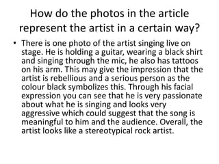
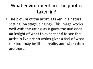
Magazine DPS InterviewAnalysis
Saikha
What magazine are you analysing &
who is being interviewed?
• The magazine I am analysing is KERRANG!
• The artist being interviewed is Tim McIlrath,
he is the lead singer in the rock band ‘Rise
Against’.
How many quotations are used in the
article? How do they attract the reader
to read the whole interview?
• There is one big quotation used on the left hand side of the
page. It takes up almost half of the page. It is written in
white, bold and stands out against the dark background so
it catches the readers eye. The quote reads “ We’ll
definitely be putting out a new album in 2014”
• The quote would attract the reader to read the whole
interview because they’d want to find out more about the
album and they would be feeling excited because possibly
their favourite band is releasing an album and they would
want to read all about it which is why they have used that
quote because it interests the reader and they know that
the audience would definitely read the rest of the
interview.
How does the sub heading invite us
into the interview?
• The sub heading gives us a brief overview of what
the interview will be about and who is going to
be interviewed which makes the audience want
to read the interview to find our more
information.
• The text of the sub heading is white with a red
background against a black background. This
makes it stand out for the audience and works
well with the title as it is also bright against the
background which makes it eye catching.
What kind of information about the
artist does the interview tell us?
• The information in the interview tells that the
artist and his band are working on a new
album for next year. They are also one of the
main bands involved in the ‘Warped Tour ‘13’.
This may make it interesting for the audience
because they find out more information about
the tour and their favourite artists in one
interview.
What is the theme of the whole
interview?
• The theme of the interview is based on the
‘Warped Tour ‘13’ everything on the page is
focused around that tour. There is also an
information box separate to the interview which
informs the audience on what to bring to the
tour. This shows that the tour is the main topic
and they are trying their best to make people
aware of it. It is different to the usual tours and
they have made that very clear in the interview.
The artist in the interview is also very excited
about the tour which may influence the audience
as well.
How do the photos in the article
represent the artist in a certain way?
• There is one photo of the artist singing live on
stage. He is holding a guitar, wearing a black shirt
and singing through the mic, he also has tattoos
on his arm. This may give the impression that the
artist is rebellious and a serious person as the
colour black symbolizes this. Through his facial
expression you can see that he is very passionate
about what he is singing and looks very
aggressive which could suggest that the song is
meaningful to him and the audience. Overall, the
artist looks like a stereotypical rock artist.
How does the font used attract the
reader?
• The font used on the double page spread is very bold.
The main text that the audience must read is
highlighted so they cannot miss it. There is a drop
capital used in the summary of the interview which
shows that there is vital information written in that
paragraph. It also makes the audience aware that, that
is where the interview starts. The questions are in
yellow bold text and the answers are beneath in white.
These two colours contrast against the black
background which makes it attractive to the audience
and they will not have trouble reading the information.
What type of language is used in the
article?
• The language used in the article by the
interviewer is informal and friendly, it is like
they are having just an everyday conversation
which makes it easier for the reader to read as
the interview just flows easily. The responses
are also informal and humorous. This makes
the reader comfortable reading the interview
and entertains them because they may find it
funny and it may make them smile which
would make them feel good whilst reading it.
What environment are the photos
taken in?
• The picture of the artist is taken in a natural
setting (on stage, singing). This image works
well with the article as it gives the audience
an insight of what to expect and to see the
artist in live action which gives a feel of what
the tour may be like in reality and when they
are there.
Is there any other information about
the artist on the page besides the
interview?
• There is no other information about the artist.
This shows that the tour and the new album is
all the audience have to look forward to which
is why they were the main topics discussed in
detail in the interview. Also, it may suggest
that these are all the important things taking
place in the artists life and it is the reason why
nothing else is shared.

Magazine dps interview_analysis

  • 1.
  • 3.
    What magazine areyou analysing & who is being interviewed? • The magazine I am analysing is KERRANG! • The artist being interviewed is Tim McIlrath, he is the lead singer in the rock band ‘Rise Against’.
  • 4.
    How many quotationsare used in the article? How do they attract the reader to read the whole interview? • There is one big quotation used on the left hand side of the page. It takes up almost half of the page. It is written in white, bold and stands out against the dark background so it catches the readers eye. The quote reads “ We’ll definitely be putting out a new album in 2014” • The quote would attract the reader to read the whole interview because they’d want to find out more about the album and they would be feeling excited because possibly their favourite band is releasing an album and they would want to read all about it which is why they have used that quote because it interests the reader and they know that the audience would definitely read the rest of the interview.
  • 5.
    How does thesub heading invite us into the interview? • The sub heading gives us a brief overview of what the interview will be about and who is going to be interviewed which makes the audience want to read the interview to find our more information. • The text of the sub heading is white with a red background against a black background. This makes it stand out for the audience and works well with the title as it is also bright against the background which makes it eye catching.
  • 6.
    What kind ofinformation about the artist does the interview tell us? • The information in the interview tells that the artist and his band are working on a new album for next year. They are also one of the main bands involved in the ‘Warped Tour ‘13’. This may make it interesting for the audience because they find out more information about the tour and their favourite artists in one interview.
  • 7.
    What is thetheme of the whole interview? • The theme of the interview is based on the ‘Warped Tour ‘13’ everything on the page is focused around that tour. There is also an information box separate to the interview which informs the audience on what to bring to the tour. This shows that the tour is the main topic and they are trying their best to make people aware of it. It is different to the usual tours and they have made that very clear in the interview. The artist in the interview is also very excited about the tour which may influence the audience as well.
  • 8.
    How do thephotos in the article represent the artist in a certain way? • There is one photo of the artist singing live on stage. He is holding a guitar, wearing a black shirt and singing through the mic, he also has tattoos on his arm. This may give the impression that the artist is rebellious and a serious person as the colour black symbolizes this. Through his facial expression you can see that he is very passionate about what he is singing and looks very aggressive which could suggest that the song is meaningful to him and the audience. Overall, the artist looks like a stereotypical rock artist.
  • 9.
    How does thefont used attract the reader? • The font used on the double page spread is very bold. The main text that the audience must read is highlighted so they cannot miss it. There is a drop capital used in the summary of the interview which shows that there is vital information written in that paragraph. It also makes the audience aware that, that is where the interview starts. The questions are in yellow bold text and the answers are beneath in white. These two colours contrast against the black background which makes it attractive to the audience and they will not have trouble reading the information.
  • 10.
    What type oflanguage is used in the article? • The language used in the article by the interviewer is informal and friendly, it is like they are having just an everyday conversation which makes it easier for the reader to read as the interview just flows easily. The responses are also informal and humorous. This makes the reader comfortable reading the interview and entertains them because they may find it funny and it may make them smile which would make them feel good whilst reading it.
  • 11.
    What environment arethe photos taken in? • The picture of the artist is taken in a natural setting (on stage, singing). This image works well with the article as it gives the audience an insight of what to expect and to see the artist in live action which gives a feel of what the tour may be like in reality and when they are there.
  • 12.
    Is there anyother information about the artist on the page besides the interview? • There is no other information about the artist. This shows that the tour and the new album is all the audience have to look forward to which is why they were the main topics discussed in detail in the interview. Also, it may suggest that these are all the important things taking place in the artists life and it is the reason why nothing else is shared.