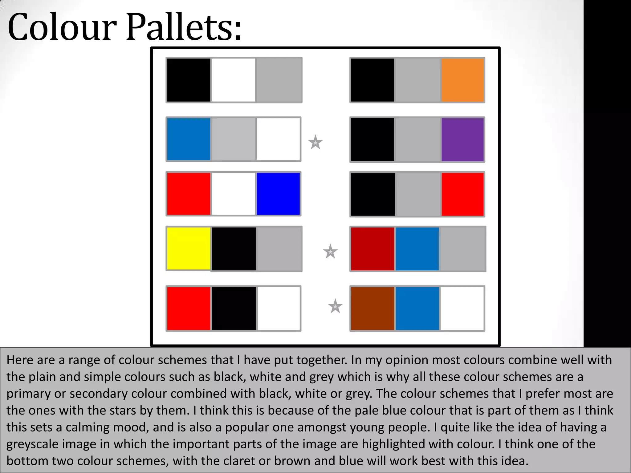
Download to read offline

Here are 3 potential fonts for the magazine headings based on your target audience profile and design goals: 1. Impact: A classic sans serif font that is bold and eye-catching. The all-caps style will stand out on the magazine covers. 2. Bank Gothic: A retro font with a gritty, urban style that evokes graffiti and punk rock aesthetics. The thick letterforms will grab attention. 3. Amatic SC: A stylized script font with an edgy, handwritten feel. The varied letter widths give it energy that would appeal to a young male audience. For subheadings, a complementary sans serif like Helvetica Neue or Arial would provide clarity while


