
Recommended
More Related Content
What's hot
What's hot (20)
Viewers also liked
Similar to Magazine Analysis
Similar to Magazine Analysis (20)
Recently uploaded
Recently uploaded (20)
Magazine Analysis
- 1. Magazine Analysis By Von Aerol Soberano Villanueva
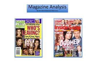
- 2. The use of a weblink informs thee consumer where they can go for additional information on the magazine as well as the soap operas that are featured. I can apply this to my own magazine so the audience is aware that the magazine has an online presence. This will specifically appeal to the young demographic as they are more likely to consume the magazine on their smart phones/computers. This is a more convenient method for the audience as this is a way of “going straight to the audience via the web” (Plunkett). The mast head is found on a white background with a combination of black and green text. The text ‘soap digest’ is illustrated in a vibrant green colour which clearly stands out and immediately attracts the consumer to inform them of the brand of magazine. I can apply this to my magazine by making sure the mast head is emphasized through the careful choosing of colours. Blumler’s theory can be applied here as the use of ‘PLUS’ attracts the consumer, suggesting that there is additional information on a soap within the magazine. This may encourage the audience to purchase the magazine. The barcode and price is placed in the bottom of the page to avoid distracting the consumer from the other features found on the page. There aren’t many cover lines used in this magazine, instead, the magazine attracts the audience through the use of star appeal (Richard Dyer) which will help promote and sell the media product. Through the use of male models, the magazine influences the ‘female gaze’ (Diana Saco) and will be appealing to female consumers. In addition, female stars are also presented in magazine which attracts the ‘male gaze’ (Laura Mulvey) and therefore will appeal to male consumers. A yellow background has been used as a foundation for the whole page. The yellow colour is not a dominant colour which allows the other colours and features of the page to catch the audience’s attention. For example the red and black text of the headline contrasts well against the yellow background. There is a ‘repeated’ (Steve Neale) use of squares as the structure for the magazine front cover. The square shape creates a sense of professionalism as the page looks organized. I can apply this to my own magazine by consistently using similar shapes to portray my magazine as an established media product. The headline has been presented as a rhetorical question. This makes it more enticing as it is different compared to the generic statement from other established magazines. It has been presented in a red text which is a very dominant colour which causes the audience to divert their gaze on the headline. The question of ‘Who’s Leaving’ represents Levi Strauss’ binary opposition theory of the ‘male versus female’ as it denotes that one of the stars is being fired.
- 3. Different font styles have been used for the cover lines to emphasise the contrast between them. This makes it much clearer for the consumer to read the text. In addition, instead of conforming to one font style, two styles have been used which makes the magazine more appealing. The mast head is very simple and has not been edited to stand out more. This is effective as it avoids taking the attention away from the main image and headline which is what the magazine is promoting. However a dominant colour has been used which means the red text naturally screams its presence by contrasting against the white background. The date of when the magazine was issued has been included to inform the consumer of whether it is the most recent magazine.. The price has been included in a black text to allow it to stand out against the white background. However it has been displayed in a small sized font so the cost- effective nature of the magazine will not encourage the consumer to purchase it, instead the magazine hopes to promote the main image as well as the cover lines which is what ‘InsideSoap’ wants the consumers to be attracted to. The consistent use of the colour red has been ‘repeated’ (Steve Neale) throughout the magazine to avoid clashing with the other colours. The limited use of the colours and repeated use of the red makes the magazine seem more professional and organised which may appeal to the audience. The strapline denotes that the magazine will contain different stories of different soaps every week. This is like a promise made between the magazine and the audience and is an example of Blumler’s theory as it attracts the consumer and encourages them to purchase the magazine. A one word headline has been used with a big font and an exclamation point on the end. The word ‘DOOMED!’ entices the consumer as it is simplistic but effective as it gives a dramatic event because of its connotation which suggest that someone is fated for something negative. Several cover lines has been included in the magazine with limited text or description as a way to interest the consumer and specifically likeable to the younger audiences as too much text would be unappealing to them. By incorporating different shapes for the cover lines, the page is less simplistic and less structured. This makes the overall page more attractive.