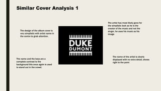
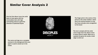
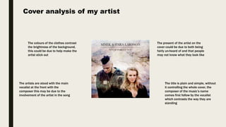
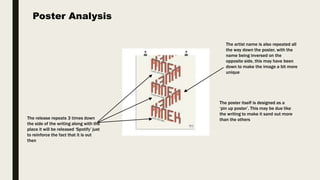
The document analyzes and summarizes the key design elements of several album covers and a concert poster. For the album covers, common elements included simple designs with high contrast colors to grab attention, central placement of the artist's name or logo as the key focus, and contrasting text/colors against the background. The concert poster repeated the release date and artist name down the sides to reinforce the information and used an inverted name to make the image unique. Overall the analyses highlighted design choices meant to clearly communicate information and make the pieces stand out visually.