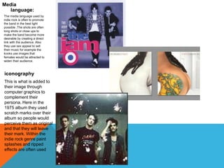
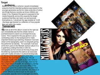
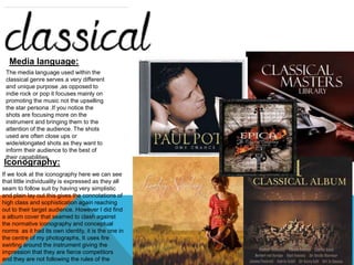
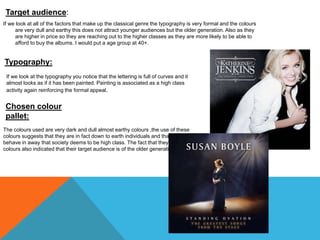
INDIE ROCK : 
Chosen colour pallet. 
The indie rock genre often uses a colour pallet of reds whites and 
blacks. To me the red screams out elements of danger and the black 
gives the impression of authority and power in the music industry. 
However the white gives the audience connotations of purity and 
meaningfulness ,this could mean that their lyrics are truthful and that the 
listeners are experiencing a second hand emotion that’s being passed 
on through the music. However as they are independent bands and 
artists ,they do not have set codes and conventions for example “you 
me at six” have experimented with an out burst of colour emblematizing 
their individual creativeness. 
Target audience. 
The target audience for the indie rock genre is 16-25 year olds. 
This is in consideration of the intention of the music as it is 
based around past experiences of the band members and often 
contains sexual references so would be inappropriate for them 
to sell themselves to younger audiences. Also the majority of 
indie rock bands are in their 20s-30s so younger people aspire 
and look up to them as icons. 
Typography 
The font used is often bold and a contrasting colour to the background to 
make their album stand out from the rest. However they each indie band 
puts their own unique spin on it for example the 1975 have the 
typography with a ripped effect implying that they are carefree and 
reckless. In contrast to this the Arctic monkeys have a flowing bold font 
almost looks as if a person as hand written it. Giving the connotations of 
them being exciting and fun to be around but then also a added element 
of them being down to earth as anybody could of wrote the tittle.
Media 
language: 
The media language used by 
indie rock is often to promote 
the band in the best light 
possible .The shots are often 
long shots or close ups to 
make the band become more 
desirable by creating a direct 
link with the audience. Also 
they use sex appeal to sell 
their music for example the 
kooks use images that 
females would be attracted to 
widen their audience. 
iconography 
This is what is added to 
their image through 
computer graphics to 
complement their 
persona. Here in the 
1975 album they used 
scratch marks over their 
album so people would 
perceive them as original 
and that they will leave 
their mark. Within the 
indie rock genre paint 
splashes and ripped 
effects are often used
Chosen colour 
pallet: 
As you can see the colour 
pallets that are used within 
the pop genre are using a 
wide range of different 
colours. But if you take a 
second look you will notice 
that all of the colours used 
are bright and bold ,Shouting 
out to the audience that this 
genre is fun and vibrant the 
place to be. By doing this 
they are drawing audiences 
in to spend money on their 
product. 
Also within the world of pop 
you have artists that follow 
the normative codes and 
conventions of the genre b y 
using bright and in your face 
colours for example Mika in 
the right hand side uses 
colour to its full potential to 
make him stand out he 
almost goes over board .Lady 
Gaga however contrasts this 
as she chooses to stand out 
for not following the 
conceptual norms as she 
incorporates dark colouring 
and shadowing into her work 
this is not associated with 
pop music and so gives her a 
unique edge and 
“something that 
realised was that 
the more colour a 
artist uses the 
more innocent the 
intentions of the 
songs seam… is 
this because 
artists that use 
darker colours are 
aiming for a 
slightly older 
audience within 
their age 
bracket?.”
Target 
audience: Based on the colour scheme I would immediately 
presume that the intended audience was based on the 
younger generation as the fun vibes ands lots of colour 
are things that as a society we know children are 
drawn in by. However this genre is exposed to the 
media frequently and so this expands the target 
audience that they can reach out and promote 
themselves to. I would set the age bracket at 13-26 
,the large age bracket is a reflection of how popular 
they are within the media. 
Typograph 
Ify w:e look at all of the album covers to the right we 
can immediately see that the artists name is 
pushed forward to stand out amongst the busy 
scene. This is typical for the pop genre to use a 
contrasting colour to the background to make 
important factors eye-catching. However if we look 
closer at the typography used it is singularly giving 
the performer an identity. For example if we look 
at the font used on the Michael Jackson album it is 
in gold fancy writing this links in with his 
iconography as he is know as the king of pop and 
the lettering represents this well as we associate 
gold with royalty and also it is placed strategically 
on the top of his head again this gives they 
audience the connotations of royalty. We all 
associate royalty with wealth so this also hints to 
the audience that not only is he high class but he 
has a high status of wealth. An contrasting identity 
is Miley Cyrus the rough and ready effect of the 
typography gives the audience the view point that 
she dangerous and almost rebel like ,this entices in 
a whole different audience type as this type of 
iconography appeals more to teenagers as she is
Media 
language. 
The media language 
used 
Within the pop genre is 
used to give the wow 
factor to their target 
audience. In Robbie 
Williams and Madonna's 
album close up shots 
are used to show the 
emotional link between 
the artist and their 
music. However artists 
may choose different 
shot types such as body 
shots and long shots 
use sex appeal to their 
advantage like Ariana 
Grande the image 
shows of her curves 
showing that she is in 
control as it is on her 
terms resulting in a 
larger variety of men 
and women in her target 
audience. When we look 
at union j the media 
language represents to 
the audience that they 
are strong as a group 
as they are all 
positioned closely 
together ,if a group 
appear to have stability 
then audiences are 
more likely to invest 
their money and time . 
Iconography 
. 
The iconography is used in pop 
more than any other genre as it 
covers individual differences on a 
larger scale as pop covers a wider 
variety of styles. I like how Robbie 
Williams has used pink spots to 
take on the iconography of his song 
as he has made himself look like 
the candy its self. But by doing this 
he is also giving himself a identity 
that is unique to him. If we look at 
Madonna's use of iconography she 
as gone for a pop-art effect giving 
the long .lasting impression that she 
is current and fresh despite being in 
the industry for a long time.
Media language: 
The media language used within the 
classical genre serves a very different 
and unique purpose ,as opposed to 
indie rock or pop it focuses mainly on 
promoting the music not the upselling 
the star persona .If you notice the 
shots are focusing more on the 
instrument and bringing them to the 
attention of the audience. The shots 
used are often close ups or 
wide/elongated shots as they want to 
inform their audience to the best of 
their capabilities. 
Iconography: 
If we look at the iconography here we can see 
that little individuality is expressed as they all 
seam to follow suit by having very simplistic 
and plain lay out this gives the connotations of 
high class and sophistication again reaching 
out to their target audience. However I did find 
a album cover that seamed to clash against 
the normative iconography and conceptual 
norms as it had its own identity, it is the one in 
the centre of my photographs, It uses fire 
swirling around the instrument giving the 
impression that they are fierce competitors 
and they are not following the rules of the 
genre.
Target audience: 
If we look at all of the factors that make up the classical genre the typography is very formal and the colours 
are very dull and earthy this does not attract younger audiences but the older generation. Also as they 
are higher in price so they are reaching out to the higher classes as they are more likely to be able to 
afford to buy the albums. I would put a age group at 40+. 
Typography: 
If we look at the typography you notice that the lettering is full of curves and it 
almost looks as if it has been painted. Painting is associated as a high class 
activity again reinforcing the formal appeal. 
Chosen colour 
pallet: 
The colours used are very dark and dull almost earthy colours ,the use of these 
colours suggests that they are in fact down to earth individuals and that they 
behave in away that society deems to be high class. The fact that they use dull 
colours also indicated that their target audience is of the older generation.

research into digi pacts and what we can learn from them.

  • 2.
    INDIE ROCK : Chosen colour pallet. The indie rock genre often uses a colour pallet of reds whites and blacks. To me the red screams out elements of danger and the black gives the impression of authority and power in the music industry. However the white gives the audience connotations of purity and meaningfulness ,this could mean that their lyrics are truthful and that the listeners are experiencing a second hand emotion that’s being passed on through the music. However as they are independent bands and artists ,they do not have set codes and conventions for example “you me at six” have experimented with an out burst of colour emblematizing their individual creativeness. Target audience. The target audience for the indie rock genre is 16-25 year olds. This is in consideration of the intention of the music as it is based around past experiences of the band members and often contains sexual references so would be inappropriate for them to sell themselves to younger audiences. Also the majority of indie rock bands are in their 20s-30s so younger people aspire and look up to them as icons. Typography The font used is often bold and a contrasting colour to the background to make their album stand out from the rest. However they each indie band puts their own unique spin on it for example the 1975 have the typography with a ripped effect implying that they are carefree and reckless. In contrast to this the Arctic monkeys have a flowing bold font almost looks as if a person as hand written it. Giving the connotations of them being exciting and fun to be around but then also a added element of them being down to earth as anybody could of wrote the tittle.
  • 3.
    Media language: Themedia language used by indie rock is often to promote the band in the best light possible .The shots are often long shots or close ups to make the band become more desirable by creating a direct link with the audience. Also they use sex appeal to sell their music for example the kooks use images that females would be attracted to widen their audience. iconography This is what is added to their image through computer graphics to complement their persona. Here in the 1975 album they used scratch marks over their album so people would perceive them as original and that they will leave their mark. Within the indie rock genre paint splashes and ripped effects are often used
  • 4.
    Chosen colour pallet: As you can see the colour pallets that are used within the pop genre are using a wide range of different colours. But if you take a second look you will notice that all of the colours used are bright and bold ,Shouting out to the audience that this genre is fun and vibrant the place to be. By doing this they are drawing audiences in to spend money on their product. Also within the world of pop you have artists that follow the normative codes and conventions of the genre b y using bright and in your face colours for example Mika in the right hand side uses colour to its full potential to make him stand out he almost goes over board .Lady Gaga however contrasts this as she chooses to stand out for not following the conceptual norms as she incorporates dark colouring and shadowing into her work this is not associated with pop music and so gives her a unique edge and “something that realised was that the more colour a artist uses the more innocent the intentions of the songs seam… is this because artists that use darker colours are aiming for a slightly older audience within their age bracket?.”
  • 5.
    Target audience: Basedon the colour scheme I would immediately presume that the intended audience was based on the younger generation as the fun vibes ands lots of colour are things that as a society we know children are drawn in by. However this genre is exposed to the media frequently and so this expands the target audience that they can reach out and promote themselves to. I would set the age bracket at 13-26 ,the large age bracket is a reflection of how popular they are within the media. Typograph Ify w:e look at all of the album covers to the right we can immediately see that the artists name is pushed forward to stand out amongst the busy scene. This is typical for the pop genre to use a contrasting colour to the background to make important factors eye-catching. However if we look closer at the typography used it is singularly giving the performer an identity. For example if we look at the font used on the Michael Jackson album it is in gold fancy writing this links in with his iconography as he is know as the king of pop and the lettering represents this well as we associate gold with royalty and also it is placed strategically on the top of his head again this gives they audience the connotations of royalty. We all associate royalty with wealth so this also hints to the audience that not only is he high class but he has a high status of wealth. An contrasting identity is Miley Cyrus the rough and ready effect of the typography gives the audience the view point that she dangerous and almost rebel like ,this entices in a whole different audience type as this type of iconography appeals more to teenagers as she is
  • 6.
    Media language. Themedia language used Within the pop genre is used to give the wow factor to their target audience. In Robbie Williams and Madonna's album close up shots are used to show the emotional link between the artist and their music. However artists may choose different shot types such as body shots and long shots use sex appeal to their advantage like Ariana Grande the image shows of her curves showing that she is in control as it is on her terms resulting in a larger variety of men and women in her target audience. When we look at union j the media language represents to the audience that they are strong as a group as they are all positioned closely together ,if a group appear to have stability then audiences are more likely to invest their money and time . Iconography . The iconography is used in pop more than any other genre as it covers individual differences on a larger scale as pop covers a wider variety of styles. I like how Robbie Williams has used pink spots to take on the iconography of his song as he has made himself look like the candy its self. But by doing this he is also giving himself a identity that is unique to him. If we look at Madonna's use of iconography she as gone for a pop-art effect giving the long .lasting impression that she is current and fresh despite being in the industry for a long time.
  • 7.
    Media language: Themedia language used within the classical genre serves a very different and unique purpose ,as opposed to indie rock or pop it focuses mainly on promoting the music not the upselling the star persona .If you notice the shots are focusing more on the instrument and bringing them to the attention of the audience. The shots used are often close ups or wide/elongated shots as they want to inform their audience to the best of their capabilities. Iconography: If we look at the iconography here we can see that little individuality is expressed as they all seam to follow suit by having very simplistic and plain lay out this gives the connotations of high class and sophistication again reaching out to their target audience. However I did find a album cover that seamed to clash against the normative iconography and conceptual norms as it had its own identity, it is the one in the centre of my photographs, It uses fire swirling around the instrument giving the impression that they are fierce competitors and they are not following the rules of the genre.
  • 8.
    Target audience: Ifwe look at all of the factors that make up the classical genre the typography is very formal and the colours are very dull and earthy this does not attract younger audiences but the older generation. Also as they are higher in price so they are reaching out to the higher classes as they are more likely to be able to afford to buy the albums. I would put a age group at 40+. Typography: If we look at the typography you notice that the lettering is full of curves and it almost looks as if it has been painted. Painting is associated as a high class activity again reinforcing the formal appeal. Chosen colour pallet: The colours used are very dark and dull almost earthy colours ,the use of these colours suggests that they are in fact down to earth individuals and that they behave in away that society deems to be high class. The fact that they use dull colours also indicated that their target audience is of the older generation.