
More Related Content
What's hot
What's hot (17)
Similar to Magazine Advertisement Research
Similar to Magazine Advertisement Research (20)
More from AmyBoardman
Magazine Advertisement Research
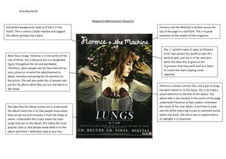
- 1. Amy Boardman Magazine Advertisement Research Enchanted background, looks as if she is in the Florence and the Machine is written across the forest. This is used to create mystery and suggest top of the page in a serif font. This is to grab this album perhaps has a twist. attention of the readers of the magazine. The ‘+’ symbol makes it seem as Florence is her own person but works as part of a Main focus image- Florence is in the centre of the band as well, and she is at her very best rule of thirds, this is because she is a recognised when she does this. It gives us the figure throughout the UK and worldwide. impression that they work well as a team Therefore, when people see her face they will be to create the chart-topping music very curious as to what the advertisement is regularly. about, therefore attracting lots of attention to the article. This will also make lots of people look out for the album when they are out and about in Florence is almost cartoon like, and a pair of lungs the shops. has been edited on to her body. This is to make a visual reference to the title of the album. The album title is also located in the centre of the page underneath Florence so that readers remember The date that the album comes out in underneath the name of the new album. A serif font is used the album name this is so that people know when and the white colouring is used to represent purity they can go out and consume it from the shops or within the artist. The text is also in capital letters online. Underneath this is also states the main to highlight it is important. songs that are on the album, this states the most popular ones so that people know what is on the album and think ‘I definitely need to buy this.’
- 2. Amy Boardman Black lipstick, nail polish, hair and clothing are used to represent that she is a dangerous Jessie J, is in the centre of the rule of thirds, character when she wants to be. This is also however she is also taking up space in the other highlighted by the text “Who You Are” this is rule of thirds as the picture is large and takes up used to make her audience embrace the fact a lot of room on the page. This represents she is that she is who she is and won’t change for a big character and that her music should be anybody. appreciated. Jessie J has her mouth open this is used to suggest she has something to say A gold serif font is used to represent that she through her music, but you have to buy wants to be number 1 in the charts as she the album to find out what it is. This is works hard every day writing and recording effective as it creates a sense of mystery music and by getting to number 1 it would be and makes the audiences want to go out the biggest reward for both her and her fans. and buy the album. The sentence “includes the #1 international The debut album “Who You Are” is informing smash” makes the audience believe that the audience which is the main song on the she is a well-known artist across the world album. Therefore if the audience loved the and her music is very good as she has lots of song then they would without a doubt want fans. This makes them want to buy the to buy the album. album because they want to join the trend and be up to date with the latest music.
- 3. Amy Boardman Magazine Advertisement Research In this photograph Gwen Stefani only has The tone of colours is used to one eye in sight of the audience; this is represent femininity within the artist. used to create a mysterious vibe to the artist. This is to attract a wide range of audiences. In the photograph Gwen is holding a crown The red lips indicate that she has a and a stick like object. This is to represent a dangerous vibe to her. However, the yellow sense of royalty. This is to suggest that her contrasts with the red this is used to music is royal in her genre and she is one of represent that she is different to all other the best artists around, this is used to attract artists in her genre. a wider fan base from her genre. The cross on her chest is used to represent that she is religious and abides by the rules of the bible. The black is used to represent The main focus of the advertisement is the luxury and suggests she has a luxury life artist’s name. This is because ‘Gwen Stefani’ because of music. is in a large serif font across the page. As it is included in the entire rule of thirds this gives The advertisement has the name of her it a category of importance and suggests to album ‘Love Angel Music Baby’ and also the audience she is something big. advertises the 2 main songs on the album ‘What You Waiting For?’ and ‘Rich Girl.’ This is to advertise to fans that have perhaps heard the songs on the radio but The actual album is advertised on the didn’t know who sang them. Therefore, advert so if the audience is buying the CD attracting a wider fan base for the album they know what to look for. and the artist.