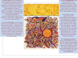
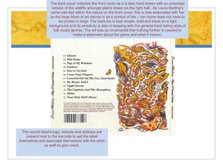
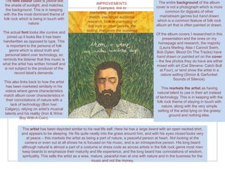
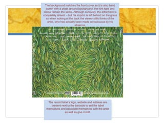
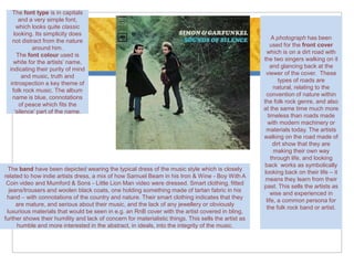
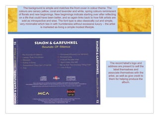
Digipak Research
       Folk Rock
      Hanan Mohamed 5161
About our Digipak
   A Digipak is a book-style fold out paperboard or card outer binding used
    to hold CDs on the inside, the first alternative to jewel case packaging.
    It’s much less likely to crack then jewel cases and allows the
    manufacturer more creativity with the graphics and overall design. The
    panels can range from from 4, to 6, to 8 etc.

   For our chosen track we must create a Digipak to market the band – this
    will be done using skills of editing, software e.g. Photoshop, photography
    and design skills. In researching digipaks however it was difficult to find
    recent examples as folk rock is a genre that was explored much more by
    artists a couple of decades ago than the present day and full digipaks
    are relatively new and more common in the more popular genres e.g.
    pop, hip hop, RnB etc. Even though album covers front covers are easily
    found, the inside and back covers are not always available. To the best
    of my ability I have researched five different bands’ albums front and
    back covers and analysed them in the following slides.

   The bands and artists I have used are: Cat Stevens, Laura Marling, Bon
    Iver, Mumford & Sons, and Simon & Garfunkel.
The font colour used is orange-red          The entire background of the
 which matches the myriad of colours               album cover is not a
    of the things drawn around the              photograph which is more
background. matches the background.           common for digipaks of other
 Her name is printed within a flower.         mainstream genres but hand
     The background consists of                 drawn which is a common
 butterflies, snake on a plant, smiley        feature of folk rock album art
face sun, mushroom, a crocodile, bug         that is often painted or drawn.
 and overall wildlife amongst flowers
        and plants all painted in                 Of the album covers I
  blue, red, yellow and orange. This                 researched in this
makes for a very bright, colorful album       presentation and the ones on
     cover which draws attention.             my homepage and research,
                                               the majority (Laura Marling:
  The actual font type is very curly at         Alas I Cannot Swim, Bob
the ends and matches the curly inside         Dylan: Blood On The Tracks)
strands of the flower – it looks like her     have hand drawn or painted
  name has grown into the flower, her           art on the cover – the few
 identity is tied up within it and nature.   photos they do have are either
This is is consistent with the theme of       mixed with art (Cat Stevens:
  folk genre which usually markets the         Catch Bull at Four), or tend
   artist as being a part of nature (see        show the artist in a nature
     cover Iron & Wine: Our Endless            setting (Simon & Garfunkel:
             Numbered Days).                        Sounds of Silence).

                                               This markets the artist as
                                              having natural talent to use in
                                             their art instead of technology.
                                             This is in keeping with the folk
                                             rock theme of staying in touch
                                               with nature, along with the
                                             very simple setting of the artist
                                               lying on the grassy ground
                                                    and nothing else.
The back cover matches the front cover as it is also hand drawn with an extended
                   version of the wildlife amongst plants drawn on the right half. As Laura Marling’s
                  name was tied within the nature on the front cover, this is now associated with her
                  so the large block of art stands in as a symbol of her – her name does not need to
                        be printed in large. The track list is kept simple, bold and black on a light
                 background and its simplicity is also in keeping with the general track listing style of
                    folk music genres. The art was so ornamental that nothing further is needed to
                                 make a statement about the genre and what it means.


  The record label’s logo, website and address are
    present next to the barcode to sell the label
themselves and associate themselves with the artist
               as well as give credit.
The font colour used is yellow like                                                            The entire background of the album
 the shade of sunlight, and matches                       IMPROVEMENTS:
                                                           Examples, link to                   cover is not a photograph which is more
  the background. This is in keeping                                                                common for digipaks of other
with the the most dominant theme of                  marketing, what audiences
                                                     match, use target audience                  mainstream genres but hand drawn
folk rock which is being in touch with                                                          which is a common feature of folk rock
               nature.                             research, look at marketing of
                                                    folk rock or other genres, the             album art that is often painted or drawn.
The actual font looks like cursive and             selling, the genre the audience
                                                                                               Of the album covers I researched in this
   joined up it looks like it has been                                                             presentation and the ones on my
handwritten as opposed to type. This                                                            homepage and research, the majority
  is important to the persona of folk                                                            (Laura Marling: Alas I Cannot Swim,
    genre which is about truth and                                                             Bob Dylan: Blood On The Tracks) have
 personal talent over technology, so                                                           hand drawn or painted art on the cover
reminds the listener that this music is                                                        – the few photos they do have are either
what the artist has written himself and                                                        mixed with art (Cat Stevens: Catch Bull
 is not subject to the producer of the                                                            at Four), or tend show the artist in a
        record label’s demands.                                                                   nature setting (Simon & Garfunkel:
                                                                                                          Sounds of Silence).
This also links back to how the artist
 has been marketed similarly in his                                                                This markets the artist as having
videos where genre characteristics                                                              natural talent to use in their art instead
match album cover characteristics in                                                           of technology. This is in keeping with the
 their connotations of nature with a                                                            folk rock theme of staying in touch with
    lack of technology (Bon Iver:                                                                  nature, along with the very simple
Calgary), relying on artist’s musical                                                            setting of the artist lying on the grassy
talents and his reality (Iron & Wine:                                                                   ground and nothing else.
          Boy With A Coin).

           The artist has been depicted similar to his real life self. Here he has a large beard with an open necked shirt,
           and appears to be sleeping. He fits quite neatly into the grass around him, and with his eyes closed looks very
              at peace – this markets the artist as being a part of nature, a peaceful person at heart. Not looking at the
             camera or even out at all shows he is focused on his music, and is an introspective person. His long beard
           although natural is almost a part of a costume or dress code as across artists in the folk rock genre most men
           keep beards to emphasize their maturity and life experience, and the long beard has connotations of wisdom,
           spirituality. This sells the artist as a wise, mature, peaceful man at one with nature and in the business for the
                                                          music and not the money.
The background matches the front cover as it is also hand
  drawn with a grass ground background, the font type and
colour remain the same. Although curiously, the artist here is
completely absent – but his imprint is left behind on the grass
  so when looking at the back the viewer stills thinks of the
   artist, who has actually been made conspicuous by his
                           absence.


    The record label’s logo, website and address are
      present next to the barcode to sell the label
  themselves and associate themselves with the artist
                 as well as give credit.
The font type is in capitals
     and a very simple font,
                                                                                                       A photograph has been
    which looks quite classic
                                                                                                      used for the front cover
              looking.
                                                                                                      which looks like a typical
   The font colour used is a
                                                                                                     street, and the focus is on
  simple black on white, which
                                                                                                       the shop on the middle
      is in keeping with the
                                                                                                        which looks like an old
    simplicity of the folk rock
                                                                                                    charity shop, a boutique or a
   genre. Simplicity shows no
                                                                                                        shop that sells vintage
     need for showing off or
                                                                                                    clothing – not any shop that
   glamour, indicates humility
                                                                                                     would be found on the high
  which leads to introspection
                                                                                                    street and does not need to
  which the artists are sold as.
                                                                                                    be flashy with lights and big
                                                                                                     displays to advertise itself.
                                                                                                    Although this cover does not
                                                                                                         reference nature, the
                                                                                                         vintage impression is
                                                                                                       consistent with folk rock
                                                                                                     music being presented in a
                                                                                                      way as having links with
                                                                                                    history and past culture, and
  The band have been depicted wearing the typical dress of the music style which is closely         fashion/dress is a large part
related to how indie artists dress. They are wearing hats, waistcoats, baggy jeans tucked into          of culture – this genre
  boots, long coats and instruments in hand. They look like mannequins in the shop window,           characteristic is also seen
which as mentioned in the analysis of the front cover on the right looks like from another time     within the music video iron &
  period – they are the band in the shop window, they have become the product and you can               Wine: Boy With A Coin
  buy them. Their instruments being forefront even before them shows the music is the most            where the dancers are all
  important part. Under their hats they all have long floppy hair and stubble. Although not the       dressed in a very classic
     typical long beard of many other male artists in the folk rock genre, there is still stubble   style of dress with even their
indicating their maturity and the facial hair symbolizes their masculinity and maturity, perhaps    make up and in a traditional
  indicating they will grow it into a beard – they’re young and new artists but their experience            seeming dance.
  and music is growing along with themselves as person. Again this sells the artist as looking
 into the deeper meanings of life, and very much about the music although this impression is
    slightly juxtaposed by their becoming the product in the window the aesthete of what the
                                        customer wants to be.
The background is even simpler than the front and focuses on one window, which
  matches the shop window on the front cover, on a blank white wall. The colour
 scheme is all white and glass, very simplistic once again and the band are absent
   from the back cover – but the window has been left slightly open, and with the
track titles printed underneath shows that by listening to this album you have been
   let into the band’s collective mind. This references the genre which is there for
introspection and usually has descriptive lyrics of significant events as opposed to
          a clubber tune with three words being repeated to a repetitive tune.


                                                                                               The record label’s
                                                                                       logo, website and address are
                                                                                            present to sell the label
                                                                                          themselves and associate
                                                                                        themselves with the artist, as
                                                                                        well as give credit to them for
                                                                                         helping produce the album.
The font colour used is yellow like the shade of sunlight, on white for the album title and the artist name on a
           rocky textured background. This is in keeping with the the most dominant theme of folk rock which is being in
                                                        touch with nature.

         The font type is in capitals and a very simple font, which looks quite classic looking. Simplicity shows no need for
                showing off or glamour, indicates humility which leads to introspection which the artists are sold as.


The entire background of the album cover is not a photograph which is more common for digipaks of other mainstream genres but
  hand drawn which is a common feature of folk rock album art that is often painted or drawn. E.g. Laura Marling: Alas I Cannot
                                           Swim, Bob Dylan: Blood On The Tracks)

The art also tends to be of nature or animals and wildlife: here within a yellow circle there is a little boy who looks like a monk holding
  the snout of a bull. The bull signifies rage and for a little boy so young to have achieved the status of a monk’s inner peacefulness
 and enlightenment to the extent that he has by himself calmed a wild animal speaks volumes about his capacity for peace. The boy
 could be taken to represent the artist and the bull the artist’s inner demons which appear to have been defeated. The boy could be
  taken to represent the artist and the bull the artist’s inner demons which appear to have been defeated. Like the Mumford & Sons:
Sigh No More album, once again the customer is presented with a window. We are on the outside looking into the artist’s mind, they
  offer us a glimpse of their soul and this markets the artist as being peaceful, moral, reflective and introspective which artists are
                                                 usually sold as within the folk rock genre.
The background matches the front cover as it is also fairly                     The record label’s logo, printed name and address
  plain with black print on a white background apart from the                         are present to sell the label themselves and
artist shown on the right. Interestingly although the band/artist                 associate themselves with the artist as well as give
  if shown is usually on the front if not both sides, here they                               credit for producing the album.
have chosen to show him only on the back cover – this shows                       Even the track titles usually have something to do
that the music and his personal connection and feelings in the                   with spirituality, love or nature: ‘moon’, ‘star’, ‘angels’,
 songs take precedence over the glamour of him as an artist,                        ‘sea’, ‘sunlight’, ‘sweet scarlet’ and ‘ruins’ which
                          or a rock star.                                          reminds us of the ruins of history civilizations and
                                                                                   places, all of which are popular topics for the folk
                                                                                                      rock music genre..


  The artist has been depicted typical of folk rock artists. Here he has a fair sized beard with a deep open necked shirt, and has a
   cigarette in one hand. He’s staring straight at the camera and consequently straight at us, looking happy with a smile and fairly
relaxed in a casual stance with long curly hair under his hat. He looks peaceful, marketing the artist as a peaceful person at heart.
His beard like other folk rock artists emphasizes his maturity and life experience. This sells the artist as a mature, peaceful man also
                                              indicated by the pleasant smile on his face.
The font type is in capitals
      and a very simple font,
     which looks quite classic
    looking. Its simplicity does
                                                                                                          A photograph has been
   not distract from the nature
                                                                                                         used for the front cover
            around him.
                                                                                                       which is on a dirt road with
     The font colour used is
                                                                                                      the two singers walking on it
    white for the artists’ name,
                                                                                                         and glancing back at the
  indicating their purity of mind
                                                                                                       viewer of the cover. These
        and music, truth and
                                                                                                             types of roads are
  introspection a key theme of
                                                                                                           natural, relating to the
   folk rock music. The album
                                                                                                       convention of nature within
   name is blue, connotations
                                                                                                      the folk rock genre, and also
      of peace which fits the
                                                                                                      at the same time much more
    ‘silence’ part of the name.
                                                                                                        timeless than roads made
                                                                                                        with modern machinery or
                                                                                                       materials today. The artists
                                                                                                      walking on the road made of
                                                                                                           dirt show that they are
                                                                                                           making their own way
                                                                                                          through life, and looking
                                                                                                       back works as symbolically
 The band have been depicted wearing the typical dress of the music style which is closely
                                                                                                      looking back on their life – it
related to how indie artists dress, a mix of how Samuel Beam in his Iron & Wine - Boy With A
                                                                                                       means they learn from their
 Coin video and Mumford & Sons - Little Lion Man video were dressed. Smart clothing, fitted
                                                                                                      past. This sells the artists as
  jeans/trousers and woolen black coats, one holding something made of tartan fabric in his
                                                                                                         wise and experienced in
 hand – with connotations of the country and nature. Their smart clothing indicates that they
                                                                                                       life, a common persona for
     are mature, and serious about their music, and the lack of any jewellery or obviously
                                                                                                       the folk rock band or artist.
 luxurious materials that would be seen in e.g. an RnB cover with the artist covered in bling,
further shows their humility and lack of concern for materialistic things. This sells the artist as
     humble and more interested in the abstract, in ideals, into the integrity of the music.
The background is simple and matches the front cover in colour theme. The
colours are canary yellow, coral and lavender and white, spring colours reminiscent
of florals and new beginnings. New beginnings indicate starting over after reflecting
on a life that could have been better, and so again links back to how folk artists are
   sold as introspective and wise. The font type is also classically cut and simple,
 very minimalist which ties in with humbleness without excessive luxury – the artist
                    is marketed as living a simple modest lifestyle.


                                                                                 The record label’s logo and
                                                                               address are present to sell the
                                                                                    label themselves and
                                                                               associate themselves with the
                                                                               artist, as well as give credit to
                                                                                them for helping produce the
                                                                                            album.

Digipak research last

  • 1.
    Digipak Research Folk Rock Hanan Mohamed 5161
  • 2.
    About our Digipak  A Digipak is a book-style fold out paperboard or card outer binding used to hold CDs on the inside, the first alternative to jewel case packaging. It’s much less likely to crack then jewel cases and allows the manufacturer more creativity with the graphics and overall design. The panels can range from from 4, to 6, to 8 etc.  For our chosen track we must create a Digipak to market the band – this will be done using skills of editing, software e.g. Photoshop, photography and design skills. In researching digipaks however it was difficult to find recent examples as folk rock is a genre that was explored much more by artists a couple of decades ago than the present day and full digipaks are relatively new and more common in the more popular genres e.g. pop, hip hop, RnB etc. Even though album covers front covers are easily found, the inside and back covers are not always available. To the best of my ability I have researched five different bands’ albums front and back covers and analysed them in the following slides.  The bands and artists I have used are: Cat Stevens, Laura Marling, Bon Iver, Mumford & Sons, and Simon & Garfunkel.
  • 3.
    The font colourused is orange-red The entire background of the which matches the myriad of colours album cover is not a of the things drawn around the photograph which is more background. matches the background. common for digipaks of other Her name is printed within a flower. mainstream genres but hand The background consists of drawn which is a common butterflies, snake on a plant, smiley feature of folk rock album art face sun, mushroom, a crocodile, bug that is often painted or drawn. and overall wildlife amongst flowers and plants all painted in Of the album covers I blue, red, yellow and orange. This researched in this makes for a very bright, colorful album presentation and the ones on cover which draws attention. my homepage and research, the majority (Laura Marling: The actual font type is very curly at Alas I Cannot Swim, Bob the ends and matches the curly inside Dylan: Blood On The Tracks) strands of the flower – it looks like her have hand drawn or painted name has grown into the flower, her art on the cover – the few identity is tied up within it and nature. photos they do have are either This is is consistent with the theme of mixed with art (Cat Stevens: folk genre which usually markets the Catch Bull at Four), or tend artist as being a part of nature (see show the artist in a nature cover Iron & Wine: Our Endless setting (Simon & Garfunkel: Numbered Days). Sounds of Silence). This markets the artist as having natural talent to use in their art instead of technology. This is in keeping with the folk rock theme of staying in touch with nature, along with the very simple setting of the artist lying on the grassy ground and nothing else.
  • 4.
    The back covermatches the front cover as it is also hand drawn with an extended version of the wildlife amongst plants drawn on the right half. As Laura Marling’s name was tied within the nature on the front cover, this is now associated with her so the large block of art stands in as a symbol of her – her name does not need to be printed in large. The track list is kept simple, bold and black on a light background and its simplicity is also in keeping with the general track listing style of folk music genres. The art was so ornamental that nothing further is needed to make a statement about the genre and what it means. The record label’s logo, website and address are present next to the barcode to sell the label themselves and associate themselves with the artist as well as give credit.
  • 5.
    The font colourused is yellow like The entire background of the album the shade of sunlight, and matches IMPROVEMENTS: Examples, link to cover is not a photograph which is more the background. This is in keeping common for digipaks of other with the the most dominant theme of marketing, what audiences match, use target audience mainstream genres but hand drawn folk rock which is being in touch with which is a common feature of folk rock nature. research, look at marketing of folk rock or other genres, the album art that is often painted or drawn. The actual font looks like cursive and selling, the genre the audience Of the album covers I researched in this joined up it looks like it has been presentation and the ones on my handwritten as opposed to type. This homepage and research, the majority is important to the persona of folk (Laura Marling: Alas I Cannot Swim, genre which is about truth and Bob Dylan: Blood On The Tracks) have personal talent over technology, so hand drawn or painted art on the cover reminds the listener that this music is – the few photos they do have are either what the artist has written himself and mixed with art (Cat Stevens: Catch Bull is not subject to the producer of the at Four), or tend show the artist in a record label’s demands. nature setting (Simon & Garfunkel: Sounds of Silence). This also links back to how the artist has been marketed similarly in his This markets the artist as having videos where genre characteristics natural talent to use in their art instead match album cover characteristics in of technology. This is in keeping with the their connotations of nature with a folk rock theme of staying in touch with lack of technology (Bon Iver: nature, along with the very simple Calgary), relying on artist’s musical setting of the artist lying on the grassy talents and his reality (Iron & Wine: ground and nothing else. Boy With A Coin). The artist has been depicted similar to his real life self. Here he has a large beard with an open necked shirt, and appears to be sleeping. He fits quite neatly into the grass around him, and with his eyes closed looks very at peace – this markets the artist as being a part of nature, a peaceful person at heart. Not looking at the camera or even out at all shows he is focused on his music, and is an introspective person. His long beard although natural is almost a part of a costume or dress code as across artists in the folk rock genre most men keep beards to emphasize their maturity and life experience, and the long beard has connotations of wisdom, spirituality. This sells the artist as a wise, mature, peaceful man at one with nature and in the business for the music and not the money.
  • 6.
    The background matchesthe front cover as it is also hand drawn with a grass ground background, the font type and colour remain the same. Although curiously, the artist here is completely absent – but his imprint is left behind on the grass so when looking at the back the viewer stills thinks of the artist, who has actually been made conspicuous by his absence. The record label’s logo, website and address are present next to the barcode to sell the label themselves and associate themselves with the artist as well as give credit.
  • 7.
    The font typeis in capitals and a very simple font, A photograph has been which looks quite classic used for the front cover looking. which looks like a typical The font colour used is a street, and the focus is on simple black on white, which the shop on the middle is in keeping with the which looks like an old simplicity of the folk rock charity shop, a boutique or a genre. Simplicity shows no shop that sells vintage need for showing off or clothing – not any shop that glamour, indicates humility would be found on the high which leads to introspection street and does not need to which the artists are sold as. be flashy with lights and big displays to advertise itself. Although this cover does not reference nature, the vintage impression is consistent with folk rock music being presented in a way as having links with history and past culture, and The band have been depicted wearing the typical dress of the music style which is closely fashion/dress is a large part related to how indie artists dress. They are wearing hats, waistcoats, baggy jeans tucked into of culture – this genre boots, long coats and instruments in hand. They look like mannequins in the shop window, characteristic is also seen which as mentioned in the analysis of the front cover on the right looks like from another time within the music video iron & period – they are the band in the shop window, they have become the product and you can Wine: Boy With A Coin buy them. Their instruments being forefront even before them shows the music is the most where the dancers are all important part. Under their hats they all have long floppy hair and stubble. Although not the dressed in a very classic typical long beard of many other male artists in the folk rock genre, there is still stubble style of dress with even their indicating their maturity and the facial hair symbolizes their masculinity and maturity, perhaps make up and in a traditional indicating they will grow it into a beard – they’re young and new artists but their experience seeming dance. and music is growing along with themselves as person. Again this sells the artist as looking into the deeper meanings of life, and very much about the music although this impression is slightly juxtaposed by their becoming the product in the window the aesthete of what the customer wants to be.
  • 8.
    The background iseven simpler than the front and focuses on one window, which matches the shop window on the front cover, on a blank white wall. The colour scheme is all white and glass, very simplistic once again and the band are absent from the back cover – but the window has been left slightly open, and with the track titles printed underneath shows that by listening to this album you have been let into the band’s collective mind. This references the genre which is there for introspection and usually has descriptive lyrics of significant events as opposed to a clubber tune with three words being repeated to a repetitive tune. The record label’s logo, website and address are present to sell the label themselves and associate themselves with the artist, as well as give credit to them for helping produce the album.
  • 9.
    The font colourused is yellow like the shade of sunlight, on white for the album title and the artist name on a rocky textured background. This is in keeping with the the most dominant theme of folk rock which is being in touch with nature. The font type is in capitals and a very simple font, which looks quite classic looking. Simplicity shows no need for showing off or glamour, indicates humility which leads to introspection which the artists are sold as. The entire background of the album cover is not a photograph which is more common for digipaks of other mainstream genres but hand drawn which is a common feature of folk rock album art that is often painted or drawn. E.g. Laura Marling: Alas I Cannot Swim, Bob Dylan: Blood On The Tracks) The art also tends to be of nature or animals and wildlife: here within a yellow circle there is a little boy who looks like a monk holding the snout of a bull. The bull signifies rage and for a little boy so young to have achieved the status of a monk’s inner peacefulness and enlightenment to the extent that he has by himself calmed a wild animal speaks volumes about his capacity for peace. The boy could be taken to represent the artist and the bull the artist’s inner demons which appear to have been defeated. The boy could be taken to represent the artist and the bull the artist’s inner demons which appear to have been defeated. Like the Mumford & Sons: Sigh No More album, once again the customer is presented with a window. We are on the outside looking into the artist’s mind, they offer us a glimpse of their soul and this markets the artist as being peaceful, moral, reflective and introspective which artists are usually sold as within the folk rock genre.
  • 10.
    The background matchesthe front cover as it is also fairly The record label’s logo, printed name and address plain with black print on a white background apart from the are present to sell the label themselves and artist shown on the right. Interestingly although the band/artist associate themselves with the artist as well as give if shown is usually on the front if not both sides, here they credit for producing the album. have chosen to show him only on the back cover – this shows Even the track titles usually have something to do that the music and his personal connection and feelings in the with spirituality, love or nature: ‘moon’, ‘star’, ‘angels’, songs take precedence over the glamour of him as an artist, ‘sea’, ‘sunlight’, ‘sweet scarlet’ and ‘ruins’ which or a rock star. reminds us of the ruins of history civilizations and places, all of which are popular topics for the folk rock music genre.. The artist has been depicted typical of folk rock artists. Here he has a fair sized beard with a deep open necked shirt, and has a cigarette in one hand. He’s staring straight at the camera and consequently straight at us, looking happy with a smile and fairly relaxed in a casual stance with long curly hair under his hat. He looks peaceful, marketing the artist as a peaceful person at heart. His beard like other folk rock artists emphasizes his maturity and life experience. This sells the artist as a mature, peaceful man also indicated by the pleasant smile on his face.
  • 11.
    The font typeis in capitals and a very simple font, which looks quite classic looking. Its simplicity does A photograph has been not distract from the nature used for the front cover around him. which is on a dirt road with The font colour used is the two singers walking on it white for the artists’ name, and glancing back at the indicating their purity of mind viewer of the cover. These and music, truth and types of roads are introspection a key theme of natural, relating to the folk rock music. The album convention of nature within name is blue, connotations the folk rock genre, and also of peace which fits the at the same time much more ‘silence’ part of the name. timeless than roads made with modern machinery or materials today. The artists walking on the road made of dirt show that they are making their own way through life, and looking back works as symbolically The band have been depicted wearing the typical dress of the music style which is closely looking back on their life – it related to how indie artists dress, a mix of how Samuel Beam in his Iron & Wine - Boy With A means they learn from their Coin video and Mumford & Sons - Little Lion Man video were dressed. Smart clothing, fitted past. This sells the artists as jeans/trousers and woolen black coats, one holding something made of tartan fabric in his wise and experienced in hand – with connotations of the country and nature. Their smart clothing indicates that they life, a common persona for are mature, and serious about their music, and the lack of any jewellery or obviously the folk rock band or artist. luxurious materials that would be seen in e.g. an RnB cover with the artist covered in bling, further shows their humility and lack of concern for materialistic things. This sells the artist as humble and more interested in the abstract, in ideals, into the integrity of the music.
  • 12.
    The background issimple and matches the front cover in colour theme. The colours are canary yellow, coral and lavender and white, spring colours reminiscent of florals and new beginnings. New beginnings indicate starting over after reflecting on a life that could have been better, and so again links back to how folk artists are sold as introspective and wise. The font type is also classically cut and simple, very minimalist which ties in with humbleness without excessive luxury – the artist is marketed as living a simple modest lifestyle. The record label’s logo and address are present to sell the label themselves and associate themselves with the artist, as well as give credit to them for helping produce the album.