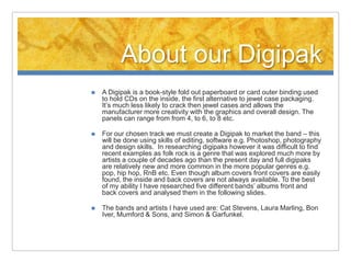
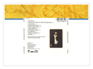
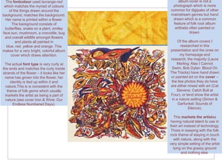
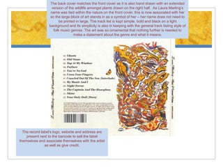
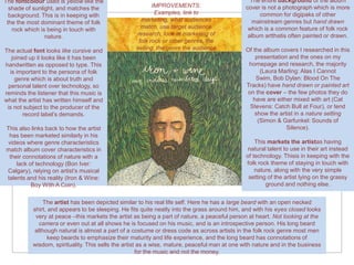
This document provides details about researching and analyzing Digipak album covers for a folk rock band. It summarizes the key findings from analyzing covers of 5 folk rock artists:
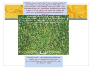
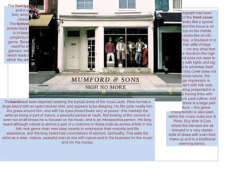
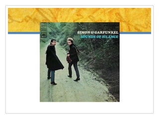
- Most of the album covers had hand-drawn or painted art rather than photographs, which markets the artist as having natural talent rather than relying on technology.
- The artwork often depicted the artist in a natural setting or incorporated natural elements to emphasize the folk rock theme of being connected to nature.
- Common design elements across the covers included simple fonts and layouts, handwritten text, and artwork that tied the artist's identity to nature. These elements sell the artist as introspective, mature, and focused on the music rather than