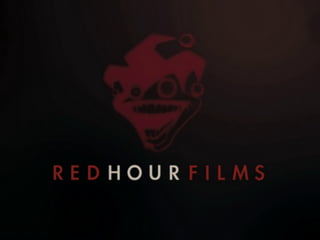
The document discusses the development of a logo for a horror film production company. It describes two attempts to create a logo using the LiveType program. The first attempt used a gothic font in purple but the color needed changing to red. The second attempt incorporated lessons learned and matched the font style to the film titles for continuity. The document also analyzes the effective logo of Hammer Films, known for horror films, which uses uppercase letters filled with monster characters that wipe to a blood-red color, creating association and symbolism.

