SlideShare a Scribd company logo
Planning of overall brand identity I want to achieve
Brand
identity
The brand identity I plan to achieve
through these elements (typography,
colour scheme, and mode of address)
is to create a mysterious, sinister
identity.
In order to achieve this, I must
ensure the aesthetics (overall
house of style) of the film logo
in terms of use of typography,
colour palette must connote
these ideas in order to give this
impression towards the targeted
audience.
A
successful
brand
identity
means
Memorable
Conventional for the genre in order for it to be effective.
Each product I produce, (ancillary products, and
film trailer must follow the house of style I
create, in order to create a brand identity that is
recognisable for my targeted audience).
The main colour scheme I want
to implement onto my products.
The use of reds, dark grey and
blacks associate with the idea of
sinister and connote the idea of
evil.
This will help me to successfully
achieve the brand identity I want
to use for my overall products.
This will help my products overall
successful as it meets the
expectations of my targeted
audience, and what they want to
see.
Due to this it will help towards
attracting and appealing my
targeted audience, as it creates a
terrifying, horrific feeling. My plans
also follow the conventions in
terms of psychological horror
contributing into making it
effective overall.
DRAFT LAYOUTS – PLANNING FONTS FILM POSTER
Typography planning
- Font styles
Film poster
Film magazine
cover
I will be finding a wide range of font styles that must follow the conventions of my
genre, psychological horror and the conventions of form for both the film poster
and the film magazine cover.
Conventions of text in film poster I must follow:
FILM LOGO
The film logo is part of the bran identity of the film, through the fonts I must create my own house of style in
terms of colour palette and font style, that follow the conventions of my genre.
My film name for now is – Safe
I will follow the serif font style, consistently as it is follows horror genre conventions, and the overall typography
Differences allowing me to create a brand identity for my film.
These are the main colours I am planning to incorporate into
my ancillary products in terms of mise-en scene – lighting. The
typography for the film logo must follow these colours in order
to create a brand identity for my film and ensure my products
link.
The font styles I have chosen meet to the expectations of my
targeted audience as in terms of colours it is what they expect
to see.
In addition the rough serif writing connotes the sense of
danger and therefore meets the expectations of my targeted
audience and the terrifying effect that my film logo creates
will contribute to making my ancillary products and film trailer
overall successful as it is what my target audience said they
would be intrigued, attracted and appealed by seeing the use
of these conventions.
The film logo will be the largest in
font size and will be placed on the
dominant area (primal optical area
of the page) and as I come to
develop my typographical design, I
will undertaking an audience
interview / questionnaire to receive
their response and evaluate the
strengths and weaknesses (likes and
dislikes) and through this I will
benchmark from my current plans
of font style in order to further
appeal and attract to my targeted
audience.
AUDIENCE FEEDBACK ON PLANNING OF TYPOGRAPHY.
- please feedback on my current plans of use of typography for my film
logo.
I love the 4th one from
the top, it really makes
me feel creped out and I
feel like the colour red
will be most helpful in
scaring your audience.
I prefer the bottom row
because it’s unusual and
scary, it doesn’t look like
you’re trying to copy from
anyone, it’s original, I also
like the colour red more.
I like the ones on the
bottom better, they’re good
so far and they achieve the
scary look you would want,
and it looks like it would be
something my friends and I
would obsesses over.
I love the bottom
one and prefer it
in bright red, it’s
really attracting.
I like the bottom row
however I think you
should you use
brighter reds cause it’s
very eye-catching.
My targeted audience overall like this use of font style
for the film logo along with the brightly red colour, as
they feel this would be more attractive and appealing to
them because it creates a sinister feeling and connotes
the sense of danger (which is what I want my brand
identity to be) in which my targeted audience expects,
which is what I need to meet in order to make my film
successful.
A strength of this use of font style is that it differentiates
however still follows the conventions of genre which will
be effective in creating a brand identity for my film, and
allows it to be more memorable for them which makes it
easier for them to identify the film when looking at my
ancillary products as they need to all link together (in
house of style) in order to create the brand identity.
BASED UPON MY TARGETED AUDIENCE FEEDBACK
Strengths Weakness To improve on
• Based upon the feedback that I have obtained, I
have to improve on the shades of colours I will
use, e.g. the red to mimic the appearance of
blood more.
• Not having many weaknesses
will limit my improvements,
make it harder for me to achieve
a much more appealing and
attracting overall more
successful.
TYPOGRAPHY PLANS FOR INTERTITLES, COVERLINES AND TEXT FOR ALL MY PRODUCTS.
1.) Use of sanserif font is conventional for the psychological horror
genre, the font’s design that appears to mimic graffiti connotes the idea
of danger because graffiti are usually banned and risky, relating to the
narrative of my film. This captures the attention of my targeted
audience meets their expectations and further appeals to them. The
font overall creates the dangerous, mysterious brand identity I would
want to establish for my film.
2.) This again has the use of sanserif styled font in which is reminiscent of graffiti however
this design includes drips to extend some letter in which connotes the idea of blood, and
generates a feeling of violence and mystery which relates to the brand identity I aim to
create through the use of typography as it will relate much to the narrative of my film,
this will further appeal and attract my target group as this is what they expect and appeal
to.
3.) This serif font style too connotes the idea of
violence, the “messy” aesthetics of the design will
create the brand identity that I want to generate
for my film, thus further appealing to my targeted
audience as this will meet their expectations and
what they want to see.
4.) This serif font style has aesthetical features such as religious cross like ‘t’ which connotes
the idea of belief and faith however the sharply curved letters generates the feeling that it
relates to something sinister. This will capture the attention of my targeted audience and
make them feel as though they are put on edge / captivate their interest during the film
trailer. It creates the brand identity that I want which is the idea of mystery and sinister. This is
what my targeted audience expect to see therefore will further appeal to them through this,
helping towards creating a successful film trailer and ancillary products.
5.) The emboldened and block capitals of this sanserif style font generates hype when it will be
used as the intertitle fonts for my film trailer, as it creates the sense that the text is almost
shouting at my targeted audience thus, captivating their attention and interest through the trailer.
This font also creates a terrifying brand identity which is what my audience expect thus further
attracting and appealing to them.
6.) This sanserif style font has more of a modern –
Victorian inspired aesthetic to it, it connotes the idea
of mystery which makes my targeted audience feel at
edge and captivates their interest through out the
trailer. It creates the brand identity of mystery which
relates to the narrative of my film, and will further
appeal to my targeted audience as it meets their
expectations and what they wanted.
AUDIENCE FEEDBACK ON PLANNING OF
TYPOGRAPHY – INTERTITLES,FILM POSTER AND
COVERLINES
I prefer number 2 as your intertitles
and for a film poster as they will be
more large and bold and attracting
when watching a film trailer however,
the others are less like this would be
more better for a magazine.
I agree the 2nd is better for a film trailer. I
like number 4 for a film poster though and
number 6 for the magazine as its more fit
for purpose and is more effective.
I don’t really like the others styles apart from
font 2, 4 and 6 I find them more appealing.
The first one is better to
be in the trailer however
number 6 is good for
either the poster of
magazine.
All of them meet my expectations of
what I should see for a typical horror
film however I do find 2, 4 and 6
more appealing just because it’s not
cringe.
I like them all however, 2 4
and 6 is more eye-catching I
feel.
BASED UPON MY TARGETD AUDIENCE FEEDBACK
STRENGTHS WEAKNESSES
• It will be hard to decide on what
colour palette to select for these
font styles because my targeted
audience has not commented on
what they would like.
TO IMPROVE:
Identify what my targeted
audience would prefer for
the colour scheme by
undertaking another
interview / using secondary
data from previous
questionnaires and / or
interviews to select a choice
of colours.

More Related Content

What's hot

Evaluation question 1
Evaluation question 1 Evaluation question 1
Evaluation question 1
Jasmine Changnai
 
Media Evaluation
Media EvaluationMedia Evaluation
Media Evaluation
callumsands
 
Summary of ancillary products findings
Summary of ancillary products findingsSummary of ancillary products findings
Summary of ancillary products findings
jphibbert
 
4. pre production(1)
4. pre production(1)4. pre production(1)
4. pre production(1)
AdamLepard
 
Digital media production
Digital media production Digital media production
Digital media production
19001069
 
A2 evaluation
A2 evaluationA2 evaluation
A2 evaluation
katyward26
 
Question 1 poster section
Question 1  poster section Question 1  poster section
Question 1 poster section
etaylorchs
 
Codes and Conventions Evaluation Question
Codes and Conventions Evaluation QuestionCodes and Conventions Evaluation Question
Codes and Conventions Evaluation Question
anitahasani123
 
A2 media evaluation
A2 media evaluationA2 media evaluation
A2 media evaluation
Benoit1997
 
In what ways does your media product use
In what ways does your media product useIn what ways does your media product use
In what ways does your media product use
etaylorchs
 
Media studies a2 coursework the evaluation
Media studies a2 coursework  the evaluationMedia studies a2 coursework  the evaluation
Media studies a2 coursework the evaluation
D Banger
 
FoS evaluation
FoS evaluationFoS evaluation
FoS evaluation
JammyJamieXD
 
Film poster
Film posterFilm poster
Film poster
bharperchs
 
Film mag analysis 2
Film mag analysis 2Film mag analysis 2
Film mag analysis 2
Jake Shelvey
 
Learning Aim A
Learning Aim ALearning Aim A
Learning Aim A
DeaconFletcher
 
Question 1- Trailer
Question 1- Trailer Question 1- Trailer
Question 1- Trailer
etaylorchs
 
A2 Evaluation- 'Beneath the Cracks'
A2 Evaluation- 'Beneath the Cracks'A2 Evaluation- 'Beneath the Cracks'
A2 Evaluation- 'Beneath the Cracks'
LilyBridget
 
Media Evaluation
Media EvaluationMedia Evaluation
Media Evaluation
John Wood
 
Lo3
Lo3Lo3
Horror magazine and poster analysis
Horror magazine and poster analysis Horror magazine and poster analysis
Horror magazine and poster analysis
Parveen Kaur
 

What's hot (20)

Evaluation question 1
Evaluation question 1 Evaluation question 1
Evaluation question 1
 
Media Evaluation
Media EvaluationMedia Evaluation
Media Evaluation
 
Summary of ancillary products findings
Summary of ancillary products findingsSummary of ancillary products findings
Summary of ancillary products findings
 
4. pre production(1)
4. pre production(1)4. pre production(1)
4. pre production(1)
 
Digital media production
Digital media production Digital media production
Digital media production
 
A2 evaluation
A2 evaluationA2 evaluation
A2 evaluation
 
Question 1 poster section
Question 1  poster section Question 1  poster section
Question 1 poster section
 
Codes and Conventions Evaluation Question
Codes and Conventions Evaluation QuestionCodes and Conventions Evaluation Question
Codes and Conventions Evaluation Question
 
A2 media evaluation
A2 media evaluationA2 media evaluation
A2 media evaluation
 
In what ways does your media product use
In what ways does your media product useIn what ways does your media product use
In what ways does your media product use
 
Media studies a2 coursework the evaluation
Media studies a2 coursework  the evaluationMedia studies a2 coursework  the evaluation
Media studies a2 coursework the evaluation
 
FoS evaluation
FoS evaluationFoS evaluation
FoS evaluation
 
Film poster
Film posterFilm poster
Film poster
 
Film mag analysis 2
Film mag analysis 2Film mag analysis 2
Film mag analysis 2
 
Learning Aim A
Learning Aim ALearning Aim A
Learning Aim A
 
Question 1- Trailer
Question 1- Trailer Question 1- Trailer
Question 1- Trailer
 
A2 Evaluation- 'Beneath the Cracks'
A2 Evaluation- 'Beneath the Cracks'A2 Evaluation- 'Beneath the Cracks'
A2 Evaluation- 'Beneath the Cracks'
 
Media Evaluation
Media EvaluationMedia Evaluation
Media Evaluation
 
Lo3
Lo3Lo3
Lo3
 
Horror magazine and poster analysis
Horror magazine and poster analysis Horror magazine and poster analysis
Horror magazine and poster analysis
 

Viewers also liked

Animatic feedback
Animatic feedbackAnimatic feedback
Animatic feedback
ClarizhNalzaro
 
Ideas
IdeasIdeas
Step outline
Step outlineStep outline
Step outline
ClarizhNalzaro
 
Shot list
Shot listShot list
Shot list
ClarizhNalzaro
 
Location scouting
Location scoutingLocation scouting
Location scouting
ClarizhNalzaro
 
Production schedule
Production scheduleProduction schedule
Production schedule
ClarizhNalzaro
 
Risk assessment
Risk assessmentRisk assessment
Risk assessment
ClarizhNalzaro
 
Casting
CastingCasting
Final drafting
Final draftingFinal drafting
Final drafting
ClarizhNalzaro
 
Safe - First script draft
Safe - First script draft Safe - First script draft
Safe - First script draft
ClarizhNalzaro
 
Intertitle font planning
Intertitle font planningIntertitle font planning
Intertitle font planning
ClarizhNalzaro
 
Mama
MamaMama
Mama
AmelliaS
 
Evaluation
EvaluationEvaluation
Evaluation
AmelliaS
 
Our Script
Our ScriptOur Script
Our Script
KatieWoodcock1
 
Shot list
Shot listShot list
Shot list
AmelliaS
 
Production Plan For Preliminary Task
Production Plan For Preliminary Task Production Plan For Preliminary Task
Production Plan For Preliminary Task
KatieWoodcock1
 
Audience interview planning
Audience interview planningAudience interview planning
Audience interview planning
ClarizhNalzaro
 
Magazine drafts
Magazine draftsMagazine drafts
Magazine drafts
AmelliaS
 
Audience feedback
Audience feedbackAudience feedback
Audience feedback
CharlieAimee24
 
Production scheldue
Production scheldueProduction scheldue
Production scheldue
AmelliaS
 

Viewers also liked (20)

Animatic feedback
Animatic feedbackAnimatic feedback
Animatic feedback
 
Ideas
IdeasIdeas
Ideas
 
Step outline
Step outlineStep outline
Step outline
 
Shot list
Shot listShot list
Shot list
 
Location scouting
Location scoutingLocation scouting
Location scouting
 
Production schedule
Production scheduleProduction schedule
Production schedule
 
Risk assessment
Risk assessmentRisk assessment
Risk assessment
 
Casting
CastingCasting
Casting
 
Final drafting
Final draftingFinal drafting
Final drafting
 
Safe - First script draft
Safe - First script draft Safe - First script draft
Safe - First script draft
 
Intertitle font planning
Intertitle font planningIntertitle font planning
Intertitle font planning
 
Mama
MamaMama
Mama
 
Evaluation
EvaluationEvaluation
Evaluation
 
Our Script
Our ScriptOur Script
Our Script
 
Shot list
Shot listShot list
Shot list
 
Production Plan For Preliminary Task
Production Plan For Preliminary Task Production Plan For Preliminary Task
Production Plan For Preliminary Task
 
Audience interview planning
Audience interview planningAudience interview planning
Audience interview planning
 
Magazine drafts
Magazine draftsMagazine drafts
Magazine drafts
 
Audience feedback
Audience feedbackAudience feedback
Audience feedback
 
Production scheldue
Production scheldueProduction scheldue
Production scheldue
 

Similar to Draft layouts – planning fonts film poster

Evaluation Question 2
Evaluation Question 2 Evaluation Question 2
Evaluation Question 2
tmillerchs
 
Final evaluation question 2
Final evaluation question 2Final evaluation question 2
Final evaluation question 2
999msvalkyrie
 
How i created a brand identity
How i created a brand identityHow i created a brand identity
How i created a brand identity
Ryan Talmage
 
horror magazine and poster analysis
horror magazine and poster analysis horror magazine and poster analysis
horror magazine and poster analysis
Parveen Kaur
 
Q2) how effective is the combination of
Q2) how effective is the combination ofQ2) how effective is the combination of
Q2) how effective is the combination of
KateSutton04
 
Question 2 - Evaluation
Question 2 - EvaluationQuestion 2 - Evaluation
Question 2 - Evaluation
Sorcha McVeigh
 
Horror poster and magazine analysis
Horror poster and magazine analysis Horror poster and magazine analysis
Horror poster and magazine analysis
Parveen Kaur
 
Horror magazine and poster analysis
Horror magazine and poster analysis Horror magazine and poster analysis
Horror magazine and poster analysis
Parveen Kaur
 
How effective is the combination of your main
How effective is the combination of your mainHow effective is the combination of your main
How effective is the combination of your main
a07achaudhry
 
Final Evaluation
Final EvaluationFinal Evaluation
Final Evaluation
Carla
 
Question 2 evaluation
Question 2  evaluationQuestion 2  evaluation
Question 2 evaluation
Sorcha McVeigh
 
Conventions of form & genre
Conventions of form & genreConventions of form & genre
Conventions of form & genre
Charlotte Bowerman
 
Evaluation Question 2
Evaluation Question 2 Evaluation Question 2
Evaluation Question 2
Rikhel98
 
Audience feedback summary fonts
Audience feedback summary   fontsAudience feedback summary   fonts
Audience feedback summary fonts
chloea2
 
Evaluation
EvaluationEvaluation
Evaluation
sammijolowe
 
Rationale.pptx - B2 creative progression.pptx
Rationale.pptx - B2 creative progression.pptxRationale.pptx - B2 creative progression.pptx
Rationale.pptx - B2 creative progression.pptx
JCKMRE
 
Brand identity
Brand identityBrand identity
Brand identity
seaton-k-4
 
Question 2
Question 2Question 2
Question 2
Messitupgirl
 
A2 Media Evlauation Question 2
A2 Media Evlauation Question 2A2 Media Evlauation Question 2
A2 Media Evlauation Question 2
Amos Mukombero
 
Evaluation Question 2
Evaluation Question 2 Evaluation Question 2
Evaluation Question 2
Rikhel98
 

Similar to Draft layouts – planning fonts film poster (20)

Evaluation Question 2
Evaluation Question 2 Evaluation Question 2
Evaluation Question 2
 
Final evaluation question 2
Final evaluation question 2Final evaluation question 2
Final evaluation question 2
 
How i created a brand identity
How i created a brand identityHow i created a brand identity
How i created a brand identity
 
horror magazine and poster analysis
horror magazine and poster analysis horror magazine and poster analysis
horror magazine and poster analysis
 
Q2) how effective is the combination of
Q2) how effective is the combination ofQ2) how effective is the combination of
Q2) how effective is the combination of
 
Question 2 - Evaluation
Question 2 - EvaluationQuestion 2 - Evaluation
Question 2 - Evaluation
 
Horror poster and magazine analysis
Horror poster and magazine analysis Horror poster and magazine analysis
Horror poster and magazine analysis
 
Horror magazine and poster analysis
Horror magazine and poster analysis Horror magazine and poster analysis
Horror magazine and poster analysis
 
How effective is the combination of your main
How effective is the combination of your mainHow effective is the combination of your main
How effective is the combination of your main
 
Final Evaluation
Final EvaluationFinal Evaluation
Final Evaluation
 
Question 2 evaluation
Question 2  evaluationQuestion 2  evaluation
Question 2 evaluation
 
Conventions of form & genre
Conventions of form & genreConventions of form & genre
Conventions of form & genre
 
Evaluation Question 2
Evaluation Question 2 Evaluation Question 2
Evaluation Question 2
 
Audience feedback summary fonts
Audience feedback summary   fontsAudience feedback summary   fonts
Audience feedback summary fonts
 
Evaluation
EvaluationEvaluation
Evaluation
 
Rationale.pptx - B2 creative progression.pptx
Rationale.pptx - B2 creative progression.pptxRationale.pptx - B2 creative progression.pptx
Rationale.pptx - B2 creative progression.pptx
 
Brand identity
Brand identityBrand identity
Brand identity
 
Question 2
Question 2Question 2
Question 2
 
A2 Media Evlauation Question 2
A2 Media Evlauation Question 2A2 Media Evlauation Question 2
A2 Media Evlauation Question 2
 
Evaluation Question 2
Evaluation Question 2 Evaluation Question 2
Evaluation Question 2
 

Recently uploaded

SWOT analysis in the project Keeping the Memory @live.pptx
SWOT analysis in the project Keeping the Memory @live.pptxSWOT analysis in the project Keeping the Memory @live.pptx
SWOT analysis in the project Keeping the Memory @live.pptx
zuzanka
 
Mule event processing models | MuleSoft Mysore Meetup #47
Mule event processing models | MuleSoft Mysore Meetup #47Mule event processing models | MuleSoft Mysore Meetup #47
Mule event processing models | MuleSoft Mysore Meetup #47
MysoreMuleSoftMeetup
 
C1 Rubenstein AP HuG xxxxxxxxxxxxxx.pptx
C1 Rubenstein AP HuG xxxxxxxxxxxxxx.pptxC1 Rubenstein AP HuG xxxxxxxxxxxxxx.pptx
C1 Rubenstein AP HuG xxxxxxxxxxxxxx.pptx
mulvey2
 
Jemison, MacLaughlin, and Majumder "Broadening Pathways for Editors and Authors"
Jemison, MacLaughlin, and Majumder "Broadening Pathways for Editors and Authors"Jemison, MacLaughlin, and Majumder "Broadening Pathways for Editors and Authors"
Jemison, MacLaughlin, and Majumder "Broadening Pathways for Editors and Authors"
National Information Standards Organization (NISO)
 
UGC NET Exam Paper 1- Unit 1:Teaching Aptitude
UGC NET Exam Paper 1- Unit 1:Teaching AptitudeUGC NET Exam Paper 1- Unit 1:Teaching Aptitude
UGC NET Exam Paper 1- Unit 1:Teaching Aptitude
S. Raj Kumar
 
BIOLOGY NATIONAL EXAMINATION COUNCIL (NECO) 2024 PRACTICAL MANUAL.pptx
BIOLOGY NATIONAL EXAMINATION COUNCIL (NECO) 2024 PRACTICAL MANUAL.pptxBIOLOGY NATIONAL EXAMINATION COUNCIL (NECO) 2024 PRACTICAL MANUAL.pptx
BIOLOGY NATIONAL EXAMINATION COUNCIL (NECO) 2024 PRACTICAL MANUAL.pptx
RidwanHassanYusuf
 
Electric Fetus - Record Store Scavenger Hunt
Electric Fetus - Record Store Scavenger HuntElectric Fetus - Record Store Scavenger Hunt
Electric Fetus - Record Store Scavenger Hunt
RamseyBerglund
 
How to deliver Powerpoint Presentations.pptx
How to deliver Powerpoint  Presentations.pptxHow to deliver Powerpoint  Presentations.pptx
How to deliver Powerpoint Presentations.pptx
HajraNaeem15
 
B. Ed Syllabus for babasaheb ambedkar education university.pdf
B. Ed Syllabus for babasaheb ambedkar education university.pdfB. Ed Syllabus for babasaheb ambedkar education university.pdf
B. Ed Syllabus for babasaheb ambedkar education university.pdf
BoudhayanBhattachari
 
A Independência da América Espanhola LAPBOOK.pdf
A Independência da América Espanhola LAPBOOK.pdfA Independência da América Espanhola LAPBOOK.pdf
A Independência da América Espanhola LAPBOOK.pdf
Jean Carlos Nunes Paixão
 
Stack Memory Organization of 8086 Microprocessor
Stack Memory Organization of 8086 MicroprocessorStack Memory Organization of 8086 Microprocessor
Stack Memory Organization of 8086 Microprocessor
JomonJoseph58
 
HYPERTENSION - SLIDE SHARE PRESENTATION.
HYPERTENSION - SLIDE SHARE PRESENTATION.HYPERTENSION - SLIDE SHARE PRESENTATION.
HYPERTENSION - SLIDE SHARE PRESENTATION.
deepaannamalai16
 
Beyond Degrees - Empowering the Workforce in the Context of Skills-First.pptx
Beyond Degrees - Empowering the Workforce in the Context of Skills-First.pptxBeyond Degrees - Empowering the Workforce in the Context of Skills-First.pptx
Beyond Degrees - Empowering the Workforce in the Context of Skills-First.pptx
EduSkills OECD
 
ISO/IEC 27001, ISO/IEC 42001, and GDPR: Best Practices for Implementation and...
ISO/IEC 27001, ISO/IEC 42001, and GDPR: Best Practices for Implementation and...ISO/IEC 27001, ISO/IEC 42001, and GDPR: Best Practices for Implementation and...
ISO/IEC 27001, ISO/IEC 42001, and GDPR: Best Practices for Implementation and...
PECB
 
Temple of Asclepius in Thrace. Excavation results
Temple of Asclepius in Thrace. Excavation resultsTemple of Asclepius in Thrace. Excavation results
Temple of Asclepius in Thrace. Excavation results
Krassimira Luka
 
How to Setup Warehouse & Location in Odoo 17 Inventory
How to Setup Warehouse & Location in Odoo 17 InventoryHow to Setup Warehouse & Location in Odoo 17 Inventory
How to Setup Warehouse & Location in Odoo 17 Inventory
Celine George
 
Présentationvvvvvvvvvvvvvvvvvvvvvvvvvvvv2.pptx
Présentationvvvvvvvvvvvvvvvvvvvvvvvvvvvv2.pptxPrésentationvvvvvvvvvvvvvvvvvvvvvvvvvvvv2.pptx
Présentationvvvvvvvvvvvvvvvvvvvvvvvvvvvv2.pptx
siemaillard
 
Level 3 NCEA - NZ: A Nation In the Making 1872 - 1900 SML.ppt
Level 3 NCEA - NZ: A  Nation In the Making 1872 - 1900 SML.pptLevel 3 NCEA - NZ: A  Nation In the Making 1872 - 1900 SML.ppt
Level 3 NCEA - NZ: A Nation In the Making 1872 - 1900 SML.ppt
Henry Hollis
 
How to Make a Field Mandatory in Odoo 17
How to Make a Field Mandatory in Odoo 17How to Make a Field Mandatory in Odoo 17
How to Make a Field Mandatory in Odoo 17
Celine George
 
writing about opinions about Australia the movie
writing about opinions about Australia the moviewriting about opinions about Australia the movie
writing about opinions about Australia the movie
Nicholas Montgomery
 

Recently uploaded (20)

SWOT analysis in the project Keeping the Memory @live.pptx
SWOT analysis in the project Keeping the Memory @live.pptxSWOT analysis in the project Keeping the Memory @live.pptx
SWOT analysis in the project Keeping the Memory @live.pptx
 
Mule event processing models | MuleSoft Mysore Meetup #47
Mule event processing models | MuleSoft Mysore Meetup #47Mule event processing models | MuleSoft Mysore Meetup #47
Mule event processing models | MuleSoft Mysore Meetup #47
 
C1 Rubenstein AP HuG xxxxxxxxxxxxxx.pptx
C1 Rubenstein AP HuG xxxxxxxxxxxxxx.pptxC1 Rubenstein AP HuG xxxxxxxxxxxxxx.pptx
C1 Rubenstein AP HuG xxxxxxxxxxxxxx.pptx
 
Jemison, MacLaughlin, and Majumder "Broadening Pathways for Editors and Authors"
Jemison, MacLaughlin, and Majumder "Broadening Pathways for Editors and Authors"Jemison, MacLaughlin, and Majumder "Broadening Pathways for Editors and Authors"
Jemison, MacLaughlin, and Majumder "Broadening Pathways for Editors and Authors"
 
UGC NET Exam Paper 1- Unit 1:Teaching Aptitude
UGC NET Exam Paper 1- Unit 1:Teaching AptitudeUGC NET Exam Paper 1- Unit 1:Teaching Aptitude
UGC NET Exam Paper 1- Unit 1:Teaching Aptitude
 
BIOLOGY NATIONAL EXAMINATION COUNCIL (NECO) 2024 PRACTICAL MANUAL.pptx
BIOLOGY NATIONAL EXAMINATION COUNCIL (NECO) 2024 PRACTICAL MANUAL.pptxBIOLOGY NATIONAL EXAMINATION COUNCIL (NECO) 2024 PRACTICAL MANUAL.pptx
BIOLOGY NATIONAL EXAMINATION COUNCIL (NECO) 2024 PRACTICAL MANUAL.pptx
 
Electric Fetus - Record Store Scavenger Hunt
Electric Fetus - Record Store Scavenger HuntElectric Fetus - Record Store Scavenger Hunt
Electric Fetus - Record Store Scavenger Hunt
 
How to deliver Powerpoint Presentations.pptx
How to deliver Powerpoint  Presentations.pptxHow to deliver Powerpoint  Presentations.pptx
How to deliver Powerpoint Presentations.pptx
 
B. Ed Syllabus for babasaheb ambedkar education university.pdf
B. Ed Syllabus for babasaheb ambedkar education university.pdfB. Ed Syllabus for babasaheb ambedkar education university.pdf
B. Ed Syllabus for babasaheb ambedkar education university.pdf
 
A Independência da América Espanhola LAPBOOK.pdf
A Independência da América Espanhola LAPBOOK.pdfA Independência da América Espanhola LAPBOOK.pdf
A Independência da América Espanhola LAPBOOK.pdf
 
Stack Memory Organization of 8086 Microprocessor
Stack Memory Organization of 8086 MicroprocessorStack Memory Organization of 8086 Microprocessor
Stack Memory Organization of 8086 Microprocessor
 
HYPERTENSION - SLIDE SHARE PRESENTATION.
HYPERTENSION - SLIDE SHARE PRESENTATION.HYPERTENSION - SLIDE SHARE PRESENTATION.
HYPERTENSION - SLIDE SHARE PRESENTATION.
 
Beyond Degrees - Empowering the Workforce in the Context of Skills-First.pptx
Beyond Degrees - Empowering the Workforce in the Context of Skills-First.pptxBeyond Degrees - Empowering the Workforce in the Context of Skills-First.pptx
Beyond Degrees - Empowering the Workforce in the Context of Skills-First.pptx
 
ISO/IEC 27001, ISO/IEC 42001, and GDPR: Best Practices for Implementation and...
ISO/IEC 27001, ISO/IEC 42001, and GDPR: Best Practices for Implementation and...ISO/IEC 27001, ISO/IEC 42001, and GDPR: Best Practices for Implementation and...
ISO/IEC 27001, ISO/IEC 42001, and GDPR: Best Practices for Implementation and...
 
Temple of Asclepius in Thrace. Excavation results
Temple of Asclepius in Thrace. Excavation resultsTemple of Asclepius in Thrace. Excavation results
Temple of Asclepius in Thrace. Excavation results
 
How to Setup Warehouse & Location in Odoo 17 Inventory
How to Setup Warehouse & Location in Odoo 17 InventoryHow to Setup Warehouse & Location in Odoo 17 Inventory
How to Setup Warehouse & Location in Odoo 17 Inventory
 
Présentationvvvvvvvvvvvvvvvvvvvvvvvvvvvv2.pptx
Présentationvvvvvvvvvvvvvvvvvvvvvvvvvvvv2.pptxPrésentationvvvvvvvvvvvvvvvvvvvvvvvvvvvv2.pptx
Présentationvvvvvvvvvvvvvvvvvvvvvvvvvvvv2.pptx
 
Level 3 NCEA - NZ: A Nation In the Making 1872 - 1900 SML.ppt
Level 3 NCEA - NZ: A  Nation In the Making 1872 - 1900 SML.pptLevel 3 NCEA - NZ: A  Nation In the Making 1872 - 1900 SML.ppt
Level 3 NCEA - NZ: A Nation In the Making 1872 - 1900 SML.ppt
 
How to Make a Field Mandatory in Odoo 17
How to Make a Field Mandatory in Odoo 17How to Make a Field Mandatory in Odoo 17
How to Make a Field Mandatory in Odoo 17
 
writing about opinions about Australia the movie
writing about opinions about Australia the moviewriting about opinions about Australia the movie
writing about opinions about Australia the movie
 

Draft layouts – planning fonts film poster

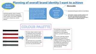
  • 1. Planning of overall brand identity I want to achieve Brand identity The brand identity I plan to achieve through these elements (typography, colour scheme, and mode of address) is to create a mysterious, sinister identity. In order to achieve this, I must ensure the aesthetics (overall house of style) of the film logo in terms of use of typography, colour palette must connote these ideas in order to give this impression towards the targeted audience. A successful brand identity means Memorable Conventional for the genre in order for it to be effective. Each product I produce, (ancillary products, and film trailer must follow the house of style I create, in order to create a brand identity that is recognisable for my targeted audience). The main colour scheme I want to implement onto my products. The use of reds, dark grey and blacks associate with the idea of sinister and connote the idea of evil. This will help me to successfully achieve the brand identity I want to use for my overall products. This will help my products overall successful as it meets the expectations of my targeted audience, and what they want to see. Due to this it will help towards attracting and appealing my targeted audience, as it creates a terrifying, horrific feeling. My plans also follow the conventions in terms of psychological horror contributing into making it effective overall.
  • 2. DRAFT LAYOUTS – PLANNING FONTS FILM POSTER Typography planning - Font styles Film poster Film magazine cover I will be finding a wide range of font styles that must follow the conventions of my genre, psychological horror and the conventions of form for both the film poster and the film magazine cover. Conventions of text in film poster I must follow: FILM LOGO The film logo is part of the bran identity of the film, through the fonts I must create my own house of style in terms of colour palette and font style, that follow the conventions of my genre. My film name for now is – Safe I will follow the serif font style, consistently as it is follows horror genre conventions, and the overall typography Differences allowing me to create a brand identity for my film. These are the main colours I am planning to incorporate into my ancillary products in terms of mise-en scene – lighting. The typography for the film logo must follow these colours in order to create a brand identity for my film and ensure my products link. The font styles I have chosen meet to the expectations of my targeted audience as in terms of colours it is what they expect to see. In addition the rough serif writing connotes the sense of danger and therefore meets the expectations of my targeted audience and the terrifying effect that my film logo creates will contribute to making my ancillary products and film trailer overall successful as it is what my target audience said they would be intrigued, attracted and appealed by seeing the use of these conventions. The film logo will be the largest in font size and will be placed on the dominant area (primal optical area of the page) and as I come to develop my typographical design, I will undertaking an audience interview / questionnaire to receive their response and evaluate the strengths and weaknesses (likes and dislikes) and through this I will benchmark from my current plans of font style in order to further appeal and attract to my targeted audience.
  • 3. AUDIENCE FEEDBACK ON PLANNING OF TYPOGRAPHY. - please feedback on my current plans of use of typography for my film logo. I love the 4th one from the top, it really makes me feel creped out and I feel like the colour red will be most helpful in scaring your audience. I prefer the bottom row because it’s unusual and scary, it doesn’t look like you’re trying to copy from anyone, it’s original, I also like the colour red more. I like the ones on the bottom better, they’re good so far and they achieve the scary look you would want, and it looks like it would be something my friends and I would obsesses over. I love the bottom one and prefer it in bright red, it’s really attracting. I like the bottom row however I think you should you use brighter reds cause it’s very eye-catching. My targeted audience overall like this use of font style for the film logo along with the brightly red colour, as they feel this would be more attractive and appealing to them because it creates a sinister feeling and connotes the sense of danger (which is what I want my brand identity to be) in which my targeted audience expects, which is what I need to meet in order to make my film successful. A strength of this use of font style is that it differentiates however still follows the conventions of genre which will be effective in creating a brand identity for my film, and allows it to be more memorable for them which makes it easier for them to identify the film when looking at my ancillary products as they need to all link together (in house of style) in order to create the brand identity.
  • 4. BASED UPON MY TARGETED AUDIENCE FEEDBACK Strengths Weakness To improve on • Based upon the feedback that I have obtained, I have to improve on the shades of colours I will use, e.g. the red to mimic the appearance of blood more. • Not having many weaknesses will limit my improvements, make it harder for me to achieve a much more appealing and attracting overall more successful.
  • 5. TYPOGRAPHY PLANS FOR INTERTITLES, COVERLINES AND TEXT FOR ALL MY PRODUCTS. 1.) Use of sanserif font is conventional for the psychological horror genre, the font’s design that appears to mimic graffiti connotes the idea of danger because graffiti are usually banned and risky, relating to the narrative of my film. This captures the attention of my targeted audience meets their expectations and further appeals to them. The font overall creates the dangerous, mysterious brand identity I would want to establish for my film. 2.) This again has the use of sanserif styled font in which is reminiscent of graffiti however this design includes drips to extend some letter in which connotes the idea of blood, and generates a feeling of violence and mystery which relates to the brand identity I aim to create through the use of typography as it will relate much to the narrative of my film, this will further appeal and attract my target group as this is what they expect and appeal to. 3.) This serif font style too connotes the idea of violence, the “messy” aesthetics of the design will create the brand identity that I want to generate for my film, thus further appealing to my targeted audience as this will meet their expectations and what they want to see. 4.) This serif font style has aesthetical features such as religious cross like ‘t’ which connotes the idea of belief and faith however the sharply curved letters generates the feeling that it relates to something sinister. This will capture the attention of my targeted audience and make them feel as though they are put on edge / captivate their interest during the film trailer. It creates the brand identity that I want which is the idea of mystery and sinister. This is what my targeted audience expect to see therefore will further appeal to them through this, helping towards creating a successful film trailer and ancillary products. 5.) The emboldened and block capitals of this sanserif style font generates hype when it will be used as the intertitle fonts for my film trailer, as it creates the sense that the text is almost shouting at my targeted audience thus, captivating their attention and interest through the trailer. This font also creates a terrifying brand identity which is what my audience expect thus further attracting and appealing to them. 6.) This sanserif style font has more of a modern – Victorian inspired aesthetic to it, it connotes the idea of mystery which makes my targeted audience feel at edge and captivates their interest through out the trailer. It creates the brand identity of mystery which relates to the narrative of my film, and will further appeal to my targeted audience as it meets their expectations and what they wanted.
  • 6. AUDIENCE FEEDBACK ON PLANNING OF TYPOGRAPHY – INTERTITLES,FILM POSTER AND COVERLINES I prefer number 2 as your intertitles and for a film poster as they will be more large and bold and attracting when watching a film trailer however, the others are less like this would be more better for a magazine. I agree the 2nd is better for a film trailer. I like number 4 for a film poster though and number 6 for the magazine as its more fit for purpose and is more effective. I don’t really like the others styles apart from font 2, 4 and 6 I find them more appealing. The first one is better to be in the trailer however number 6 is good for either the poster of magazine. All of them meet my expectations of what I should see for a typical horror film however I do find 2, 4 and 6 more appealing just because it’s not cringe. I like them all however, 2 4 and 6 is more eye-catching I feel.
  • 7. BASED UPON MY TARGETD AUDIENCE FEEDBACK STRENGTHS WEAKNESSES • It will be hard to decide on what colour palette to select for these font styles because my targeted audience has not commented on what they would like. TO IMPROVE: Identify what my targeted audience would prefer for the colour scheme by undertaking another interview / using secondary data from previous questionnaires and / or interviews to select a choice of colours.