Making communications land - Are they received and understood as intended? we...
Comparative analysis
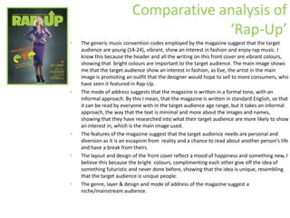
1. Comparative analysis of ‘Rap-Up’ The generic music convention codes employed by the magazine suggest that the target audience are young (14-24), vibrant, show an interest in fashion and enjoy rap music. I know this because the header and all the writing on this front cover are vibrant colours, showing that bright colours are important to the target audience. The main image shows me that the target audience show an interest in fashion, as Eve, the artist in the main image is promoting an outfit that the designer would hope to sell to more consumers, who have seen it featured in Rap-Up. The mode of address suggests that the magazine is written in a formal tone, with an informal approach. By this I mean, that the magazine is written in standard English, so that it can be read by everyone with in the target audience age range, but it takes an informal approach, the way that the text is minimal and more about the images and names, showing that they have researched into what their target audience are more likely to show an interest in, which is the main image used. The features of the magazine suggest that the target audience needs are personal and diversion as it is an escapism from reality and a chance to read about another person’s life and have a break from theirs. The layout and design of the front cover reflect a mood of happiness and something new, I believe this because the bright colours, complimenting each other give off the idea of something futuristic and never done before, showing that the idea is unique, resembling that the target audience is unique people. The genre, layer & design and mode of address of the magazine suggest a niche/mainstream audience.
2. Comparative analysis of ‘RWD’ The generic music convention codes employed by the magazine suggest that the target audience are; young (14-20), most likely to be black, have a certain dress sense, inspired by there idols. IT also shows minimal use in colour, showing that this target audience can reach out to many people of this age who have an interest in the artists ‘Giggs’ as there is no specific colour to him. The mode of address suggests that the magazine is written in an informal manner, but also suggests that it mainly consists of images. I think that it may consist mainly of images because the front cover is an indicator of how the rest of the magazine will be and the front cover has minimal writing and only bold lettering and a large image showing a very young audience who take an interest in the lifestyle of their stars, but not necessarily the ins and outs of every detail of their lives and rely more on images of the artists to tell the story of their idol. The features of the magazine suggest that the target audience needs are personal and diversion as it is an escapism from reality and a chance to read about another person’s life and have a break from theirs. The layout and design of the front cover reflect a mood of youthism and a relaxed atmosphere. I think it reflects youthism as the colour schemes are fairly basic and a plain background with a co-ordinated colour scheme for the clothing and the design of the front cover. It also comes a long relaxed as Giggs is holding a powerful pose, with a wide stance, yet he looks relaxed and approachable in the shot so that the audience feel like he is a genuine person as well as a role model. The genre, layer & design and mode of address of the magazine suggest a niche/mainstream audience.
3. Comparative analysis of ‘Grime Time’ The generic music convention codes employed by the magazine suggest that the target audience are young, (13-26), have a key interest in their looks and how they are seen by other people because of the way they dress. As well as this, I think that the target audience for ‘Grime Time’ are keen supporters of new acts as the front cover states that it is the ‘First interview’ with YMC Money, showing that to become known, he has had local support and from there been branded out to become a known artist. The mode of address suggests that the magazine is written in a formal way with an informal approach. I think it comes across informal because the style of the front cover is very laid out and not busy on the eye, yet there is a lot of writing on the front page, showing that there is likely to be a fair bit of text on the inside of the magazine, hinting an educated and slightly mature audience who take a key interest in this genre. The features of the magazine suggest that the target audience needs are personal and diversion as it is an escapism from reality and a chance to read about another person’s life and have a break from theirs. The layout and design of the front cover reflect a mood of a serious attitude about the industry as well as a kind of misunderstanding about the artist. I think this is reflected in the front cover of Grime Time as ‘YMC Money’s’ face looked quite serious, yet approachable and he is almost covered up, showing that the article could unveil him as an artist to the reader’s. The genre, layer & design and mode of address of the magazine suggest a niche/mainstream audience.