Downloaded 3,385 times


![This is the old Last Concerts website. [http://
www.lastconcerts.com/]](https://image.slidesharecdn.com/casestudyiosdesignhdweb2703-120327044218-phpapp02/85/iOS-design-a-case-study-22-320.jpg)
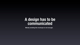
![I generally use this template called Touch
Gesture reference guide to show if there is any
specific movement required on a screen. [http://
www.lukew.com/ff/entry.asp?1071]](https://image.slidesharecdn.com/casestudyiosdesignhdweb2703-120327044218-phpapp02/85/iOS-design-a-case-study-30-320.jpg)
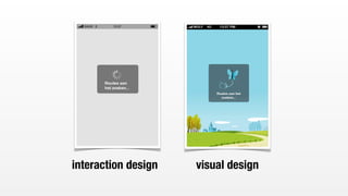
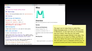
![This is another template (by Teehan+Lax). I don’t
use it personally but I included it here show the
difference between the interaction design and
visual design. A “sketch” style is used here to
show that this part of the design is NOT about
the visual. [http://www.teehanlax.com/blog/ipad-
sketch-elements-ai/]](https://image.slidesharecdn.com/casestudyiosdesignhdweb2703-120327044218-phpapp02/85/iOS-design-a-case-study-31-320.jpg)
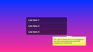
![List item 1
List item 2
List item 3
Here’s my version the grouped table view... you
could say: not much difference? I say - fits right
into iOS! [Download PSD: http://dribbble.com/
shots/233036-iPhone-list-PSD ]](https://image.slidesharecdn.com/casestudyiosdesignhdweb2703-120327044218-phpapp02/85/iOS-design-a-case-study-48-320.jpg)
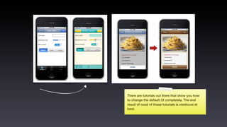
![If what you are building can’t be built with the
default UI elements take a close look at what the
leaders in a particular field are doing e.g.
FourSquare recently decided to switch over to
MapBox for their maps. [http://mapbox.com/]](https://image.slidesharecdn.com/casestudyiosdesignhdweb2703-120327044218-phpapp02/85/iOS-design-a-case-study-51-320.jpg)

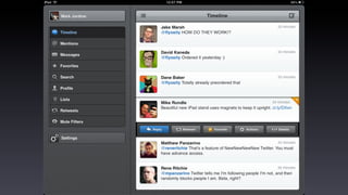
![But if nobody took any UI risk there would not be any
innovation out there, so it depends on what you’re
doing. This screenshot is from Al Gore’s Our Choice, in
my opinion the best e-book there is on iPad,
interaction design-wise that is (then Apple took these
ideas and made iBooks author... that’s life!) [ http://
www.youtube.com/watch?v=U-edAGLokak ]
This was done by Mike Matas, Bret Victor and their
team. Two names you should definitely remember if
you’re into interface design. [http://
www.mikematas.com/] [http://worrydream.com/]](https://image.slidesharecdn.com/casestudyiosdesignhdweb2703-120327044218-phpapp02/85/iOS-design-a-case-study-54-320.jpg)
![The Tapbots guys are famous for their custom
interfaces. Their business is practically based on the
fact that their apps are 100% custom. I love how they
think of power users. [http://tapbots.com/] [http://
tapbots.com/software/tweetbot/ipad/]](https://image.slidesharecdn.com/casestudyiosdesignhdweb2703-120327044218-phpapp02/85/iOS-design-a-case-study-56-320.jpg)
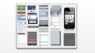
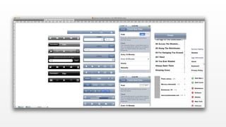
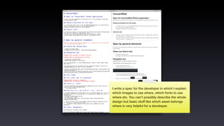
![The Teehan+Lax PSD template is your best friend
when designing for iOS. It’s an almost perfect
representation of Apple’s UI elements in the form
of a PSD. [ http://www.teehanlax.com/blog/
iphone-4-gui-psd-retina-display/ ]](https://image.slidesharecdn.com/casestudyiosdesignhdweb2703-120327044218-phpapp02/85/iOS-design-a-case-study-65-320.jpg)


![Michael Flarup’s template is the best template
out there for designing your app icon. Recently a
new version came out “supporting” the new
iPad. [ http://appicontemplate.com/ ]](https://image.slidesharecdn.com/casestudyiosdesignhdweb2703-120327044218-phpapp02/85/iOS-design-a-case-study-83-320.jpg)
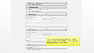
![Some tools to work faster when making assets:
Prepo is a Mac app to easily convert @2x images
to regular sized images (“@1x”). [Prepo: http://
wearemothership.com/work/prepo/]](https://image.slidesharecdn.com/casestudyiosdesignhdweb2703-120327044218-phpapp02/85/iOS-design-a-case-study-88-320.jpg)

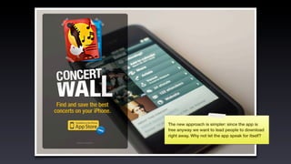
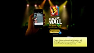
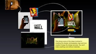

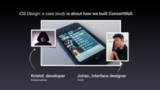
This document outlines a presentation on iOS design, specifically focused on a case study for the Concertwall app, detailing the design process from the initial brief to the final outcome. It discusses wireframing, interaction design, custom versus native UI elements, and best practices for app icon creation and marketing strategies. The author emphasizes the importance of understanding platform standards and provides various resources and templates to aid in effective design communication.