Download as PDF, PPTX


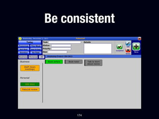
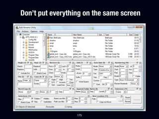
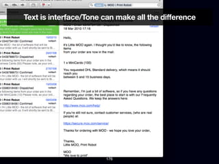


The presentation 'Design for Developers' aims to educate developers on principles of interface design, emphasizing effective design decisions over subjective creativity. It covers key topics like typography, alignment, and practical design rules while challenging the notion that design is solely a visual skill. The speaker, Johan Wolf, shares insights from his freelance design practice to help developers create user-friendly products without needing advanced design tools.


