Download to read offline
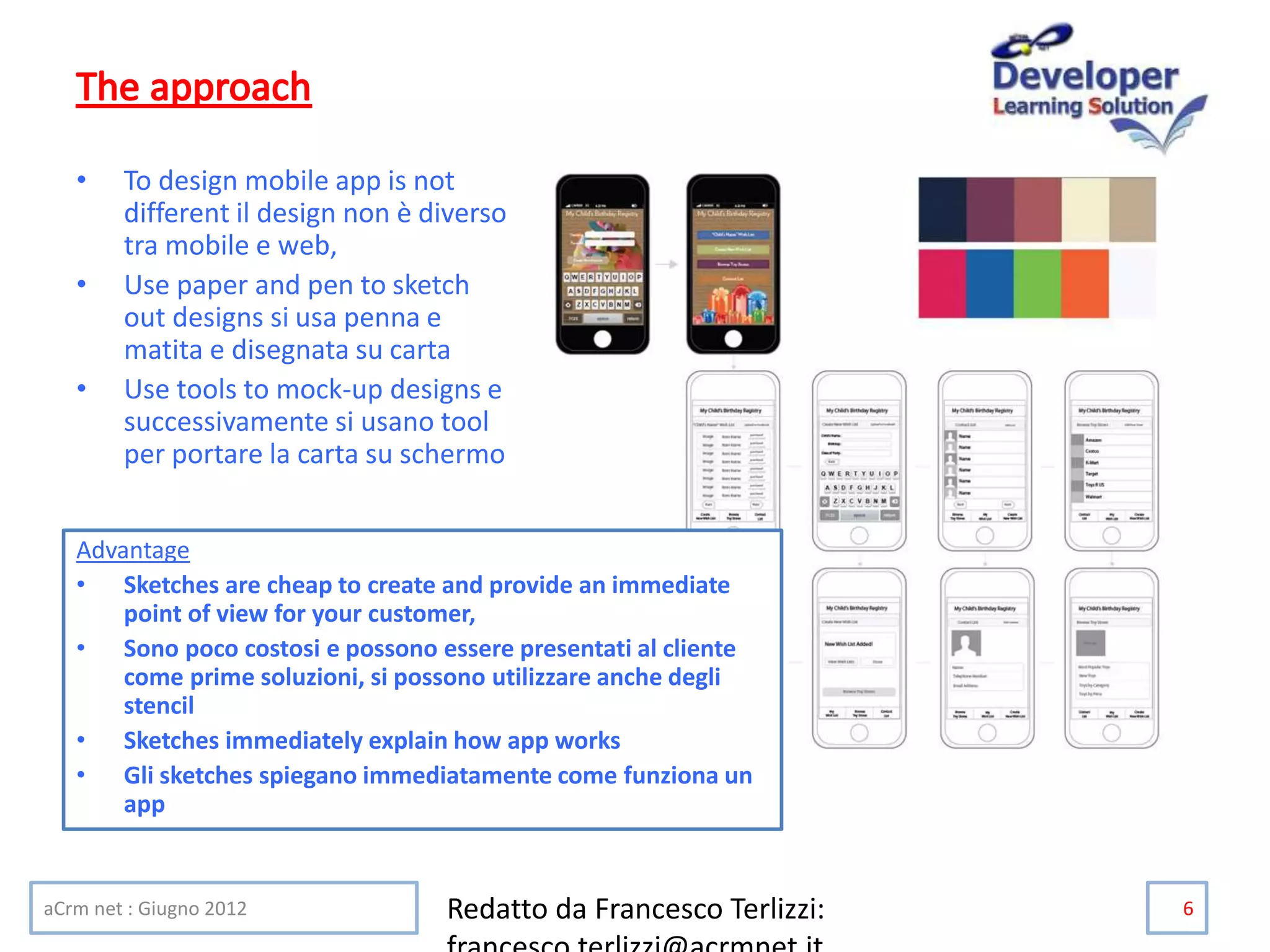

This document provides information about designing mobile apps, including: 1. It discusses tools that can be used to create mock-up designs for mobile apps, such as paper, pen, and digital mock-up tools. 2. It outlines several key differences between designing for mobile versus desktop, such as smaller screens, touch interfaces, and varying operating systems and devices. 3. It emphasizes the importance of usability testing and designing for the specific affordances and guidelines of each mobile operating system. Tailoring designs for different platforms rather than using a "one size fits all" approach is recommended.


![[SwiftPH + PADC Meetup - May 2019] Mobile Interface Guidelines Comparison (iO...](https://cdn.slidesharecdn.com/ss_thumbnails/swiftph-mobileinterfaceguidelines-190522010444-thumbnail.jpg?width=640&height=640&fit=bounds)


