Download as PDF, PPTX


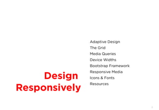

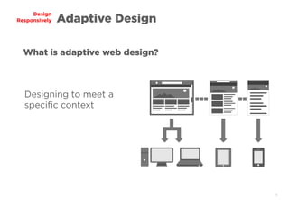
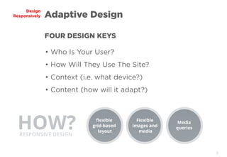

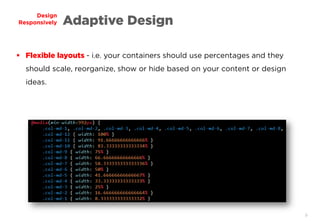
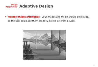
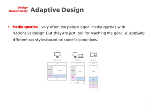

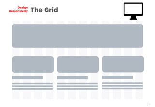
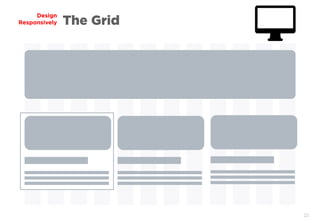
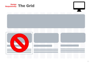
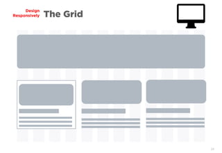
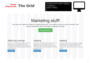
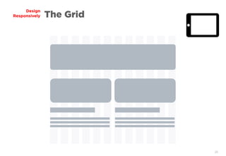
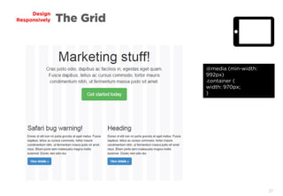
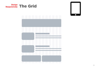
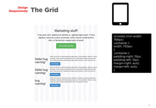
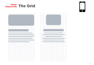
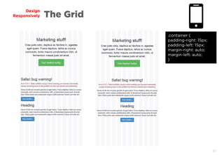
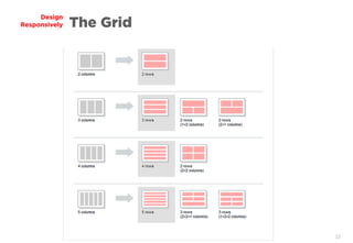
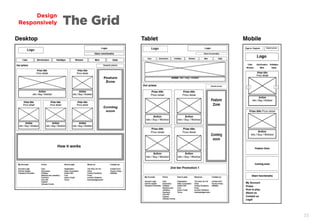
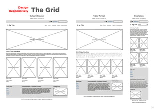
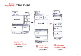
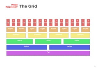

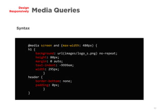
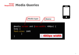

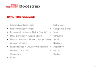
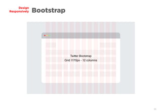
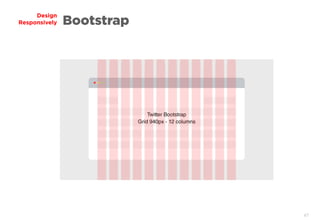
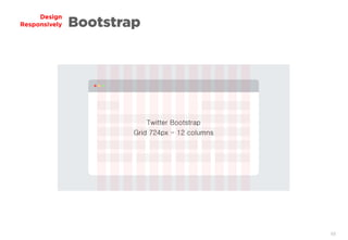
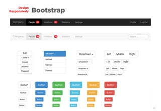
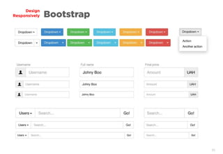
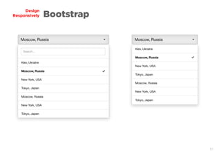
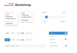

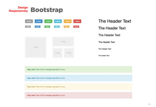

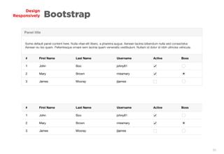
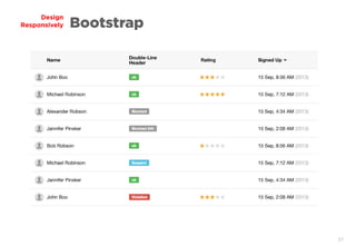

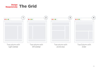
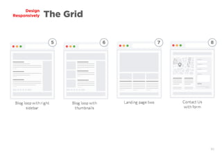
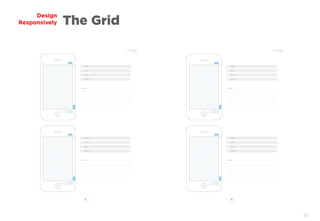


The document discusses principles of responsive and adaptive web design. It covers topics like flexible layouts, images and media, media queries, breakpoints, grids, and frameworks like Bootstrap. Flexible layouts using percentages allow content to scale and reorganize across devices. Images and media should resize proportionally. Media queries apply different CSS styles based on screen width conditions. The grid helps layout content consistently. Frameworks like Bootstrap provide tools to build responsive sites more easily. The goal is to design sites that adapt to various contexts like device type or width.


