RESPONSIVE WEB DESIGN
ADVANTAGES & BEST PRACTICE
19TH JUNE 2014
 Darrin Addams
• Co-founder with 25+ years’ experience
• Ex-Capgemini
 Mike Cundall
• DNN Consultant
• One of UK’s most skilled DNN specialists
PRESENTERS
 Established in the UK in 2003
 Based in Manchester, presence in London
 Largest specialist DNN team in the UK
• Analysts and Consultants
• Web Developers and Software Engineers
• UX Designers
• Support
• Project Managers
ABOUT US - COMPANY
Cantarus’ Mission Statement
To be the UK’s provider of choice for best-of-breed web
solutions based on DNN technology and through that to
deliver innovation, quality and measurable ROI to our clients
ABOUT US
 Originally a Microsoft technology demonstration
 DNN Platform: now the world’s largest open
source project on Microsoft technology
 Powers over 800,000 production websites
 Downloaded more than 7 million times
 World’s leading Microsoft-based WAF and CMS
 Under stewardship of DNN Corp.
 Base for Evoq products
ABOUT DNN SOFTWARE
 DNN Platform:
• Free, open source base
 DNN Evoq Content:
• Supported
• Enterprise-class CMS
• Two editions
 DNN Evoq Social
• Supported
• Build social communities
• Integrates with Evoq Content
 Evoq as a Service
 DNN Evoq Suite: The Social CMS
DNN PRODUCTS
OUR CLIENTS
Tennants
Distribution
 One billion smartphones in use
 One half of all local searches via mobile devices
 Average users can spend 2.7 hours per day socialising on a
mobile device
 Over a third of all traffic on handheld mobile/tablet device
 Mobile (tablet and smartphone) traffic share increased
from 23% to 37% in 2013
 Desktop traffic share decreased from 77% to 63% in 2013
 Mobile and tablet web browsing set to overtake
traditional desktop usage in 2014
MOBILE DEVICE SHARE
AVERAGE UK MOBILE SHARE - 2013
 Traditionally, websites always designed from
desktop experience first
 Mobile and tablet was a secondary goal
 Growing trend that mobiles considered first
and then work up to desktop experience
 “Mobile First” web-design quickly becoming a
widely-adopted design principle
 There are considerations such as what type of
user will be viewing your site
MOBILE FIRST
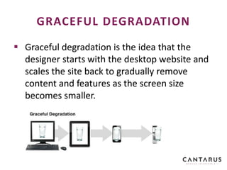
 Graceful degradation is the idea that the
designer starts with the desktop website and
scales the site back to gradually remove
content and features as the screen size
becomes smaller.
GRACEFUL DEGRADATION
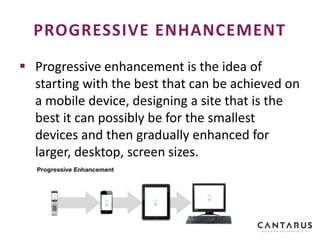
 Progressive enhancement is the idea of
starting with the best that can be achieved on
a mobile device, designing a site that is the
best it can possibly be for the smallest
devices and then gradually enhanced for
larger, desktop, screen sizes.
PROGRESSIVE ENHANCEMENT
 Same goal, different results?
 GD may result in severely watered-down mobile
version so reality is to consider mobile as part of your
desktop design
 PE can let you add/improve as you can which ties in
with Agile development (sprints which improve
functionality)
 Performance can suffer from a GD approach as mobile
can end up loading desktop content which it then
ignores. PE approach tends to produce leaner
implementations
 Foundation and Bootstrap are now mobile-first
DEGRADATION VS ENHANCEMENT
 Aimed at crafting sites to provide an optimal
viewing experience,
 Easy reading and navigation with a minimum of
resizing, panning, and scrolling,
 Targets a wide range of devices (from mobile
phones to desktop computer monitors),
 A responsive site adapts its layout to the viewing
environment by using:
• Fluid, proportion-based grids,
• Flexible images,
• CSS3 media queries (@media rule extension).
RESPONSIVE DESIGN
 Lower development costs (single site)
 Easier (cheaper) to maintain and support
 Content is easier to create and administer
 Simpler deployment
 Reduced hosting and resource utilisation
COSTS
 Google recommends the use of Responsive
Design for creating mobile websites:
• Single content URL is easier for users to interact with,
share, and link to
• Single content URL helps Google algorithms assign
indexing properties for content
• No redirection needed for users to get device-
optimised view, which reduces loading time
• Saves resources for site and Google crawlers
• Single domain prevents SEO dilution across multiple
sites
SEO
 Dedicated mobile sites may have more scope to
meet requirements of mobile users
 In practice, responsive design can usually meet
all requirements
 Many frameworks available to speed up site
design and improve/standardise user experience
 DNN offers a device-aware content preview
feature
 Consolidated view – the ability to be device
agnostic when presenting content is implicit
USER EXPERIENCE (UX)
 A responsive design may offer lower-
performance than a dedicated mobile site as
desktop elements of a page may be downloaded
by a mobile device
 Mobile sites may be more applicable for users in
countries where Internet access speed is an issue
 Dedicated mobile sites can be much more
efficient in terms of:
• Data transfer
• Number of associated page requests
PERFORMANCE
 Typically a structure of files and folders of
standardized code
• HTML,
• CSS,
• JavaScript (e.g. mobile image sliders, mobile UX)
 Known as front-end/CSS frameworks
 Faster to develop with than a custom solution
RESPONSIVE FRAMEWORKS
 Bootstrap
• Built at Twitter,
• Managed via GitHub,
• Offers large number of styles.
 Foundation
• Made by ZURB, a product design company in
California,
• Features Interchange (HTML partials for device-
specific content – more later),
• Fewer styles out of the box than Bootstrap.
POPULAR FRAMEWORKS
 Mobile first
 HTML 5
 Uses Normalize.css to improve cross-browser
rendering (support IE8+)
 Fluid grid system scaling up to 12 columns as
device/viewport size increases
 Sass (Syntactically Awesome Style-Sheets)
• Extends and compiles into CSS
• Supports Mixins (for code reuse), variables
(numbers, strings, colours and booleans), arguments,
nested code and selector inheritance
EXAMPLE - BOOTSTRAP
 Lets you selectively load entire sections based
on the client device type
 Load different sections of your page for
particular media queries
 Load up mobile-friendly components on small
devices, and more robust/heavier/feature-
rich components for desktops
 Images - only load larger resources for
devices that can handle it.
FOUNDATION – INTERCHANGE
 Gumby – built on Sass pre-processor
 Yahoo Pure – lightweight, no JS plugins –
great for the metro design of Windows
 InK – includes drag/drop support and MIT-
licensed icons
 Skeleton, Responsive Grid System, Base,
Compass, Fluid Baseline Grid, etc.
OTHER FRAMEWORKS
 Bootstrap and Foundation have standard
download packages with styles and JS to
support lots of components
 You don’t need to download them all!
 Get only the JS and CSS you need for your
web site to reduce bloat and page load times
 Design first and then customise the package
to suit your requirements
LEVERAGING A FRAMEWORK
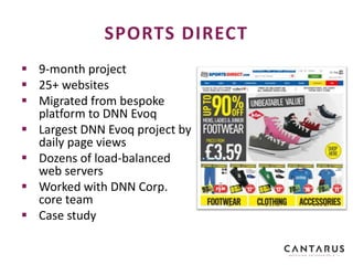
 9-month project
 25+ websites
 Migrated from bespoke
platform to DNN Evoq
 Largest DNN Evoq project by
daily page views
 Dozens of load-balanced
web servers
 Worked with DNN Corp.
core team
 Case study
SPORTS DIRECT
 Sister website of SportsDirect.com
 Same catalogue of products as
SportsDirect.com
 Previously no support for mobile devices
CASE STUDY - LILLYWHITES
www.lillywhites.com
 Support for mobile devices provided via 3rd party
service
 No support for tablet devices
 Very expensive to rollout new websites
 Have to maintain multiple codebases
 New features developed on desktop not
available on mobile devices
 Large % of users accessed the site via mobiles
devices…
PROBLEMS & BRIEF
Cantarus Brief:
“Convert the Sport Direct codebase
into a supportable, feature rich, fully-
responsive framework with support
for mobile and tablet devices…”
PROBLEMS & BRIEF
 Visitors should not be aware if it is a
responsive site as apposed to
dedicated mobile site
 Huge challenge to maintain
performance with addition of
responsive framework & additional
mark-up code
IMPLEMENTATION
 3 distinct views:
• Desktop, Mobile & Tablet
 Full gesture support
 Geo-IP detection of user location
 Switch to desktop/mobile view
KEY FEATURES
Responsive Switch
HTML5
Geolocation API
 Lazy-load images
 Use a CDN such as CloudFlare
 Mobile-first helps!
 Load menus asynchronously
• Over 2/3 of mark-up for Lillywhites Homepage
was mobile & desktop menus
• Menus are loaded after the page loads to give
users the feeling of fast load
PERFORMANCE
DEMONSTRATION
LILLYWHITES
 Mobile set to overtake desktop in 2014
 Choose your delivery vehicle – responsive design or
separate mobile/desktop sites
 Google recommends responsive design
 Responsive generally the cheaper and more desirable
approach
 Dedicated mobile site may still be the best choice
 Decide if mobile-first is your preferred approach - GD
vs PE
 Front-end/CSS frameworks for responsive design
SUMMARY
Thanks for listening; questions are welcome!
Darrin Addams & Mike Cundall
E: sales@cantarus.com
T: +44 (0)161 813 3100 | F: +44 (0)207 657 4254
SOURCES
http://www.intelligentpositioning.com/blog/2014/01/mobile-and-tablet-
traffic-set-to-overtake-desktop-by-mid-2014/
http://bradfrostweb.com/wp-
content/uploads/2011/06/progressive_enhancement.jpg
http://demos.jquerymobile.com/1.0a4.1/docs/_assets/images/jquery-
logo.png
http://filzhut.net/projects/responsive-switch/static/images/logo.png

Responsive Web Design - Advantages and Best Practice for Sports Direct

  • 1.
    RESPONSIVE WEB DESIGN ADVANTAGES& BEST PRACTICE 19TH JUNE 2014
  • 2.
     Darrin Addams •Co-founder with 25+ years’ experience • Ex-Capgemini  Mike Cundall • DNN Consultant • One of UK’s most skilled DNN specialists PRESENTERS
  • 3.
     Established inthe UK in 2003  Based in Manchester, presence in London  Largest specialist DNN team in the UK • Analysts and Consultants • Web Developers and Software Engineers • UX Designers • Support • Project Managers ABOUT US - COMPANY
  • 4.
    Cantarus’ Mission Statement Tobe the UK’s provider of choice for best-of-breed web solutions based on DNN technology and through that to deliver innovation, quality and measurable ROI to our clients ABOUT US
  • 5.
     Originally aMicrosoft technology demonstration  DNN Platform: now the world’s largest open source project on Microsoft technology  Powers over 800,000 production websites  Downloaded more than 7 million times  World’s leading Microsoft-based WAF and CMS  Under stewardship of DNN Corp.  Base for Evoq products ABOUT DNN SOFTWARE
  • 6.
     DNN Platform: •Free, open source base  DNN Evoq Content: • Supported • Enterprise-class CMS • Two editions  DNN Evoq Social • Supported • Build social communities • Integrates with Evoq Content  Evoq as a Service  DNN Evoq Suite: The Social CMS DNN PRODUCTS
  • 7.
  • 8.
     One billionsmartphones in use  One half of all local searches via mobile devices  Average users can spend 2.7 hours per day socialising on a mobile device  Over a third of all traffic on handheld mobile/tablet device  Mobile (tablet and smartphone) traffic share increased from 23% to 37% in 2013  Desktop traffic share decreased from 77% to 63% in 2013  Mobile and tablet web browsing set to overtake traditional desktop usage in 2014 MOBILE DEVICE SHARE
  • 9.
    AVERAGE UK MOBILESHARE - 2013
  • 10.
     Traditionally, websitesalways designed from desktop experience first  Mobile and tablet was a secondary goal  Growing trend that mobiles considered first and then work up to desktop experience  “Mobile First” web-design quickly becoming a widely-adopted design principle  There are considerations such as what type of user will be viewing your site MOBILE FIRST
  • 11.
     Graceful degradationis the idea that the designer starts with the desktop website and scales the site back to gradually remove content and features as the screen size becomes smaller. GRACEFUL DEGRADATION
  • 12.
     Progressive enhancementis the idea of starting with the best that can be achieved on a mobile device, designing a site that is the best it can possibly be for the smallest devices and then gradually enhanced for larger, desktop, screen sizes. PROGRESSIVE ENHANCEMENT
  • 13.
     Same goal,different results?  GD may result in severely watered-down mobile version so reality is to consider mobile as part of your desktop design  PE can let you add/improve as you can which ties in with Agile development (sprints which improve functionality)  Performance can suffer from a GD approach as mobile can end up loading desktop content which it then ignores. PE approach tends to produce leaner implementations  Foundation and Bootstrap are now mobile-first DEGRADATION VS ENHANCEMENT
  • 14.
     Aimed atcrafting sites to provide an optimal viewing experience,  Easy reading and navigation with a minimum of resizing, panning, and scrolling,  Targets a wide range of devices (from mobile phones to desktop computer monitors),  A responsive site adapts its layout to the viewing environment by using: • Fluid, proportion-based grids, • Flexible images, • CSS3 media queries (@media rule extension). RESPONSIVE DESIGN
  • 15.
     Lower developmentcosts (single site)  Easier (cheaper) to maintain and support  Content is easier to create and administer  Simpler deployment  Reduced hosting and resource utilisation COSTS
  • 16.
     Google recommendsthe use of Responsive Design for creating mobile websites: • Single content URL is easier for users to interact with, share, and link to • Single content URL helps Google algorithms assign indexing properties for content • No redirection needed for users to get device- optimised view, which reduces loading time • Saves resources for site and Google crawlers • Single domain prevents SEO dilution across multiple sites SEO
  • 17.
     Dedicated mobilesites may have more scope to meet requirements of mobile users  In practice, responsive design can usually meet all requirements  Many frameworks available to speed up site design and improve/standardise user experience  DNN offers a device-aware content preview feature  Consolidated view – the ability to be device agnostic when presenting content is implicit USER EXPERIENCE (UX)
  • 18.
     A responsivedesign may offer lower- performance than a dedicated mobile site as desktop elements of a page may be downloaded by a mobile device  Mobile sites may be more applicable for users in countries where Internet access speed is an issue  Dedicated mobile sites can be much more efficient in terms of: • Data transfer • Number of associated page requests PERFORMANCE
  • 19.
     Typically astructure of files and folders of standardized code • HTML, • CSS, • JavaScript (e.g. mobile image sliders, mobile UX)  Known as front-end/CSS frameworks  Faster to develop with than a custom solution RESPONSIVE FRAMEWORKS
  • 20.
     Bootstrap • Builtat Twitter, • Managed via GitHub, • Offers large number of styles.  Foundation • Made by ZURB, a product design company in California, • Features Interchange (HTML partials for device- specific content – more later), • Fewer styles out of the box than Bootstrap. POPULAR FRAMEWORKS
  • 21.
     Mobile first HTML 5  Uses Normalize.css to improve cross-browser rendering (support IE8+)  Fluid grid system scaling up to 12 columns as device/viewport size increases  Sass (Syntactically Awesome Style-Sheets) • Extends and compiles into CSS • Supports Mixins (for code reuse), variables (numbers, strings, colours and booleans), arguments, nested code and selector inheritance EXAMPLE - BOOTSTRAP
  • 22.
     Lets youselectively load entire sections based on the client device type  Load different sections of your page for particular media queries  Load up mobile-friendly components on small devices, and more robust/heavier/feature- rich components for desktops  Images - only load larger resources for devices that can handle it. FOUNDATION – INTERCHANGE
  • 23.
     Gumby –built on Sass pre-processor  Yahoo Pure – lightweight, no JS plugins – great for the metro design of Windows  InK – includes drag/drop support and MIT- licensed icons  Skeleton, Responsive Grid System, Base, Compass, Fluid Baseline Grid, etc. OTHER FRAMEWORKS
  • 24.
     Bootstrap andFoundation have standard download packages with styles and JS to support lots of components  You don’t need to download them all!  Get only the JS and CSS you need for your web site to reduce bloat and page load times  Design first and then customise the package to suit your requirements LEVERAGING A FRAMEWORK
  • 25.
     9-month project 25+ websites  Migrated from bespoke platform to DNN Evoq  Largest DNN Evoq project by daily page views  Dozens of load-balanced web servers  Worked with DNN Corp. core team  Case study SPORTS DIRECT
  • 26.
     Sister websiteof SportsDirect.com  Same catalogue of products as SportsDirect.com  Previously no support for mobile devices CASE STUDY - LILLYWHITES www.lillywhites.com
  • 27.
     Support formobile devices provided via 3rd party service  No support for tablet devices  Very expensive to rollout new websites  Have to maintain multiple codebases  New features developed on desktop not available on mobile devices  Large % of users accessed the site via mobiles devices… PROBLEMS & BRIEF
  • 28.
    Cantarus Brief: “Convert theSport Direct codebase into a supportable, feature rich, fully- responsive framework with support for mobile and tablet devices…” PROBLEMS & BRIEF
  • 29.
     Visitors shouldnot be aware if it is a responsive site as apposed to dedicated mobile site  Huge challenge to maintain performance with addition of responsive framework & additional mark-up code IMPLEMENTATION
  • 30.
     3 distinctviews: • Desktop, Mobile & Tablet  Full gesture support  Geo-IP detection of user location  Switch to desktop/mobile view KEY FEATURES Responsive Switch HTML5 Geolocation API
  • 31.
     Lazy-load images Use a CDN such as CloudFlare  Mobile-first helps!  Load menus asynchronously • Over 2/3 of mark-up for Lillywhites Homepage was mobile & desktop menus • Menus are loaded after the page loads to give users the feeling of fast load PERFORMANCE
  • 32.
  • 33.
     Mobile setto overtake desktop in 2014  Choose your delivery vehicle – responsive design or separate mobile/desktop sites  Google recommends responsive design  Responsive generally the cheaper and more desirable approach  Dedicated mobile site may still be the best choice  Decide if mobile-first is your preferred approach - GD vs PE  Front-end/CSS frameworks for responsive design SUMMARY
  • 34.
    Thanks for listening;questions are welcome! Darrin Addams & Mike Cundall E: sales@cantarus.com T: +44 (0)161 813 3100 | F: +44 (0)207 657 4254
  • 35.

Editor's Notes

  • #7 DNN Store for extensibility and flexibility: Thousands of modules Thousands of skins Dedicated companies DNN Community for support Over 1 million members Online forums International conferences, seminars and webinars Global DNN Partner network
  • #9 http://www.intelligentpositioning.com/blog/2014/01/mobile-and-tablet-traffic-set-to-overtake-desktop-by-mid-2014/
  • #17 https://developers.google.com/webmasters/smartphone-sites/