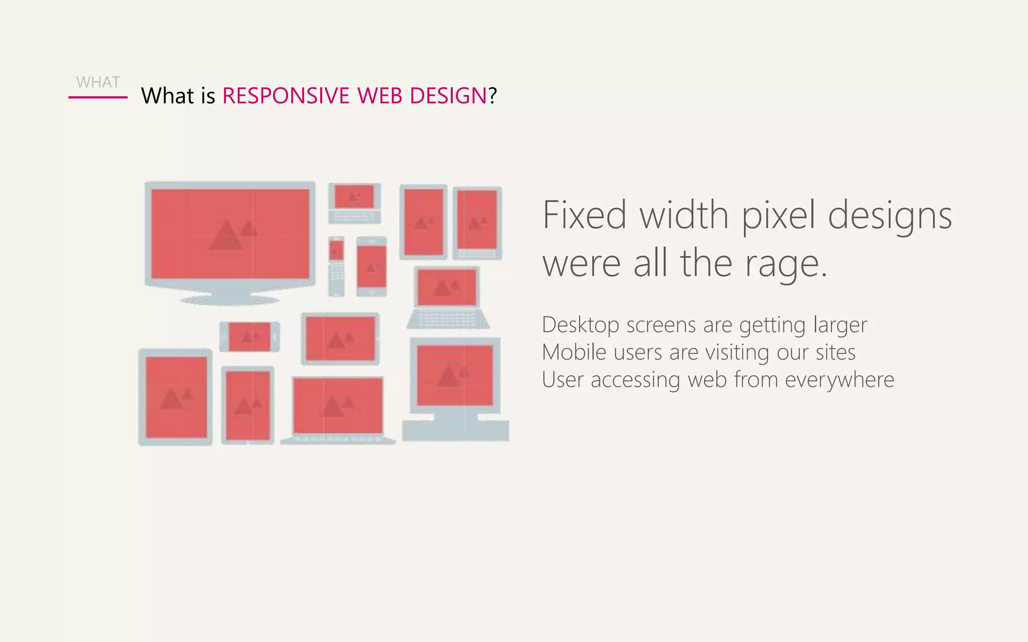
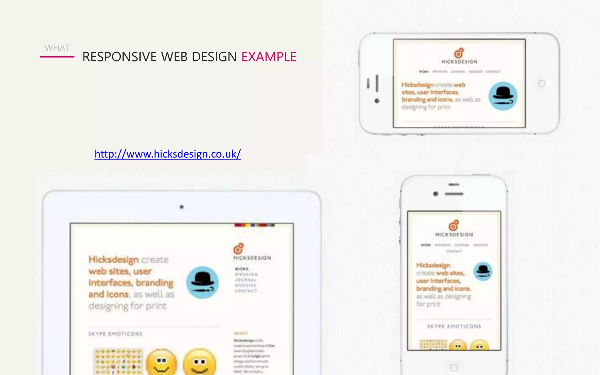
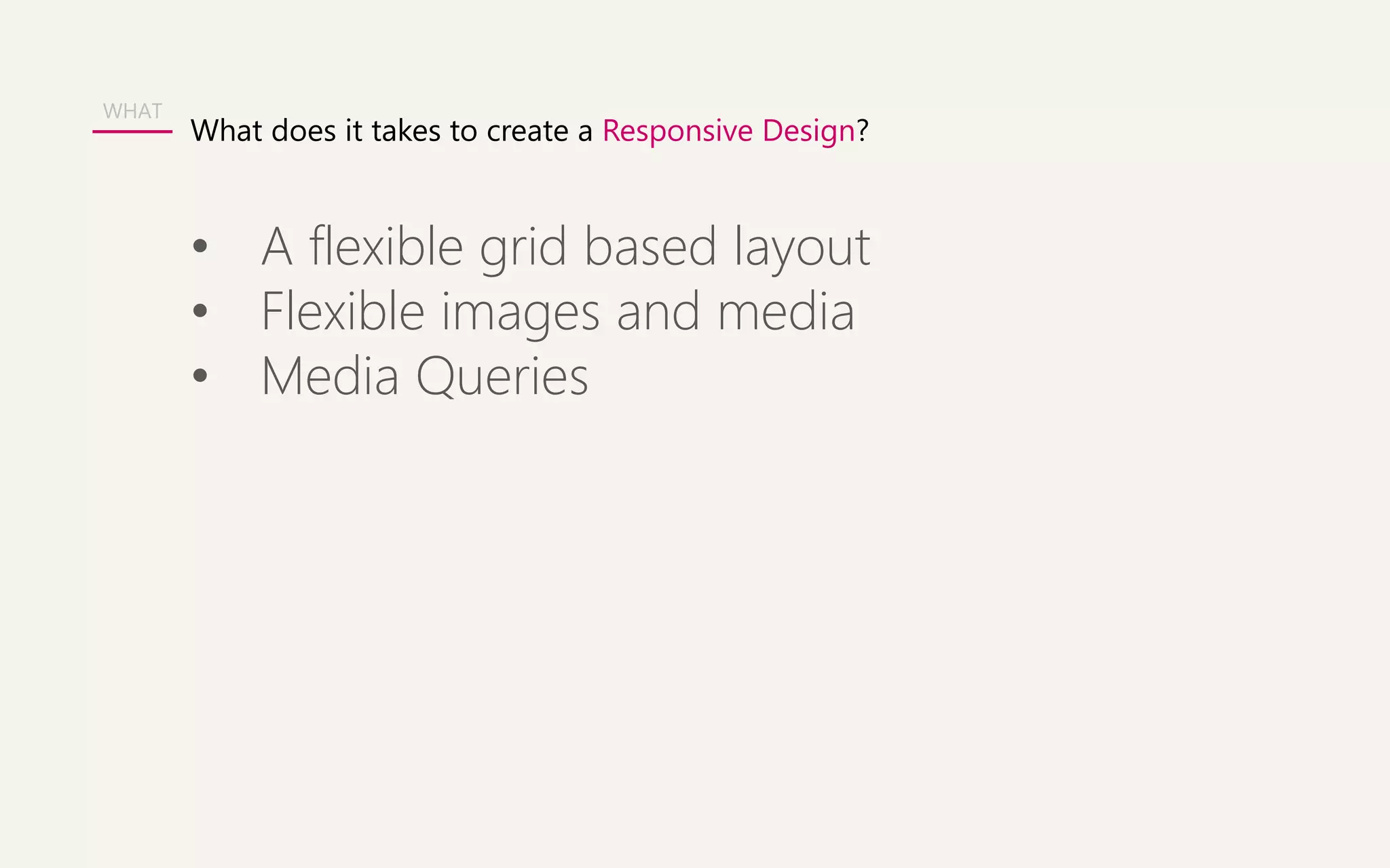
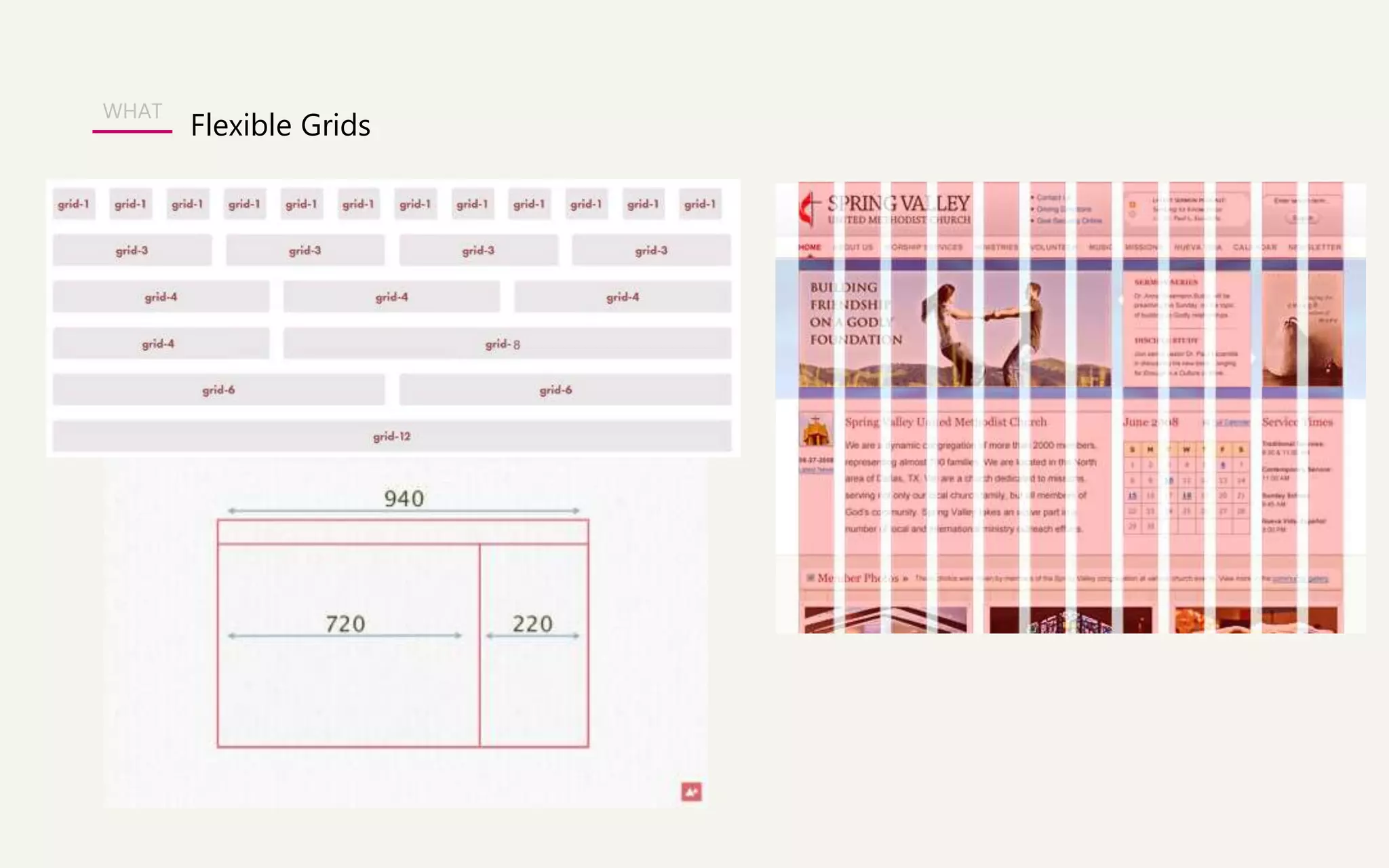
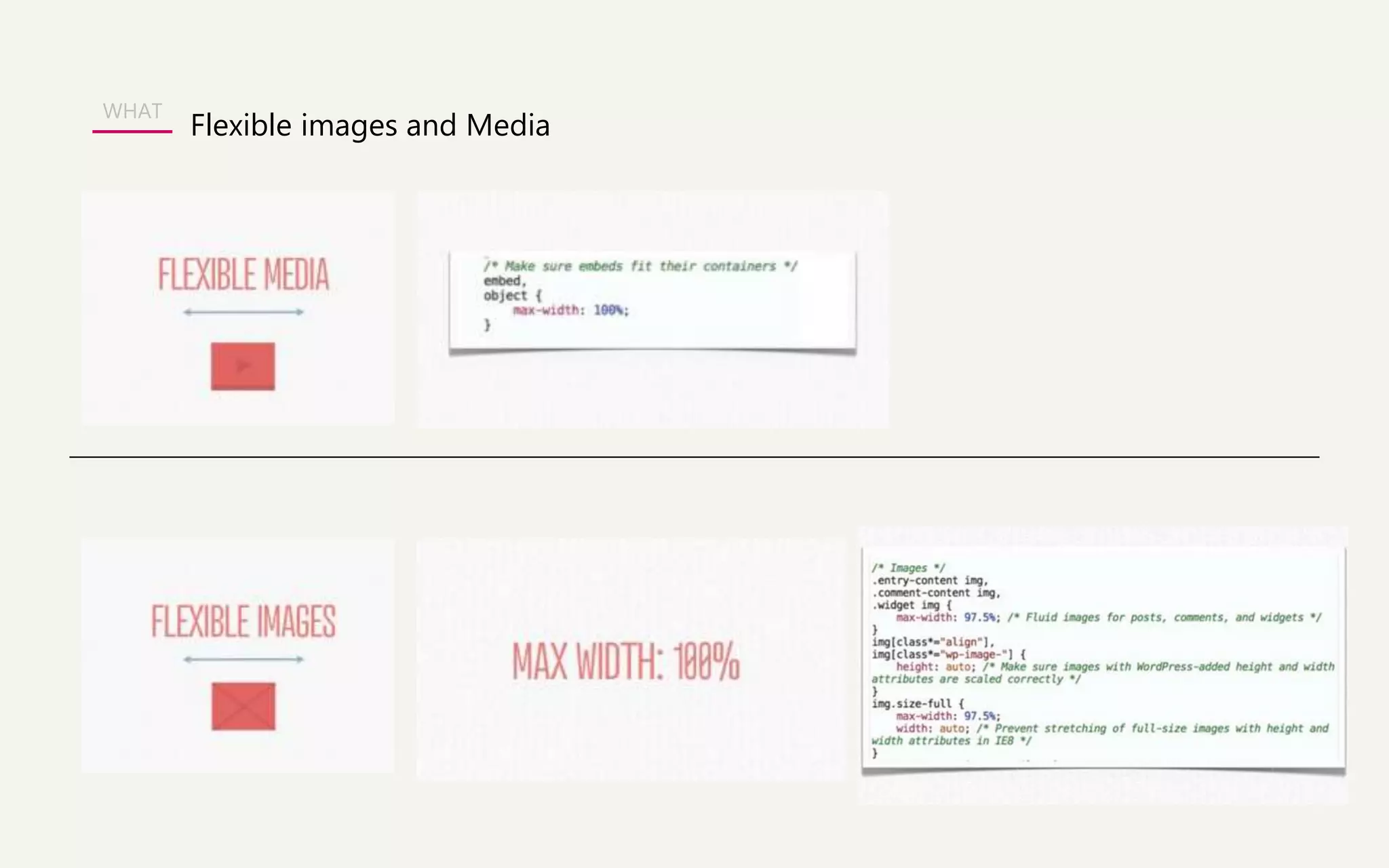
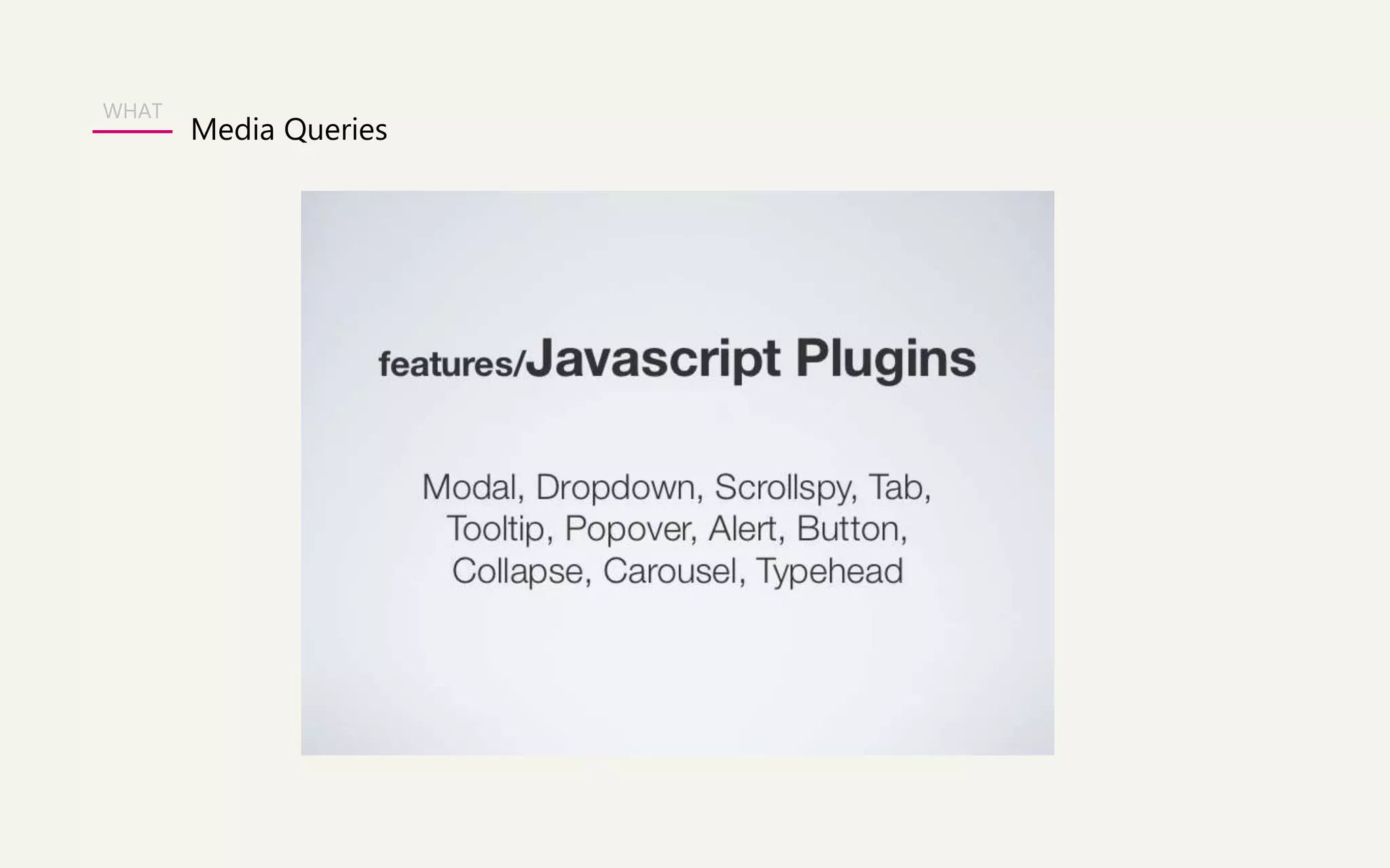
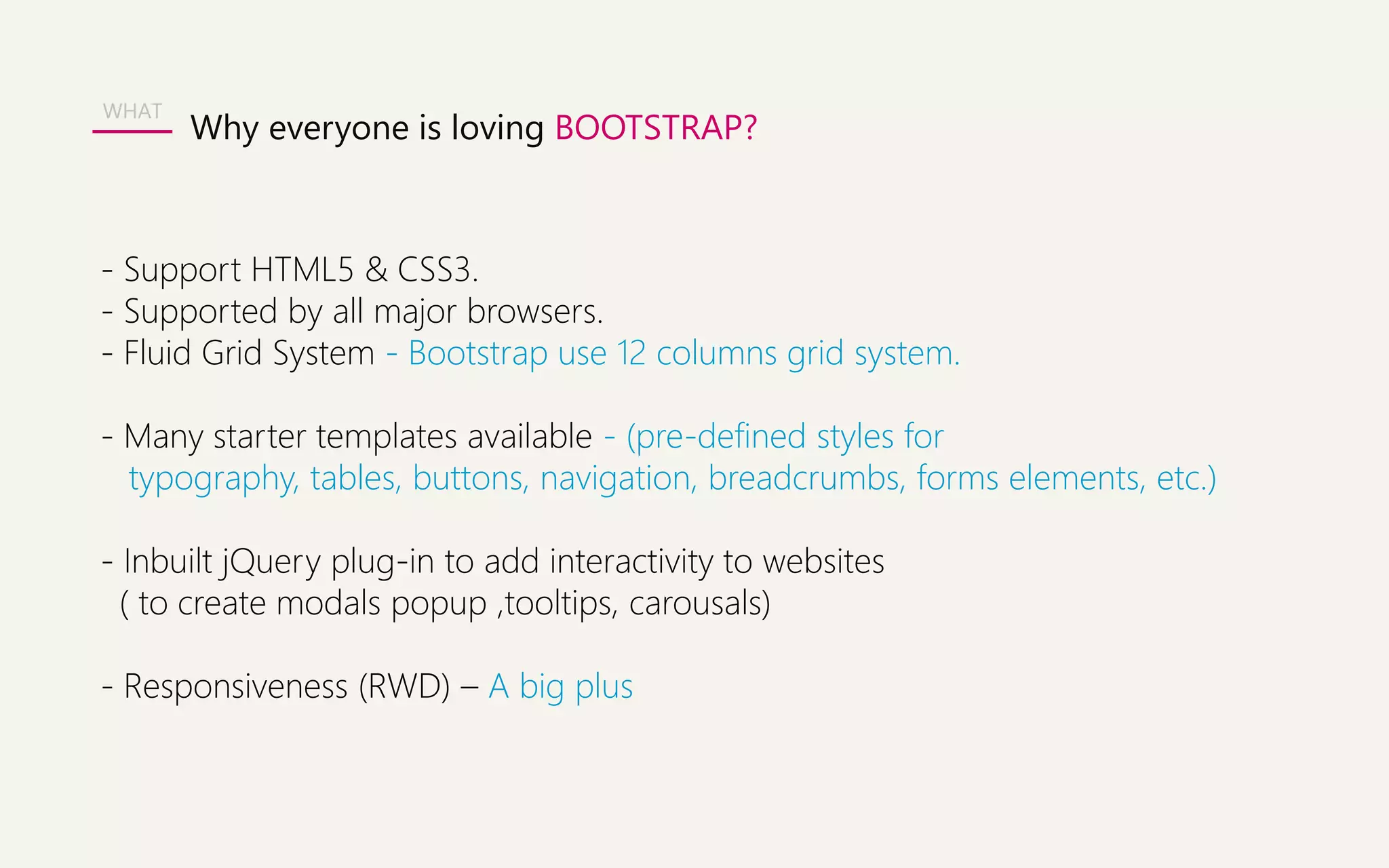
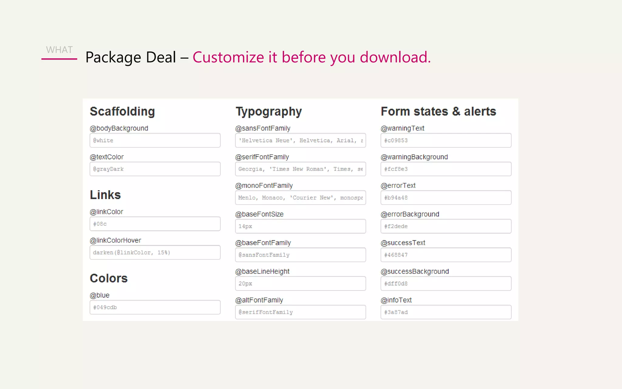
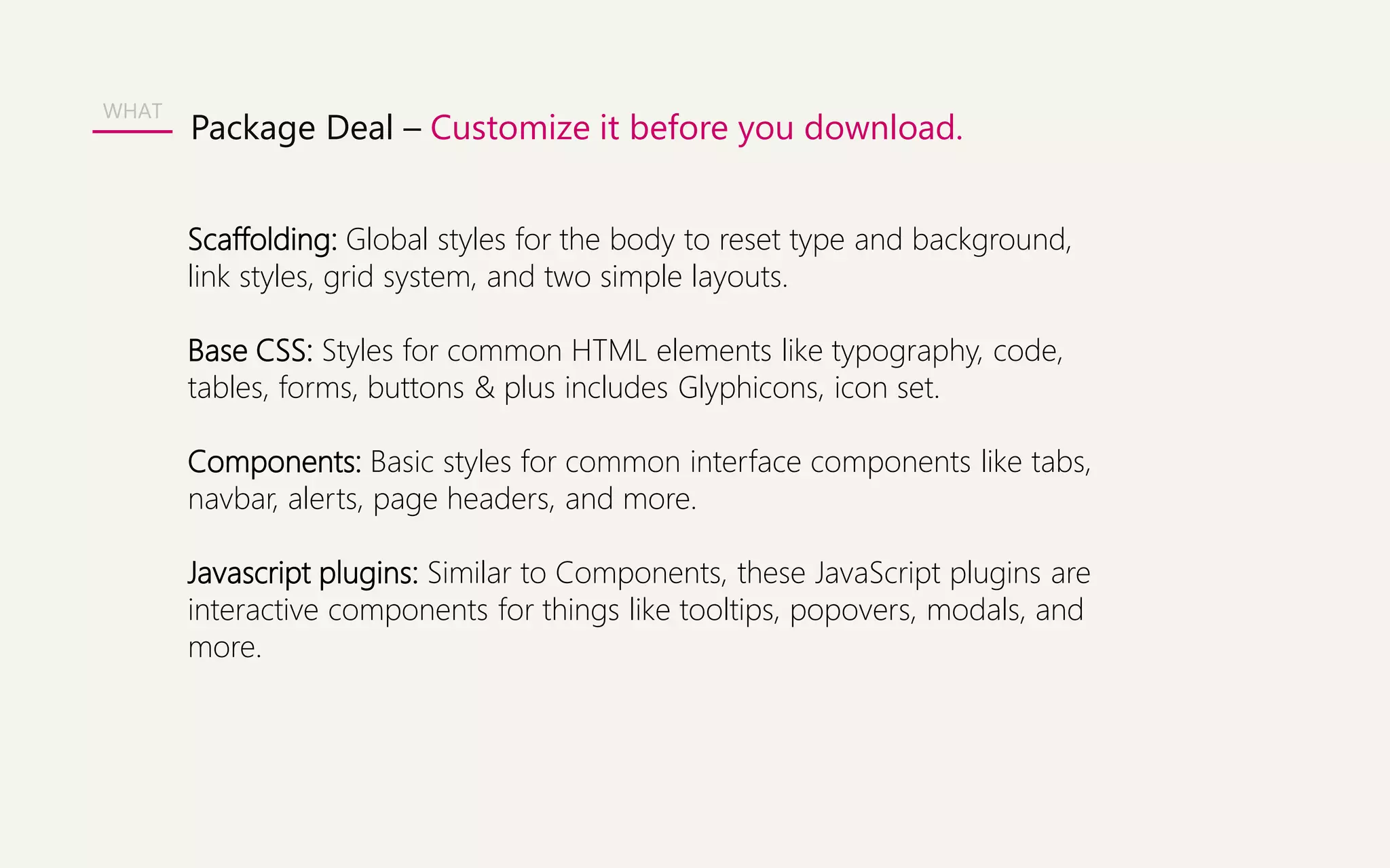
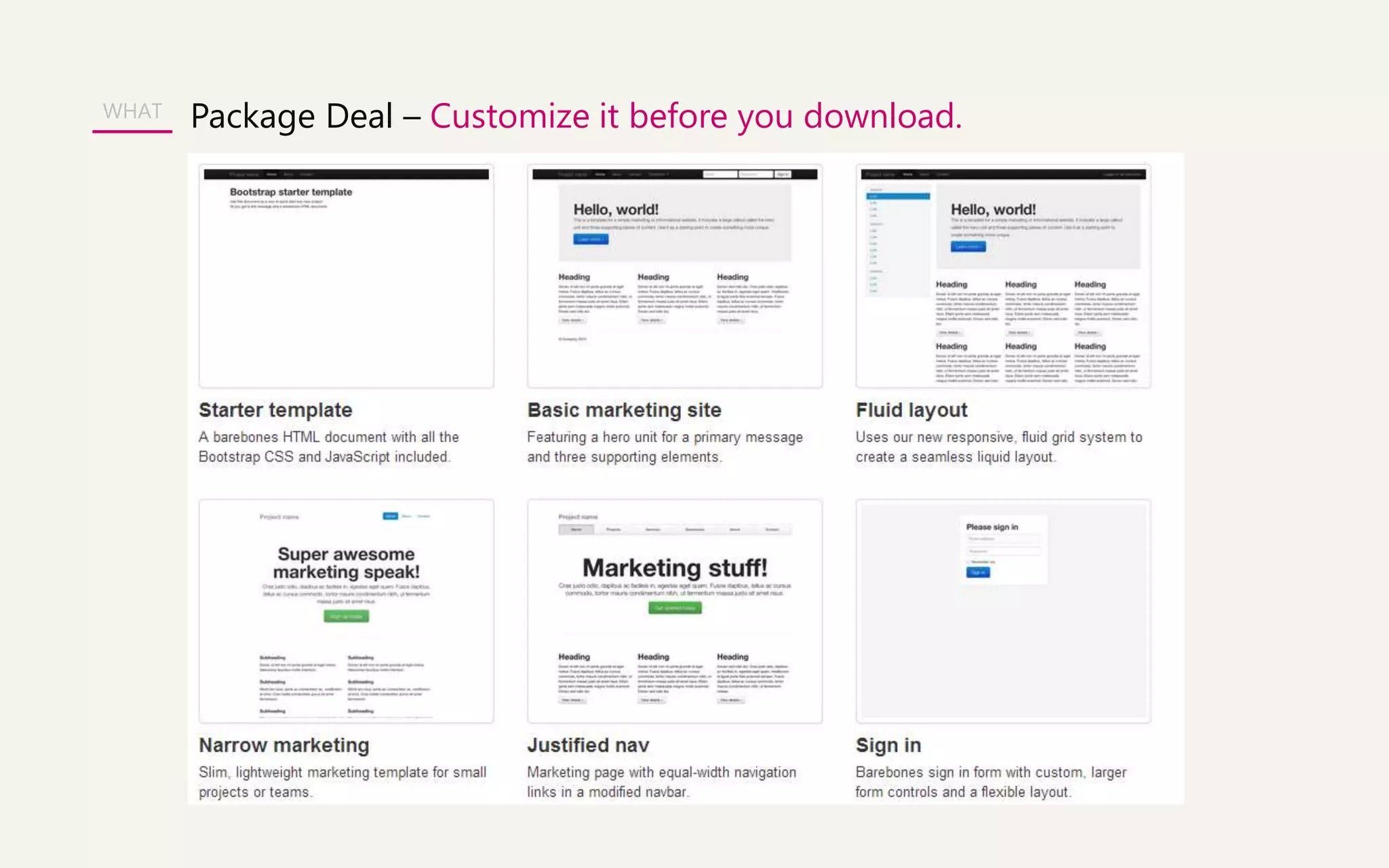
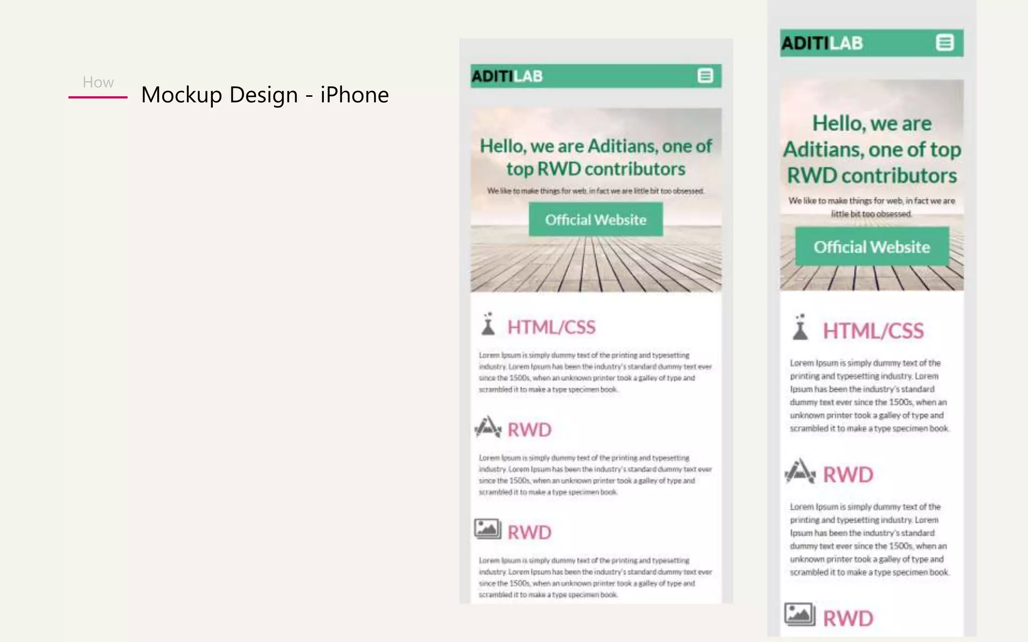
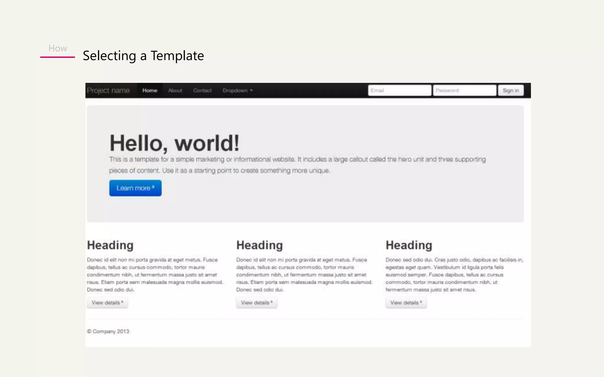
Responsive Website Design 
Process
Agenda 
WHY 
WHAT 
HOW
The future of Mobile Web in 2015 
The total number of people 
using the web on mobile 
devices is set to surpass 
desktops by 2015. 
- International Data Corporation (IDC) 
WHY
Separate Mobile Sites WHY
Mobile Apps 
WHY
Rather than tailoring 
Disconnected designs to each of an ever-increasing 
number of web devices, we can 
treat them as facets of the same experience. 
- Ethan Marcotte 
WHY
Responsive Website Design 
WHY
What is RESPONSIVE WEB DESIGN? 
Fixed width pixel designs 
were all the rage. 
Desktop screens are getting larger 
Mobile users are visiting our sites 
User accessing web from everywhere 
WHAT
RESPONSIVE WEB DESIGN EXAMPLE 
WHAT 
http://www.hicksdesign.co.uk/
What does it takes to create a Responsive Design? 
• A flexible grid based layout 
• Flexible images and media 
• Media Queries 
WHAT
WHAT
WHAT 
Flexible Grids
Flexible images and Media 
WHAT
Media Queries 
WHAT
Responsive UI Framework 
WHAT 
In the world of web design, a framework is defined as a package 
made up of a structure of files and folders of standardized code 
(HTML, CSS, JS documents etc.) which can be used to support the 
development of websites, as a basis to start building a site. 
The aim of frameworks is to provide a common structure so that 
developers don’t have to redo it from scratch and can reuse the code 
provided. In this way, frameworks allow us to cut out much of the work 
and save a lot of time.
Popular 5 Responsive UI Framework 
WHAT 
• Bootstrap 
• Foundation 
• Skeleton 
• Unsemantic 
• Gumby
WHAT 
An open 
source 
UI Framework 
HTML 
CSS 
JS 
About Bootstrap
WHAT 
Facts about BOOTSTRAP 
- Bootstrap was released in by Twitter developers 2 year back. 
- Their idea was to develop a frontend UI framework to 
encourage consistency across the platform and 
speed up the development of new websites. 
- Bootstrap is now widely accepted in the market. 
- Recently they have launched 3.0 version. 
Mark Jacob 
} 
Twitter Developer
WHAT 
Who are using BOOTSTRAP? 
- Joomla 3.0 
- Slideshare 
- Toyota.com 
-Appster
WHAT 
Responsive/Bootstrap Examples 
http://wrapbootstrap.com/preview/WB0412697 
http://wrapbootstrap.com/preview/WB0L500N4 
http://wrapbootstrap.com/preview/WB0F7FH2P 
Inspiration 
http://netfruits.com/2013/02/websites-built-with-bootstrap/
WHAT 
Why everyone is loving BOOTSTRAP? 
- Support HTML5 & CSS3. 
- Supported by all major browsers. 
- Fluid Grid System - Bootstrap use 12 columns grid system. 
- Many starter templates available - (pre-defined styles for 
typography, tables, buttons, navigation, breadcrumbs, forms elements, etc.) 
- Inbuilt jQuery plug-in to add interactivity to websites 
( to create modals popup ,tooltips, carousals) 
- Responsiveness (RWD) – A big plus
WHAT 
Package Deal – Customize it before you download.
WHAT 
Package Deal – Customize it before you download. 
Scaffolding: Global styles for the body to reset type and background, 
link styles, grid system, and two simple layouts. 
Base CSS: Styles for common HTML elements like typography, code, 
tables, forms, buttons & plus includes Glyphicons, icon set. 
Components: Basic styles for common interface components like tabs, 
navbar, alerts, page headers, and more. 
Javascript plugins: Similar to Components, these JavaScript plugins are 
interactive components for things like tooltips, popovers, modals, and 
more.
WHAT Package Deal – Customize it before you download.
WHAT 
Bootstrap Website Walkthrough 
http://getbootstrap.com/2.3.2/
Summary 
- Is free! Saves you time & money. Implementation is easy. 
- Gives you free CSS styles and inbuilt Jqueries. 
- Best is you can make a responsive website for all devices. 
- Being open sourced, you will get great help from online forums.
Agenda 
WHY 
WHAT 
HOW 
Folder Structure 
Mockup Design 
Selecting a Template 
Applying Style 
Manipulate template 
Testing tools for different Devices
How 
Folder Structure 
CSS 
bootstrap.css 
bootstrap.min.css 
JS 
bootstrap.js 
bootstrap.min.js 
Fonts 
glyphicons-halflings-regular.eot 
glyphicons-halflings-regular.svg
How 
Mockup Design - Desktop
How 
Mockup Design 
1170
How 
Mockup Design - iPad
How 
Mockup Design - iPad
How 
Mockup Design - iPhone
How 
Selecting a Template
How 
Testing tools for different Devices 
Device simulator 
http://lab.maltewassermann.com/viewport-resizer/ 
Grid Display 
http://alefeuvre.github.io/foundation-grid-displayer/

RWD - Bootstrap

  • 1.
  • 2.
  • 3.
    The future ofMobile Web in 2015 The total number of people using the web on mobile devices is set to surpass desktops by 2015. - International Data Corporation (IDC) WHY
  • 4.
  • 5.
  • 6.
    Rather than tailoring Disconnected designs to each of an ever-increasing number of web devices, we can treat them as facets of the same experience. - Ethan Marcotte WHY
  • 7.
  • 8.
    What is RESPONSIVEWEB DESIGN? Fixed width pixel designs were all the rage. Desktop screens are getting larger Mobile users are visiting our sites User accessing web from everywhere WHAT
  • 9.
    RESPONSIVE WEB DESIGNEXAMPLE WHAT http://www.hicksdesign.co.uk/
  • 10.
    What does ittakes to create a Responsive Design? • A flexible grid based layout • Flexible images and media • Media Queries WHAT
  • 11.
  • 12.
  • 13.
  • 14.
  • 15.
    Responsive UI Framework WHAT In the world of web design, a framework is defined as a package made up of a structure of files and folders of standardized code (HTML, CSS, JS documents etc.) which can be used to support the development of websites, as a basis to start building a site. The aim of frameworks is to provide a common structure so that developers don’t have to redo it from scratch and can reuse the code provided. In this way, frameworks allow us to cut out much of the work and save a lot of time.
  • 16.
    Popular 5 ResponsiveUI Framework WHAT • Bootstrap • Foundation • Skeleton • Unsemantic • Gumby
  • 17.
    WHAT An open source UI Framework HTML CSS JS About Bootstrap
  • 18.
    WHAT Facts aboutBOOTSTRAP - Bootstrap was released in by Twitter developers 2 year back. - Their idea was to develop a frontend UI framework to encourage consistency across the platform and speed up the development of new websites. - Bootstrap is now widely accepted in the market. - Recently they have launched 3.0 version. Mark Jacob } Twitter Developer
  • 19.
    WHAT Who areusing BOOTSTRAP? - Joomla 3.0 - Slideshare - Toyota.com -Appster
  • 20.
    WHAT Responsive/Bootstrap Examples http://wrapbootstrap.com/preview/WB0412697 http://wrapbootstrap.com/preview/WB0L500N4 http://wrapbootstrap.com/preview/WB0F7FH2P Inspiration http://netfruits.com/2013/02/websites-built-with-bootstrap/
  • 21.
    WHAT Why everyoneis loving BOOTSTRAP? - Support HTML5 & CSS3. - Supported by all major browsers. - Fluid Grid System - Bootstrap use 12 columns grid system. - Many starter templates available - (pre-defined styles for typography, tables, buttons, navigation, breadcrumbs, forms elements, etc.) - Inbuilt jQuery plug-in to add interactivity to websites ( to create modals popup ,tooltips, carousals) - Responsiveness (RWD) – A big plus
  • 22.
    WHAT Package Deal– Customize it before you download.
  • 23.
    WHAT Package Deal– Customize it before you download. Scaffolding: Global styles for the body to reset type and background, link styles, grid system, and two simple layouts. Base CSS: Styles for common HTML elements like typography, code, tables, forms, buttons & plus includes Glyphicons, icon set. Components: Basic styles for common interface components like tabs, navbar, alerts, page headers, and more. Javascript plugins: Similar to Components, these JavaScript plugins are interactive components for things like tooltips, popovers, modals, and more.
  • 24.
    WHAT Package Deal– Customize it before you download.
  • 25.
    WHAT Bootstrap WebsiteWalkthrough http://getbootstrap.com/2.3.2/
  • 26.
    Summary - Isfree! Saves you time & money. Implementation is easy. - Gives you free CSS styles and inbuilt Jqueries. - Best is you can make a responsive website for all devices. - Being open sourced, you will get great help from online forums.
  • 27.
    Agenda WHY WHAT HOW Folder Structure Mockup Design Selecting a Template Applying Style Manipulate template Testing tools for different Devices
  • 28.
    How Folder Structure CSS bootstrap.css bootstrap.min.css JS bootstrap.js bootstrap.min.js Fonts glyphicons-halflings-regular.eot glyphicons-halflings-regular.svg
  • 29.
  • 30.
  • 31.
  • 32.
  • 33.
  • 34.
  • 35.
    How Testing toolsfor different Devices Device simulator http://lab.maltewassermann.com/viewport-resizer/ Grid Display http://alefeuvre.github.io/foundation-grid-displayer/