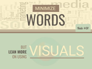
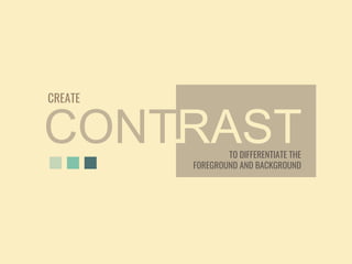
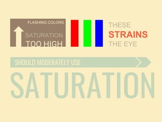
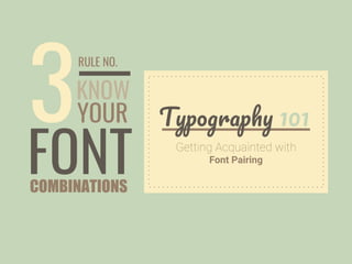
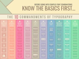
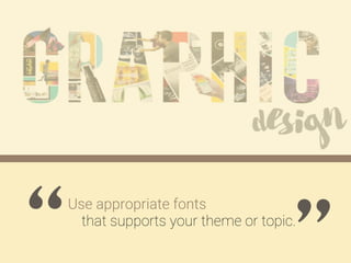
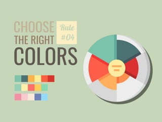
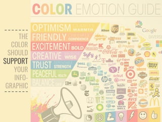
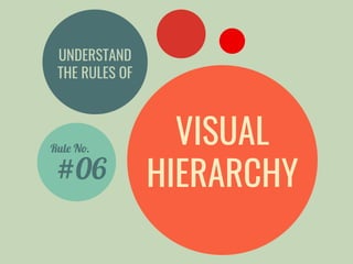
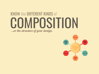
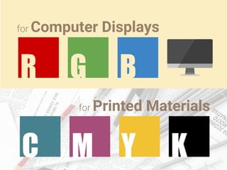
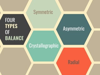
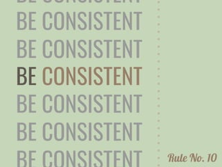
This is part 2 of the 3-part series of constructing an infographic. This presentation showcases 10 graphic design rules in designing your infographic. One should make this rules as guide; they may experiment with these rules, or even break them.
This document announces a graphic design seminar that will cover fundamentals of effective graphic design. The seminar will cover topics such as understanding your audience, using headlines and subheads, composing ideas, knowing your objectives, and basic typography rules. It will teach skills for assembling text and graphics to catch a reader's eye and elicit the desired response. Attendees will learn how to apply these basic design skills to communicate ideas on paper swiftly, clearly and effectively.
Good practises in graphic design, typography and editing: “Clear Layout. Basi...Tomasz Charnas
Graduates’ visual works and fragments of presentation about content design at Tischner European University by Tomasz Charnas, an editor, publisher, communication scientist and specialist in language and literature. Visual materials have been taken from original LinkedIn user guide prepared by the students' group.
Graphic design for marketing professionalsJason Tham
This document discusses key principles of graphic design including typography, layout using C.R.A.P. (Contrast, Repetition, Alignment, Proximity) principles and establishing visual hierarchy. It explains how typography like serif vs. sans serif fonts and layout features like leading and justification impact readability. C.R.A.P. principles are outlined for organizing content visually. The concept of visual hierarchy is introduced, noting that less is more in battling for attention and emphasizing essential information over clutter. The document concludes with a recap of the covered topics.
A layout is a drawing or plan showing the positioning of elements on a page. Templates provide preset layouts with standardized formatting. Designers use non-printing guides to help precisely place objects, including margin guides along the edge of the page, column guides to control text flow, and ruler guides for alignment. Considerations for layout include formatting, page size, master pages to maintain consistency, and prototypes to mock up the final design. Common layout types are business cards, letterheads, flyers, brochures, newsletters, advertisements, magazine pages, and infographics.
This document discusses the four main principles of graphic design: proximity, alignment, repetition, and contrast. It defines each principle and provides examples to illustrate how designers use proximity to group related elements, alignment to organize elements on a page, repetition to make a design feel cohesive, and contrast to make certain elements stand out. The document stresses that these principles work together and are rarely applied individually in well-designed works.
The document provides 10 rules for graphic design composition:
1. Find your focal point
2. Use leading lines to guide the eye
3. Employ scale and hierarchy to emphasize important elements
4. Balance your design elements
5. Ensure elements complement each other
6. Boost or reduce contrast to draw attention
7. Repeat design elements for consistency
8. Leverage white space to improve clarity
9. Align elements for visual cohesion
10. Divide the design space into thirds for focal point placement
The document provides an overview of the history and principles of graphic design. It discusses early examples of visual communication from cave paintings to the invention of writing systems. Key developments included Johannes Gutenberg's printing press and the establishment of typography. The document outlines important typefaces and designers that advanced principles like functionality, simplicity and optical spacing. It explores concepts such as dynamic planes, space, and the work of designers like Josef Muller-Brockman, László Moholy-Nagy, Paul Rand and Saul Bass that helped establish graphic design as an art form.
The document discusses typography fundamentals, including:
- The anatomy and classification of letterforms
- Factors that affect readability of text like size, line height, measure, alignment, tracking, and kerning
- Methods for creating a typographic hierarchy using scale, color, value, style, placement
- Considerations for choosing typefaces like available features, pairing typefaces, and personality conveyed
- Examples of well-designed websites that demonstrate good typography principles
- A section on implementing type on the web and the state of web typography
Graphic Design Elements and Principles - Tips and inspirationShahria Hossain
Graphic Design Elements and Principles - Tips and inspiration.In this Slide i tried to share some tips and inspiraion and some major discuss about Graphic Design principles and elements.I hope you enjoy it all.
It may be something we often overlook, but typography plays an essential part in the presentation process. Typography can change the entire look and feel of a presentation. Big Fish introduces the five way typography is powerful in your presentation.
Graphic design is a visual problem-solving process that involves creative and strategic thinking to achieve communication goals and mediate human experiences. It encompasses various types of design including web design, user interface design, user experience design, identity design, strategy design, infographic design, typography design, art direction, wayfinding, packaging design, advertising design, and motion design. The role of graphic design has evolved beyond just visual communication and now imagines new roles for emerging technologies to envision future experiences.
This document provides guidance on how to design an effective logo. It emphasizes that logos should be simple, with 93% of successful logos using a simple design. Logos should use a limited color palette, typically one or two colors that match the company's message. Emerging trends in logo design emphasize minimalism, monoline designs, negative space, and hand-drawn styles. Designers must balance creating original logos with the need to take on multiple projects, avoiding plagiarism.
Presentation into the principles of design within the context of visual design. This is intended to be delivered to year one degree students.
The principles of design are rules to help guide a designer how to arrange the various elements of a composition in relation to each other and the overall design. By considering, applying and understanding the various Principles of Design throughout the design process you will help ensure a more positive outcome
The document provides guidance for non-graphic designers on the basics of graphic design, outlining key considerations like target audience, content, image area, color, and printing before beginning a design project. It also discusses design principles like simplicity, emphasis, and white space and common dos and don'ts such as using high resolution photos for print versus low resolution for web. The overall message is that effective visual communication is the goal of graphic design rather than absolute right and wrong.
The document provides an overview of graphic design principles and best practices. It discusses the graphic design process, elements of design like line, shape, texture, and color, principles of design like balance and emphasis, guidelines for effective layouts, and common design problems to avoid. The key points covered are analyzing the audience, organizing content, choosing appropriate formatting and layout, and creating a unified design that guides the reader's eye through balanced and emphasized use of visual elements.
This is a presentation on visual design elements. Here you will learn all about design elements. You will know all the elements of design, its applications and uses. You will also know where you can find more solutions on design elements
Beginning drawing media and pencil holdingcequinn1
This document provides an overview of basic drawing techniques. It discusses different drawing media, including dry media like charcoal and pencils, as well as wet media like ink and paint. It also describes different types of pencils from graphite to ebony and how pencil hardness is determined by the ratio of graphite to binder material. Grip techniques like basic tripod, extended tripod, overhand and underhand are illustrated and their applications explained. A brief history of drawing and examples of drawings by famous artists like Da Vinci, Rembrandt, Degas and Warhol are also mentioned.
The document provides a history of writing systems from early pictographs to the development of alphabets and discusses the invention of the printing press. It then explains the role of typography in graphic design in communicating messages and includes definitions of key typographic terms such as typefaces, serifs, and measurements like points and picas.
The document discusses graphic design as a freelancing career path. It outlines that graphic design is found everywhere in everyday life from packaging to websites. It involves both creative and communication skills to understand clients' needs. The basics of graphic design involve elements like lines, shapes, and colors, as well as tools like pencils and rulers. There are many opportunities for graphic designers in fields like print, web, and mobile media. Freelancing allows graphic designers to find work on marketplaces and portfolio sites.
Graphic Design is a visual problem solving using text & graphical elements to create something that gets the viewer
attention and communicates in an easy effective manner.
Graphic design uses visual elements like color, shape, and typography combined with design principles such as contrast, hierarchy, and alignment to create visual representations for communication. Key mediums include painting, drawing, engraving, and lettering. Graphic design applies these visual elements and principles to decide on the look and function of various designs through a process involving thinking, problem solving, and practicality. Popular graphic design jobs include advertising, branding, web design, and magazine layout.
This document provides guidance on how to design efficiently by delivering messages to audiences through idea and graphic design elements. It outlines 10 key steps for the design process: 1) determining the message, 2) developing the idea, 3) finding inspiration, 4) specifying patterns, 5) determining content, 6) using design software, 7) applying design principles, 8) using color theory, 9) repeating the process for refinement, and 10) contacting the author for feedback. The document emphasizes establishing the message and audience, developing a clear idea, following design principles and color theory, and iterating the process to enhance the final design.
Presentation given by Jake Van Ness of Graphic Precision at the PetSittingOlogy Conference 2013 in Las Vegas. His presentation covered principles such as color, typography and logo types. He also included two recent case studies to see how the logo design was used across different types of marketing materials to keep a consistent brand.
The document outlines common mistakes to avoid as a keynote speaker, including having a bad start that does not engage the audience, using too many slides with too much text, and overloading the audience with too much information without a clear central idea. It recommends starting with a story, keeping slides simple, structuring the talk around a central idea, including one or two relatable stories to build human interest, being enthusiastic, focusing on the audience not yourself, rehearsing, and managing time limits.
This document provides a guide to creating engaging presentations with key points about information, visuals, quality, and preparation. It recommends limiting information to 1 point per slide and grabbing attention within 3 seconds. Visuals should be used to enhance the presentation but avoid stock images. Quality requires consistent design, fonts, color schemes, and whitespace. Most importantly, proper preparation through careful creation, rehearsal is needed and can take 30 hours for a 1 hour presentation.
Get creative with latest web design and ui trends for 2021 and beyond! conver...CatherineTeves1
This blog explores the latest web design trends defined by the leading web design agencies and also shares some effective tips and tricks that you can use. It is compiled by the experts of Prism Digital Marketing.
https://www.prism-me.com/blog/latest-web-design-ui-trends-2021
Todorstoyanov.com - 22 logo design mistakes to avoidTodor Stoyanov
The document provides advice on common mistakes to avoid when designing logos. It discusses 22 specific mistakes, including not planning adequately at the beginning of a project, creating discriminatory or offensive logos, borrowing too many ideas from other artists, making logos that are not adaptable to different media, including too many details or elements, and using poor typography choices. The overall message is that logos need to be well-planned, original, functional across different contexts, convey the right message about a brand clearly and simply, and use design best practices.
Arts & Crafts: 5 Tips for Becoming a Better Marketer-DesignerBen Ratner
As inbound marketers, we're all content creators in a visual world. In order to succeed and grow, we must learn to tell our story both visually and verbally.
Here are my 5 tips for becoming a better marketer-designer. They are based on my 2 years experience doing inbound marketing and design at HubSpot.
A short guide for businesses so that they can get an understanding of how to bring online presence to their brand. You will get an understanding of how important it is to have good typography and imagery on your website and also a range of other key factors.
www.wecanimagine.ie
The document discusses the pros and cons of using graphic resumes. It notes that graphic resumes can help applicants stand out, clearly showcase their skills and strengths through visuals, and appeal to younger recruiters. However, graphic resumes also carry risks like being unsuitable for applicant tracking systems, seen as unprofessional, or highlighting employment gaps. It provides tips on ensuring graphic resumes are clear, not distractingly designed, and appropriate for the target industry.
Online usability for conversion marketingniklabrik
This presentation provides you with an overview of the most famous usability findings for regular web sites having acquisition flows. It also provides do's and don'ts to address those. Enjoy.
Content marketing is a powerful way to reach customers. Learn the top 4 content marketing mistakes that could be costing you money & what you can do about them.
This document discusses key aspects of good and bad design. It notes that good design is a relationship between form and function, with both being important. Good design meets a communication need and prompts an emotional response. Critical ingredients for good design include thorough research, understanding context and audience, and allowing sufficient time in the design process. Bad design fails to consider function and can result from inappropriate stylistic choices, lack of usability testing, or "design by committee."
The document provides 10 tips for effective websites for local businesses. Tip #1 is to have a compelling layout design with professional design and effective use of colors, bullets, spacing and typography. Tip #2 is to have great content focused on topics users want to read about rather than just the company. Tip #3 is to keep content concise and easy to read using shorter pieces, bullets and whitespace. Tip #4 is to use keyword-rich headings to break up content and direct users to information. Tip #5 is to use visual content like images, graphics and videos which can grab attention.
10 frightening pitfalls that can turn your visitors offdarren brailsford
The document discusses 10 pitfalls that can turn visitors away from a website. These include having an "under construction" sign, overusing new technologies, including a visitor counter, lacking copyright statements, using passive verbs, long sentences and pages, not calling visitors to action, not highlighting product benefits, and typographical/grammatical errors. Paying attention to these details and usability factors is important to avoid scaring visitors away and damaging a business's reputation.
5 errores de la visualización de datos en Qlik ViewBSolutions Group
This document discusses 5 common pitfalls of data visualization and provides tips to avoid each one. The pitfalls are: 1) Color Abuse - using too much or inappropriate color that can confuse viewers. 2) Misuse of Pie Charts - including too much data in pie charts which obscures the big picture. 3) Visual Clutter - including unnecessary elements or too many KPIs which obscures meaning. 4) Poor Design - prioritizing aesthetics over effective communication of data. 5) Bad Data - visualizations that reveal issues with the underlying data sources. The document provides tips for each pitfall such as using color purposefully, limiting pie charts' data, keeping visuals simple, involving designers, and addressing data
Presented by Lea Synefakis-Pica for Analytics That Excite 2014
Even the most seasoned analyst can make very simple changes to a presentations to make a big impact. If everyone in your audience is catching up on email or sleep, chances are your presentation design and/or data charts are obscuring your valuable insights and hurting you rather than helping you. Lea can help you inspire action and build credibility with a fresh new toolbox of tips and techniques to set your presentations apart and get the results you’re looking for.
A pitch deck can be one of the most important documents your company will ever create. A Business Plan Writer doesn’t just focus on the business plan, they also create pitch decks. The best business plan writers know that when it comes to your pitch deck, the design is just as important as the content. These pitch deck design tips will help ensure your pitch deck keeps the attention of your audience, pulls them in, and gets them excited about your business.
You’re putting your money on the line with social media ads so you’ll want a return on investment!
This month’s learning slot is all about social media ads. Fran and Danni are breaking down the pros and cons of running social media ads and why they’re worth it.
What you’ll learn:
💡 Why you should consider running social media ads
💡 Some of the most common mistakes made with social ads and how to overcome them
💡 A few recommendations for people starting out
This presentation covers a little bit more than just the basics. Geared more toward technical people that work with designers, it explains what we do, how we do it and what the future holds for the field of interactive design.
This document provides an overview and summary of the book "Save the Pixel" by Ben Hunt. It discusses the philosophy of simple web design and focuses on using as few elements as possible to effectively communicate goals and help visitors achieve their objectives. The key principles outlined include using "enough and no more", following Occam's Razor to choose the simplest solution, designing the content rather than decorative elements, and managing visitors' limited attention by reducing complexity and unnecessary visual elements. The goal is to maximize success rates by optimizing the balance between a visitor's attention and the amount of information they need to process.
Similar to Infographics Series: Graphic Design Rules (20)
How to Manage Your Lost Opportunities in Odoo 17 CRMCeline George
Odoo 17 CRM allows us to track why we lose sales opportunities with "Lost Reasons." This helps analyze our sales process and identify areas for improvement. Here's how to configure lost reasons in Odoo 17 CRM
How to Setup Warehouse & Location in Odoo 17 InventoryCeline George
In this slide, we'll explore how to set up warehouses and locations in Odoo 17 Inventory. This will help us manage our stock effectively, track inventory levels, and streamline warehouse operations.
How to Add Chatter in the odoo 17 ERP ModuleCeline George
In Odoo, the chatter is like a chat tool that helps you work together on records. You can leave notes and track things, making it easier to talk with your team and partners. Inside chatter, all communication history, activity, and changes will be displayed.
Leveraging Generative AI to Drive Nonprofit InnovationTechSoup
In this webinar, participants learned how to utilize Generative AI to streamline operations and elevate member engagement. Amazon Web Service experts provided a customer specific use cases and dived into low/no-code tools that are quick and easy to deploy through Amazon Web Service (AWS.)
Chapter wise All Notes of First year Basic Civil Engineering.pptxDenish Jangid
Chapter wise All Notes of First year Basic Civil Engineering
Syllabus
Chapter-1
Introduction to objective, scope and outcome the subject
Chapter 2
Introduction: Scope and Specialization of Civil Engineering, Role of civil Engineer in Society, Impact of infrastructural development on economy of country.
Chapter 3
Surveying: Object Principles & Types of Surveying; Site Plans, Plans & Maps; Scales & Unit of different Measurements.
Linear Measurements: Instruments used. Linear Measurement by Tape, Ranging out Survey Lines and overcoming Obstructions; Measurements on sloping ground; Tape corrections, conventional symbols. Angular Measurements: Instruments used; Introduction to Compass Surveying, Bearings and Longitude & Latitude of a Line, Introduction to total station.
Levelling: Instrument used Object of levelling, Methods of levelling in brief, and Contour maps.
Chapter 4
Buildings: Selection of site for Buildings, Layout of Building Plan, Types of buildings, Plinth area, carpet area, floor space index, Introduction to building byelaws, concept of sun light & ventilation. Components of Buildings & their functions, Basic concept of R.C.C., Introduction to types of foundation
Chapter 5
Transportation: Introduction to Transportation Engineering; Traffic and Road Safety: Types and Characteristics of Various Modes of Transportation; Various Road Traffic Signs, Causes of Accidents and Road Safety Measures.
Chapter 6
Environmental Engineering: Environmental Pollution, Environmental Acts and Regulations, Functional Concepts of Ecology, Basics of Species, Biodiversity, Ecosystem, Hydrological Cycle; Chemical Cycles: Carbon, Nitrogen & Phosphorus; Energy Flow in Ecosystems.
Water Pollution: Water Quality standards, Introduction to Treatment & Disposal of Waste Water. Reuse and Saving of Water, Rain Water Harvesting. Solid Waste Management: Classification of Solid Waste, Collection, Transportation and Disposal of Solid. Recycling of Solid Waste: Energy Recovery, Sanitary Landfill, On-Site Sanitation. Air & Noise Pollution: Primary and Secondary air pollutants, Harmful effects of Air Pollution, Control of Air Pollution. . Noise Pollution Harmful Effects of noise pollution, control of noise pollution, Global warming & Climate Change, Ozone depletion, Greenhouse effect
Text Books:
1. Palancharmy, Basic Civil Engineering, McGraw Hill publishers.
2. Satheesh Gopi, Basic Civil Engineering, Pearson Publishers.
3. Ketki Rangwala Dalal, Essentials of Civil Engineering, Charotar Publishing House.
4. BCP, Surveying volume 1
हिंदी वर्णमाला पीपीटी, hindi alphabet PPT presentation, hindi varnamala PPT, Hindi Varnamala pdf, हिंदी स्वर, हिंदी व्यंजन, sikhiye hindi varnmala, dr. mulla adam ali, hindi language and literature, hindi alphabet with drawing, hindi alphabet pdf, hindi varnamala for childrens, hindi language, hindi varnamala practice for kids, https://www.drmullaadamali.com
ISO/IEC 27001, ISO/IEC 42001, and GDPR: Best Practices for Implementation and...PECB
Denis is a dynamic and results-driven Chief Information Officer (CIO) with a distinguished career spanning information systems analysis and technical project management. With a proven track record of spearheading the design and delivery of cutting-edge Information Management solutions, he has consistently elevated business operations, streamlined reporting functions, and maximized process efficiency.
Certified as an ISO/IEC 27001: Information Security Management Systems (ISMS) Lead Implementer, Data Protection Officer, and Cyber Risks Analyst, Denis brings a heightened focus on data security, privacy, and cyber resilience to every endeavor.
His expertise extends across a diverse spectrum of reporting, database, and web development applications, underpinned by an exceptional grasp of data storage and virtualization technologies. His proficiency in application testing, database administration, and data cleansing ensures seamless execution of complex projects.
What sets Denis apart is his comprehensive understanding of Business and Systems Analysis technologies, honed through involvement in all phases of the Software Development Lifecycle (SDLC). From meticulous requirements gathering to precise analysis, innovative design, rigorous development, thorough testing, and successful implementation, he has consistently delivered exceptional results.
Throughout his career, he has taken on multifaceted roles, from leading technical project management teams to owning solutions that drive operational excellence. His conscientious and proactive approach is unwavering, whether he is working independently or collaboratively within a team. His ability to connect with colleagues on a personal level underscores his commitment to fostering a harmonious and productive workplace environment.
Date: May 29, 2024
Tags: Information Security, ISO/IEC 27001, ISO/IEC 42001, Artificial Intelligence, GDPR
-------------------------------------------------------------------------------
Find out more about ISO training and certification services
Training: ISO/IEC 27001 Information Security Management System - EN | PECB
ISO/IEC 42001 Artificial Intelligence Management System - EN | PECB
General Data Protection Regulation (GDPR) - Training Courses - EN | PECB
Webinars: https://pecb.com/webinars
Article: https://pecb.com/article
-------------------------------------------------------------------------------
For more information about PECB:
Website: https://pecb.com/
LinkedIn: https://www.linkedin.com/company/pecb/
Facebook: https://www.facebook.com/PECBInternational/
Slideshare: http://www.slideshare.net/PECBCERTIFICATION
it describes the bony anatomy including the femoral head , acetabulum, labrum . also discusses the capsule , ligaments . muscle that act on the hip joint and the range of motion are outlined. factors affecting hip joint stability and weight transmission through the joint are summarized.
This presentation includes basic of PCOS their pathology and treatment and also Ayurveda correlation of PCOS and Ayurvedic line of treatment mentioned in classics.
How to Build a Module in Odoo 17 Using the Scaffold MethodCeline George
Odoo provides an option for creating a module by using a single line command. By using this command the user can make a whole structure of a module. It is very easy for a beginner to make a module. There is no need to make each file manually. This slide will show how to create a module using the scaffold method.
A review of the growth of the Israel Genealogy Research Association Database Collection for the last 12 months. Our collection is now passed the 3 million mark and still growing. See which archives have contributed the most. See the different types of records we have, and which years have had records added. You can also see what we have for the future.
How to Make a Field Mandatory in Odoo 17Celine George
In Odoo, making a field required can be done through both Python code and XML views. When you set the required attribute to True in Python code, it makes the field required across all views where it's used. Conversely, when you set the required attribute in XML views, it makes the field required only in the context of that particular view.
4. One, avoid using words instead of visuals. One of the most common mistakes is that
amateurs and non-designers use too many words, too much text in their design. This might
be their slide, it might be their infographic presentation and so on.
So what you instead want to do is to stick with visual cues and just the essential elements.
So reduce some amount of content and supplement that with visual cues. That way the user
can focus on what you try to communicate with them.
PLEASE AVOID DOING THIS!