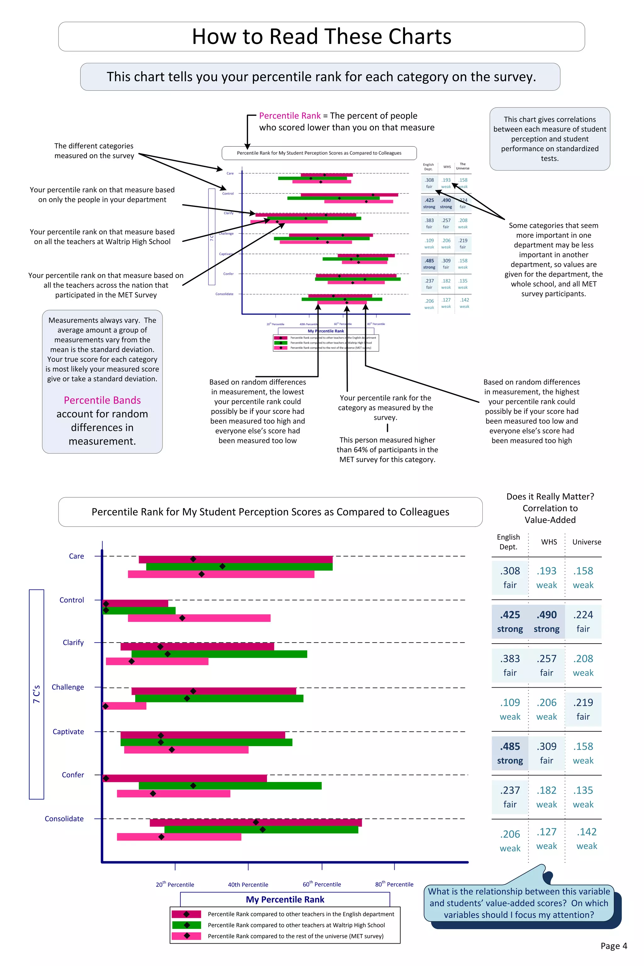
7C’s
My Percentile Rank
20th
Percentile 40th Percentile 60th
Percentile 80th
Percentile
Control
Clarify
Challenge
Captivate
Confer
Consolidate
Does it Really Matter?
Correlation to
Value-Added
WHS Universe
English
Dept.
.158
weak
.425
strong
.219
fair
.208
weak
.158
weak
.135
weak
.142
weak
.257
fair
.309
fair
.224
fair
.193
weak
.485
strong
.490
strong
.206
weak
.182
weak
.127
weak
.308
fair
.383
fair
.109
weak
.206
weak
.237
fair
What is the relationship between this variable
and students’ value-added scores? On which
variables should I focus my attention?Percentile Rank compared to other teachers in the English department
Percentile Rank compared to other teachers at Waltrip High School
Percentile Rank compared to the rest of the universe (MET survey)
Percentile Rank for My Student Perception Scores as Compared to Colleagues
Care
How to Read These Charts
The
Universe
Percentile Rank = The percent of people
who scored lower than you on that measure
The different categories
measured on the survey
This chart tells you your percentile rank for each category on the survey.
Your percentile rank on that measure based
on only the people in your department
Your percentile rank on that measure based
on all the teachers at Waltrip High School
Your percentile rank on that measure based on
all the teachers across the nation that
participated in the MET Survey
Some categories that seem
more important in one
department may be less
important in another
department, so values are
given for the department, the
whole school, and all MET
survey participants.
Your percentile rank for the
category as measured by the
survey.
Based on random differences
in measurement, the highest
your percentile rank could
possibly be if your score had
been measured too low and
everyone else’s score had
been measured too high
Based on random differences
in measurement, the lowest
your percentile rank could
possibly be if your score had
been measured too high and
everyone else’s score had
been measured too low
Measurements always vary. The
average amount a group of
measurements vary from the
mean is the standard deviation.
Your true score for each category
is most likely your measured score
give or take a standard deviation.
Percentile Bands
account for random
differences in
measurement. This person measured higher
than 64% of participants in the
MET survey for this category.
This chart gives correlations
between each measure of student
perception and student
performance on standardized
tests.
Page 4
A t-test is a statistical test that distinguishes whether a
number is truly different from the mean or just a random
difference due to normal variation between measures.
LEGEND
Total score is
especially low
relative to the
department
mean
Score is lower
than the
department
mean
Score is not
significantly
different from
department
mean
Score is higher
than the
department
mean
Total score is
especially high
relative to the
department
mean
Survey Results and Student Growth by Period
This number is NOT the
average score of your
students’ responses. It
is a number (called a z-
score) that tells you
whether your students’
responses were higher
or lower than other
teachers in your
department and by
how much.
Period 2R
Eng2 Reg
Care
Control
Clarify
Challenge
Captivate
Confer
Consolidate
Period 2G
Eng2 Reg
Period 3G
Eng2 Reg
ALL
Period 3R
Eng2 Reg
Class
Growth
School
Growth
Class Growth = includes all
students in that class period,
including LEP and special needs
students, because the measure
compares each individual
student only to himself and all
students are expected to show
growth.
School Growth = This number
serves as a reference against
which to judge each period’s
growth; by comparing the class
growth to the school growth,
one can judge whether that
class outperformed or under-
performed their peers. E.g.
Even if a period showed a fall of
-1.00 but the school showed a
fall of -6.25, that class
outperformed their peers.
Use caution when making inferences based on this value because
the sample population is very small.
By Period Brainstorming Worksheet
Compare your Student Growth by Period chart to your Student Perception by Period chart and brainstorm some possible causes, questions, or
actions to be taken. You can use the following symbols:
++ + +/- - --
very positive positive neutral negative very negative
results results results results results
Period Student Perception
Student Performance &
Value Added
Brainstorm
example ++ +/-
students report being challenged and captivated but didn’t show much gain on
the test; revisit my scope and sequence? am I missing some tested SE’s?
t-test
Your score is
significantly
lower than the
group if it is
below…
Your
department’s
mean…
Your score is
significantly
higher than
the group if
it is above…
Care -.754908 .092269 .939447
Control -.906445 -.059269 .787907
Clarify -.882609 -.035431 .811748
Challenge -.893728 -.046546 .800636
Captivate -.783838 .063331 .910500
Confer -.916662 -.069485 .777693
Consolidate -.907591 -.060408 .786775
This chart tells you how your students responded period by period on the survey and
the average growth in performance on the state test for each student in that period.
How to Read These Charts
Z-score for
each category
on the survey
for each
period
Statistical table that tells you whether your Z-score is truly
lower or higher than other teachers in your department or
if the difference is due to random variation
For easy interpretation, the Z-scores already have
been color-coded according to this chart.
Caution!
Measurements from
such a small number
of cases are highly
volatile—any
calculations from such
a small sample should
be taken with a grain
of salt.
Class Growth = includes all students in
that class period, including LEP and
special needs students, because the
measure compares each individual
student only to himself and all students
are expected to show growth.
School Growth = This number
serves as a reference against which
to judge each period’s growth; by
comparing the class growth to the
school growth, one can judge
whether that class outperformed
or under-performed their peers.
E.g. Even if a period showed a fall
of -1.00 but the school showed a
fall of -6.25, that class
outperformed their peers.
Even though .7755 doesn’t
appear to show much growth it
is significantly better than the
school’s performance of
-2.600.
-0.585 -0.794 -0.666 0.185 0.285 0.304 1.415
8.67
n=9
-6.130
1.075 1.445 1.952 1.471 0.385 -1.275 1.652
-25.89
n=7
-6.130
-0.610 -2.736 -0.798 -1.886 -0.895 -1.565 -1.579
-27.44
n=15
-6.130
-0.567 -3.307 -2.346 -1.262 -1.947 -1.275 -0.214
-4.8
n=15
-6.130
-0.446 -2.203 -0.996 -1.041 -0.899 -1.123 -0.355
-13.63
n=41
-6.130
Page 5
Summary of TAKS Results
Mean = the percent of students who showed mastery
(Pass & Commend Rates and Objectives) or the average
score (Scale Score and OERs)
N = the number of students who are included in this data
set; so as to make a fair comparison, students who are LEP
or have special needs are excluded from this data set.
N = the number of students who are included in this data
set; so as to make a fair comparison, students who are LEP,
have special needs, or are taking an AP-level class are
excluded from this data set.
The yellow box indicates that the
score is significantly lower than the
mean score for the content team.
The green box indicates that the
score is significantly higher than the
mean score for the content team.
The value-added
score is a
combination of
student
performance and
student growth as
used by EVAAS (and
ASPIRE).
TAKS Objectives
How to Read These Charts
This chart tells you how your students performed on the 2011 TAKS test.
Unlike the report returned by TEA, this data has been controlled for extenuating variables such as students’ LEP or
Special Education status. Only on-level students taking the regular TAKS test are included in this report.
Unlike the class
growth score, only
on-level students
who took the
regular TAKS test
are included in this
measure.
Eng 2
Teacher
Eng 2
Teacher
Eng 2
Teacher
Page 6
XXXXX
TAKS Scores & Course Grades Correlation Worksheet
TAKS Scores as Compared to Course Grades
This chart compares how a student’s performance on the TAKS test compares with his grade in the course.
These students
demonstrated
mastery of tested SEs
yet failed the course.
These students failed
both the TAKS test
and the course.
These students failed
to demonstrate
mastery of tested SEs
yet passed the course.
These students
passed both the TAKS
test and the course.
Each circle on the diagram represents one student plotted by his
score on the TAKS test on the y-axis (vertical) and his spring
course grade for that content area on the x-axis (horizontal).
Though all of these students demonstrated a radically different level
of mastery of tested SEs, they all earned a similar grade in the course.
Despite demonstrating relatively the
same mastery of SEs on the test, these
students finished the semester with
radically different course grades.
How to Read These Charts
How might a student end up
in each of these four quadrants?
Do the grades students earn in my class tend to reflect
students’ mastery of tested SEs?
Page 7
XXXXX

Individualized-Data-Report_Sample

  • 1.
    7C’s My Percentile Rank 20th Percentile40th Percentile 60th Percentile 80th Percentile Control Clarify Challenge Captivate Confer Consolidate Does it Really Matter? Correlation to Value-Added WHS Universe English Dept. .158 weak .425 strong .219 fair .208 weak .158 weak .135 weak .142 weak .257 fair .309 fair .224 fair .193 weak .485 strong .490 strong .206 weak .182 weak .127 weak .308 fair .383 fair .109 weak .206 weak .237 fair What is the relationship between this variable and students’ value-added scores? On which variables should I focus my attention?Percentile Rank compared to other teachers in the English department Percentile Rank compared to other teachers at Waltrip High School Percentile Rank compared to the rest of the universe (MET survey) Percentile Rank for My Student Perception Scores as Compared to Colleagues Care How to Read These Charts The Universe Percentile Rank = The percent of people who scored lower than you on that measure The different categories measured on the survey This chart tells you your percentile rank for each category on the survey. Your percentile rank on that measure based on only the people in your department Your percentile rank on that measure based on all the teachers at Waltrip High School Your percentile rank on that measure based on all the teachers across the nation that participated in the MET Survey Some categories that seem more important in one department may be less important in another department, so values are given for the department, the whole school, and all MET survey participants. Your percentile rank for the category as measured by the survey. Based on random differences in measurement, the highest your percentile rank could possibly be if your score had been measured too low and everyone else’s score had been measured too high Based on random differences in measurement, the lowest your percentile rank could possibly be if your score had been measured too high and everyone else’s score had been measured too low Measurements always vary. The average amount a group of measurements vary from the mean is the standard deviation. Your true score for each category is most likely your measured score give or take a standard deviation. Percentile Bands account for random differences in measurement. This person measured higher than 64% of participants in the MET survey for this category. This chart gives correlations between each measure of student perception and student performance on standardized tests. Page 4
  • 2.
    A t-test isa statistical test that distinguishes whether a number is truly different from the mean or just a random difference due to normal variation between measures. LEGEND Total score is especially low relative to the department mean Score is lower than the department mean Score is not significantly different from department mean Score is higher than the department mean Total score is especially high relative to the department mean Survey Results and Student Growth by Period This number is NOT the average score of your students’ responses. It is a number (called a z- score) that tells you whether your students’ responses were higher or lower than other teachers in your department and by how much. Period 2R Eng2 Reg Care Control Clarify Challenge Captivate Confer Consolidate Period 2G Eng2 Reg Period 3G Eng2 Reg ALL Period 3R Eng2 Reg Class Growth School Growth Class Growth = includes all students in that class period, including LEP and special needs students, because the measure compares each individual student only to himself and all students are expected to show growth. School Growth = This number serves as a reference against which to judge each period’s growth; by comparing the class growth to the school growth, one can judge whether that class outperformed or under- performed their peers. E.g. Even if a period showed a fall of -1.00 but the school showed a fall of -6.25, that class outperformed their peers. Use caution when making inferences based on this value because the sample population is very small. By Period Brainstorming Worksheet Compare your Student Growth by Period chart to your Student Perception by Period chart and brainstorm some possible causes, questions, or actions to be taken. You can use the following symbols: ++ + +/- - -- very positive positive neutral negative very negative results results results results results Period Student Perception Student Performance & Value Added Brainstorm example ++ +/- students report being challenged and captivated but didn’t show much gain on the test; revisit my scope and sequence? am I missing some tested SE’s? t-test Your score is significantly lower than the group if it is below… Your department’s mean… Your score is significantly higher than the group if it is above… Care -.754908 .092269 .939447 Control -.906445 -.059269 .787907 Clarify -.882609 -.035431 .811748 Challenge -.893728 -.046546 .800636 Captivate -.783838 .063331 .910500 Confer -.916662 -.069485 .777693 Consolidate -.907591 -.060408 .786775 This chart tells you how your students responded period by period on the survey and the average growth in performance on the state test for each student in that period. How to Read These Charts Z-score for each category on the survey for each period Statistical table that tells you whether your Z-score is truly lower or higher than other teachers in your department or if the difference is due to random variation For easy interpretation, the Z-scores already have been color-coded according to this chart. Caution! Measurements from such a small number of cases are highly volatile—any calculations from such a small sample should be taken with a grain of salt. Class Growth = includes all students in that class period, including LEP and special needs students, because the measure compares each individual student only to himself and all students are expected to show growth. School Growth = This number serves as a reference against which to judge each period’s growth; by comparing the class growth to the school growth, one can judge whether that class outperformed or under-performed their peers. E.g. Even if a period showed a fall of -1.00 but the school showed a fall of -6.25, that class outperformed their peers. Even though .7755 doesn’t appear to show much growth it is significantly better than the school’s performance of -2.600. -0.585 -0.794 -0.666 0.185 0.285 0.304 1.415 8.67 n=9 -6.130 1.075 1.445 1.952 1.471 0.385 -1.275 1.652 -25.89 n=7 -6.130 -0.610 -2.736 -0.798 -1.886 -0.895 -1.565 -1.579 -27.44 n=15 -6.130 -0.567 -3.307 -2.346 -1.262 -1.947 -1.275 -0.214 -4.8 n=15 -6.130 -0.446 -2.203 -0.996 -1.041 -0.899 -1.123 -0.355 -13.63 n=41 -6.130 Page 5
  • 3.
    Summary of TAKSResults Mean = the percent of students who showed mastery (Pass & Commend Rates and Objectives) or the average score (Scale Score and OERs) N = the number of students who are included in this data set; so as to make a fair comparison, students who are LEP or have special needs are excluded from this data set. N = the number of students who are included in this data set; so as to make a fair comparison, students who are LEP, have special needs, or are taking an AP-level class are excluded from this data set. The yellow box indicates that the score is significantly lower than the mean score for the content team. The green box indicates that the score is significantly higher than the mean score for the content team. The value-added score is a combination of student performance and student growth as used by EVAAS (and ASPIRE). TAKS Objectives How to Read These Charts This chart tells you how your students performed on the 2011 TAKS test. Unlike the report returned by TEA, this data has been controlled for extenuating variables such as students’ LEP or Special Education status. Only on-level students taking the regular TAKS test are included in this report. Unlike the class growth score, only on-level students who took the regular TAKS test are included in this measure. Eng 2 Teacher Eng 2 Teacher Eng 2 Teacher Page 6 XXXXX
  • 4.
    TAKS Scores &Course Grades Correlation Worksheet TAKS Scores as Compared to Course Grades This chart compares how a student’s performance on the TAKS test compares with his grade in the course. These students demonstrated mastery of tested SEs yet failed the course. These students failed both the TAKS test and the course. These students failed to demonstrate mastery of tested SEs yet passed the course. These students passed both the TAKS test and the course. Each circle on the diagram represents one student plotted by his score on the TAKS test on the y-axis (vertical) and his spring course grade for that content area on the x-axis (horizontal). Though all of these students demonstrated a radically different level of mastery of tested SEs, they all earned a similar grade in the course. Despite demonstrating relatively the same mastery of SEs on the test, these students finished the semester with radically different course grades. How to Read These Charts How might a student end up in each of these four quadrants? Do the grades students earn in my class tend to reflect students’ mastery of tested SEs? Page 7 XXXXX