Evaluation question 1
•Download as PPTX, PDF•
0 likes•91 views
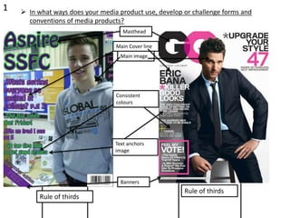
The document discusses how the student magazine both follows and challenges conventions of other media products: - It follows conventions such as using a masthead in the top left corner, a direct image of the subject for the cover, consistent colors, banners, and the rule of thirds. - However, it challenges conventions by using a bold, less formal font instead of the typical sans serif for the target audience. - While the contents page generally follows conventions like including page references and using photos to preview contents, the non-sans serif font breaks from convention.
Report
Share
Report
Share

Recommended
Evaluation Question 1
This document summarizes the codes and conventions used in a double page magazine spread. It describes including a main title in a suitable font at the top, a large main image taking up most of the space, a secondary related image, a standfirst to introduce the article, a pull quote in the same color as the title to grab attention, a byline crediting the author, the magazine masthead, and the article text wrapping around an image. It also includes other typical magazine elements like a consistent color scheme, broadcast time for the featured content, a drop cap, and background image. The document concludes that it conforms to established magazine codes and conventions to make the layout clear and appealing to readers accustomed to the real publication's
Question 1
This document summarizes the ways in which the student's mock magazine product uses conventions from real media products. It notes several conventions the mock magazine shares with real magazines, such as having a recognizable name and cover photo on the front page. It also includes conventions like a contents page with photos and text in a structured layout, double page articles with large titles and grabby questions. The student concludes they successfully applied known conventions like these throughout their mock magazine without developing new ones, but were able to improve their photo editing skills and maintain a consistent structure and theme.
Question 1 evaluation
My media product uses, develops, and challenges conventions of real media in several ways. I adhered to conventions like placing the main image in the center and using the rule of thirds. Throughout the magazine, research is applied, like centering the main cover image. The double page spread further develops conventions by cutting out an image and adding it to a new background with adjusted lighting. This challenges conventions more than just adding one picture.
Question 1 Evaluation AS MEDIA
This document discusses how the student's media magazine product uses and challenges conventions of real magazines. It identifies several conventions the magazine employs that are also seen in professional magazines, such as the use of cover lines, pull quotes, and consistent coloring. However, the student notes some challenges, such as including a wide range of images rather than just one per page as most magazines do. The student also used a Q&A format for articles rather than a traditional journalistic writing style, to better engage their target audience. Overall, the document analyzes the balance of employing industry standards while also innovating in ways suited to its intended readers.
Magazine production evaluation - Question 1
The document discusses the conventions used in the design of a magazine's front cover, contents page, and double page spread. For the front cover, conventions like font sizes, color schemes, placement of elements, and use of images are followed. The contents page layout follows rules of thirds and includes typical elements like the masthead, date, and subscription promotion. The double page spread also adheres to conventions such as pull quotes, drop caps, rules of thirds, date and page info placement, tags, and full-page images related to the article. Maintaining a consistent style and following industry standards helps the magazine look professional across formats.
Evaluation q1
This document discusses the conventions of real music magazines that the student's media product does and does not follow. It examines conventions related to the cover page, masthead, cover lines, images, contents page, articles, and overall design. The student's product challenges some conventions, such as tilting the cover line and not including a header, but follows others like using multiple images on the contents page and including a letter from the editor. Overall, the document analyzes how the student's magazine both adheres to and innovates on standard magazine formatting and features.
Question 6 Evaluation
The document discusses the various technologies used to create a magazine for a media studies class, including Photoshop, InDesign, Illustrator, cameras, Word, and Blogger. For Photoshop and Illustrator, the author found introductory lessons helpful for learning the software. While InDesign was initially difficult, with practice and help from teachers and classmates, the author gained confidence using it. Different cameras were used to take quality photos for the magazine. Word was used for writing tasks. Creating a blog using Blogger was a new process for sharing and receiving feedback on coursework progress.
Presentation. evaulation x
This document discusses the conventions and challenges of magazine design. It addresses the masthead, main image, headings, grid spacing, quotes, and barcode/date. Conventions like these are used but sometimes challenged with things like sexual images. The target audience is identified as young, fashionable females. Various technologies used in constructing the magazine are also reviewed, like guidelines, selection tools, and editing images. Looking back, improvements are recognized from the preliminary task to the full product.
Q1 front cover
The document discusses how the media product's front cover uses, develops, or challenges conventions of real magazines. It follows conventions such as including a masthead, cover lines on the sides, and medium shots for the main image. However, it challenges conventions by having the main image looking away from the camera, a barcode designed as a microphone, pricing in the top left corner instead of by the barcode, and issue date below the masthead instead of by the barcode. Overall, it both follows and challenges conventions to make the design appealing and informative for the target audience.
Evaluation question 1
My magazine product uses and challenges some conventions of real media products. It breaks conventions by having cover lines all over the page rather than confined to one side. It uses an unconventional black, white, and blue color scheme. The masthead overlaps the main image, whereas conventions typically have the image overlap the masthead. The magazine follows conventions regarding pricing and barcode location but makes them more explicit. It breaks conventions through using different font styles and sizes than typical magazines.
Evaluation q1 g
This document summarizes how the media product follows several conventions of real magazines. It discusses including page numbers on the double page spread but not elsewhere to balance convention with clarity. It also includes the standard masthead in the top left corner to catch readers' eyes. Fonts are primarily Myriad Pro to provide familiarity while some are distorted for variety. The color scheme of white, black, and red is used to look professional while accommodating color blindness. Conventions are followed to engage the intended audience while some, like page numbers, are adapted for usability.
Magazine plan for my magazines front cover
The document discusses the design of the front cover of a school magazine. It will include a main image relevant to school life to catch readers' attention. It will also have a memorable masthead in a bright color that stands out and acts as the magazine's visual brand. Cover lines will provide information about the magazine's contents and intrigue readers to buy it. A consistent color scheme will tie the cover together and match the main image. The layout places the masthead, image, school badge, cover lines, and slogan prominently. The contents page will list cover lines in an easy-to-read font matching the front cover for consistency.
Question 1
This document discusses how the media product draws from and challenges conventions of real magazines like Mixmag. It takes inspiration from Mixmag's masthead format, use of bold fonts and black and white color scheme. However, it challenges Mixmag's convention of having the main image cover the title. Pull quotes and mentions of popular artists are used on the cover to attract readers, as with most magazines. Photoshop effects are applied to images, unlike most magazines' simple photos. Page numbers and watermarks are also included for brand recognition.
Question 1
My magazine follows several conventions of real music magazines:
1. It uses a masthead on the cover and contents pages in a distinct font to identify the magazine title, mimicking techniques used by magazines like NME.
2. The color scheme of black, white, and red is typical of rock/indie magazines like Kerrang and adds a rough, grungy look.
3. The fonts mimic those of the genre to attract the target audience, and the main text font is used consistently throughout for familiarity, as seen in many rock magazines.
4. Studio photographs are the primary image on pages, a convention for a more professional look, though some action shots are also used on
Evaluation q1 Lydia Rosado
The document discusses how the media product both follows and challenges conventions of real magazines. It follows conventions through elements like the masthead, coverlines, images, and layout which make the information easily accessible to readers. It challenges conventions by using techniques like a faded background on the cover, different color schemes, alternate image poses and expressions, and adjusting the positioning or style of certain elements to make the product stand out. The document also analyzes how the inside article pages both conform to and adapt magazine conventions through similarities and differences in layout, text placement, columns and more.
Evaluation question 1
The document discusses the conventions of magazine design that the author followed and challenged in their media product. Some conventions the author followed include keeping the masthead visible and unobstructed, using medium shots for the main image, and including cover lines and page numbers on the contents page. Some conventions the author challenged include placing the strapline at the top of the cover rather than bottom and only including cover lines on the left side. The author strived to both conform to and adapt magazine conventions to suit their target teenage audience.
5
The document discusses how the author addressed their target audience of teenagers and young adults in their media product, a magazine. They included a music download voucher code to attract the audience since their research found most obtain music online. A sans serif font was used throughout as it looks modern and is easy to read for the target age group. Feedback from test groups confirmed the overall design was similar to real magazines and certain elements like the title attracted their attention, showing the design successfully appealed to the intended audience. Images used also portrayed stereotypical aggression through facial expressions and actions to match the interests of the target male demographic.
5
The document discusses how the author addressed their target audience of teenagers and young adults in their media product, a magazine. They included a music download voucher code to attract the audience since their research found most obtain music online. A sans serif font was used throughout as it looks modern and is easy to read for the target age group. Feedback from focus groups confirmed the overall design was similar to real magazines and certain features like the title attracted their attention, showing the design successfully appealed to the target audience. Images used portrayed stereotypical aggression through facial expressions and smashing a guitar, which the author felt would attract the target male demographic.
Question 1 evaluation
The media product summarizes how their magazine, called "Live Love Music", uses and develops conventions of real magazines. The masthead is placed at the top of the page to grab attention, as is standard. Images are a major part to attract audiences as the magazine is new. The front cover model portrays the genre and style in a way that fits the target audience while also challenging conventions by wearing casual clothing instead of an obvious costume.
Q1
The document discusses how the media product applies, develops, and challenges conventions of real magazines. It describes emulating several conventions in its design, such as the photography, layout, and use of pull quotes on the cover, contents page, and double page spread that are typically seen in magazines like Kerrang!. Specifically, it replicates the "L-shaped" contents page layout and column structure of articles. The document also notes developing continuity across pages through consistent fonts, colors, and focus on one artist. Additionally, it challenges some conventions by only featuring one band across pages for contextual linking, using heavy motion blur on a contents photo atypically, and making the magazine shorter than most for its young audience.
Evaluation
The document discusses what was learned from analyzing various parts of magazines, including front covers, contents pages, and double page spreads. For front covers, key techniques identified were the use of colors associated with the genre and central images of artists looking at the camera. For contents pages, elements like intriguing titles and graphic features that match the listed contents were noted. Double page spreads typically feature a large graphic on one page with text on the other or wrapped around. Feedback from a questionnaire revealed the importance of understanding the target audience's preferences to best meet their needs. This feedback will be used to improve the magazine concept.
In what ways does your media product use, develop and challenge forms and con...
The document discusses how the author's media product follows conventions of real pop magazines for their target young audience. The author researched various magazine genres and pop magazines specifically to identify common styles and layouts to incorporate, such as direct addressing of the reader, medium close-up shots, and bright colors. The author aimed to closely follow typical magazine conventions to make their magazine familiar to the target audience while adding some unique elements like a blue background color.
Question 1
A convention in media is a unique style or format used to present content. Magazines each have their own conventions for layout, text styles, and visual elements that establish their brand and engage readers. The document discusses how the author's magazine front cover, double-page spread, and contents page follow conventions from the magazine VIBE, such as placing text within colored blocks or using large overlapping images. Common conventions like barcodes and structured tables of contents are also used to mimic realism.
Evaluation
This document summarizes how the media product uses common magazine conventions like a masthead, coverlines, and direct eye contact on the cover photo. It explains that the masthead gives the magazine an identity and is the first thing readers see. Coverlines provide a sneak peek at the magazine's contents to attract potential buyers. The layout of the contents page breaks some conventions but tries to follow a rule of three for organization.
Task 16 evaluation question 1 double page spread
Both magazine spreads use a similar interview layout with questions and answers in columns. However, the key differences are:
- The OP magazine has the title, subtitles, and logo on the left page only, following convention. Q magazine spreads these elements across both pages.
- Q magazine does not include a page number, breaking convention. The OP magazine includes a page number in yellow for branding consistency.
- Quotes are presented differently, with the OP magazine making some quotes larger than others to attract readers. Q magazine does not vary quote sizes.
Overall the OP magazine follows most conventions around layout and branding elements, while Q magazine breaks some conventions in its presentation of elements across the double page.
5. How did you attract/ address your target audience
To attract their target audience, the author used both conventional magazine design elements like cover lines and strap lines, as well as some unconventional elements like placing the masthead on the left side and using a wider image instead of a close-up on the cover. By combining traditional and original styles, the author aimed to make the magazine feel familiar yet different and unique. They also used bold colors, modern technology references, and photos that reflected the target audience to appeal to their independent and contemporary readership.
In what ways does your media product use, develop or challenge forms and conv...
The student created a music magazine as a class project. In their evaluation, they note how their magazine follows several conventions of real music magazines, such as featuring musicians on the cover and limiting the color scheme. They also followed conventions like placing the magazine title behind the models' heads on the cover. However, they challenged some conventions by keeping the editor's note on the contents page short and using many photos rather than just text to showcase featured bands. Overall, they were pleased with how their magazine looked and that it received positive reactions while generally adhering to typical magazine conventions.
Evaluation Question 1
The document discusses how the media product evaluates, develops, and challenges conventions of real media forms. It examines how studying other music magazines like Q and NME helped understand what to include. Key conventions that were adopted include a close-up image taking up most of the front cover, a small masthead, and short cover lines. The contents page layout was also modeled after Q, including columns for regulars, features and advertisements. Double page spreads similarly followed conventions like a close-up image on the first page and long shot on the second, with casual writing and quotes. Overall, the goal was to stick to typical music magazine codes and formats to create a professional look.
All risk assessments
This risk assessment document identifies potential hazards for a student taking photos around their college campus. It lists 3 hazards in each of 4 different locations: inside the reception area, outside by the entrance from the park, outside the sports hall, and in the refectory. The hazards include bumping into people, slipping on stones or steps, tripping over chairs or bags. For each hazard, the document rates the degree of risk, identifies existing control measures, and notes any further actions required to mitigate the risks.
TASK 5
The document outlines plans for a new music magazine, including researching similar publications for inspiration. It discusses using the vintage rock magazine as a model for consistency of style and layout. Potential names for the new magazine are listed as "Boogie-Woogie", "Chicago Blues", and "Heartbreak Hotel". Suggested article topics include interviews with up-and-coming artists and readers' favorite songs.
More Related Content
What's hot
Q1 front cover
The document discusses how the media product's front cover uses, develops, or challenges conventions of real magazines. It follows conventions such as including a masthead, cover lines on the sides, and medium shots for the main image. However, it challenges conventions by having the main image looking away from the camera, a barcode designed as a microphone, pricing in the top left corner instead of by the barcode, and issue date below the masthead instead of by the barcode. Overall, it both follows and challenges conventions to make the design appealing and informative for the target audience.
Evaluation question 1
My magazine product uses and challenges some conventions of real media products. It breaks conventions by having cover lines all over the page rather than confined to one side. It uses an unconventional black, white, and blue color scheme. The masthead overlaps the main image, whereas conventions typically have the image overlap the masthead. The magazine follows conventions regarding pricing and barcode location but makes them more explicit. It breaks conventions through using different font styles and sizes than typical magazines.
Evaluation q1 g
This document summarizes how the media product follows several conventions of real magazines. It discusses including page numbers on the double page spread but not elsewhere to balance convention with clarity. It also includes the standard masthead in the top left corner to catch readers' eyes. Fonts are primarily Myriad Pro to provide familiarity while some are distorted for variety. The color scheme of white, black, and red is used to look professional while accommodating color blindness. Conventions are followed to engage the intended audience while some, like page numbers, are adapted for usability.
Magazine plan for my magazines front cover
The document discusses the design of the front cover of a school magazine. It will include a main image relevant to school life to catch readers' attention. It will also have a memorable masthead in a bright color that stands out and acts as the magazine's visual brand. Cover lines will provide information about the magazine's contents and intrigue readers to buy it. A consistent color scheme will tie the cover together and match the main image. The layout places the masthead, image, school badge, cover lines, and slogan prominently. The contents page will list cover lines in an easy-to-read font matching the front cover for consistency.
Question 1
This document discusses how the media product draws from and challenges conventions of real magazines like Mixmag. It takes inspiration from Mixmag's masthead format, use of bold fonts and black and white color scheme. However, it challenges Mixmag's convention of having the main image cover the title. Pull quotes and mentions of popular artists are used on the cover to attract readers, as with most magazines. Photoshop effects are applied to images, unlike most magazines' simple photos. Page numbers and watermarks are also included for brand recognition.
Question 1
My magazine follows several conventions of real music magazines:
1. It uses a masthead on the cover and contents pages in a distinct font to identify the magazine title, mimicking techniques used by magazines like NME.
2. The color scheme of black, white, and red is typical of rock/indie magazines like Kerrang and adds a rough, grungy look.
3. The fonts mimic those of the genre to attract the target audience, and the main text font is used consistently throughout for familiarity, as seen in many rock magazines.
4. Studio photographs are the primary image on pages, a convention for a more professional look, though some action shots are also used on
Evaluation q1 Lydia Rosado
The document discusses how the media product both follows and challenges conventions of real magazines. It follows conventions through elements like the masthead, coverlines, images, and layout which make the information easily accessible to readers. It challenges conventions by using techniques like a faded background on the cover, different color schemes, alternate image poses and expressions, and adjusting the positioning or style of certain elements to make the product stand out. The document also analyzes how the inside article pages both conform to and adapt magazine conventions through similarities and differences in layout, text placement, columns and more.
Evaluation question 1
The document discusses the conventions of magazine design that the author followed and challenged in their media product. Some conventions the author followed include keeping the masthead visible and unobstructed, using medium shots for the main image, and including cover lines and page numbers on the contents page. Some conventions the author challenged include placing the strapline at the top of the cover rather than bottom and only including cover lines on the left side. The author strived to both conform to and adapt magazine conventions to suit their target teenage audience.
5
The document discusses how the author addressed their target audience of teenagers and young adults in their media product, a magazine. They included a music download voucher code to attract the audience since their research found most obtain music online. A sans serif font was used throughout as it looks modern and is easy to read for the target age group. Feedback from test groups confirmed the overall design was similar to real magazines and certain elements like the title attracted their attention, showing the design successfully appealed to the intended audience. Images used also portrayed stereotypical aggression through facial expressions and actions to match the interests of the target male demographic.
5
The document discusses how the author addressed their target audience of teenagers and young adults in their media product, a magazine. They included a music download voucher code to attract the audience since their research found most obtain music online. A sans serif font was used throughout as it looks modern and is easy to read for the target age group. Feedback from focus groups confirmed the overall design was similar to real magazines and certain features like the title attracted their attention, showing the design successfully appealed to the target audience. Images used portrayed stereotypical aggression through facial expressions and smashing a guitar, which the author felt would attract the target male demographic.
Question 1 evaluation
The media product summarizes how their magazine, called "Live Love Music", uses and develops conventions of real magazines. The masthead is placed at the top of the page to grab attention, as is standard. Images are a major part to attract audiences as the magazine is new. The front cover model portrays the genre and style in a way that fits the target audience while also challenging conventions by wearing casual clothing instead of an obvious costume.
Q1
The document discusses how the media product applies, develops, and challenges conventions of real magazines. It describes emulating several conventions in its design, such as the photography, layout, and use of pull quotes on the cover, contents page, and double page spread that are typically seen in magazines like Kerrang!. Specifically, it replicates the "L-shaped" contents page layout and column structure of articles. The document also notes developing continuity across pages through consistent fonts, colors, and focus on one artist. Additionally, it challenges some conventions by only featuring one band across pages for contextual linking, using heavy motion blur on a contents photo atypically, and making the magazine shorter than most for its young audience.
Evaluation
The document discusses what was learned from analyzing various parts of magazines, including front covers, contents pages, and double page spreads. For front covers, key techniques identified were the use of colors associated with the genre and central images of artists looking at the camera. For contents pages, elements like intriguing titles and graphic features that match the listed contents were noted. Double page spreads typically feature a large graphic on one page with text on the other or wrapped around. Feedback from a questionnaire revealed the importance of understanding the target audience's preferences to best meet their needs. This feedback will be used to improve the magazine concept.
In what ways does your media product use, develop and challenge forms and con...
The document discusses how the author's media product follows conventions of real pop magazines for their target young audience. The author researched various magazine genres and pop magazines specifically to identify common styles and layouts to incorporate, such as direct addressing of the reader, medium close-up shots, and bright colors. The author aimed to closely follow typical magazine conventions to make their magazine familiar to the target audience while adding some unique elements like a blue background color.
Question 1
A convention in media is a unique style or format used to present content. Magazines each have their own conventions for layout, text styles, and visual elements that establish their brand and engage readers. The document discusses how the author's magazine front cover, double-page spread, and contents page follow conventions from the magazine VIBE, such as placing text within colored blocks or using large overlapping images. Common conventions like barcodes and structured tables of contents are also used to mimic realism.
Evaluation
This document summarizes how the media product uses common magazine conventions like a masthead, coverlines, and direct eye contact on the cover photo. It explains that the masthead gives the magazine an identity and is the first thing readers see. Coverlines provide a sneak peek at the magazine's contents to attract potential buyers. The layout of the contents page breaks some conventions but tries to follow a rule of three for organization.
Task 16 evaluation question 1 double page spread
Both magazine spreads use a similar interview layout with questions and answers in columns. However, the key differences are:
- The OP magazine has the title, subtitles, and logo on the left page only, following convention. Q magazine spreads these elements across both pages.
- Q magazine does not include a page number, breaking convention. The OP magazine includes a page number in yellow for branding consistency.
- Quotes are presented differently, with the OP magazine making some quotes larger than others to attract readers. Q magazine does not vary quote sizes.
Overall the OP magazine follows most conventions around layout and branding elements, while Q magazine breaks some conventions in its presentation of elements across the double page.
5. How did you attract/ address your target audience
To attract their target audience, the author used both conventional magazine design elements like cover lines and strap lines, as well as some unconventional elements like placing the masthead on the left side and using a wider image instead of a close-up on the cover. By combining traditional and original styles, the author aimed to make the magazine feel familiar yet different and unique. They also used bold colors, modern technology references, and photos that reflected the target audience to appeal to their independent and contemporary readership.
In what ways does your media product use, develop or challenge forms and conv...
The student created a music magazine as a class project. In their evaluation, they note how their magazine follows several conventions of real music magazines, such as featuring musicians on the cover and limiting the color scheme. They also followed conventions like placing the magazine title behind the models' heads on the cover. However, they challenged some conventions by keeping the editor's note on the contents page short and using many photos rather than just text to showcase featured bands. Overall, they were pleased with how their magazine looked and that it received positive reactions while generally adhering to typical magazine conventions.
Evaluation Question 1
The document discusses how the media product evaluates, develops, and challenges conventions of real media forms. It examines how studying other music magazines like Q and NME helped understand what to include. Key conventions that were adopted include a close-up image taking up most of the front cover, a small masthead, and short cover lines. The contents page layout was also modeled after Q, including columns for regulars, features and advertisements. Double page spreads similarly followed conventions like a close-up image on the first page and long shot on the second, with casual writing and quotes. Overall, the goal was to stick to typical music magazine codes and formats to create a professional look.
What's hot (20)
In what ways does your media product use, develop and challenge forms and con...
In what ways does your media product use, develop and challenge forms and con...
5. How did you attract/ address your target audience
5. How did you attract/ address your target audience
In what ways does your media product use, develop or challenge forms and conv...
In what ways does your media product use, develop or challenge forms and conv...
Viewers also liked
All risk assessments
This risk assessment document identifies potential hazards for a student taking photos around their college campus. It lists 3 hazards in each of 4 different locations: inside the reception area, outside by the entrance from the park, outside the sports hall, and in the refectory. The hazards include bumping into people, slipping on stones or steps, tripping over chairs or bags. For each hazard, the document rates the degree of risk, identifies existing control measures, and notes any further actions required to mitigate the risks.
TASK 5
The document outlines plans for a new music magazine, including researching similar publications for inspiration. It discusses using the vintage rock magazine as a model for consistency of style and layout. Potential names for the new magazine are listed as "Boogie-Woogie", "Chicago Blues", and "Heartbreak Hotel". Suggested article topics include interviews with up-and-coming artists and readers' favorite songs.
Initial introductory task
A music magazine focuses on a particular music genre or niche market. It contains news, interviews, and reviews of new albums, songs, films and music videos. Readers can also find information on tour dates, music festivals, and advertisements relevant to the target audience. Images in the magazine include photographs of artists, album covers, and merchandise as well as pictures related to the genre. The front cover typically features a prominent image of a well-known artist from that genre along with cover lines previewing the magazine's stories and content.
Choosing a genre
The document discusses choosing a genre and name for a new music magazine. It considers focusing on pop rock as this combination has been successful for other magazines like Q. A pop rock genre would appeal to a wide target audience of young adults and incorporate popular music. It also discusses choosing a name that identifies the genre and engages readers, as well as establishing a consistent house style through color scheme and fonts to brand the magazine. Proper article layout and design is also important to create appealing content and maintain the house style across issues to build recognizability with readers.
Task 5
The document discusses a music magazine called Q that will focus on the pop genre of music. Q is a monthly UK-based magazine that has been published since 1986. It covers pop music news and reviews and was founded to appeal to teenagers interested in popular music. Some key details about Q are that it is published by Bauer Media Group, was first issued in October 1986, and was originally called "Cue" but the name was later changed to the single letter "Q" for marketing purposes.
4 questions on ipc
IPC has been publishing magazines for over 150 years, starting with titles focused on outdoor activities and gardening. In later decades, they expanded to topics like women's interests and music. Their magazines have targeted a variety of audiences. IPC would be an appropriate publisher for a new music magazine due to their long history in publishing, broad range of audiences, and experience with successful music titles like NME. They may focus on genres not covered by other magazines, such as indie rock. While IPC publishes some music magazines, alternative publishers like Bauer could also work well since they do not currently have a magazine dedicated to music but do have experience publishing multiple music-focused titles.
task 4a questions
IPC has published magazines targeting a variety of audiences in Europe for over a century, including magazines focused on hobbies like horses, cycling, and stamps. They also published magazines for women like Woman's Own and introduced Woman's Weekly in the early 1900s targeting white, middle-class women. IPC would be an appropriate publisher for a new music magazine because they have experience targeting various audiences with different magazines and have been in business for a long time, so they could attract multiple music genres and have a well-known publishing brand.
Task 1
A music magazine is a publication targeted towards a specific music genre and its audience. It aims to create intimacy between readers by assuming they are already familiar with the genre's content. Typical content includes celebrity gossip, tour dates, success stories, interviews, reviews, and charts focused on the genre. Images commonly feature bands, fans with artists, music festivals, album covers, and representations of the genre's culture. General characteristics of all music magazines include direct address of readers, mastheads related to their genre, legally required publishing details, biographies of editors or artists, and promotional text to draw readers' attention.
Evaluation question 1
The document discusses how the media product, a magazine called Skyline, uses and develops conventions of magazine design. It describes several elements of the magazine's front cover that follow conventions, such as using a medium shot for the main image, applying the rule of thirds, and using a consistent color scheme. It also notes some ways the magazine challenges conventions, such as using a mixture of serif and sans serif fonts rather than mainly one type. For the contents page, the document notes how it positions elements according to the rule of thirds, highlights certain articles, and includes a background image, developing the original drawn draft.
Ipc research
The document discusses the types of magazines and target audiences that IPC, a publishing company, has been associated with over the years. It notes that IPC initially targeted middle class men with newspapers in the early 1800s and later launched women's magazines. It launched the first music magazine, Musical Express, in the 1950s. By the late 1960s, IPC was publishing a wide variety of magazine genres including music, women's, sports and special interest magazines targeting various classes, ages, and genders.
4a
IPC began launching magazines in the late 1800s targeting middle class white men, but began expanding their audiences over time. In the early 1900s, they started targeting white middle class women with magazines like Woman's Own. In the 1950s, they launched music magazines like NME that attracted younger, mostly white middle class male audiences. IPC has since continued targeting a wide range of audiences across gender, ethnicity and social class.
Media
The magazine cover is aimed at teenage girls, as indicated by the pink font and rounded font style. It features an image of Lady Gaga to appeal to the target audience. Throughout the magazine, a pink, black, and white color scheme and informal font are used to create a fun, accessible feel for teenage readers. The contents page is clearly laid out to help readers easily find articles on their favorite music artists.
Fonts+colours .
Different fonts and colors send messages to audiences. A sans serif font will appeal to younger audiences and be used for the magazine, while a script font is elegant but not readable and better suits older audiences. A boxed font works only for titles, while a handwritten font can be used for the contents page. Font sizes will be largest for the masthead and main coverline, and smaller for other coverlines and articles. Dark and bright colors like purple and pink together make the magazine visually appealing, fitting the target younger female audience for a pop genre magazine.
Viewers also liked (14)
Similar to Evaluation question 1
gPpt0000000 q1 good
The document discusses how the media product challenges conventions of real media. It uses proper formatting and placement of images, such as centering the main image on the cover page. It also develops conventions by cutting out images and adding them to custom backgrounds to look more professional. Additionally, it includes a variety of image styles and colors throughout the pages rather than keeping everything uniform.
Question 1
The media product uses and develops conventions of real music magazines. It includes typical magazine features like a masthead, cover lines, barcode, date, issue, and price. Some conventions are challenged, like placing the price next to the barcode rather than below the masthead. Not making one cover line stand out more than others also challenges convention.
The contents page follows conventions with columns, title, masthead, and multiple images. It challenges conventions by using only two columns instead of three and adding brief article descriptions to images rather than just page numbers.
The double-page article layout uses conventions like a main image, bylines, columns, and separating questions and answers with font colors. It challenges conventions by using only
Evaluation
The document compares and contrasts the author's college life magazine with Teen Vogue magazine in terms of their adherence to and challenging of typical magazine conventions and codes. Some similarities between the magazines include including things like a masthead, barcode, cover lines, and main image on the front cover. Differences include things like color scheme, placement of date line, inclusion of a puff or tagline. The author also discusses keeping to conventions for things like layout of contents page while also challenging conventions through things like unique color scheme and number of images used.
Question 1
In what ways does your media product use, develop or challenge forms and conventions of real media products?
Main Task Question 1
The document discusses how the media product challenges conventions of real magazines. It uses proper formatting of images on the cover including centering the main image and using cover lines. Internally it challenges conventions by cutting out images and placing them on custom backgrounds, varying image styles and editing images differently. It also challenges conventions by varying colors across pages rather than keeping them consistent.
Evaluation activity 1
The document summarizes how the student's media product uses and develops conventions of real magazines. For the cover title, the font fits conventions but challenges conventions by using different fonts on interior pages. Page layouts are similar to Q Magazine. Images use close-ups and framing like real magazines. The article font and layout is readable like Q Magazine but the header style is more centralized. The magazine represents the alternative rock genre through clothing and lipstick. Artists are depicted simply to avoid distraction from their image. The color scheme develops conventions from magazines like Q and Vibe.
Evaluation Question 1
This document discusses how the media product, a magazine, uses and develops conventions of real magazines. It describes using mastheads, cover lines, main images and fonts in conventional ways. While some elements initially aimed to challenge conventions, like cover line placement, they had to conform to conventions after photos were taken. Layouts follow conventions like interviews and a "from the editor" section. A two-page main image also conforms to conventions seen in reference magazines. Text placement makes it readable around photos, respecting conventions of leaving images prominent. Overall, the magazine respects many real magazine conventions while a few elements had to alter plans to better conform.
Media Studies
The document discusses how the media product both uses and challenges conventions of real magazines. It uses conventions such as a masthead, coverlines, consistent page numbering and layout. However, it also challenges conventions by having an informal band photo on the cover where members are swearing, an untidy double page spread layout, and photos of smoking and swearing which would typically not be allowed. The goal is to have a magazine that appeals to an indie audience by staying true to the genre rather than strictly following mainstream magazine conventions.
Evaluation of student magazine final
The document evaluates a student magazine by analyzing how it uses and challenges conventions of real media products. It finds that the student magazine challenges conventions by using a bookcase background instead of white, and uses color schemes and mastheads similarly to real magazines like GQ and Vogue to look professional. The magazine addresses students at the college directly and uses an attractive model on the cover to attract readers, mimicking techniques used in other magazines. Through creating the magazine, the author learned to use software like Photoshop and technologies like cameras, blogs, and file sharing to develop professional-looking media.
Conventions
The document discusses the design of a magazine cover and contents page and how it uses and develops conventions of magazine design. Some key points:
- The magazine cover uses a masthead, consistent colors, serif fonts, cover lines, and anchors the main image like typical magazine covers. However, it uses a medium close-up image rather than close-up to fit its niche college audience.
- The contents page uses consistent colors, photos, page references, serif subtitles and numbers, and rule of thirds composition like conventional magazines.
- Minor changes were made from draft designs to better follow conventions - adding more cover lines, repositioning the image, and arranging images and text on the contents page
Magazine project evaluation
The document discusses the design choices made for a magazine called "Cure Magazine" including using a neat masthead on the cover to identify the magazine, including all article topics on the cover lines for an unconventional design, and using images throughout to bring dimension while maintaining a simple and clean layout with ample white space consistent with the magazine's style. The double page spread continues this style with placement of images and text while representing teenage social groups by including casual photos of boys hanging out that most people could relate to their own experiences as teenagers.
Evaluation media
The document discusses the ways in which the author's magazine designs use and develop conventions of real magazines.
For the magazine cover, the author uses typical conventions like a masthead at the top and a medium shot for the main image. However, the placement of the strapline at the bottom challenges conventions.
For the double-page spread, the use of different colored text in a Q&A format follows conventions, while just using the subject's name for the title develops conventions.
The contents page keeps many elements conventional, like a background image and listing content, but overlaps images in a way atypical of real magazines.
The author aims to represent social group E, ages 18-25, through
Evaluation question 1
The document discusses how the media product, a magazine, uses conventions of real magazines. It describes including a masthead positioned using the rule of thirds, medium shots for the main image, larger cover lines for the main story, consistent house style, bar code in the bottom corner, large bold masthead, cover lines about artists, large numbers by subheadings, box format for contents, bold subheadings with small text, multiple images, recurring house style, and information about next week's issue. It also discusses using columns for body text, large mastheads for double page spreads, large artist images, consistent house style on double page spreads, and different colors or bolding to indicate speakers in interviews.
Evaluation question 1
The document provides an evaluation of the forms and conventions used in the student's media magazine product. It discusses several key conventions used in the front cover, contents page, and article page. The front cover uses conventions like the masthead, cover lines, selling line, and cover image. The contents page includes page numbers, columns, editor's letter, and context. The article page features a large cover image, columns for text, drop caps, pull quotes, and adheres to the color scheme. The student also drew inspiration from existing magazines and discussed how some magazines challenge conventions by not including cover lines or positioning the masthead differently.
Evaluation question 1
The document provides an evaluation of the forms and conventions used in the student's media magazine product. It discusses several key conventions used in the front cover, contents page, and article page that align with real music magazines. This includes the masthead, cover lines, cover image, color scheme, columns, and page numbers. The student also discusses how they drew inspiration from existing magazines and developed some elements while maintaining the overall conventions. Finally, it analyzes some magazines that challenge conventions in their designs.
Eval Q1
This document summarizes how the media product uses and develops conventions of real magazines. It discusses design elements like the masthead, cover images, bar codes, and cover lines. It also covers layouts for the content page, with columns, images on the left, page numbers, and fonts. The double page spread layout includes a large cover image, headlines, and 3 column writing style. Images are typically bright, large, and from a variety of locations to appeal to different audiences. While some conventions are followed, the design also challenges conventions in places like thinner mastheads and fewer images per page.
Evaluation question 1
This document discusses how the author's media product both uses and challenges conventions of real magazines.
Some conventions that were used include a prominent masthead in a bold font, pull quotes on the cover and spreads to intrigue readers, studio photographs like those in Mojo magazine from the 1990s, and multiple sub-images on the cover.
Some ways the product challenged conventions were using a retro art style with the masthead, incorporating QR codes for online content not typically seen, and combining sophistication and nostalgia in the design. The goal was to create a magazine that felt both familiar yet modern for the target audience.
Question 1 - Media Evaluation
This document provides an analysis of how the student's media product conforms to and develops conventions of real pop genre magazines. It summarizes how various elements like the masthead, naming, images, costumes, people, title/font style, written content, music suggestions, layout, and contents page follow expectations of the genre through techniques like bright colors and styles, airbrushed models, and column formatting while also challenging some conventions through a less organized interview layout and expanded contents page elements. The analysis considers how stereotypes, target audiences, and readability are addressed across the different sections.
Similarities and differeces
This document discusses how the media product both follows and challenges conventions of magazine design. It follows conventions such as using buzzwords and a top strip to provide information, anchoring text to images, and using a clear color scheme and subheadings to organize sections. However, it challenges conventions by having the model directly address the audience in a relaxed pose, placing the masthead on the right side to avoid covering the image, and centering the main coverline over the image. The contents page also challenges conventions by including three smaller images instead of one large image and adding a bottom strip for continuity between pages.
Similar to Evaluation question 1 (20)
More from asmediad14
Question 2 - Emma Grimes
The document discusses the effectiveness of combining images, sound, voiceovers, presenters, gender representation, and titles across a documentary, double-page magazine spread, and radio trailer about the topic of social media. Key points included using the same images, music, voxpops, and experts across all three mediums to maintain consistency and appeal to the target teenage audience. Both female and male perspectives were represented equally. The documentary and radio trailer used different voiceovers to avoid boredom, while the magazine spread quoted the documentary's presenters to create links between the pieces. All three linked back to the BBC for branding purposes.
Question 2 - Emma Grimes
The document discusses the effectiveness of combining images, sound, voiceovers, presenters, gender representation, and titles across a documentary, double-page magazine spread, and radio trailer about the topic of social media. Key points included using the same images, music, voxpops, and experts across all three mediums to consistently target teenagers. Voiceovers differed between the documentary and radio trailer to avoid boredom. The products were also effectively linked through quoting presenters and including the documentary's broadcast details. Overall the combination of elements across the three products created an coherent advertising strategy.
Magazine screenshots
This document provides a step-by-step guide for creating a magazine double page spread (DPS) in InDesign. Key steps included adding a background layer, designing the main title using social media logos, removing backgrounds from images, adding a sidebar with app icons and statistics, and formatting the text article by importing from Word and using drop caps and bylines. The overall process guided the reader through visually designing multiple elements to construct an engaging two-page magazine layout.
Font Types
This document discusses different font styles and their suitability for different purposes in a magazine. It describes sans serif fonts as commonly used for body text and being suitable for attracting a teenage audience. Serif fonts are described as classic but less versatile and more suitable for older audiences. Script fonts are seen as adding personality but being difficult to read. Display fonts are meant to draw attention, such as for mastheads. Hand lettered fonts can provide a personal touch for things like editorials and bylines. Each font style has strengths and weaknesses for different target audiences and uses.
Article sub edited
This documentary explores the effects of social media on everyday life, as social media plays an active part in the lives of 2.2 billion people, with over 12 new active mobile social users added every second. The one-hour documentary airs on BBC Three and examines both the negative and positive impacts of social media on society. It includes interviews with experts such as a curriculum leader who discusses using social media in education. While experts praise social media's usefulness, they also note it can become obsessive and cause students to be online late at night.
Student risk assessment- computers in library
This risk assessment document evaluates the risks of students filming or taking photos in the college library. It identifies potential hazards such as tripping over wires or bags on the floor. The degree of risk is assessed as minor for students, staff, cleaners, visitors, and people with disabilities. Existing control measures are outlined, such as keeping wires tied together and spaced chairs. Further action plans are proposed, like filming in less cluttered areas and ensuring bags and unused chairs are tucked away. The overall risk rating for the assessed task is determined to be minimal.
Student risk assessment - canteen
This risk assessment document evaluates the risks of students filming and taking photos in the college refectory/canteen area. It identifies several hazards including a busy location with risk of slipping on spilled liquids, and a fire hazard due to the nearby kitchen. The worst potential outcomes are minor injuries from slips or major injuries from a kitchen fire. Existing controls include cleaning staff and clear pathways. The action plan is to film when fewer students are present to avoid noise disruptions but not block foot traffic or cause other issues. Filming locations should also avoid risks of injury or interference.
Voice over script
Social media is ubiquitous in everyday life, especially for students. The documentary will explore how social media affects both students and staff at a local college. It will include views from students on the most popular social media apps they use, how useful the apps are in their daily lives, and how social media impacts them overall. Interviews were conducted with students at Solihull Sixth Form College to understand their social media habits and perspectives on the role these platforms play in their everyday experiences.
Media studies script
Social networking has over 100 million daily users on Twitter alone. A report explores how social media affects both students and teachers at Solihull Sixth Form College, where interviews were conducted with Politics and Sociology teacher Mike Pattison about his views on social media, as well as students in the local Solihull town center.
Storyboard a2
This storyboard contains 16 shots for a documentary about social media and teenagers. Shot 1 introduces the documentary outside a college with narration about social networking. Shot 2 shows a teenager on a computer at the library while the narrator talks about social networking. Shot 3 shows an interview in the college canteen asking students their views on social media. The documentary examines how social media affects teenagers' lives and behaviors.
Brainstorm 2 gaming makes you violent
This document outlines a potential documentary topic on whether gaming makes people more violent. The documentary would film gamers playing and get their thoughts on violence in games. It would also use archival footage and ask experts in gaming shops their opinions. The documentary would discuss what types of games are most violent and how gaming affects violence. It proposes an expositional mode and multi-strand narrative style. The target audience would be mainly male teenagers, and filming would occur on the college grounds and in gaming shops. Experts from gaming shops would provide opinions, and vox pops from gamers and parents would also be collected.
Question 1
The document discusses how the media product sticks to conventions of real magazines. It follows rules such as including a masthead at the top of pages, using a consistent color scheme and font for house style. It also includes coverlines, barcodes, dates and sticks to a stereotypical theme for its target audience. Throughout the contents page and double page spread, it maintains typical magazine conventions like listing page numbers and using images and colored fonts to engage readers.
Task 4b
Immediate Media Company publishes over 50 magazine titles and employs 750 staff. Top of the Pops magazine is published monthly focusing on pop music charts, gossip, fashion and more. Originally targeted between ages 12-15, it now reaches a wider audience including parents feeling nostalgic. The document discusses choosing a pop music genre for a magazine and researching Top of the Pops magazine published by Immediate Media Company.
Question 6
I have learned about several new technologies during the construction of my magazine, including InDesign, Adobe Photoshop, Prezi, and the Snipping Tool. InDesign allowed me to properly resize images on pages. The Snipping Tool provided an efficient way to copy and paste parts of pages. I also expanded my knowledge of Microsoft Word and PowerPoint by using them to create presentations and simple documents.
Alternative rock artists
The document lists and provides brief descriptions of several influential rock bands and artists. It includes profiles of R.E.M describing their formation and role in pioneering alternative rock. It also covers Nirvana's rise to fame and influence on grunge and alternative rock. The Smiths are highlighted as one of the most important British alternative rock bands of the 1980s. Evanescence is introduced with details on founding members Amy Lee and their status as a successful rock band led by a female singer-songwriter.
Alternative Rock Artists
The document lists 10 influential alternative rock bands: R.E.M., The Smiths, U2, Radiohead, Nirvana, The Cure, Red Hot Chili Peppers, Joy Division, Pearl Jam, and Sonic Youth. It then provides more details on the founding and history of R.E.M., Nirvana, and The Smiths; describing them as pioneering and influential alternative rock bands from the 1980s.
Comparison with real magazines
This document compares the layout of a digital magazine to real print magazines. It notes key similarities such as bold mastheads at the top of pages, main cover lines related to central images, headers, page numbers, and drop caps to begin articles. Pictures and original images are also included to link to articles and sections. The digital magazine replicates features of real magazines to provide a similar user experience.
Task 6 - Evaluation
The document discusses the software and hardware used during the planning and construction stages of a coursework project. During planning, Microsoft PowerPoint was used to create slides that could be embedded on other platforms like blogger. New skills like embedding presentations were learned. More sophisticated presentation software like Powtoon and Emaze were also used. A Canon SLR camera was used to take professional quality photos for a magazine during construction. Adobe Photoshop was used to manipulate images for the magazine cover and contents page, though it had a learning curve. InDesign was used to layout double page spreads, though creating blur effects between pages required some troubleshooting.
Question four and five
The target audience for the media product is teenagers and young adults interested in rock and gothic/emo music and fashion. Both male and female audiences are targeted. The typical target audience member is shown in a video to be a female teenager dressed in black hair and dark clothing, reflecting the style of the genre. The author attracted this audience through the use of dark colors like purple and black in the magazine design, along with some yellow for visual interest, that relate to the rock genre aesthetic and appeal to both male and female readers. Feedback from a focus group provided ideas for colors, the target age range and ethnicity, and an appropriate magazine masthead to attract the intended audience.
More from asmediad14 (20)
Recently uploaded
How to Build a Module in Odoo 17 Using the Scaffold Method
Odoo provides an option for creating a module by using a single line command. By using this command the user can make a whole structure of a module. It is very easy for a beginner to make a module. There is no need to make each file manually. This slide will show how to create a module using the scaffold method.
The Diamonds of 2023-2024 in the IGRA collection
A review of the growth of the Israel Genealogy Research Association Database Collection for the last 12 months. Our collection is now passed the 3 million mark and still growing. See which archives have contributed the most. See the different types of records we have, and which years have had records added. You can also see what we have for the future.
The History of Stoke Newington Street Names
Presented at the Stoke Newington Literary Festival on 9th June 2024
www.StokeNewingtonHistory.com
Chapter wise All Notes of First year Basic Civil Engineering.pptx
Chapter wise All Notes of First year Basic Civil Engineering
Syllabus
Chapter-1
Introduction to objective, scope and outcome the subject
Chapter 2
Introduction: Scope and Specialization of Civil Engineering, Role of civil Engineer in Society, Impact of infrastructural development on economy of country.
Chapter 3
Surveying: Object Principles & Types of Surveying; Site Plans, Plans & Maps; Scales & Unit of different Measurements.
Linear Measurements: Instruments used. Linear Measurement by Tape, Ranging out Survey Lines and overcoming Obstructions; Measurements on sloping ground; Tape corrections, conventional symbols. Angular Measurements: Instruments used; Introduction to Compass Surveying, Bearings and Longitude & Latitude of a Line, Introduction to total station.
Levelling: Instrument used Object of levelling, Methods of levelling in brief, and Contour maps.
Chapter 4
Buildings: Selection of site for Buildings, Layout of Building Plan, Types of buildings, Plinth area, carpet area, floor space index, Introduction to building byelaws, concept of sun light & ventilation. Components of Buildings & their functions, Basic concept of R.C.C., Introduction to types of foundation
Chapter 5
Transportation: Introduction to Transportation Engineering; Traffic and Road Safety: Types and Characteristics of Various Modes of Transportation; Various Road Traffic Signs, Causes of Accidents and Road Safety Measures.
Chapter 6
Environmental Engineering: Environmental Pollution, Environmental Acts and Regulations, Functional Concepts of Ecology, Basics of Species, Biodiversity, Ecosystem, Hydrological Cycle; Chemical Cycles: Carbon, Nitrogen & Phosphorus; Energy Flow in Ecosystems.
Water Pollution: Water Quality standards, Introduction to Treatment & Disposal of Waste Water. Reuse and Saving of Water, Rain Water Harvesting. Solid Waste Management: Classification of Solid Waste, Collection, Transportation and Disposal of Solid. Recycling of Solid Waste: Energy Recovery, Sanitary Landfill, On-Site Sanitation. Air & Noise Pollution: Primary and Secondary air pollutants, Harmful effects of Air Pollution, Control of Air Pollution. . Noise Pollution Harmful Effects of noise pollution, control of noise pollution, Global warming & Climate Change, Ozone depletion, Greenhouse effect
Text Books:
1. Palancharmy, Basic Civil Engineering, McGraw Hill publishers.
2. Satheesh Gopi, Basic Civil Engineering, Pearson Publishers.
3. Ketki Rangwala Dalal, Essentials of Civil Engineering, Charotar Publishing House.
4. BCP, Surveying volume 1
Exploiting Artificial Intelligence for Empowering Researchers and Faculty, In...
Exploiting Artificial Intelligence for Empowering Researchers and Faculty, In...Dr. Vinod Kumar Kanvaria
Exploiting Artificial Intelligence for Empowering Researchers and Faculty,
International FDP on Fundamentals of Research in Social Sciences
at Integral University, Lucknow, 06.06.2024
By Dr. Vinod Kumar KanvariaHow to Fix the Import Error in the Odoo 17
An import error occurs when a program fails to import a module or library, disrupting its execution. In languages like Python, this issue arises when the specified module cannot be found or accessed, hindering the program's functionality. Resolving import errors is crucial for maintaining smooth software operation and uninterrupted development processes.
Leveraging Generative AI to Drive Nonprofit Innovation
In this webinar, participants learned how to utilize Generative AI to streamline operations and elevate member engagement. Amazon Web Service experts provided a customer specific use cases and dived into low/no-code tools that are quick and easy to deploy through Amazon Web Service (AWS.)
Walmart Business+ and Spark Good for Nonprofits.pdf
"Learn about all the ways Walmart supports nonprofit organizations.
You will hear from Liz Willett, the Head of Nonprofits, and hear about what Walmart is doing to help nonprofits, including Walmart Business and Spark Good. Walmart Business+ is a new offer for nonprofits that offers discounts and also streamlines nonprofits order and expense tracking, saving time and money.
The webinar may also give some examples on how nonprofits can best leverage Walmart Business+.
The event will cover the following::
Walmart Business + (https://business.walmart.com/plus) is a new shopping experience for nonprofits, schools, and local business customers that connects an exclusive online shopping experience to stores. Benefits include free delivery and shipping, a 'Spend Analytics” feature, special discounts, deals and tax-exempt shopping.
Special TechSoup offer for a free 180 days membership, and up to $150 in discounts on eligible orders.
Spark Good (walmart.com/sparkgood) is a charitable platform that enables nonprofits to receive donations directly from customers and associates.
Answers about how you can do more with Walmart!"
How to Make a Field Mandatory in Odoo 17
In Odoo, making a field required can be done through both Python code and XML views. When you set the required attribute to True in Python code, it makes the field required across all views where it's used. Conversely, when you set the required attribute in XML views, it makes the field required only in the context of that particular view.
Hindi varnamala | hindi alphabet PPT.pdf
हिंदी वर्णमाला पीपीटी, hindi alphabet PPT presentation, hindi varnamala PPT, Hindi Varnamala pdf, हिंदी स्वर, हिंदी व्यंजन, sikhiye hindi varnmala, dr. mulla adam ali, hindi language and literature, hindi alphabet with drawing, hindi alphabet pdf, hindi varnamala for childrens, hindi language, hindi varnamala practice for kids, https://www.drmullaadamali.com
How to Setup Warehouse & Location in Odoo 17 Inventory
In this slide, we'll explore how to set up warehouses and locations in Odoo 17 Inventory. This will help us manage our stock effectively, track inventory levels, and streamline warehouse operations.
ANATOMY AND BIOMECHANICS OF HIP JOINT.pdf
it describes the bony anatomy including the femoral head , acetabulum, labrum . also discusses the capsule , ligaments . muscle that act on the hip joint and the range of motion are outlined. factors affecting hip joint stability and weight transmission through the joint are summarized.
LAND USE LAND COVER AND NDVI OF MIRZAPUR DISTRICT, UP
This Dissertation explores the particular circumstances of Mirzapur, a region located in the
core of India. Mirzapur, with its varied terrains and abundant biodiversity, offers an optimal
environment for investigating the changes in vegetation cover dynamics. Our study utilizes
advanced technologies such as GIS (Geographic Information Systems) and Remote sensing to
analyze the transformations that have taken place over the course of a decade.
The complex relationship between human activities and the environment has been the focus
of extensive research and worry. As the global community grapples with swift urbanization,
population expansion, and economic progress, the effects on natural ecosystems are becoming
more evident. A crucial element of this impact is the alteration of vegetation cover, which plays a
significant role in maintaining the ecological equilibrium of our planet.Land serves as the foundation for all human activities and provides the necessary materials for
these activities. As the most crucial natural resource, its utilization by humans results in different
'Land uses,' which are determined by both human activities and the physical characteristics of the
land.
The utilization of land is impacted by human needs and environmental factors. In countries
like India, rapid population growth and the emphasis on extensive resource exploitation can lead
to significant land degradation, adversely affecting the region's land cover.
Therefore, human intervention has significantly influenced land use patterns over many
centuries, evolving its structure over time and space. In the present era, these changes have
accelerated due to factors such as agriculture and urbanization. Information regarding land use and
cover is essential for various planning and management tasks related to the Earth's surface,
providing crucial environmental data for scientific, resource management, policy purposes, and
diverse human activities.
Accurate understanding of land use and cover is imperative for the development planning
of any area. Consequently, a wide range of professionals, including earth system scientists, land
and water managers, and urban planners, are interested in obtaining data on land use and cover
changes, conversion trends, and other related patterns. The spatial dimensions of land use and
cover support policymakers and scientists in making well-informed decisions, as alterations in
these patterns indicate shifts in economic and social conditions. Monitoring such changes with the
help of Advanced technologies like Remote Sensing and Geographic Information Systems is
crucial for coordinated efforts across different administrative levels. Advanced technologies like
Remote Sensing and Geographic Information Systems
9
Changes in vegetation cover refer to variations in the distribution, composition, and overall
structure of plant communities across different temporal and spatial scales. These changes can
occur natural.
Wound healing PPT
This document provides an overview of wound healing, its functions, stages, mechanisms, factors affecting it, and complications.
A wound is a break in the integrity of the skin or tissues, which may be associated with disruption of the structure and function.
Healing is the body’s response to injury in an attempt to restore normal structure and functions.
Healing can occur in two ways: Regeneration and Repair
There are 4 phases of wound healing: hemostasis, inflammation, proliferation, and remodeling. This document also describes the mechanism of wound healing. Factors that affect healing include infection, uncontrolled diabetes, poor nutrition, age, anemia, the presence of foreign bodies, etc.
Complications of wound healing like infection, hyperpigmentation of scar, contractures, and keloid formation.
Recently uploaded (20)
How to Build a Module in Odoo 17 Using the Scaffold Method
How to Build a Module in Odoo 17 Using the Scaffold Method
Chapter wise All Notes of First year Basic Civil Engineering.pptx
Chapter wise All Notes of First year Basic Civil Engineering.pptx
Exploiting Artificial Intelligence for Empowering Researchers and Faculty, In...
Exploiting Artificial Intelligence for Empowering Researchers and Faculty, In...
Leveraging Generative AI to Drive Nonprofit Innovation
Leveraging Generative AI to Drive Nonprofit Innovation
Walmart Business+ and Spark Good for Nonprofits.pdf
Walmart Business+ and Spark Good for Nonprofits.pdf
How to Setup Warehouse & Location in Odoo 17 Inventory
How to Setup Warehouse & Location in Odoo 17 Inventory
NEWSPAPERS - QUESTION 1 - REVISION POWERPOINT.pptx
NEWSPAPERS - QUESTION 1 - REVISION POWERPOINT.pptx
Film vocab for eal 3 students: Australia the movie
Film vocab for eal 3 students: Australia the movie
LAND USE LAND COVER AND NDVI OF MIRZAPUR DISTRICT, UP
LAND USE LAND COVER AND NDVI OF MIRZAPUR DISTRICT, UP
Evaluation question 1
- 1. 1 In what ways does your media product use, develop or challenge forms and conventions of media products? Masthead Main image Main Cover line Consistent colours Banners Text anchors image Rule of thirds Rule of thirds
- 2. • In my student magazine I have used one masthead so the reader will not be distracted from what the magazine is and offers, in the masthead also I located it on the top left corner of the magazine this was done so when the magazine is placed in a shop is will be stacked but still readable this follows convention. Another example of how I have followed convention is in my main image in which the student used was directly facing the camera like in ‘GQ’ this use of direct is suitable because it makes the image the focus of the magazine. In the image the shot type is also similar with both magazines using a medium length camera shot also creating a focus form the reader into the image whom is the subject of the magazine. I have also followed convention by using a consistent and continuous colour scheme of college colours green and purple this is used to try and prevent the reader from not understanding all text on display. However one thing I did change was the font used as ‘san serif’ is usually the magazine convention, I differed from this and used more a bold and attractive font called ‘hobo std’ which feels younger and less formal for young adults whom are the target audience compared with a magazine such as ‘GQ’. I put a small banner in the corner of my magazine to add an important piece of information e.g. the price of the magazine this also follows the typical convention. 22
- 3. 3 In what ways does your media product use, develop or challenge forms and conventions of media products? Selection of photos Contents title Page reference Consistent colours Rule of thirds Rule of thirds
- 4. 4 In what ways does your media product use, develop or challenge forms and conventions of media products? My contents title I used breaks the usual convention used on a magazine due to it using a font other than ‘san serif’ as just like on by front cover I have continued to follow my house style by using ‘hobo std’ the reason for this is it feels a younger and less formal font for young adults whom are the target audience compared with a magazine such as ‘Q’. I have used a range of photos of my contents page which is convention on a contents page in a magazine usually to give the reader a small image preview of what is contained on that page but also as seen on my magazine images that relate to the contents text such as ‘sports trials this week’ being associated with an image of a rugby ball while ‘Q’ has a text of ‘the courteeners’ and then an image of the band. In my contents page I have included page references as this is the main purpose of a contents page and does not make sense to break this convention. On the contents page I have also followed my colour scheme of green and purple (college colours)to keep consistency and follow my house style and not break convention. Rule of thirds is used my magazine to help separate information and not confuse the reader this also follows convention as seen on ‘Q’