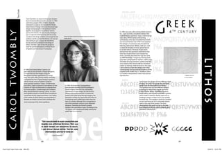
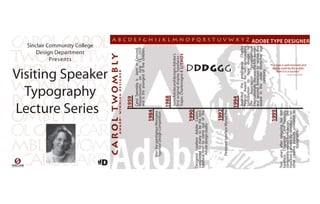
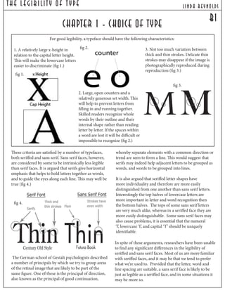
Carol Twombly is an award-winning American type designer born in 1959. In 1988, she joined Adobe Systems part-time and designed some of their first original display typefaces like Trajan, Charlemagne, and Lithos. Lithos became an instant success after its release in 1990. It is based on ancient Greek stone inscriptions but with a more modern and simplified design. Twombly continues to be recognized as one of the most influential type designers of the 20th century.
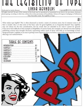
![The Legibilit y Of T ype lind a reynolds
d1
chapter 2 - variations in letterform [cont.]
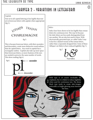
Condensed & Extended Type
The danger with condensed
styles is that the letters will either
apparently or actually fill in
and run together. The standard
of reproduction needs to be
high to ensure good legibility.
Extended styles reduce the
number of words that can be read
at each fixation. Normal letter
proportions can be distorted very
easily in electronic typesetting
systems, with predictably illegible
results in many cases.
Type Size
If the type is too small, letters and word will be difficult
to discriminate. If it is too large, less words will be
perceived at each fixation. For a normal reading distance
of 12-15 in, the optimum type size for continuous text
is usually somewhere between 9pt and 11pt, depending
on the x-height of the typeface and the circumstances in
which the material will be used.
one point = 1/72 inch
one pica = 12 points
one inch = 6 picas or 72 points
Ex.
extended
condensed
Ex.](https://image.slidesharecdn.com/a25ff349-8670-4bcc-be93-9b01ee9c3cd5-150202093352-conversion-gate01/85/ID-P-PS-portfolio-compressed-7-320.jpg)


![Things I Know About Type [Field Guide]](https://cdn.slidesharecdn.com/ss_thumbnails/thingsiknowabouttype-fieldguide-121030022134-phpapp02-thumbnail.jpg?width=640&height=640&fit=bounds)


