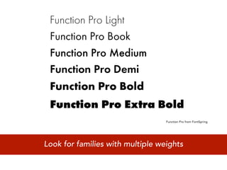
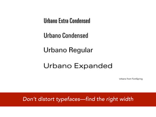
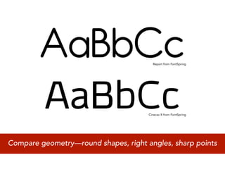
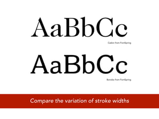
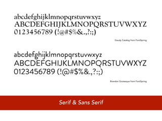
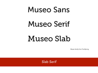
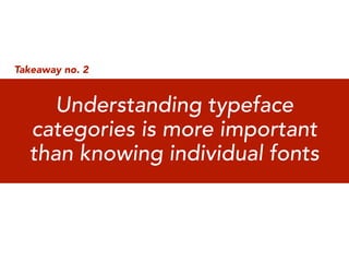
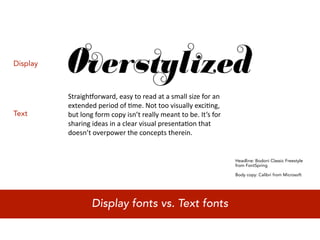
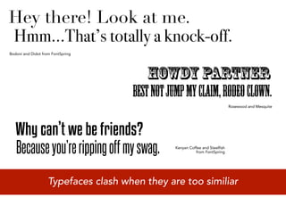
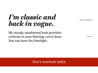
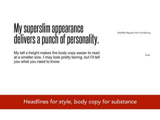
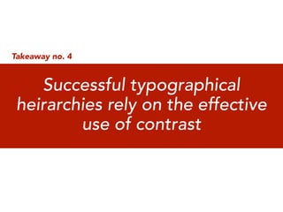
How to Choose Fonts
A Practical Guide to Web-Optimized Typefaces


                                                                 Image © Don Moyer


  Mick Winters                                @mickwinters
  Director of User Experience at HM Wallace   #remixsouthfonts
  Adjunct Professor at The Creative Circus
I am Mick Winters


I am not Theo Rosendorf


Last-minute substitution
Which box did you have when you were a kid?
red, yellow, blue, green, orange,
            brown, violet (purple), and black


With only 8 options, choosing is easy
Apricot, Aquamarine, Bittersweet
Black, Blue, Blue Gray, Blue Green,
Blue Violet, Brick Red, Brown, Burnt
Orange, Burnt Sienna, Cadet Blue,
Carnation Pink, Copper, Cornflower,
Forest Green, Gold, Goldenrod, Gray,
Green, Green Blue, Green Yellow,
Indian Red*, Lavender, Lemon Yellow,
Magenta, Mahogany, Maize, Maroon,
Melon, Mulberry*, Navy Blue, Olive
Green, Orange, Orange Red, Orange
Yellow, Orchid, Flesh*, Periwinkle,
Pine Green, Plum, Midnight Blue, Raw
Sienna, Raw Umber, Red, Red Orange,
Red Violet, Salmon, Sea Green, Sepia,
Sky Blue, Silver, Spring Green, Tan,
Thistle*, Turquoise Blue, Violet, Violet
Blue, Violet Red, White, Yellow, Yellow
Green, Yellow Orange
*Renamed: Chestnut (1999), Mango Tango (2003),
          Peach (1962), Indigo (2000)


                 With 64 options, making choices gets trickier
Arial                          Impact
Arial Black                    Times New Roman

Comic Sans MS                  Trebuchet MS
Georgia                        Verdana
Courier New


        With only 9 options, choosing is easy...
Arial
  Helvetica is better
                                 Impact :-p
                                     ugly

Arial Black                      Times New Roman
   too dark for body copy               hard to read online

Comic Sans MS                    Trebuchet MS
           never ever!

Georgia                          Verdana
                                     didn’t deserve the
Courier New                          promotion IKEA
                                     gave it
   good for code, not for copy


    ...but some options are better than others.
I’m not bad.
 I’m just drawn that way.


Comic Sans is a lot like Jessica Rabbit
http://typekit.com/libraries/full


Now, hundreds of @font-face Webfonts are available
Takeaway no.1


  Closely examining letterform
 anatomy leads to greater taste
       in typeface design
From “The Typographic Desk Reference” by Theo Rosendorf
                                                          http://typedeskref.com/images/5.gif


Pay close attention to Stem, Apex, and Counter shapes
Function Pro from FontSpring


Look for families with multiple weights
Urbano from FontSpring


Don’t distort typefaces—find the right width
Report from FontSpring


                                      Cinecav X from FontSpring


Compare geometry—round shapes, right angles, sharp points
Caslon from FontSpring


                             Bonobo from FontSpring


Compare the variation of stroke widths
Gaudy Catalog from FontSpring


                     Brandon Grotesque from FontSpring


Serif & Sans Serif
Museo family from FontSpring


Slab Serif
Takeaway no. 2


    Understanding typeface
  categories is more important
  than knowing individual fonts
Display


          Straigh(orward,
easy
to
read
at
a
small
size
for
an

          extended
period
of
8me.
Not
too
visually
exci8ng,

Text      but
long
form
copy
isn’t
really
meant
to
be.
It’s
for

          sharing
ideas
in
a
clear
visual
presenta8on
that

          doesn’t
overpower
the
concepts
therein.


                                                                   Headline: Bodoni Classic Freestyle
                                                                   from FontSpring

                                                                   Body copy: Calibri from Microsoft


                  Display fonts vs. Text fonts
Typekit
                       FontSpring


Google Web Fonts


                   Navigating font styles & tags
Academic Categories     Popular Styles & Tags
Humanist                Bitmap
Transitional            Blackletter
Modern / Geometric      Comic & Cartoon
                        Distressed (Grunge)
                        Futuristic (Techno)
                        Retro & Novelty
                        Script & Handwriting
                        Stencil
                        Typewriter & Monospace
                        Western


Fonts are categorized by shape and cultural reference
FontSpring


                                  FontSpring


Good for:                       Avoid:
Providing balance               Headlines


            Academic Category 1: Humanist
FontSpring


              Helvetica Neue
                                         Licensed by Apple


Good for:                          Avoid:
Body copy                          Over-reliance


            Academic Category 2: Transitional
FontSpring


                               Typekit


Good for:                      Avoid:
Historic (Modern Era)          Body copy


      Academic Category 3: Modern / Geometric
Typekit


                             FontSpring


                                                    FontSpring


Good for:                           Avoid:
Headlines                           Historical (pre-1990s)
Button text

              Popular Styles 1: Bitmap
FontSpring


                                               Typekit


Good for:                           Avoid:
Edgy                                Body copy
Metal m/                           Feminine brands
Historical (Middle Ages)

               Popular Styles 2: Blackletter
Typekit


                                                 FontSpring


                                        Google Web Fonts


Good for:                         Avoid:
Captions, Headlines               Long Passages


           Popular Styles 3: Comic & Cartoon
FontSpring


                                                  Typekit


                                             FontSpring


Good for:                            Avoid:
Texture                              Repetition


            Popular Styles 4: Distressed (Grunge)
Typekit


                                              FontSpring


                                     FontSpring


Good for:                           Avoid:
Headlines, Body copy                Inconsistency
(in certain instances)

           Popular Styles 5: Futuristic (Techno)
FontSpring


                                                       Typekit


                                    Google Web Fonts


Good for:                          Avoid:
Nuthin’                            Like the plague


            Popular Styles 6: Retro & Novelty
Google Web Fonts


                                                 FontSpring


                                           Typekit


Good for:                            Avoid:
Headlines,                           Over-elaborate
Calls-to-Action                      flourishes, childish

          Popular Styles 7: Script & Handwriting
Typekit


                                             FontSpring


                                                     FontSpring


Good for:                           Avoid:
Callouts, adding edge               Body copy


                 Popular Styles 8: Stencil
FontSpring


                                            Typekit


                                             Typekit


Good for:                        Avoid:
Code, Personal manifestos        Monotony


       Popular Styles 9: Typewriter & Monospace
Google Web Fonts


                                                             FontSpring


                                                FontSpring


Good for:                                  Avoid:
Party invites                              Business use
                                           Body copy

                Popular Styles 10: Western
Takeaway no. 3


  Seek surprising, yet balanced
   combinations of typefaces
Hey there! Look at me.
Hmm...That’s totally a knock-off.
Bodoni and Didot from FontSpring


                                         Howdy Partner
                                      Best not jump my claim, rodeo clown.
                                                                               Rosewood and Mesquite


   Why can’t we be friends?
   Because you’re ripping off my swag.           Kenyan Coffee and Steelfish
                                                           from FontSpring


                    Typefaces clash when they are too similiar
I’m looking for
a leading role.
                                       Steelspring Serif from FontSpring


I’ll be your sidekick. I do my best                            Georgia

work in making you look good.


 Combine a sober face with a more stylish enabler
I’m classic and                           Miller Text Bold Italic


back in vogue.
My steady, unadorned look provides 
contrast to your 4lowing, curvy lines.                 Cambria


You can have the limelight.


                 Don’t overlook italics
My superslim appearance
delivers a punch of personality.
                                                             Steelfish Regular from FontSpring


My tall x-height makes the body copy easier to read                                     Arial
at a smaller size. I may look pretty boring, but I’ll tell
you what you need to know.


      Headlines for style, body copy for substance
Takeaway no. 4


    Successful typographical
 heirarchies rely on the effective
         use of contrast
Navigation
              Headline
              Sub-Headline for main content
              Introductory quote
              Body copy
              Sidebar headline
              Sidebar body copy
              Link text
              Call to action
              Contact information
              Footer links


Carefully note all levels of information in your design
Navigation Tab 1                    Navigation Tab 2            Navigation Tab 3


THE HEADLINE IS THE BIG IDEA
This subhead introduces the reader to the topic

“The quote hooks the audience.”
Venison beef ribs shoulder bacon strip steak. Salami turkey fatback swine,                 Related Topic Headline
tenderloin flank pork drumstick chuck. Beef tri-tip pork chop ham hock andouille,
flank brisket shankle pork loin spare ribs shank sausage drumstick meatloaf.
                                                                                      Venison beef ribs shoulder bacon strip
Chicken beef ribs tenderloin short loin. Flank fatback t-bone salami pancetta            steak. Salami turkey fatback swine,
shankle. Tenderloin brisket ball tip, pork loin tri-tip hamburger fatback turkey t-   tenderloin flank pork drumstick chuck.
bone pork chop shoulder ham hock pastrami bacon. Salami ribeye pork belly,                  Beef tri-tip pork chop ham hock
ham corned beef venison meatball strip steak drumstick swine andouille ball tip         andouille, flank brisket shankle pork
pork chop sirloin chuck.                                                                       loin spare ribs shank sausage
                                                                                                          drumstick meatloaf.
The next subhead separates one idea from another.                                     Venison beef ribs shoulder bacon strip
Venison beef ribs shoulder bacon strip steak. Salami turkey fatback swine,               steak. Salami turkey fatback swine,
tenderloin flank pork drumstick chuck. Beef tri-tip pork chop ham hock andouille,     tenderloin flank pork drumstick chuck.
flank brisket shankle pork loin spare ribs shank sausage drumstick meatloaf.

Call to action tells the user what to do next >>>

Contact Information
Footer Link 1 | Footer Link 2 | Footer Link 3 | Footer Link 4
                                                                                       “Wireframe” design set entirely in Avenir


       Use size, color, weight, and shape to create contrast
Naviga&on
Tab
1                        Naviga&on
Tab
2          Naviga&on
Tab
3


THE HEADLINE IS THE BIG IDEA
This subhead introduces the reader to the topic

“The quote hooks the audience.”
Venison beef ribs shoulder bacon strip steak. Salami turkey fatback swine, tenderloin            Related Topic Headline
flank pork drumstick chuck. Beef tri-tip pork chop ham hock andouille, flank brisket
shankle pork loin spare ribs shank sausage drumstick meatloaf. Chicken beef ribs
                                                                                              Venison beef ribs shoulder bacon strip
tenderloin short loin. Flank fatback t-bone salami pancetta shankle. Tenderloin brisket          steak. Salami turkey fatback swine,
ball tip, pork loin tri-tip hamburger fatback turkey t-bone pork chop shoulder ham hock       tenderloin flank pork drumstick chuck.
pastrami bacon. Salami ribeye pork belly, ham corned beef venison meatball strip          Beef tri-tip pork chop ham hock andouille,
steak drumstick swine andouille ball tip pork chop sirloin chuck.                          flank brisket shankle pork loin spare ribs
                                                                                                 shank sausage drumstick meatloaf.
The next subhead separates one idea from another.                                            Venison beef ribs shoulder bacon strip
Venison beef ribs shoulder bacon strip steak. Salami turkey fatback swine, tenderloin           steak. Salami turkey fatback swine,
flank pork drumstick chuck. Beef tri-tip pork chop ham hock andouille, flank brisket         tenderloin flank pork drumstick chuck.
shankle pork loin spare ribs shank sausage drumstick meatloaf.

Call to action tells the user what to do next >>>

Contact Information                                                                                        “Heirarchy” design set in:
                                                                                                 Calibri, Mufferaw, Museo , Vanburg,
Footer
Link
1
|
Footer
Link
2
|
Footer
Link
3
|
Footer
Link
4                                     Franklin Gothic Book, Museo Slab,
                                                                                                               Georgia, and Rockwell


     Apply contrasting typefaces to specific data elements
Bacon Ipsum
       Venison beef ribs shoulder bacon strip steak. Salami
       turkey fatback swine, tenderloin flank pork drumstick
       chuck. Beef tri-tip pork chop ham hock andouille, flank
       brisket shankle pork loin spare ribs shank sausage
       drumstick meatloaf. Chicken beef ribs tenderloin short
       loin. Flank fatback t-bone salami pancetta shankle.
       Tenderloin brisket ball tip, pork loin tri-tip hamburger
       fatback turkey t-bone pork chop shoulder ham hock
       pastrami bacon. Salami ribeye pork belly, ham corned
       beef venison meatball strip steak drumstick swine
       andouille ball tip pork chop sirloin chuck.


                                                    http://www.baconipsum.com


Move over greeking, now there’s something meatier
Takeaway no. 5


     You do not have complete
       control over how your
      typography is displayed
Review your browser analytics
http://www.fontspring.com/fontface


              http://www.fontspring.com/blog/the-new-bulletproof-font-face-syntax


Use bulletproof @font-face syntax
Em = M
   Typically*, 1Em = 16 pixels
   *Also typical is that your user has changed their settings.


Deploy relative type size controls
{ font: 'Exactly what I want', 'A solid substitute',
A reasonable stand-in, Works in a pinch, I guess
this is okay, C’mon asshole buy a new computer; }


    Continue to build regressive type stacks
http://www.fontcomparer.com/


Test to see how your substitution choices will perform
Takeaway no. 7


    There are many good free
fonts available, but you’ll need to
   buy (or steal) the best fonts
*Only if you have lots of
                              time and patience to weed
                              through a ton of garbage


Best* free sites for fonts
Best pay sites for fonts
Final Takeaway


         Creative Developers
       are the superstars of the
        not-too-distant future
Thank you!
 Any questions?

Feel free to connect with me on Twitter:
         @mickwinters
       #remixsouthfonts
How to Choose Fonts: A Practical Guide to Web-Optimized Typefaces

How to Choose Fonts: A Practical Guide to Web-Optimized Typefaces

  • 1.
    How to ChooseFonts A Practical Guide to Web-Optimized Typefaces Image © Don Moyer Mick Winters @mickwinters Director of User Experience at HM Wallace #remixsouthfonts Adjunct Professor at The Creative Circus
  • 2.
    I am MickWinters I am not Theo Rosendorf Last-minute substitution
  • 3.
    Which box didyou have when you were a kid?
  • 4.
    red, yellow, blue,green, orange, brown, violet (purple), and black With only 8 options, choosing is easy
  • 5.
    Apricot, Aquamarine, Bittersweet Black,Blue, Blue Gray, Blue Green, Blue Violet, Brick Red, Brown, Burnt Orange, Burnt Sienna, Cadet Blue, Carnation Pink, Copper, Cornflower, Forest Green, Gold, Goldenrod, Gray, Green, Green Blue, Green Yellow, Indian Red*, Lavender, Lemon Yellow, Magenta, Mahogany, Maize, Maroon, Melon, Mulberry*, Navy Blue, Olive Green, Orange, Orange Red, Orange Yellow, Orchid, Flesh*, Periwinkle, Pine Green, Plum, Midnight Blue, Raw Sienna, Raw Umber, Red, Red Orange, Red Violet, Salmon, Sea Green, Sepia, Sky Blue, Silver, Spring Green, Tan, Thistle*, Turquoise Blue, Violet, Violet Blue, Violet Red, White, Yellow, Yellow Green, Yellow Orange *Renamed: Chestnut (1999), Mango Tango (2003), Peach (1962), Indigo (2000) With 64 options, making choices gets trickier
  • 7.
    Arial Impact Arial Black Times New Roman Comic Sans MS Trebuchet MS Georgia Verdana Courier New With only 9 options, choosing is easy...
  • 8.
    Arial Helveticais better Impact :-p ugly Arial Black Times New Roman too dark for body copy hard to read online Comic Sans MS Trebuchet MS never ever! Georgia Verdana didn’t deserve the Courier New promotion IKEA gave it good for code, not for copy ...but some options are better than others.
  • 9.
    I’m not bad. I’m just drawn that way. Comic Sans is a lot like Jessica Rabbit
  • 10.
    http://typekit.com/libraries/full Now, hundreds of@font-face Webfonts are available
  • 11.
    Takeaway no.1 Closely examining letterform anatomy leads to greater taste in typeface design
  • 12.
    From “The TypographicDesk Reference” by Theo Rosendorf http://typedeskref.com/images/5.gif Pay close attention to Stem, Apex, and Counter shapes
  • 13.
    Function Pro fromFontSpring Look for families with multiple weights
  • 14.
    Urbano from FontSpring Don’tdistort typefaces—find the right width
  • 15.
    Report from FontSpring Cinecav X from FontSpring Compare geometry—round shapes, right angles, sharp points
  • 16.
    Caslon from FontSpring Bonobo from FontSpring Compare the variation of stroke widths
  • 17.
    Gaudy Catalog fromFontSpring Brandon Grotesque from FontSpring Serif & Sans Serif
  • 18.
    Museo family fromFontSpring Slab Serif
  • 19.
    Takeaway no. 2 Understanding typeface categories is more important than knowing individual fonts
  • 20.
    Display Straigh(orward,
easy
to
read
at
a
small
size
for
an
 extended
period
of
8me.
Not
too
visually
exci8ng,
 Text but
long
form
copy
isn’t
really
meant
to
be.
It’s
for
 sharing
ideas
in
a
clear
visual
presenta8on
that
 doesn’t
overpower
the
concepts
therein. Headline: Bodoni Classic Freestyle from FontSpring Body copy: Calibri from Microsoft Display fonts vs. Text fonts
  • 21.
    Typekit FontSpring Google Web Fonts Navigating font styles & tags
  • 22.
    Academic Categories Popular Styles & Tags Humanist Bitmap Transitional Blackletter Modern / Geometric Comic & Cartoon Distressed (Grunge) Futuristic (Techno) Retro & Novelty Script & Handwriting Stencil Typewriter & Monospace Western Fonts are categorized by shape and cultural reference
  • 23.
    FontSpring FontSpring Good for: Avoid: Providing balance Headlines Academic Category 1: Humanist
  • 24.
    FontSpring Helvetica Neue Licensed by Apple Good for: Avoid: Body copy Over-reliance Academic Category 2: Transitional
  • 25.
    FontSpring Typekit Good for: Avoid: Historic (Modern Era) Body copy Academic Category 3: Modern / Geometric
  • 26.
    Typekit FontSpring FontSpring Good for: Avoid: Headlines Historical (pre-1990s) Button text Popular Styles 1: Bitmap
  • 27.
    FontSpring Typekit Good for: Avoid: Edgy Body copy Metal m/ Feminine brands Historical (Middle Ages) Popular Styles 2: Blackletter
  • 28.
    Typekit FontSpring Google Web Fonts Good for: Avoid: Captions, Headlines Long Passages Popular Styles 3: Comic & Cartoon
  • 29.
    FontSpring Typekit FontSpring Good for: Avoid: Texture Repetition Popular Styles 4: Distressed (Grunge)
  • 30.
    Typekit FontSpring FontSpring Good for: Avoid: Headlines, Body copy Inconsistency (in certain instances) Popular Styles 5: Futuristic (Techno)
  • 31.
    FontSpring Typekit Google Web Fonts Good for: Avoid: Nuthin’ Like the plague Popular Styles 6: Retro & Novelty
  • 32.
    Google Web Fonts FontSpring Typekit Good for: Avoid: Headlines, Over-elaborate Calls-to-Action flourishes, childish Popular Styles 7: Script & Handwriting
  • 33.
    Typekit FontSpring FontSpring Good for: Avoid: Callouts, adding edge Body copy Popular Styles 8: Stencil
  • 34.
    FontSpring Typekit Typekit Good for: Avoid: Code, Personal manifestos Monotony Popular Styles 9: Typewriter & Monospace
  • 35.
    Google Web Fonts FontSpring FontSpring Good for: Avoid: Party invites Business use Body copy Popular Styles 10: Western
  • 36.
    Takeaway no. 3 Seek surprising, yet balanced combinations of typefaces
  • 37.
    Hey there! Lookat me. Hmm...That’s totally a knock-off. Bodoni and Didot from FontSpring Howdy Partner Best not jump my claim, rodeo clown. Rosewood and Mesquite Why can’t we be friends? Because you’re ripping off my swag. Kenyan Coffee and Steelfish from FontSpring Typefaces clash when they are too similiar
  • 38.
    I’m looking for aleading role. Steelspring Serif from FontSpring I’ll be your sidekick. I do my best Georgia work in making you look good. Combine a sober face with a more stylish enabler
  • 39.
    I’m classic and Miller Text Bold Italic back in vogue. My steady, unadorned look provides  contrast to your 4lowing, curvy lines.  Cambria You can have the limelight. Don’t overlook italics
  • 40.
    My superslim appearance deliversa punch of personality. Steelfish Regular from FontSpring My tall x-height makes the body copy easier to read Arial at a smaller size. I may look pretty boring, but I’ll tell you what you need to know. Headlines for style, body copy for substance
  • 41.
    Takeaway no. 4 Successful typographical heirarchies rely on the effective use of contrast
  • 42.
    Navigation Headline Sub-Headline for main content Introductory quote Body copy Sidebar headline Sidebar body copy Link text Call to action Contact information Footer links Carefully note all levels of information in your design
  • 43.
    Navigation Tab 1 Navigation Tab 2 Navigation Tab 3 THE HEADLINE IS THE BIG IDEA This subhead introduces the reader to the topic “The quote hooks the audience.” Venison beef ribs shoulder bacon strip steak. Salami turkey fatback swine, Related Topic Headline tenderloin flank pork drumstick chuck. Beef tri-tip pork chop ham hock andouille, flank brisket shankle pork loin spare ribs shank sausage drumstick meatloaf. Venison beef ribs shoulder bacon strip Chicken beef ribs tenderloin short loin. Flank fatback t-bone salami pancetta steak. Salami turkey fatback swine, shankle. Tenderloin brisket ball tip, pork loin tri-tip hamburger fatback turkey t- tenderloin flank pork drumstick chuck. bone pork chop shoulder ham hock pastrami bacon. Salami ribeye pork belly, Beef tri-tip pork chop ham hock ham corned beef venison meatball strip steak drumstick swine andouille ball tip andouille, flank brisket shankle pork pork chop sirloin chuck. loin spare ribs shank sausage drumstick meatloaf. The next subhead separates one idea from another. Venison beef ribs shoulder bacon strip Venison beef ribs shoulder bacon strip steak. Salami turkey fatback swine, steak. Salami turkey fatback swine, tenderloin flank pork drumstick chuck. Beef tri-tip pork chop ham hock andouille, tenderloin flank pork drumstick chuck. flank brisket shankle pork loin spare ribs shank sausage drumstick meatloaf. Call to action tells the user what to do next >>> Contact Information Footer Link 1 | Footer Link 2 | Footer Link 3 | Footer Link 4 “Wireframe” design set entirely in Avenir Use size, color, weight, and shape to create contrast
  • 44.
    Naviga&on
Tab
1 Naviga&on
Tab
2 Naviga&on
Tab
3 THE HEADLINE IS THE BIG IDEA This subhead introduces the reader to the topic “The quote hooks the audience.” Venison beef ribs shoulder bacon strip steak. Salami turkey fatback swine, tenderloin Related Topic Headline flank pork drumstick chuck. Beef tri-tip pork chop ham hock andouille, flank brisket shankle pork loin spare ribs shank sausage drumstick meatloaf. Chicken beef ribs Venison beef ribs shoulder bacon strip tenderloin short loin. Flank fatback t-bone salami pancetta shankle. Tenderloin brisket steak. Salami turkey fatback swine, ball tip, pork loin tri-tip hamburger fatback turkey t-bone pork chop shoulder ham hock tenderloin flank pork drumstick chuck. pastrami bacon. Salami ribeye pork belly, ham corned beef venison meatball strip Beef tri-tip pork chop ham hock andouille, steak drumstick swine andouille ball tip pork chop sirloin chuck. flank brisket shankle pork loin spare ribs shank sausage drumstick meatloaf. The next subhead separates one idea from another. Venison beef ribs shoulder bacon strip Venison beef ribs shoulder bacon strip steak. Salami turkey fatback swine, tenderloin steak. Salami turkey fatback swine, flank pork drumstick chuck. Beef tri-tip pork chop ham hock andouille, flank brisket tenderloin flank pork drumstick chuck. shankle pork loin spare ribs shank sausage drumstick meatloaf. Call to action tells the user what to do next >>> Contact Information “Heirarchy” design set in: Calibri, Mufferaw, Museo , Vanburg, Footer
Link
1
|
Footer
Link
2
|
Footer
Link
3
|
Footer
Link
4 Franklin Gothic Book, Museo Slab, Georgia, and Rockwell Apply contrasting typefaces to specific data elements
  • 45.
    Bacon Ipsum Venison beef ribs shoulder bacon strip steak. Salami turkey fatback swine, tenderloin flank pork drumstick chuck. Beef tri-tip pork chop ham hock andouille, flank brisket shankle pork loin spare ribs shank sausage drumstick meatloaf. Chicken beef ribs tenderloin short loin. Flank fatback t-bone salami pancetta shankle. Tenderloin brisket ball tip, pork loin tri-tip hamburger fatback turkey t-bone pork chop shoulder ham hock pastrami bacon. Salami ribeye pork belly, ham corned beef venison meatball strip steak drumstick swine andouille ball tip pork chop sirloin chuck. http://www.baconipsum.com Move over greeking, now there’s something meatier
  • 46.
    Takeaway no. 5 You do not have complete control over how your typography is displayed
  • 47.
  • 48.
    http://www.fontspring.com/fontface http://www.fontspring.com/blog/the-new-bulletproof-font-face-syntax Use bulletproof @font-face syntax
  • 49.
    Em = M Typically*, 1Em = 16 pixels *Also typical is that your user has changed their settings. Deploy relative type size controls
  • 50.
    { font: 'Exactlywhat I want', 'A solid substitute', A reasonable stand-in, Works in a pinch, I guess this is okay, C’mon asshole buy a new computer; } Continue to build regressive type stacks
  • 51.
    http://www.fontcomparer.com/ Test to seehow your substitution choices will perform
  • 52.
    Takeaway no. 7 There are many good free fonts available, but you’ll need to buy (or steal) the best fonts
  • 53.
    *Only if youhave lots of time and patience to weed through a ton of garbage Best* free sites for fonts
  • 54.
    Best pay sitesfor fonts
  • 55.
    Final Takeaway Creative Developers are the superstars of the not-too-distant future
  • 56.
    Thank you! Anyquestions? Feel free to connect with me on Twitter: @mickwinters #remixsouthfonts