This document summarizes the creator's process of designing their music magazine over multiple iterations. In their first attempt, they used PowerPoint but found it too simple. Their second attempt in Photoshop had letters that got lost on the bright background. Their third attempt was bold but they changed the color. Their final magazine cover design incorporated color, fonts, and layout that they were happy with. They went through a similar process of multiple revisions to develop their double page spread and content page designs.
Rex ist ein Tool zur Automatisierung von Applikations- und Konfigurationsrollouts. Die gewünschte Umgebung wird mittels eines Script (Perl) beschrieben und kann somit auf unterschiedlichen Systemen ausgeführt werden. Rex verbindet sich per SSH auf das Zielsystem und führt die entsprechenden Arbeiten aus.
In diesem Vortrag wird zunächst auf die Basis von Rex eingegangen. Dann wird gezeigt, wie man mit Hilfe von Rex sich und seinem Team schnell eine Testumgebung mit VirtualBox zur Verfügung stellen kann, und wie man – in Zusammenarbeit mit den Systemadministratoren – die gleichen Scripte zum Aufbau und dem Deployment der Produktionsumgebung verwenden kann.
1. How my magazine changed over time.
1st attempt
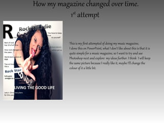
This is my first attempted of doing my music magazine,
I done this on PowerPoint, what I don’t like about this is that it is
quite simple for a music magazine, so I want to try and use
Photoshop next and explore my ideas further. I think I will keep
the same picture because I really like it, maybe I’ll change the
colour of it a little bit.
2. 2nd attempt on my music magazine
This is my 2nd attempt and I really liked it but
what is not really working for me is how the
letters gets kind of lost on the bright background,
so my next step is to find a way to make the
writing stand out a but more, and I also want to
add a Facebook logo so people can find the
‘Rmagazine’ on Facebook and I also want to add
a price.
3. 3rd attempt on my music magazine.
This is what I done on Photoshop, it was 3rd attempt
on the music magazine, and I really liked it but I feel
like it is a bit bold and blunt, so I’ll probably change
the colour now and see if I can make it brighter,
what I did like about it is how the writing stands
out, it goes really well with the white and black
background.
4. My final magazine cover
This is my final music magazine and I am
really happy with the results, the colour are
amazing, the fonts are just the way I wanted,
I think the layout works really well and no
area is blank. I like the red of the font links
with my model’s lipstick.
5. My 1st attempt on my double page spread
This is my first attempt on doing my double page spread, but the blue I don’t think it really links to
the front page, so I think my next step would be to experiment with different colours and maybe try
out different fonts, maybe I wont change the ‘L’ I really like the way it stands out.
6. 2nd attempt on my double page spread
This is my second attempt and this time I change the top fonts a little bit, the font for my
double page spread is the same one that I used for my front cover, I really wanted them to
link in a way, another that is worrying me is that the background is a bit blunt, so I think
my next step would be to try and combine two pictures on the background so it is not as
simple.
7. Final double page spread
This is my final double page spread, a lot of people said that they loved the pictures so I
am really happy that I was able to combine the two pictures that I like together, I blended
the pictures into the background so the writing would be visible, I also changed the colour
to red so it linked to the front page of my magazine. Overall I am really happy with my
double page spread
8. 1st Content page
This is my first attempt on my content page, I
really like the picture but I feel like the font is
not really good, and also the writing are a bit
hard to read so my next aim is to be able to
make sure that the writing is clearer, so I might
blend the background a little bit.
9. Final Content page
This is my final content page, I really
like how the background blends
really well with the whole page, I
wanted to keep this page simple and
something that it would be easy to
read, so I decided that I wanted to
keep the writing back and quite, I am
also happy with the picture that I
took, I think it goes really well with
the writing.
10. Final Content page
This is my final content page, I really
like how the background blends
really well with the whole page, I
wanted to keep this page simple and
something that it would be easy to
read, so I decided that I wanted to
keep the writing back and quite, I am
also happy with the picture that I
took, I think it goes really well with
the writing.