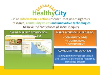
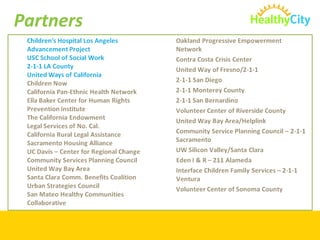
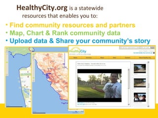
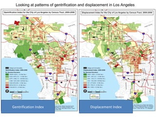
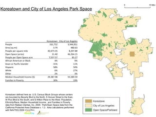
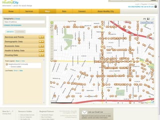
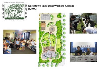
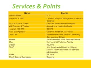
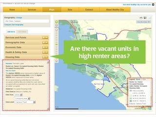
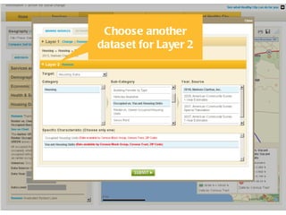
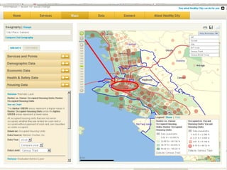
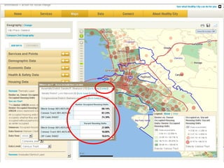
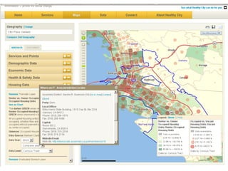
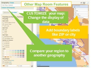
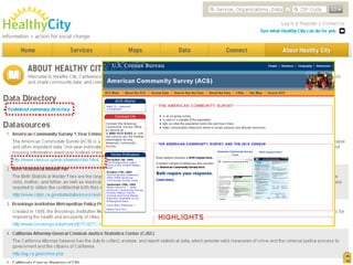
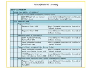
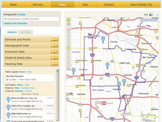
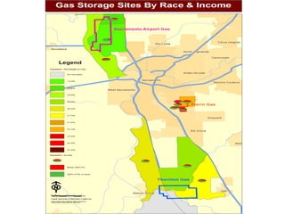
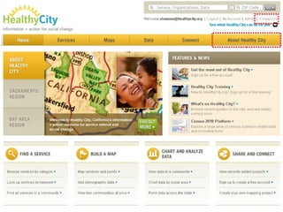
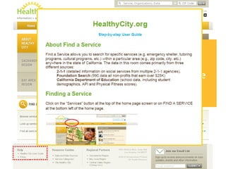
Community Planning and Development Information + action for social change
A National civil rights POLICY/ ACTION TANK Healthy City is a project of…
A National civil rights “ACTION TANK”
DIRECT TECHNICAL SUPPORT TO : COMMUNITY ORGS FOUNDATIONS GOVERNMENT COMMUNITY RESEARCH LAB Training community groups to lead and sustain action-oriented research & technology projects … is an  information + action  resource  that unites  rigorous research,  community voices  and innovative technologies   to solve the root causes of social inequity  ONLINE MAPPING TECHNOLOGY www.HealthyCity.org
Partners
Find community resources and partners Map, Chart & Rank community data Upload data & Share your community’s story  HealthyCity.org  is a statewide resources that enables you to:
http://www.npsp.sa.gov.au/site/page.cfm?u=1608
Community Issues & Needs Community Knowledge Coordination Locating Assets and Gaps Planning  Policy/Advocacy Mapping Data Provides Visual Evidence for…
Visual evidence that is clear, easy to understand, and dramatic…
 
Revealing Patterns
Gentrification Index Displacement Index Looking at patterns of gentrification and displacement in Los Angeles
Informing Public Policy – Promoting Transparency and Data Driven Planning
Koreatown and City of Los Angeles Park Space Koreatown defined here as  U.S. Census Block Groups whose centers are bounded by Beverly Blvd to the North, S Hoover Street to the East, W Pico Blvd to the South, and S Wilton Place to the West. Population, Ethnicity/Race, Median Household Income , and Families in Poverty data from Nielsen Claritas, Inc. 2009.  Park/Open Space data from the California Protected Area Database v. 1.3.  Area calculations performed with NAVTEQ 2009 shapefiles.   Koreatown City of Los Angeles People 161,732 3,944,951 Area (sq mi) 3.79 480.63 People per square mile 42,673.35 8,207.88 Open Space (acres) 21.40 46,264.15 People per Open Space acre 7,557.57 85.27 African American or Black 4% 9% Asian or Pacific Islander 31% 11% Hispanic 58% 50% White 6% 27% Other 2% 3% Median Household Income ($) 29,387.98 55,589.59 Families in Poverty 30% 19%
 
Koreatown Immigrant Workers Alliance (KIWA)
Questions?
What’s on HealthyCity.org? Oh, the Data You’ll See!
Services & Points  Name Source Social Services 211s Nonprofits IRS 990 Center for Nonprofit Management in Southern California Schools Public & Private California Department of Edaucation WIC Agencies & Vendors Network for a Healthy California Hospitals (OSHPD) OSHPD Head Start Agencies California Head Start Association Child Care Department of Social Services Community Care Licensing Division Alcohol Department of Alcoholic Beverage Control EPA Environmental Protection Agency Grocery DeLorme FQHC U.S. Department of Health and Human Services Health Resources and Services Administration Banks DeLorme Check Cashing Businesses DeLorme
Healthy City has 2-1-1 data  (health & human services)  for the following counties: Alameda, Contra Costa, Fresno,  Los Angeles, Marin, Monterey, Napa, Riverside, Sacramento, San Bernardino, San Diego, San Francisco, Santa Clara, Solano, Sonoma, Ventura
Community Data Over 2500 variables Multiple years of data More datasets coming soon
The HealthyCity.org website
What you can do on Healthy City Find potential partners Map, chart data Create community profiles Gather community input on proposed projects Upload data and information to share and package View what others are working on and share your projects or collaborate
You can save and share anything you create while logged in GET STARTED! Mapping community data to demonstrate need and advocate for planning
Where are there renters in Oakland? Where are there vacant units? Are there opportunities for redevelopment here?
Click the +- buttons  to add Data to your map
 
Are there vacant units in high renter areas?
Choose another dataset for Layer 2


Add boundary labels  like ZIP or city CUSTOMIZE  your map: Change the display of data Compare your region to another geography Other Map Room Features
Learn about our data sources
 
 
Mapping community data to demonstrate the need and advocate for resources Questions?
Creating charts and tables to better understand a community or region
There is a proposed new transit-oriented development in Culver City. What do the communities here currently look like (demographics, housing, income, etc.) and how might this affect them?
 
Select Demographic Data
How does this compare to averages for cities nearby? (Los Angeles, Santa Monica, Bevery Hills)
 
City of LA has a higher percentage of people who carpool and take public transportation
Creating charts and tables to better understand a community or region Questions?
Learn about advanced features
Save  searches, maps & charts Upload  your own Point & Thematic Datasets Draw  your own neighborhood boundaries Create  a live mapping session Tell your Story  (with Pictures, Video & Audio) Search  Stories, live maps, and more in the Share & Connect room A few HealthyCity.org Advanced Features
 
 
Draw  your own neighborhood boundaries
Map or Chart data within your new boundary
Upload  your own Point OR Thematic Datasets
Create an Excel Spreadsheet with up to  1000 points *Save as Excel 97-2003 workbook*
Upload your own  Thematic Datasets
A  Live Map  enables multiple people to : Draw and drop points, lines, and shapes on a shared map   Attach photos & video Create Live Mapping Sessions (with Pictures, Video & Audio)
Create a Story to: Promote your initiative or highlight your work!  Package your saved maps, live mapping sessions, reports, multi-media and more into a “story” that you can share Create a Story
Share  and Search Stories (& more) Statewide
Questions?
Issue 7.5 billion cubic feet of natural gas sited to be stored beneath densely-populated urban community with heavy concentration of minority households Goal  Using environmental justice argument, demonstrate racial impact of proposed storage site and have storage sited elsewhere Demonstrate Describe community impacted by the proposed storage site Alternative sites would have less impact and minimal environmental justice concerns


Questions?
 
 
Help is Available: Click on  Healthy City User Guide or  FAQs
Thank You!

Healthy City Community Planning and Development webinar

  • 1.
    Community Planning andDevelopment Information + action for social change
  • 2.
    A National civilrights POLICY/ ACTION TANK Healthy City is a project of…
  • 3.
    A National civilrights “ACTION TANK”
  • 4.
    DIRECT TECHNICAL SUPPORTTO : COMMUNITY ORGS FOUNDATIONS GOVERNMENT COMMUNITY RESEARCH LAB Training community groups to lead and sustain action-oriented research & technology projects … is an information + action resource that unites rigorous research, community voices and innovative technologies to solve the root causes of social inequity ONLINE MAPPING TECHNOLOGY www.HealthyCity.org
  • 5.
  • 6.
    Find community resourcesand partners Map, Chart & Rank community data Upload data & Share your community’s story HealthyCity.org is a statewide resources that enables you to:
  • 7.
  • 8.
    Community Issues &Needs Community Knowledge Coordination Locating Assets and Gaps Planning Policy/Advocacy Mapping Data Provides Visual Evidence for…
  • 9.
    Visual evidence thatis clear, easy to understand, and dramatic…
  • 10.
  • 11.
  • 12.
    Gentrification Index DisplacementIndex Looking at patterns of gentrification and displacement in Los Angeles
  • 13.
    Informing Public Policy– Promoting Transparency and Data Driven Planning
  • 14.
    Koreatown and Cityof Los Angeles Park Space Koreatown defined here as U.S. Census Block Groups whose centers are bounded by Beverly Blvd to the North, S Hoover Street to the East, W Pico Blvd to the South, and S Wilton Place to the West. Population, Ethnicity/Race, Median Household Income , and Families in Poverty data from Nielsen Claritas, Inc. 2009. Park/Open Space data from the California Protected Area Database v. 1.3. Area calculations performed with NAVTEQ 2009 shapefiles.   Koreatown City of Los Angeles People 161,732 3,944,951 Area (sq mi) 3.79 480.63 People per square mile 42,673.35 8,207.88 Open Space (acres) 21.40 46,264.15 People per Open Space acre 7,557.57 85.27 African American or Black 4% 9% Asian or Pacific Islander 31% 11% Hispanic 58% 50% White 6% 27% Other 2% 3% Median Household Income ($) 29,387.98 55,589.59 Families in Poverty 30% 19%
  • 15.
  • 16.
  • 17.
  • 18.
    What’s on HealthyCity.org?Oh, the Data You’ll See!
  • 19.
    Services & Points Name Source Social Services 211s Nonprofits IRS 990 Center for Nonprofit Management in Southern California Schools Public & Private California Department of Edaucation WIC Agencies & Vendors Network for a Healthy California Hospitals (OSHPD) OSHPD Head Start Agencies California Head Start Association Child Care Department of Social Services Community Care Licensing Division Alcohol Department of Alcoholic Beverage Control EPA Environmental Protection Agency Grocery DeLorme FQHC U.S. Department of Health and Human Services Health Resources and Services Administration Banks DeLorme Check Cashing Businesses DeLorme
  • 20.
    Healthy City has2-1-1 data (health & human services) for the following counties: Alameda, Contra Costa, Fresno, Los Angeles, Marin, Monterey, Napa, Riverside, Sacramento, San Bernardino, San Diego, San Francisco, Santa Clara, Solano, Sonoma, Ventura
  • 21.
    Community Data Over2500 variables Multiple years of data More datasets coming soon
  • 22.
  • 23.
    What you cando on Healthy City Find potential partners Map, chart data Create community profiles Gather community input on proposed projects Upload data and information to share and package View what others are working on and share your projects or collaborate
  • 24.
    You can saveand share anything you create while logged in GET STARTED! Mapping community data to demonstrate need and advocate for planning
  • 25.
    Where are thererenters in Oakland? Where are there vacant units? Are there opportunities for redevelopment here?
  • 26.
    Click the +-buttons to add Data to your map
  • 27.
  • 28.
    Are there vacantunits in high renter areas?
  • 29.
  • 30.
  • 31.
  • 32.
  • 33.
    Add boundary labels like ZIP or city CUSTOMIZE your map: Change the display of data Compare your region to another geography Other Map Room Features
  • 34.
    Learn about ourdata sources
  • 35.
  • 36.
  • 37.
    Mapping community datato demonstrate the need and advocate for resources Questions?
  • 38.
    Creating charts andtables to better understand a community or region
  • 39.
    There is aproposed new transit-oriented development in Culver City. What do the communities here currently look like (demographics, housing, income, etc.) and how might this affect them?
  • 40.
  • 41.
  • 42.
    How does thiscompare to averages for cities nearby? (Los Angeles, Santa Monica, Bevery Hills)
  • 43.
  • 44.
    City of LAhas a higher percentage of people who carpool and take public transportation
  • 45.
    Creating charts andtables to better understand a community or region Questions?
  • 46.
  • 47.
    Save searches,maps & charts Upload your own Point & Thematic Datasets Draw your own neighborhood boundaries Create a live mapping session Tell your Story (with Pictures, Video & Audio) Search Stories, live maps, and more in the Share & Connect room A few HealthyCity.org Advanced Features
  • 48.
  • 49.
  • 50.
    Draw yourown neighborhood boundaries
  • 51.
    Map or Chartdata within your new boundary
  • 52.
    Upload yourown Point OR Thematic Datasets
  • 53.
    Create an ExcelSpreadsheet with up to 1000 points *Save as Excel 97-2003 workbook*
  • 54.
    Upload your own Thematic Datasets
  • 55.
    A LiveMap enables multiple people to : Draw and drop points, lines, and shapes on a shared map Attach photos & video Create Live Mapping Sessions (with Pictures, Video & Audio)
  • 56.
    Create a Storyto: Promote your initiative or highlight your work! Package your saved maps, live mapping sessions, reports, multi-media and more into a “story” that you can share Create a Story
  • 57.
    Share andSearch Stories (& more) Statewide
  • 58.
  • 59.
    Issue 7.5 billioncubic feet of natural gas sited to be stored beneath densely-populated urban community with heavy concentration of minority households Goal Using environmental justice argument, demonstrate racial impact of proposed storage site and have storage sited elsewhere Demonstrate Describe community impacted by the proposed storage site Alternative sites would have less impact and minimal environmental justice concerns
  • 60.
  • 61.
  • 62.
  • 63.
  • 64.
  • 65.
  • 66.
    Help is Available:Click on Healthy City User Guide or FAQs
  • 67.

Editor's Notes

  • #3 Healthy City is a project of the Advancement Project, a national civil rights, public policy action tank focused on closing the opportunity gap for high need communities. We believe that sustainable progress can be made when multiple tools—law, policy analysis, strategic communications, technology, and research— are coordinated with grassroots movements. Healthy City is a direct outgrowth of these principles.
  • #8 Things to consider when planning for communities. HC uses visuals to understand these aspects of a community. Mapping data and information about a place can help to visualize it.
  • #13 From 2000 to 2008. worked with SAJE to show gentrification and displacement specifically around usc and use findings to push for community benefits agreements (keeping a percentage of housing and jobs for the local community).
  • #22 Broader in scope, while more focused on local communities HealthyCity.org now covers the State of California in addition to Los Angeles County. Users can now view more data and smaller geographies such as block groups, and new geographies such as Air Basins and updated Voter Precincts are available for search.
  • #25 By mapping thematic data, you are able to see a certain characteristic about your neighborhood (any geography). You can look at areas that have a high concentration of people in poverty, then look at the resources available to this population. You may be able to identify gaps in services, or begin to look at the allocation of resources.
  • #34 Using the Customize tab, you can alter the data level, year, number of classes, ranges, etc. Remember, you can print, save, and email your map.
  • #51 If you have a specific focus/campaign/development area made up of zip codes, census tracts, etc.
  • #56 Community engagement
  • #59 Turn over to Maya
  • #60 This is an example of active litigation at LSNC. A natural gas company came to Sacramento a few years ago and sought approval for a project to store 8 billion cubic feet of natural gas below a densely populated urban community with a heavy concentration of minority households. There is a naturally formed geological pocket that could store this amount of natural gas; natural gas formerly filled this area but was extracted, leaving it empty. The approval process is governed by the California Public Utilities Commission and there is an ALJ from this agency presiding over the process. Our client is a community organization based in the community affected by the proposed storage site. Maps have been used in this case in a few ways. First, they were used as planning guides for determining which alternative gas storage sites may have less impact on humans. The maps were also used as tools during proceedings before the Public Utilities Commission to show the disparate impact of this project on a urban, densely populated, community of color when alternative sites would not have such an impact.
  • #61 This first maps shows three sites: Sacramento Airport Gas, Florin Gas, and Thornton Gas. The natural gas company is trying to site the storage facility at the Florin location. The Airport and Thornton locations have been identified as possible alternative sites that could be used instead.
  • #62 This map shows the racial demographics of the communities living above the potential storage locations. The green portions show the lowest percentage of people of color living in the potentially affected areas, and red shows the highest percentage, with yellow being in the middle. The map shows the highest concentrations of people of color live above the Florin location. The airport location appears to have the lowest percentage of people of color living in that area, while Thornton is in the middle.
  • #63 This next slide overlays race and income. The same rules apply in this map; green is the lowest concentration of people of color, with red the highest. The pie charts show those who earn greater than 200% of the federal poverty line, which is demonstrated in green. The red portion of the pie chart shows those who earn less than 200% of the federal poverty line. This percentage of the poverty line is relevant for us because that is the income eligibility threshold we have at LSNC. This map shows not only that the highest concentration of people of color live above the Florin location, but also that the highest concentration of impoverished people live there, as opposed to the alternative sites. This map was used to support the argument that there are alternative sites with less impact, based on race and poverty, and those alternative sites should be chosen instead.
  • #64 Turn over to Maya