Download to read offline
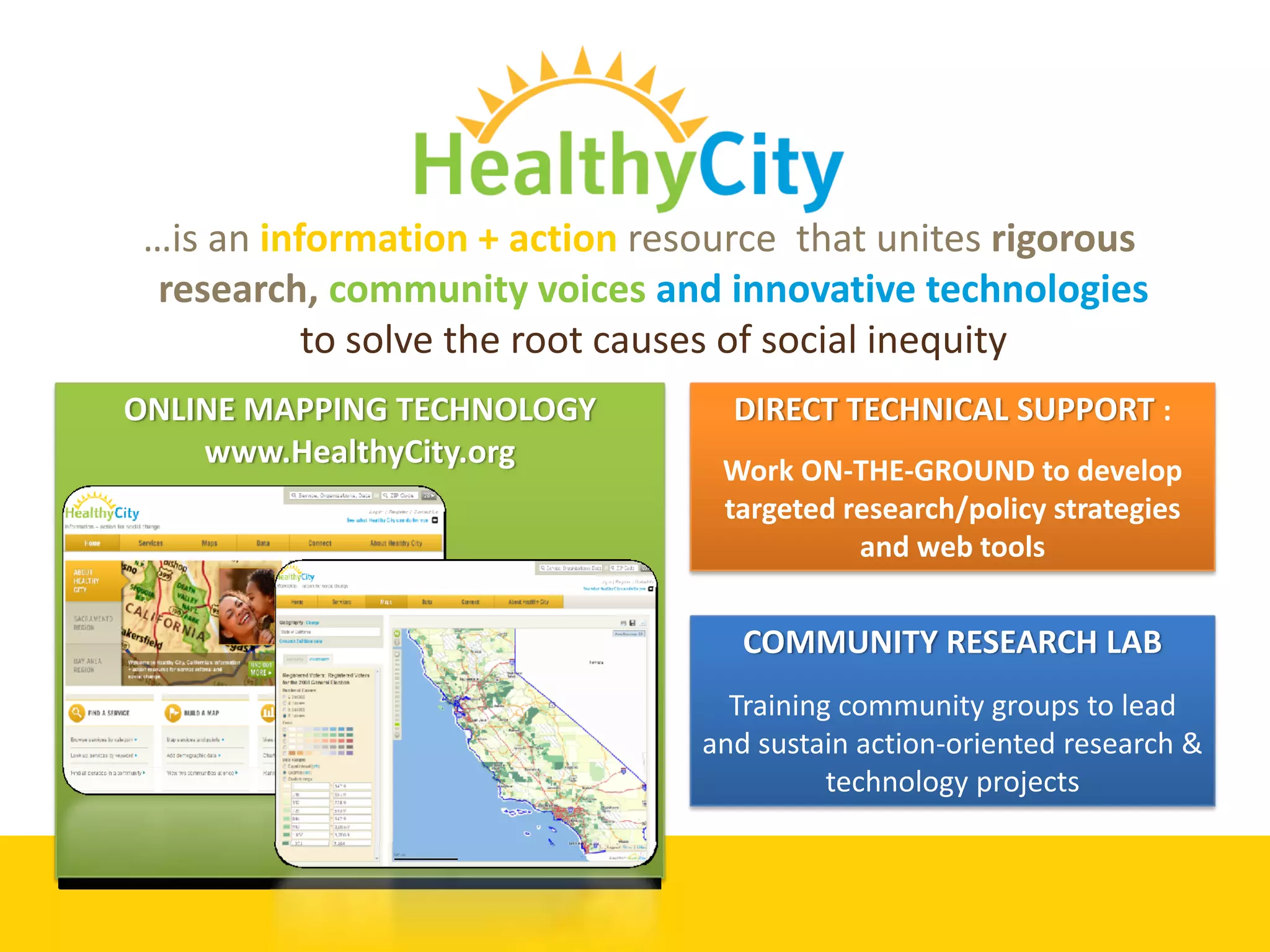
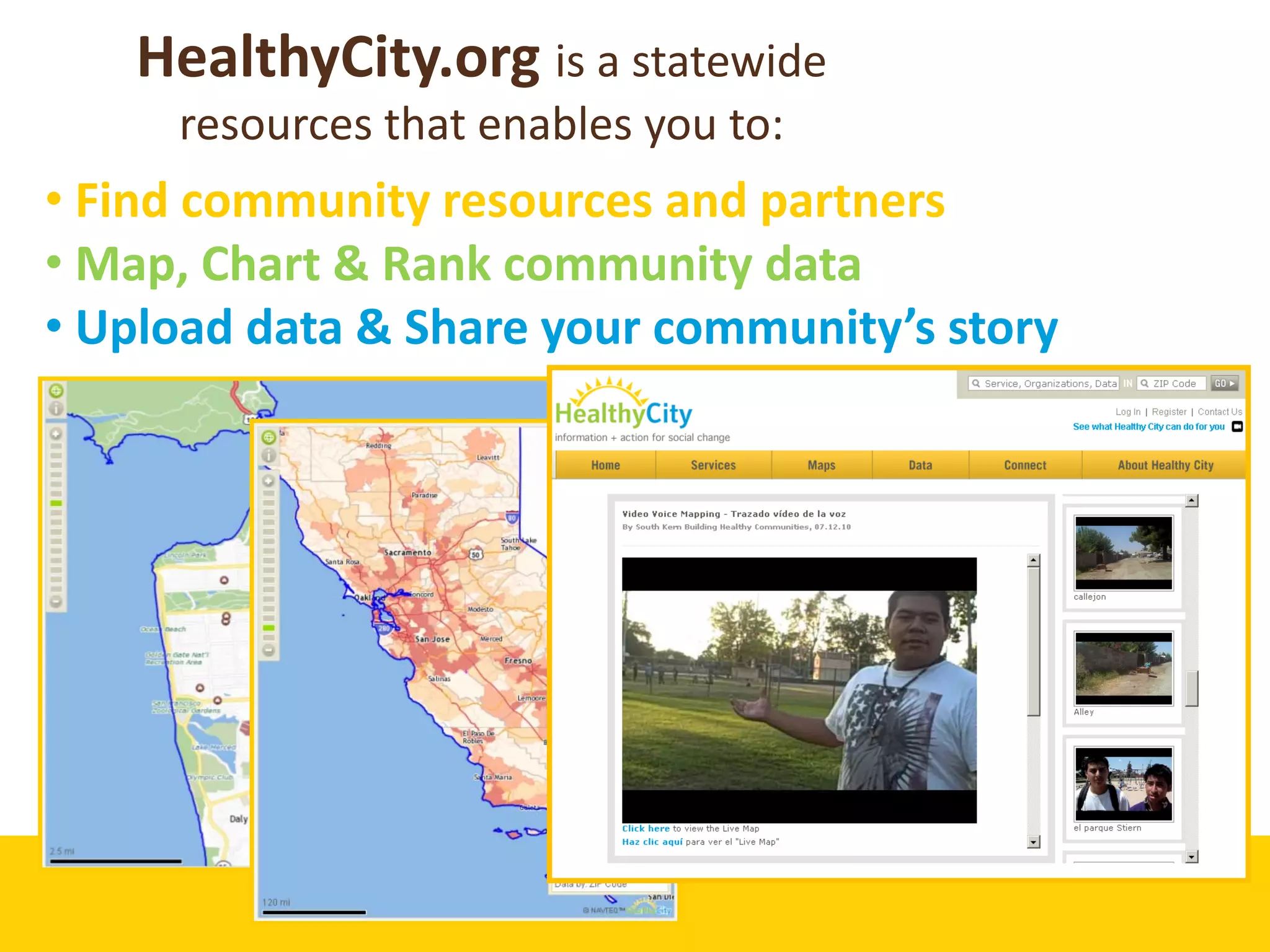
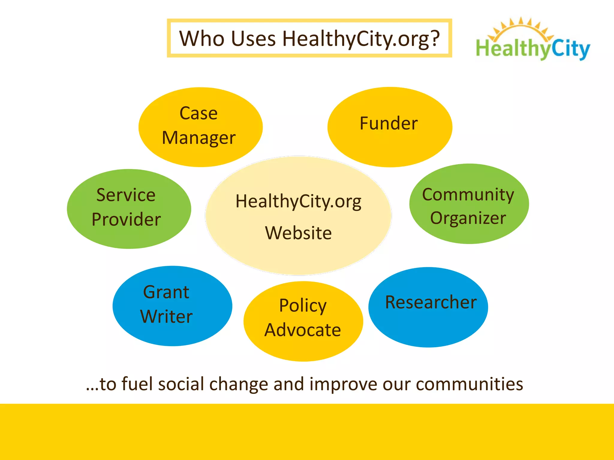
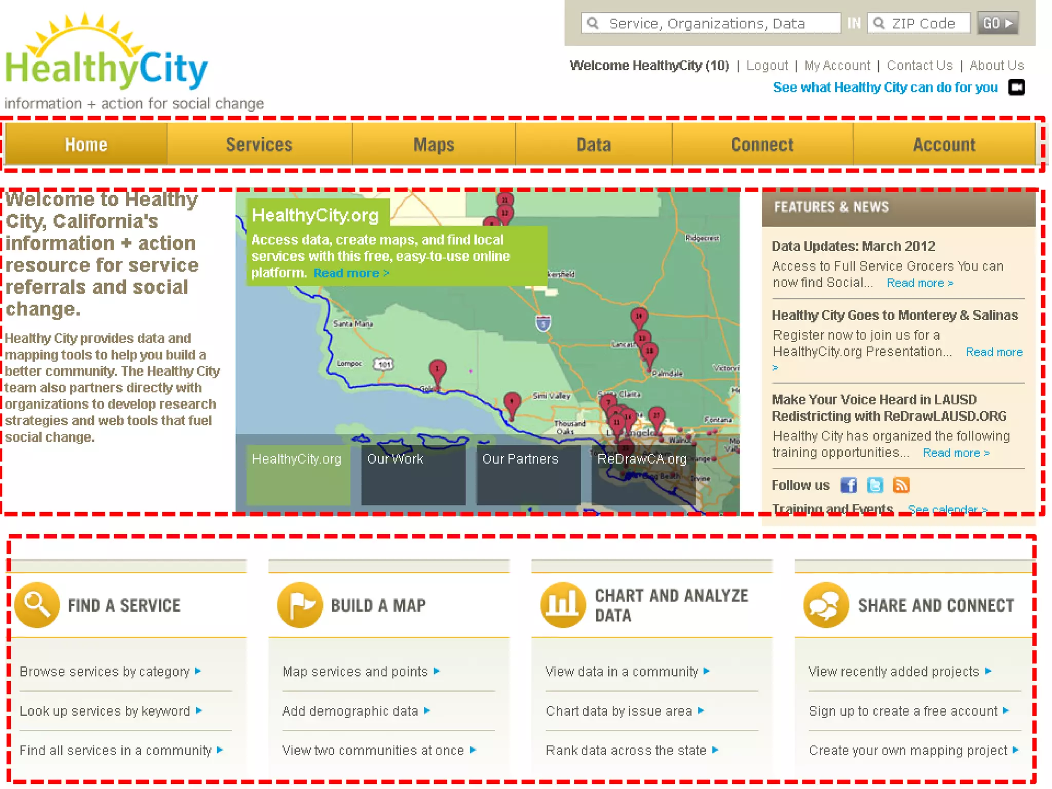
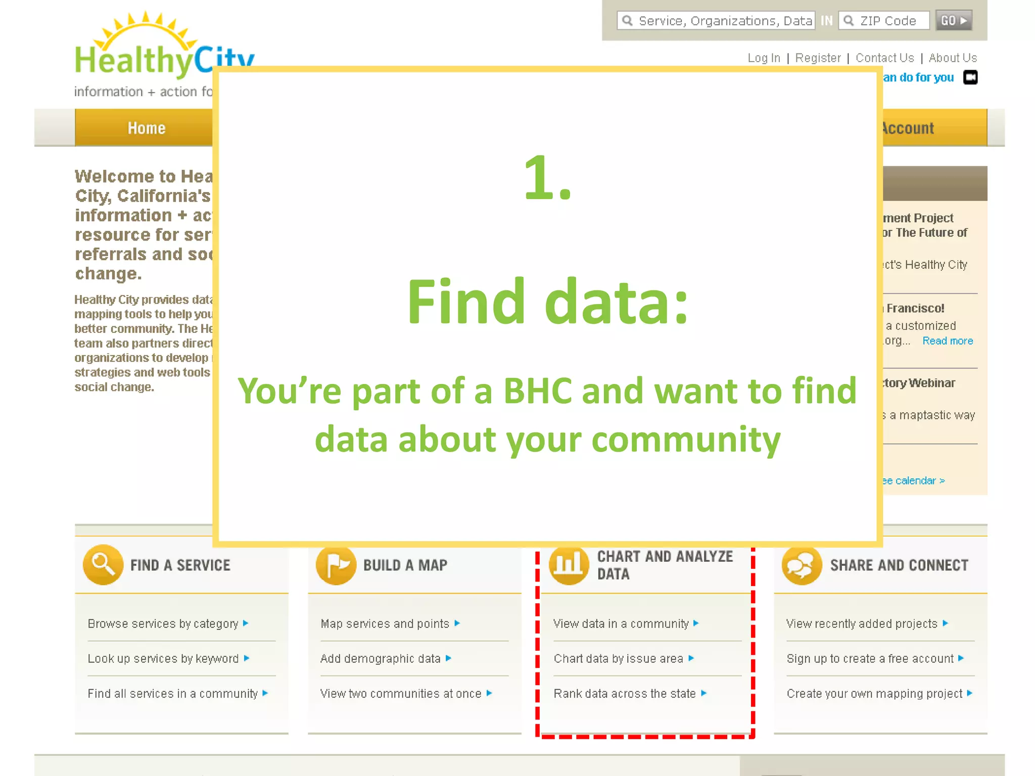
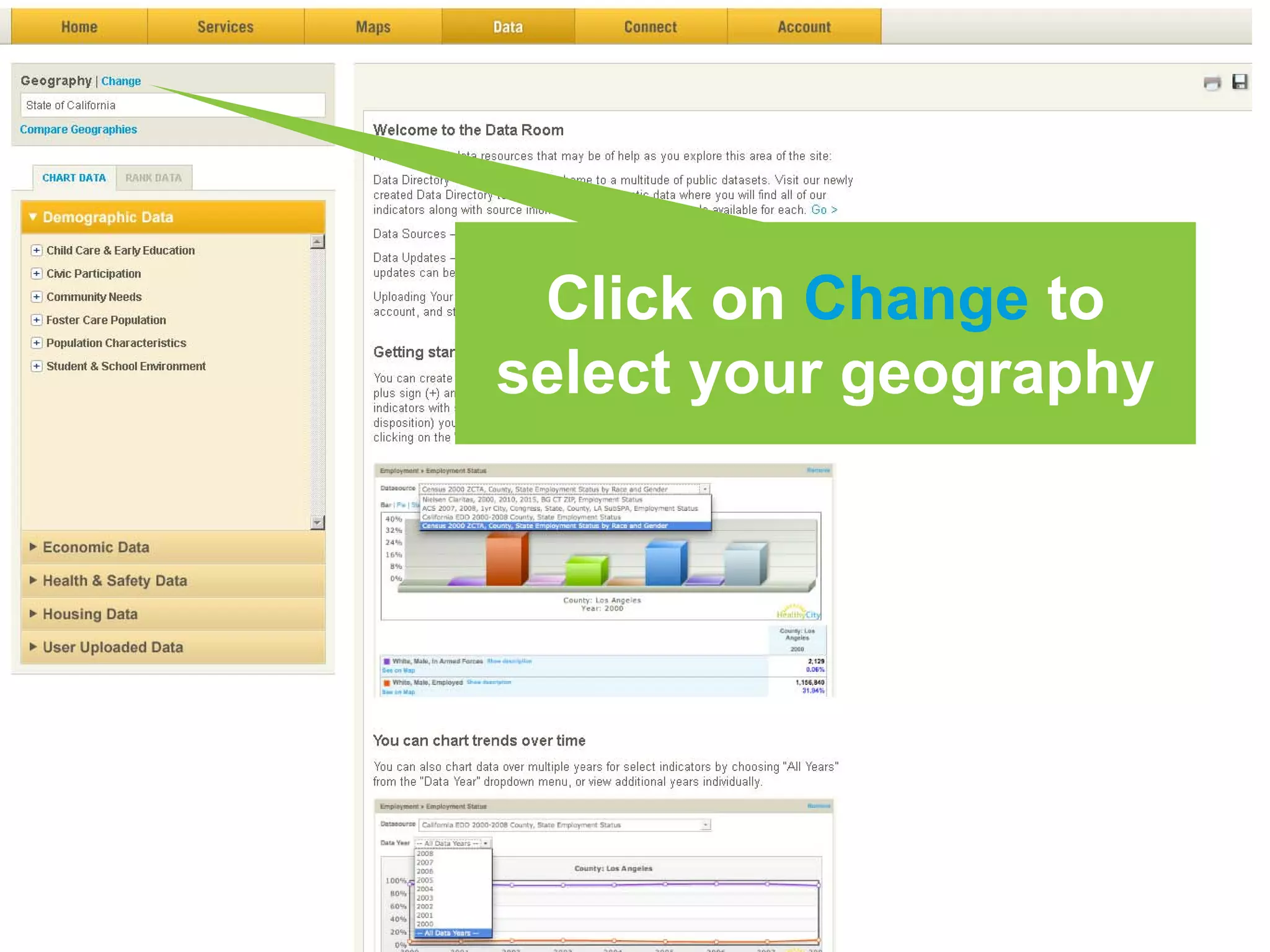
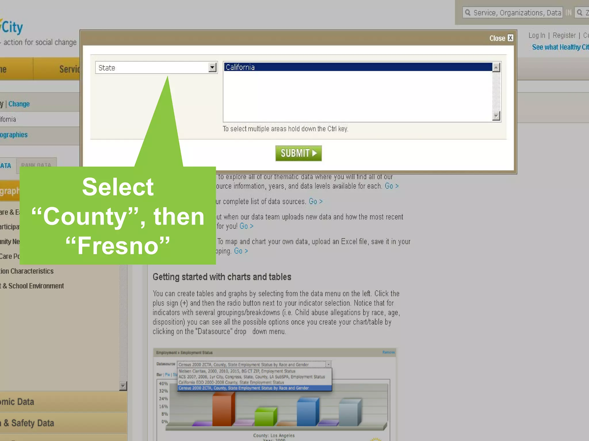
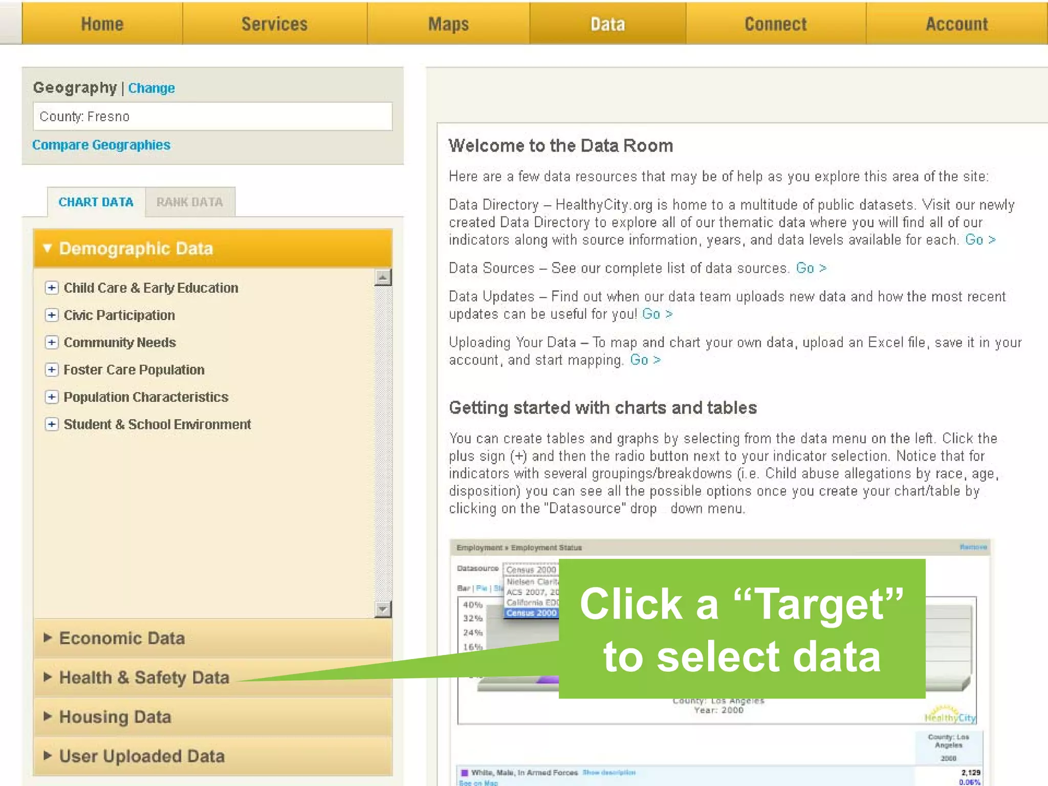
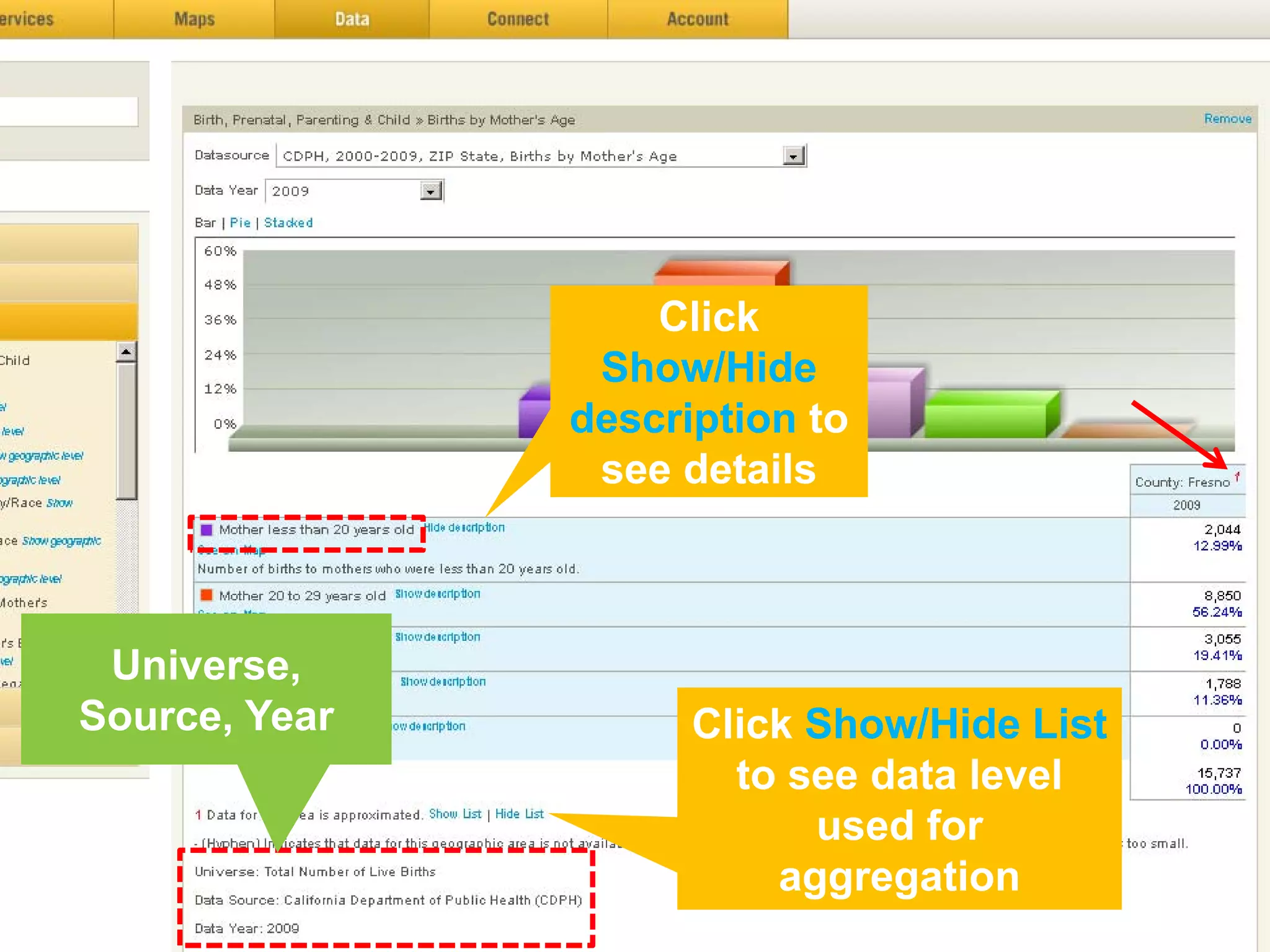
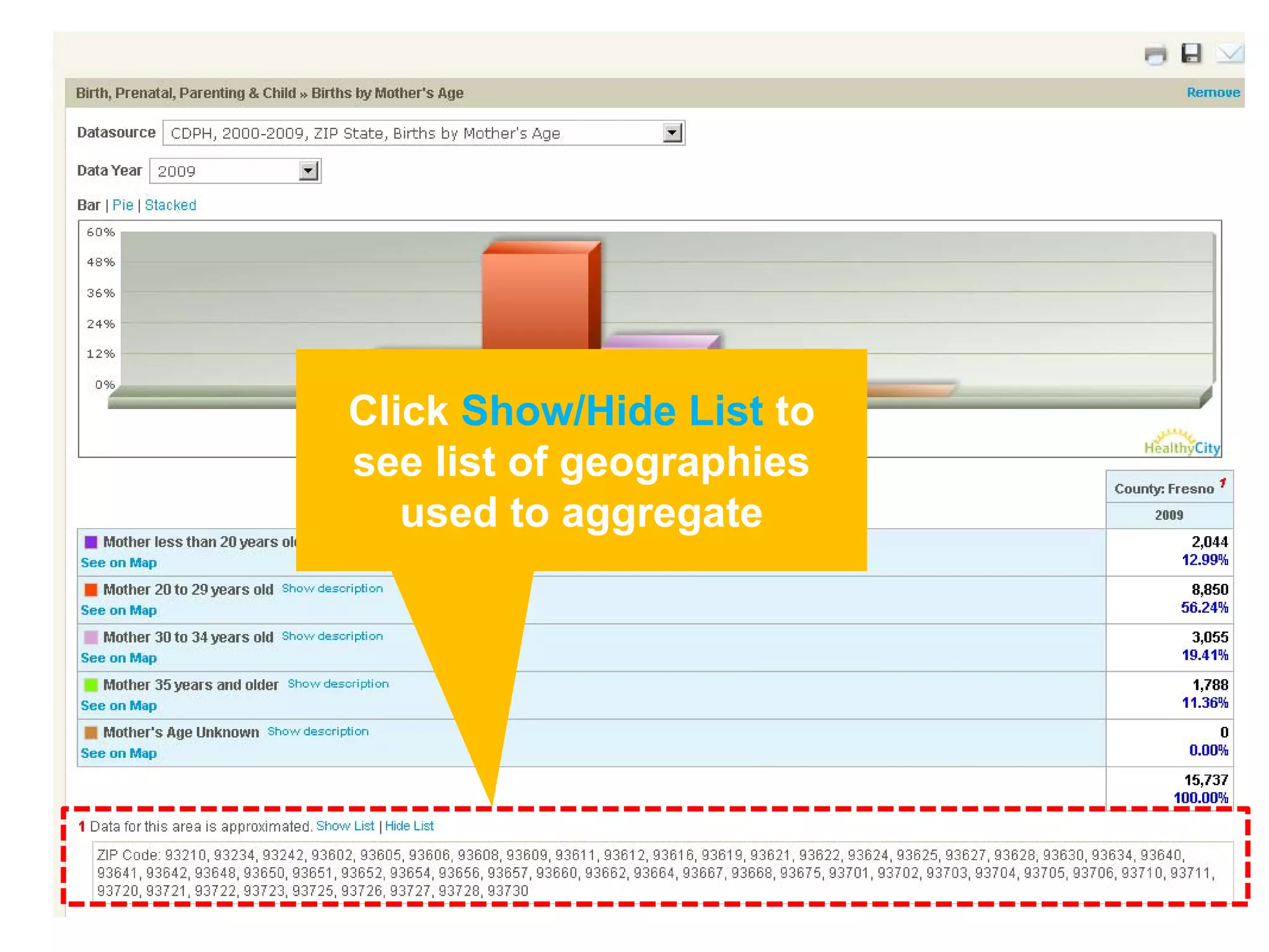
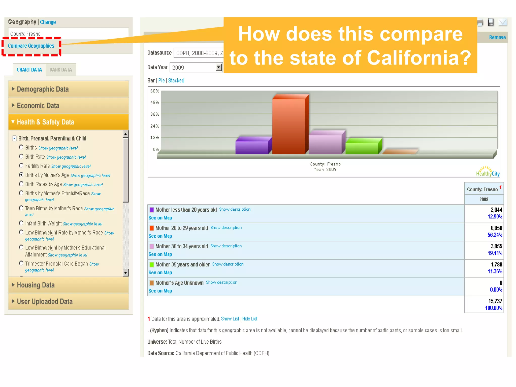
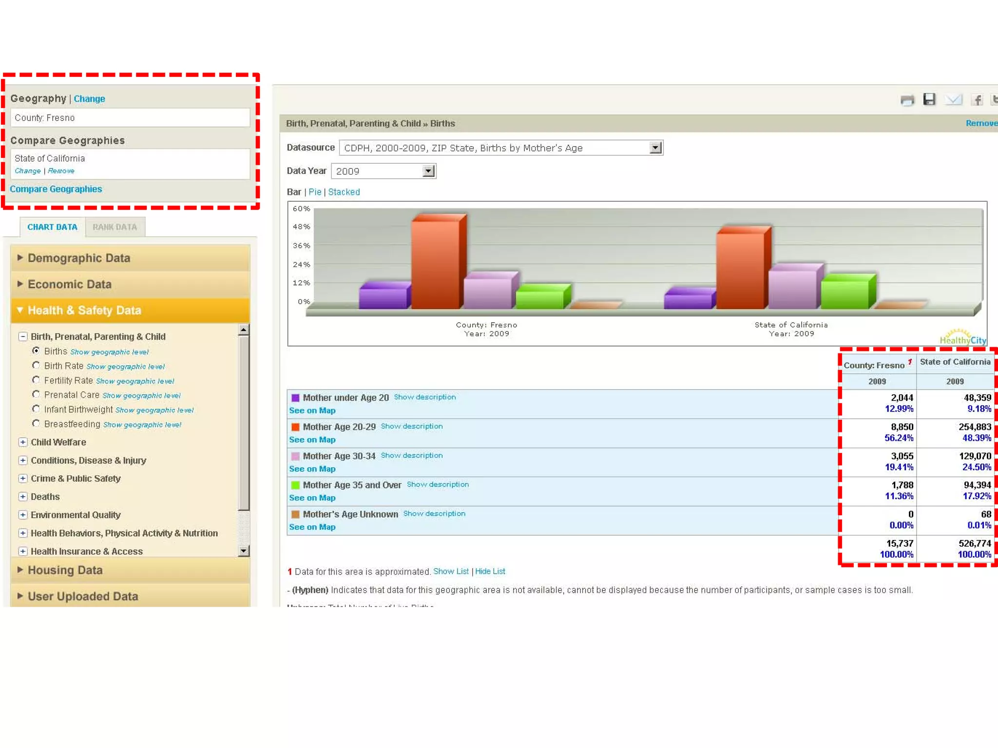
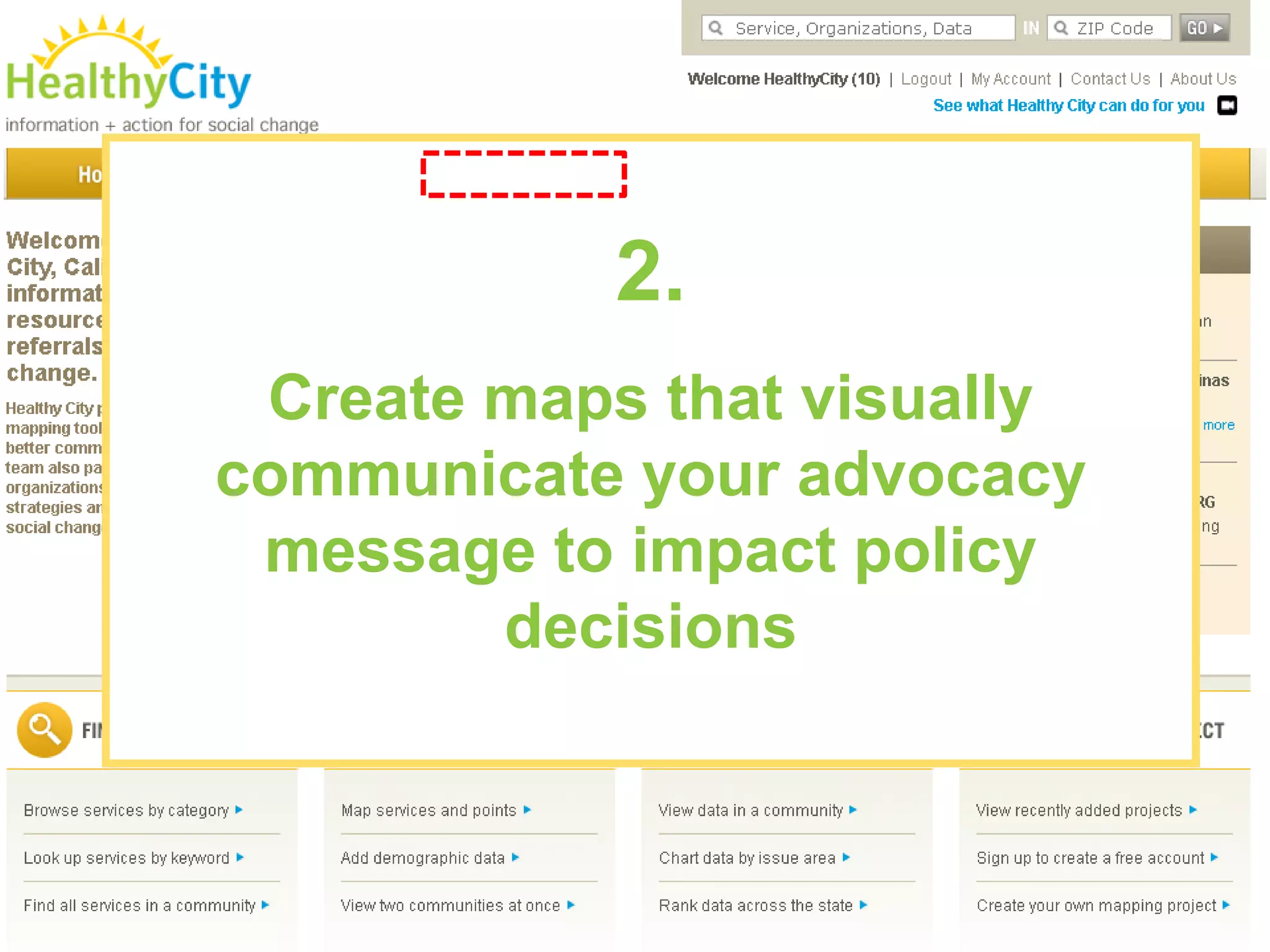
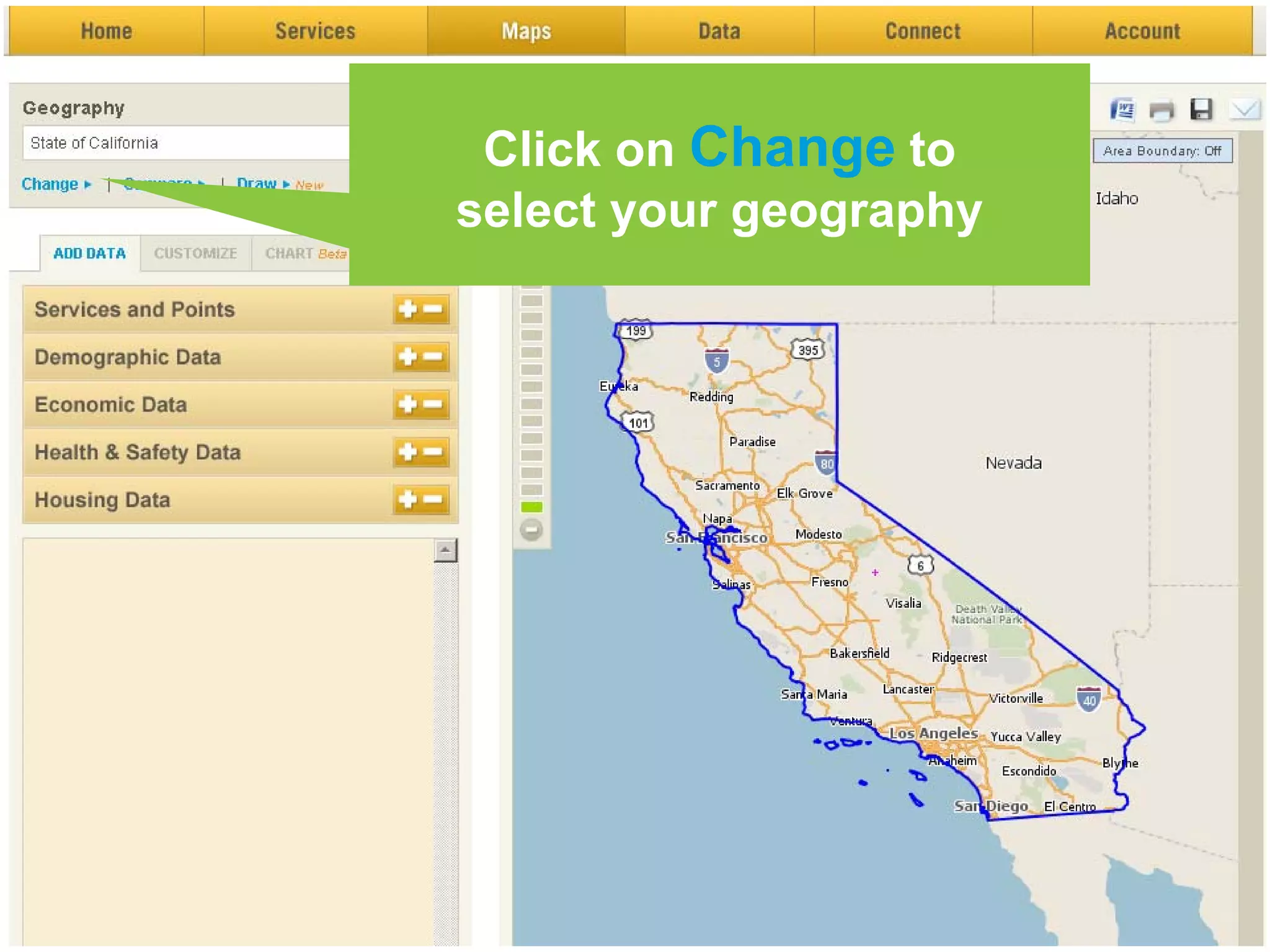
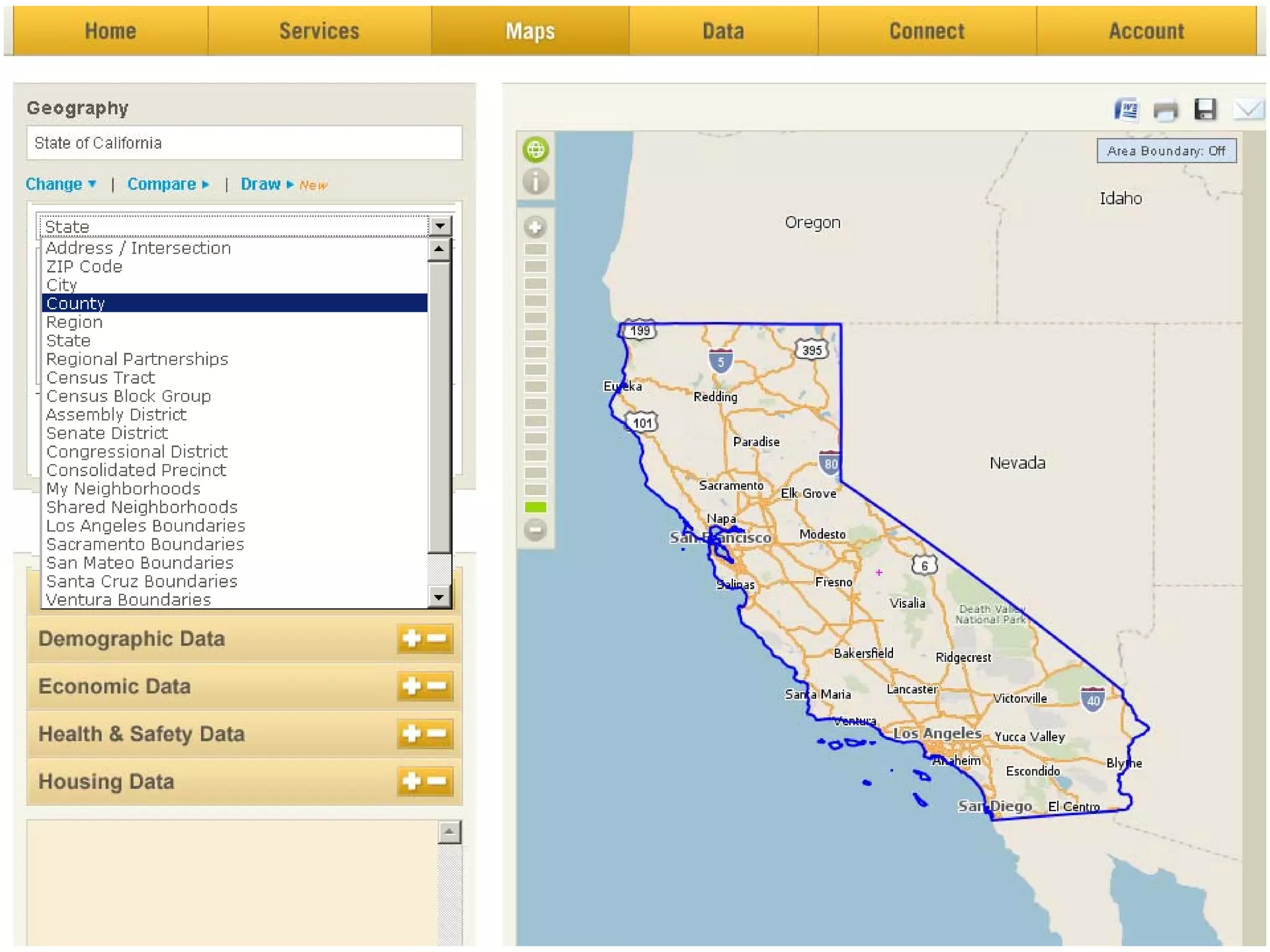
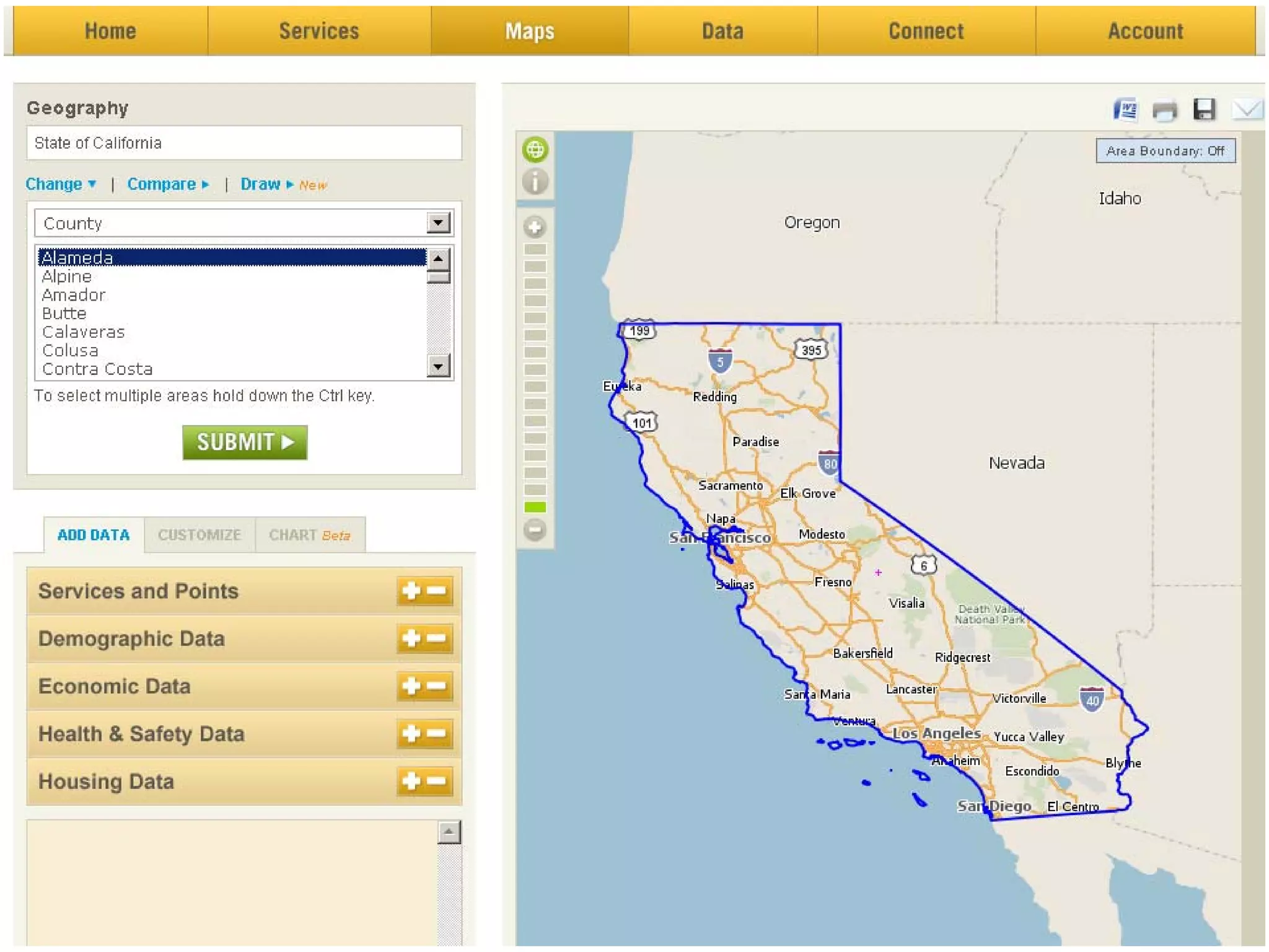

This document provides information about a project called HealthyCity.org that aims to use mapping technology and community-driven research to address social inequities. It does this by connecting community knowledge to data visualized on maps, supporting advocacy strategies, and providing online tools and resources. The document outlines how HealthyCity.org can be used by community groups, researchers, policymakers and others to map local data, find partners and resources, and fuel social change initiatives in their communities.


