Download to read offline


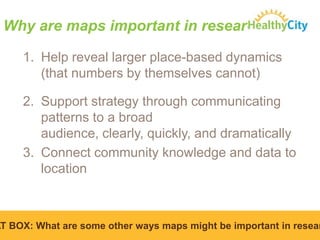
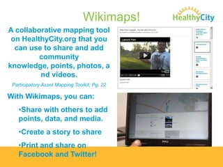
![Map Making 101: An example
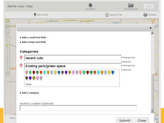
Data Needed:
• Owner-Occupied Housing Units
• Registered voters
Feasibility:
• Data available publically available [on HealthyCity.org]](https://image.slidesharecdn.com/mapmaking101final-140130154321-phpapp01/85/Map-Making-101-25-320.jpg)

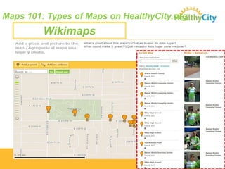
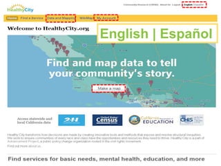
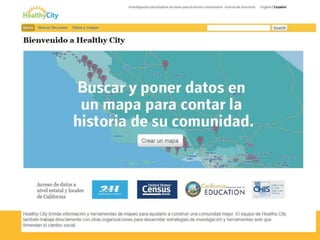
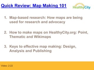

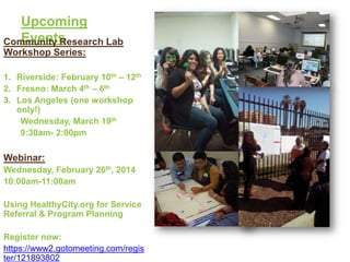

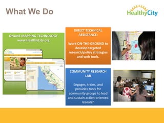
The document provides an overview of a webinar on making maps for research and advocacy using HealthyCity.org. The webinar teaches participants how maps can be used for community organizing, advocacy, program planning, and grant writing. It covers types of maps, data sources, and best practices for effective map design and analysis. The webinar aims to equip community groups with mapping skills to conduct action-oriented research and social change efforts.


![P41 Thompson Jp[1]](https://cdn.slidesharecdn.com/ss_thumbnails/p41-thompson-jp1-100318222120-phpapp02-thumbnail.jpg?width=640&height=640&fit=bounds)


